
Overlaying Information on a Plot
On a previous posting entitled Focused on Zooming, Bao posed a great question that I thought would be useful to answer in a separate post. The question concerned the ability to overlay data on a plot. At its simplest, an overlay can be implemented in terms of placing a non-visible axes above the visible one. There are, however different scenarios for needing an overlay. In this post, I’ll examine the different overlays and how you might go about creating them in MATLAB.
Contents
Decorating an Object
One of the most common reasons for an overlay is to draw attention to a plot of interest. For example, if we have four subplots containing data we may wish to draw attention to one of the subplots over the others.
figure;
subplot(2,2,1);
plot(rand(3));
interestingAxes = subplot(2,2,2);
plot(magic(3));
subplot(2,2,3);
plot(rand(3));
subplot(2,2,4);
plot(rand(3));

In the above plot, there is nothing to indicate whether one axes is more important than another. It would be useful to highlight the axes we wish to emphasize.
We begin by creating a non-visible axes whose position covers the whole figure.
invisibleAxes = axes('Visible','off','Position',[0 0 1 1],...
    'XLim',[0 1],'YLim',[0 1],'HitTest','off');

Setting the XLim and YLim properties ensure that when we deal with coordinates normalized to the figure, they will also be normalized to the axes. The HitTest property tells tools such as ZOOM to ignore this axes when interacting with the figure.
We will now create a pink border around our interesting axes using the rectangle command:
border = rectangle('Parent',invisibleAxes,...
    'Position',get(interestingAxes,'Position'), ...
    'EdgeColor', [1 .4 .4],...
    'LineWidth',4,'HitTest','off');

The pink rectangle now indicates which area of the figure may be important.
close;
Annotating a Plot
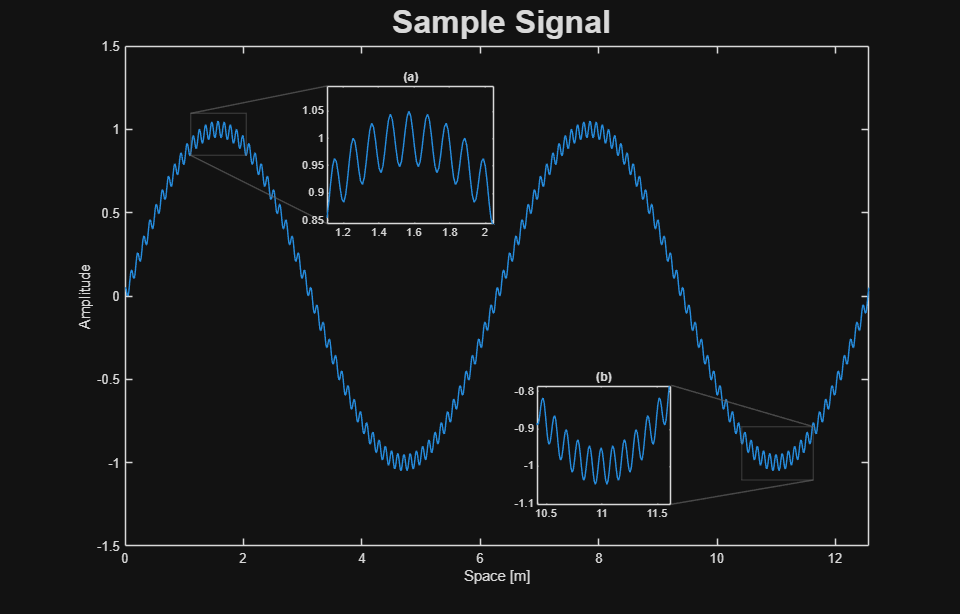
In some cases, the figure is too large a canvas on which to communicate. In this case, we may want to focus on aspects of the data. These annotations will appear on top of the data. For this case, we will use a smaller overlay axes. We will ensure that this axes has the same X and Y limits as the original plot using the linkaxes command.
figure;
dataAxes = axes;
plot(magic(3));
invisibleAxes = axes('Visible','off',...
    'Position',get(dataAxes,'Position'),...
    'HitTest','off','XLimMode','manual','YLimMode','manual');
linkaxes([dataAxes invisibleAxes]);

If we wish to draw attention to an area, we can now place information into the invisible axes using annotations.
rectangle('Parent',invisibleAxes,'Position',[1.6 5 .2 1],...
    'EdgeColor',[1 .4 .4],'LineWidth',4);
text('Parent',invisibleAxes,'String','No Data Here',...
    'HorizontalAlignment','Center','VerticalAlignment','Bottom',...
    'Position',[1.7 6 0]);

Since the limits have been linked, the pink box and the associated text will travel with the data when the plot is panned or zoomed.
zoom(2);

close;
Adding Transient Information
Sometimes, the information we wish to provide may be transient. For example, if a user clicks on a line, we may want to see more information about the line. After the user is satisfied, this information should go away. This sort of interaction model can also be implemented in terms of an overlay as well in conjunction with figure callbacks.
A more complex case may be that of a jeweler’s loupe tool. In this case, we want to create a visible axes that shows a zoomed in portion of the data being examined. The following code will create a loupe without the need for user interaction.
figure;
dataAxes = axes;
plot(magic(3));
% Compute the center of the axes:
dataAxesPosition = get(dataAxes,'Position');
xc = dataAxesPosition(1) + dataAxesPosition(3)/2;
yc = dataAxesPosition(2) + dataAxesPosition(4)/2;
% Use this information to compute the center of an overview:
loupeAxesPosition = [xc-.125, yc-.125, .25, .25];
loupeAxes = axes('Position',loupeAxesPosition,...
    'XTickLabel','','YTickLabel','','XTick',[],'YTick',[],'Box','on');
% Copy the children of the data axes over:
copyobj(get(dataAxes,'Children'),loupeAxes);
% Zoom the loupe axes by a factor of 4:
zoom(loupeAxes,4);

A fully featured jeweler’s loupe tool which uses figure callbacks may be found on the File Exchange here.
In general, the axes can be used for more than displaying plots. It can also be used as a window into different aspects of the data. What sort of information have you tried to add to plots in the past?
- Category:
- Data Tools


Comments
To leave a comment, please click here to sign in to your MathWorks Account or create a new one.