Learn about MATLAB Plots using Trendy
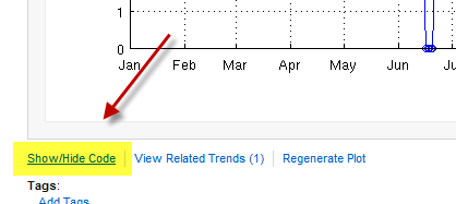
The other day I was looking at questions from our users on MATLAB Answers, the MATLAB Central and also on MATLAB’s Facebook page. I saw quite a few posts asking questions about ways to enhance MATLAB plots. When I am trying to learn something new, I always learn better if I can see how others have done it, so I thought it would be fun to would share some plots from Trendy that show basic things you can do. Remember that Trendy lets you click on the “Show/Hide Code” button to see the code the author used to create the plot.
Let’s take a look at some examples of plots…
Using Data Markers
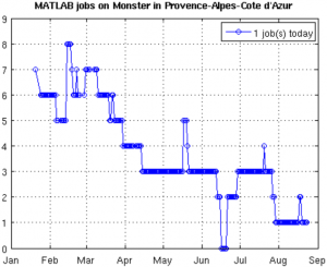
In How many MATLAB jobs in South of France, Aurelien is showing a simple chart using Trendy defaults. Notice that data points in the chart are represented by an ‘o’.
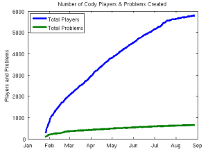
In this next trend, Rob Nickerson has created a simple chart with a different look by removing the data point markers from his plot code and making the lines thicker. Also notice that he has added a label on the y-axis using the ylabel command. He has also kept the chart legend from interfering with his chart by relocating it near the y-axis.
Changing Plot Colors
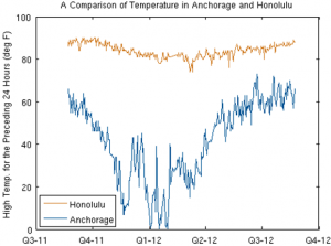
In Ned Gulley’s trend Temperatures in Anchorage and Honolulu, notice that he has a similar plot charting two different pieces of data. But if you look at his code, you can see how he easily changed the colors in his plot command.
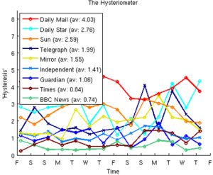
If you’ve been checking out Trendy at all, you’ve probably seen Hugo Carr‘s Hysteriometer which is “a measure of the total expressed fear and outrage from newspaper tabloids in Britain benchmarked against their more moderate counterparts”. (See reference in the British paper, the Independent “Calm down, dears“.) What you might not have noticed in the plot is how Hugo has controlled the colors used in the plots using ColorOrder, which is a pretty handy feature.
Putting Multiple Plots in One Graphic
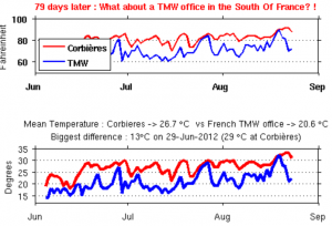
One last plot I’d like to share with you is, again, by Aurelien. In MathWorks should have an office in my village, he’s taken the plot we saw in the earlier example. He’s used the subplot command to combine it with a second plot, creating a single graphic. It is a good visual technique to compare data while conserving whitespace on your page.
Share Your Favorite Trends!
Do you have a favorite Trendy plot that shows of nifty ways of sharing your data? If so, leave a comment to share them with other readers!
 Cleve’s Corner: Cleve Moler on Mathematics and Computing
 The MATLAB Blog
 Guy on Simulink
 MATLAB Community
 Artificial Intelligence
 Developer Zone
 Stuart’s MATLAB Videos
 Behind the Headlines
 File Exchange Pick of the Week
 Hans on IoT
 Student Lounge
 MATLAB ユーザーコミュニティー
 Startups, Accelerators, & Entrepreneurs
 Autonomous Systems
 Quantitative Finance
 MATLAB Graphics and App Building




评论
要发表评论,请点击 此处 登录到您的 MathWorks 帐户或创建一个新帐户。