
Labeling Bars Made Easy
 |
Guest Writer: Benjamin Kraus Ben has been a Software Engineer on the MATLAB Graphics and Charting Team since 2015. Although his first exposure to MATLAB was in 2000 as an undergraduate studying Biological Engineering and Computer Science at Cornell University, he really grew to love MATLAB while completing his PhD in Biomedical Engineering at Boston University. Throughout graduate school Ben used MATLAB nearly every day for nearly every aspect of his research: from running his experimental setup, collecting data, and analyzing data, to producing figures for his thesis and research papers. Ben joined MathWorks in 2013 and spent a little over a year in the Engineering Development Group at MathWorks before joining the Graphics and Charting Team. When he isn't at a computer, Ben enjoys biking, rowing, and sailing, and is a member of The Fast and the Fouriers running club at MathWorks. |

Although the Charting Team loves adding completely new chart types to MATLAB (such as violin plot), we try not to forget our old favorites, including the trusty bar plot. We've added two new features to bar plots in R2024a and R2024b that makes it just a bit easier to get that perfect bar plot: the ability to adjust the amount of whitespace between groups of bars and a way to easily add labels to your bar plots.
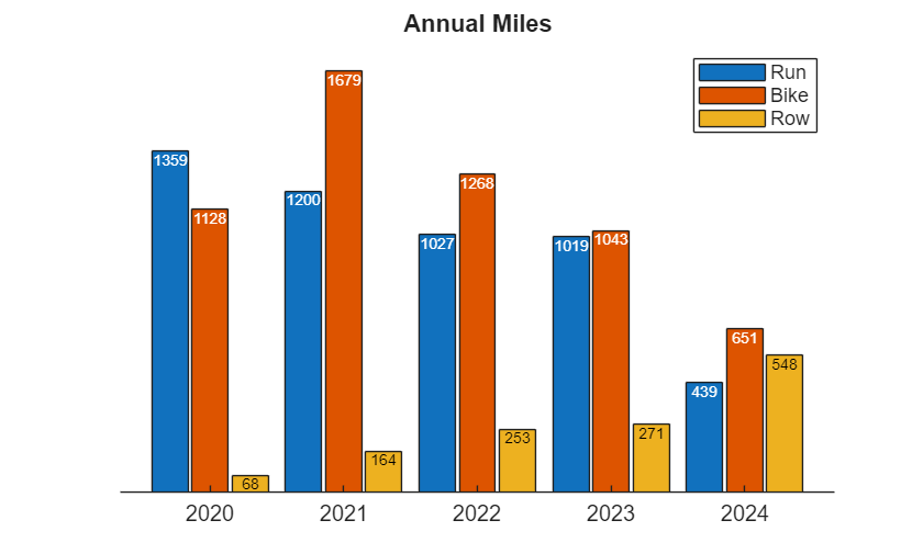
To show off these new features, I'm going to build a bar plot of my biking, rowing, and running mileage since 2020. I spend a good chunk of my day at a computer, so I try to compensate for that by getting outside for a daily workout. Let's take an initial look at the data:
ax = axes;
years = ["2020", "2021", "2022", "2023", "2024"];
run = [1359, 1200, 1027, 1019, 439];
bike = [1128, 1679, 1268, 1043, 651];
row = [68, 164, 253, 271, 548];
b = bar(years, [run; bike; row]);
legend(["Run", "Bike", "Row"])
title("Annual Miles")
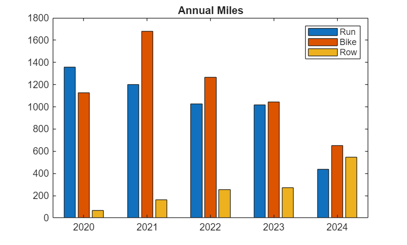
As you can see, like many people, I logged a lot of running and biking miles in 2020. Unfortunately, a recent injury has curtailed a lot of my running, but I've replaced it with more rowing (a relatively new sport for me).
Add labels to a bar plot
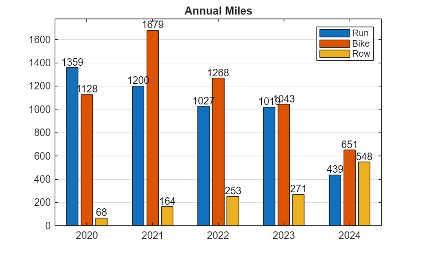
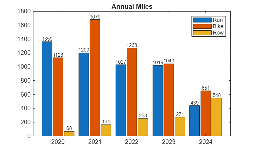
One issue with the bar plot above is that it can be hard to read precise values. You've got to visually trace from the top of each bar back to the y-axis and then interpolate to get an approximate value. A quick way to fix that is to add grid lines:
ax.YGrid='on';

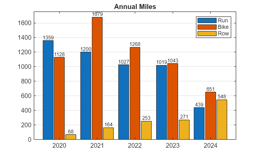
This helps a little, but you still need to interpolate to get an approximate value. Sometimes you want to show the actual value as a label above each bar. A new feature in R2024b makes this much easier. Starting in R2024b, you can set the Labels property to add labels automatically aligned with the top of each bar. Each set of data (run, bike, and row) corresponds to a different Bar object, so we need to set the Labels property individually for each set of data. Let's see what that looks like:
b(1).Labels = run;
b(2).Labels = bike;
b(3).Labels = row;
The astute observer will note that I set those properties using the original data in the form of numeric vectors. When you do that, MATLAB will automatically convert those values into strings. However, if you prefer, you can set the labels to include whatever strings you want.
Control bar and group width in a bar plot
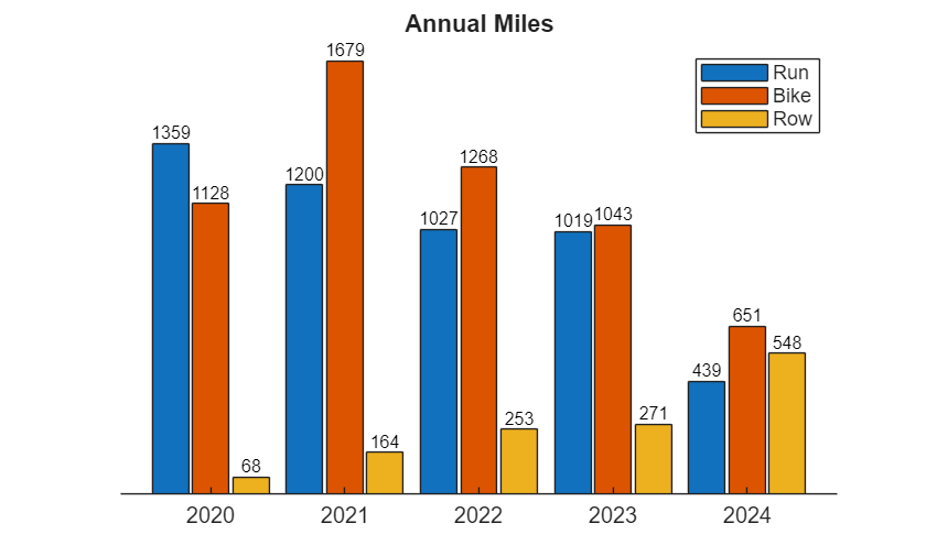
With the new labels you can now tell exactly how many miles I logged each year, but the chart is getting a bit cluttered. Let's see what we can do to clean that up.
To start with, I'm going to eliminate some white space by making each individual bar and each group of bars a bit wider using two properties: BarWidth and GroupWidth. The BarWidth property has been available in MATLAB for many years. This property is a ratio that controls the width of each individual bar, with a value of 0 meaning the bars should have no width and a value of 1 meaning the bars should touch each other (occupy 100% of the space available). The GroupWidth property was added in MATLAB R2024a and controls the width of each group of bars. Similar to BarWidth, GroupWidth is a ratio: a value of 0 for means the group should have no width and a value of 1 means each group should be touching the neighboring group.
set(b,BarWidth=0.9,GroupWidth=0.9)

That helped a lot, but a few labels are still overlapping. Let's decrease the font size to make more room.
fontsize(b,8,"points")
Now the labels no longer overlap, but the chart is still a little cluttered. The y-axis and grid lines are not as useful once you have labels, so I'm going to turn those off.
axis('off')
ax.XAxis.Visible = true;
Label location and color
That looks pretty good, but there are two more features of the bar labels I want to show off, which is automatic color selection and label location. To demonstrate these features, I'm going to make the bar labels a little smaller and then move them into the bars by setting the LabelLocation property.
set(b,LabelLocation='end-inside')
set(b,FontSize=7)
Notice how the labels on the yellow bars stay black (because they are against a light background), but the other labels change to white (to contrast against the blue and red bars). If you would prefer to pick the label color yourself, you can set the LabelColor property (using a single color for all the bars or one color per bar).
Other properties you can use to customize your labels include: FontName, FontSize, FontWeight, FontAngle, and Interpreter.
Want more flexibility with your labels?
What if you need just a bit more flexibility with your label placement, or you are stuck in an older release and can't leverage this new feature?
Although it requires a bit more fiddling, you can do something similar using the XEndPoints and YEndPoints properties, which were added in MATLAB R2019b. These properties give you the exact x- and y-coordinates of the tips of the bars, which you can pass into the text command to create labels at each bar. This approach requires a little more patience to get correct (such as setting the HorizontalAlignment and VerticalAlignment) but it produces text objects that you can position anywhere you like, giving you complete flexibility over the label properties.
b = bar(years, [run; bike; row],BarWidth=0.9,GroupWidth=0.9);
legend(["Run", "Bike", "Row"])
title("Annual Miles")
x = [b.XEndPoints]; % Combine all the x-coordinates into one matrix.
y = [b.YEndPoints]; % Combine all the y-coordinates into one matrix.
text(x,y,string(y),HorizontalAlignment='center',VerticalAlignment='bottom',FontSize=8)
Let me know in the comments what other bar labeling features you'd like to see.


コメント
コメントを残すには、ここ をクリックして MathWorks アカウントにサインインするか新しい MathWorks アカウントを作成します。