R2024b release: What’s new in Graphics and App Building?
Two of my favorite times of the year are September and March, when the landscape transforms beautifully in my area of the globe. These months also mark exciting transformations in the MATLAB world with new releases! I fondly remember eagerly scouring the release notes to uncover new features and being the first to share them with my peers in the lab. Now, I get to share these exciting updates with you! Here are some highlights of new graphics and app building features in R2024b. Stay tuned to the Graphics and App Building blog for in-depth articles on some of these topics, often written by the primary developer in the project!
New charts and graphics objects
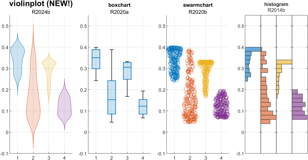
Visualize the estimated probability density of your data using the new violinplot, combining elements of a boxchart and swarmchart to evaluate and compare groups of data. The figure below plots the same set of data using various tools to visualize distributions. Observe how violinplot smoothly extends beyond the range of data, providing a visual estimate of the data’s distribution beyond the observed values.
violinplot(M)
Enhance your map visualizations by displaying icons in GeographicAxes or MapAxes using the new IconChart object, generated by the geoiconchart function (Mapping Toolbox). Check out this map of domestic airports near MathWorks HQ. No need for a legend with these icons!
geoiconchart(lat, lon, 'MWlogo.png', SizeData=30)
geoiconchart(lat, lon, 'airplane.png', SizeData=30)
![]()
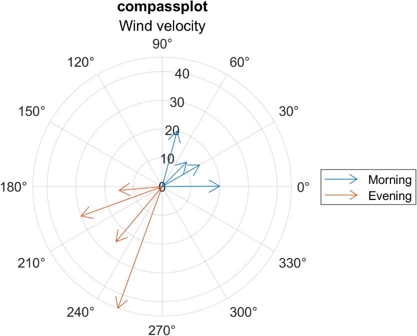
compassplot joins the polar axes family to provide an easy way to visualize your radial data. Anyone using the older compass() function, built in Cartesian coordinates, is encouraged to make the switch to compassplot to take advantage of PolarAxes properties. See our deep-dive into compassplot.
compassplot(windDirection, windSpeed)
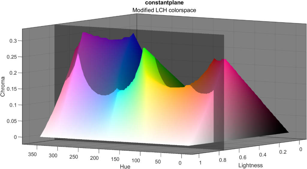
My favorite new R2024b feature in this category is the ConstantPlane, generated by the constantplane() function. Similar to ConstantLine objects (xline, yline, R2018b) and ConstantRegion (xregion, yregion, R2023a), constant planes extend infinitely and have many use cases to enhance and annotate 3D visualizations. The example below uses a ConstantPlane to show a 2D slice of a modified LCH colorspace at 80% lightness. Without the plane, it would be difficult to see the chroma border of the 3D volume at this lightness value.
constantplane('y',0.7)
Charting features and enhancements
We’ve noticed that people frequently label bars in a bar plot and sometimes get stuck fumbling around with text placement or alignment. Now bar has a Labels property along with label customization options. A great application of this feature is labeling stacked bars with the raw data to see the length of each segment. Notice that we also take care of choosing a default font color based on the bar color.
h=bar(M,'stacked')
h(1).Labels = M(:,1);

Are your legends taking up too much space because of wide legend icons? Control the width of legends using the new IconColumnWidth property. The figure below shows the default legend width compared to a minimal legend width. I also snuck in two constant planes.
legend(ax,'IconColumnWidth',10)
![]()
Pie charts and donut charts can quickly become cluttered with many sparsely populated categories. Now you can group those items in an “Others” category by setting the NumDisplayWedges. This example below also shows the new DisplayOrder property that sorts the categories in ascending or descending order. Compare these two donut charts below that contain the same set of data but the one on the right caps the number of categories and sorts them.
donutchart(tbl,'Country',DisplayOrder='descend',NumDisplayWedges=10)

tiledlayout(), with no inputs, now defaults to a “flow” arrangement that updates the grid size any time a new axes is added using nexttile(). This is one of the charting team’s favorite enhancements and makes it even easier to flexibly add axes to a figure in an adaptive grid layout.
tiledlayout()
plot(nexttile(), __)
surface(nexttile(), __)
histogram(nexttile(), __)
New App building features
UI Button and UI StateButton objects now have an interpreter property that supports a wide range of tex, latex, and html markup options for greater customization.
btn = uibutton(fig, 'Text', . . .
 "<strong>Delete data</strong><br>" + . . .
    "<mark><strong>I know what I'm doing</strong></mark>", . . .
    'Interpreter', 'html', 'Position', [100 100 150 45]);

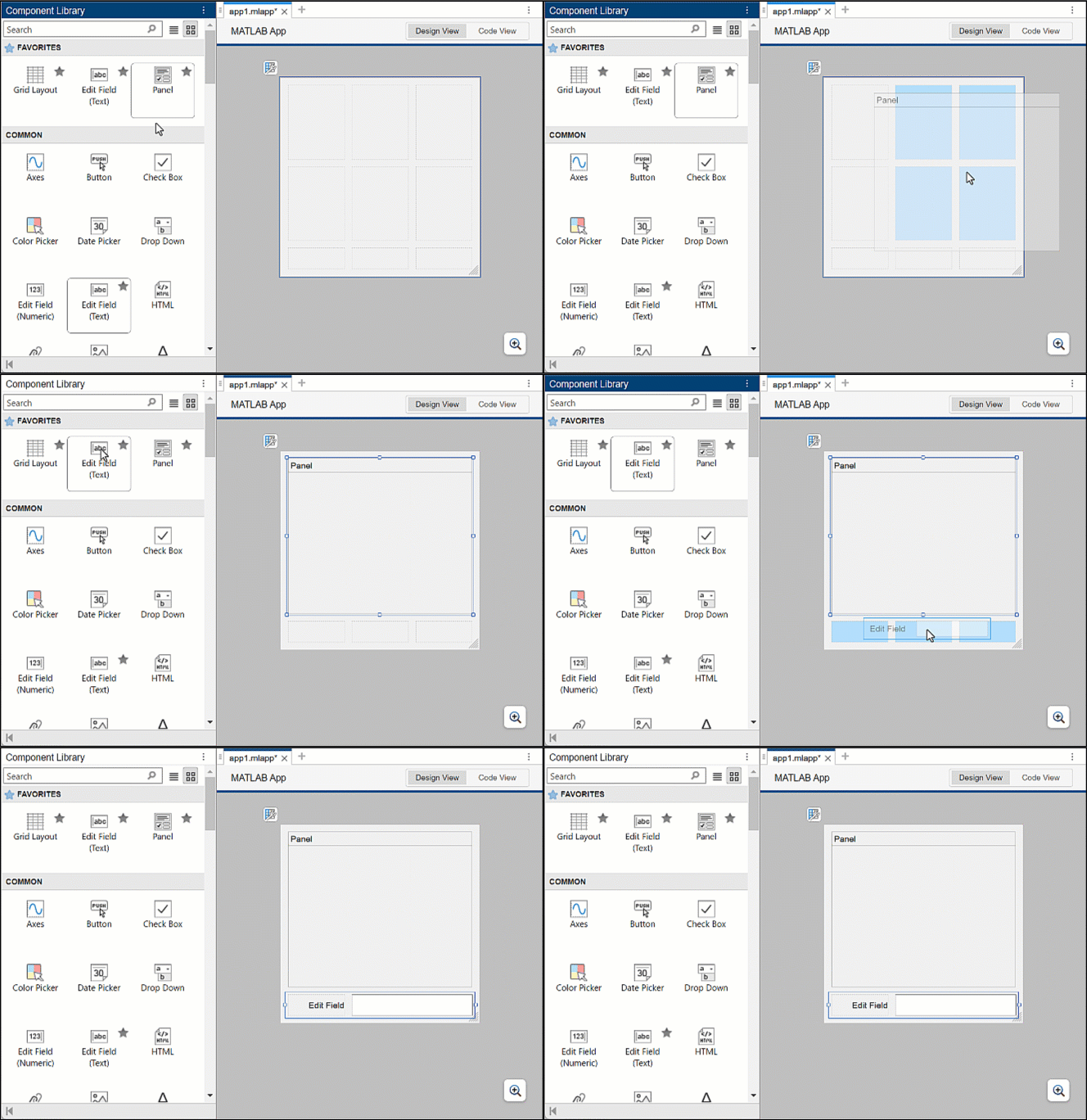
Dragging UI components into a gridded layout in App Designer’s Design Mode just got a whole lot easier by supporting multiple cell spans. See more tips on using grid layout managers in App Designer.
Some cleanup on our end
opengl() - In a future release, changing the renderer using opengl() will no longer be necessary and this function will be removed. Starting with this release, you’ll see a warning when using opengl(). Use rendererinfo to query renderer information.
legend outputs – We’ve been actively enhancing the legend() function based on our observations of how users were utilizing its undocumented outputs. Since R2018b, legend() has had only one documented output, the Legend object handle, and the documentation has warned against using additional undocumented outputs since R2016a. In a future release, requesting multiple outputs from legend will no longer be supported, with a warning appearing in R2024b. If you still rely on multiple outputs to legend, we’d love to hear your use case in the comments below.
hold all - Last year an Answers forum contributor and Community Advisory Board member, goc3, brought to our attention that the hold all command contains a warning in the documentation stating it is the same as hold on and will be removed. He’s right! So, we removed hold all from the documentation, but it continues to be an alias for hold on. We recommend replacing any references to hold all with hold on, if any still exist out there.




评论
要发表评论,请点击 此处 登录到您的 MathWorks 帐户或创建一个新帐户。