Plotting a New Course: A Grown-Up compassplot
 |
Guest Writer: Abby Skofield Today's R2024b feature highlight is written by Abby Skofield, a developer on the Charting Team and a returning contributor to the Graphics and App Building blog. This blog serves as a unique outlet for readers to gain insights directly from the developers behind the new features which is why we're thrilled to have Abby share her expertise with us on the new compassplot. See Abby's full bio on our contributors page. |
MathWorks turned 40 years old earlier this year, marking a significant milestone in our journey of accelerating the pace of engineering and science! Coincidentally, I am also turning 40 this October, and to age as gracefully as possible I am trying to embrace change and, you know, resist the temptation to hold on too tightly to outdated ideas. In the spirit of evolution, today I am introducing compassplot, the latest grown-up addition to MATLAB's suite of PolarAxes-based plotting functions introduced in R2024b.
As we celebrate this new chapter, it's also time to say goodbye to the trusty compass function. It served us well in a MATLAB landscape before the introduction of object handles, App Designer, and PolarAxes, but hasn't been able to keep up. The new compassplot represents a more mature approach, offering streamlined workflows and enhanced customization capabilities. Join me today to explore the possibilities of this new visualization.
theta = linspace(0,3*pi/4,10);
rho = 1:numel(theta);
clf
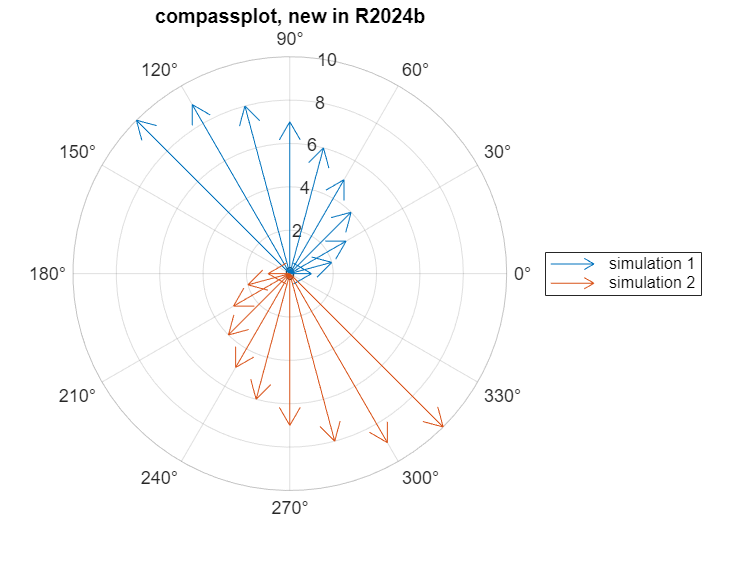
compassplot(theta, rho, DisplayName="simulation 1")
hold on
compassplot(theta, -rho, DisplayName="simulation 2")
title("compassplot, new in R2024b")
legend
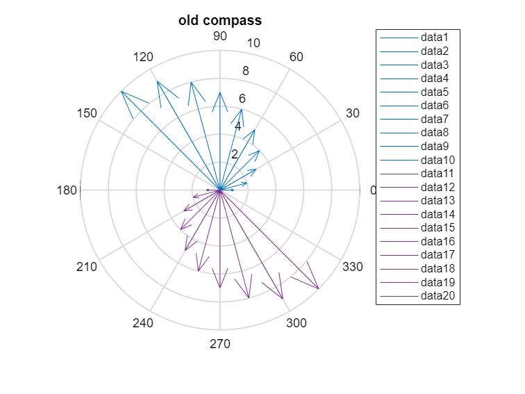
By comparison, the old compass function only understands Cartesian coordinates so we have to take an extra step to convert the polar inputs to Cartesian using pol2cart.
[u,v] = pol2cart(theta,rho);
clf
compass(u,v)
hold on
compass(-u,-v)
title("old compass")
% And old compass is not embarrassed to fill up your legend like this ...
legend(Location="northeastoutside")
Customization with compassplot and PolarAxes
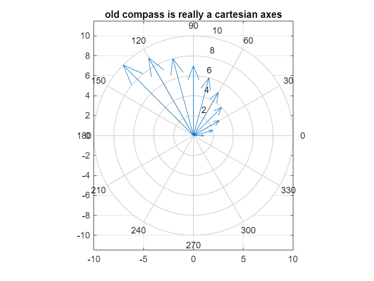
Besides doing something sensible with legend, the real strength of the new compassplot comes from the PolarAxes it is drawn in. The older compass function draws both the compass arrows as well as the concentric circles, radii and labels needed for the polar coordinate system - all in an actually Cartesian Axes! This means there is no (easy) way to customize how that coordinate system appears.
clf
compass(u, v)
axis on
box on
grid on
title("old compass is really a cartesian axes")
Both PolarAxes and the new PolarCompassPlot object created by compassplot, however, have polar-specific properties you can use to customize a visualization to your needs, as you can start to see when we display the handles of the two objects.
clf
pax = polaraxes
% Create sample data & compassplot
values = [91, 45, 80, 77, 34];
n = numel(values);
theta = linspace(0, (n-1)*2*pi/n, n);
c = compassplot(theta,values)
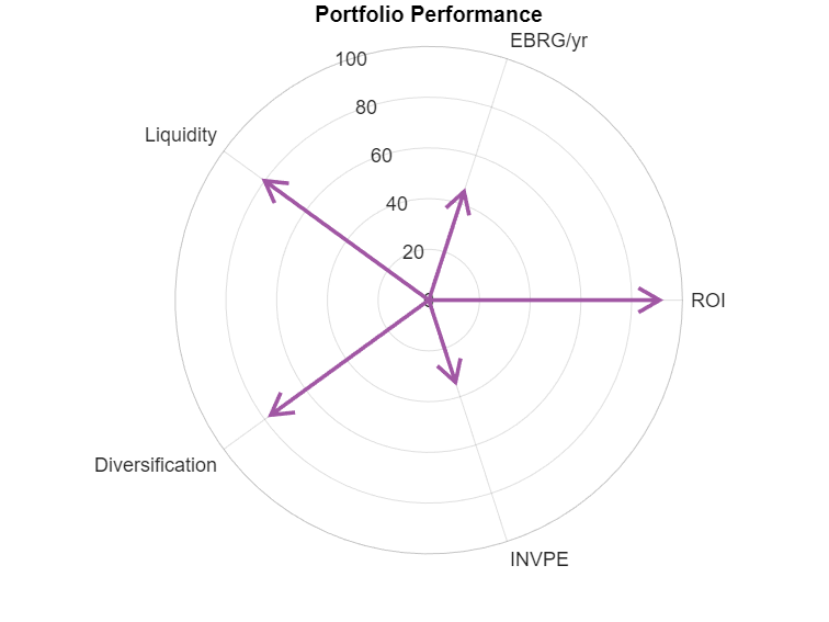
Using these properties, and some nice convenience functions, we can customize the objects to create a spiderplot-like visualization of some made-up portfolio metrics.
% Customize PolarAxes by setting properties.
pax.ThetaAxisUnits = "radians";
pax.RAxisLocation = 3*pi/5;
% Simple functions are also available to customize PolarAxes
% ticks and limits.
metrics = ["ROI","EBRG/yr","Liquidity","Diversification","INVPE"];
thetaticks(theta);
thetaticklabels(metrics);
rlim([0 100]);
title("Portfolio Performance")
% Customize PolarCompassPlot properties.
c.LineWidth = 2;
c.Color = "#A157A4";
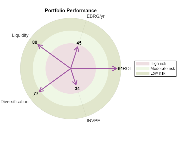
PolarAxes also supports combining multiple objects, for instance adding text labels and regions to help the audience understand the data, which was difficult or impossible to do with the older "fake" polar Axes.
rticks([]);
% Add text objects to indicate the R value at at each compass vertex
n = diff(rlim)*.08; % 8 percent of rlim for padding
txt = text(theta, values+n, string(values), FontWeight="bold",HorizontalAlignment="center",VerticalAlignment="middle");
% Add filled regions
r(1) = radiusregion([0 50], FaceColor="#C8969F", DisplayName="High risk");
r(2) = radiusregion([50 75], FaceColor="#CBE5A8", DisplayName="Moderate risk");
r(3) = radiusregion([75 100], FaceColor="#9DAD55", DisplayName="Low risk");
legend(r)
Which way the wind blows ...
The example above uses the compassplot vectors to illustrate the magnitude of several distinct metrics. Compass vectors are also useful for illustrating more classic vector-type data, for instance wind measurements. My colleague Ned Gulley highlighted a community File Exchange submission several years ago using a NOAA dataset with wind speed and direction measurements at a specific buoy in Boston Harbor, not far from MathWorks' headquarters.
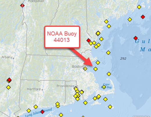
We can import some more recent data from this same dataset using readtable to really see compassplot at work. After a little bit of data cleanup, we have a table with daily wind speed and direction measurements at this buoy from September 2023.
url = "https://www.ndbc.noaa.gov/view_text_file.php?filename=44013h2023.txt.gz&dir=data/historical/stdmet/";
tbl = readtable(url, VariableNamingRule="preserve");
tbl.WDIR(tbl.WDIR == 999) = NaN; % Clean up missing values
tbl.WDIR = deg2rad(tbl.WDIR); % Convert to radians
sept = tbl(tbl.MM == 9, :); % Filter down to September
% The data set includes observations every 10 minutes. For simplicity, we'll use the
% mean value for each day.
sept = groupsummary(sept, ["#YY","MM","DD"], "mean", ["WDIR","WSPD"]);
sept(1:8,:)
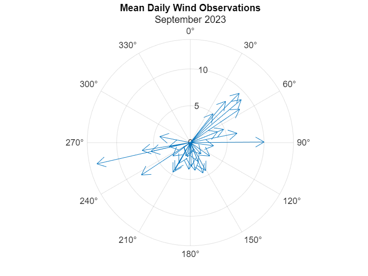
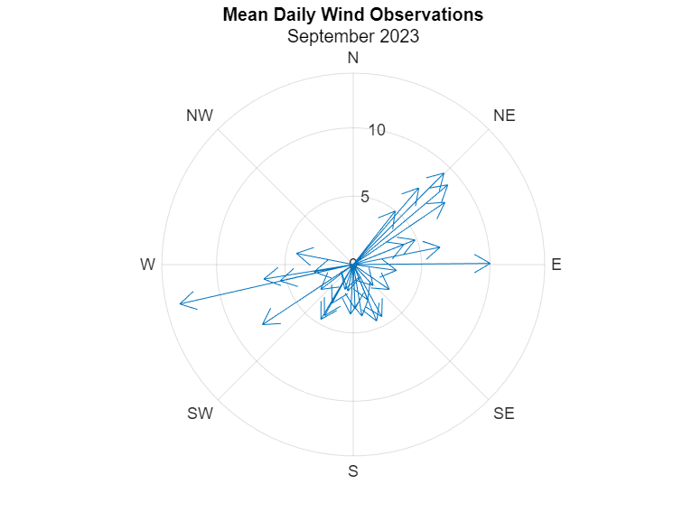
Plot the September data. Notice that we're passing the table directly into the compassplot function and specifying which table variables to use. We can also configure the PolarAxes with 0° oriented at the "top" of the display and with direction values arranged clockwise from there.
clf
pax = polaraxes;
compassplot(sept, "mean_WDIR", "mean_WSPD");
% Configure polaraxes to account for the fact that WDIR measurements are in
% degrees clockwise from true north.
pax.ThetaDir = "clockwise";
pax.ThetaZeroLocation = "top";
title("Mean Daily Wind Observations", "September 2023")
Adding Compass Labels
As we saw in the previous example, the PolarAxes is can be easily customized. Here, we're really making compassplot feel at home by adding familiar compass labels.
thetaticks(0:45:360);
thetaticklabels(["N" "NE" "E" "SE" "S" "SW" "W" "NW"]);
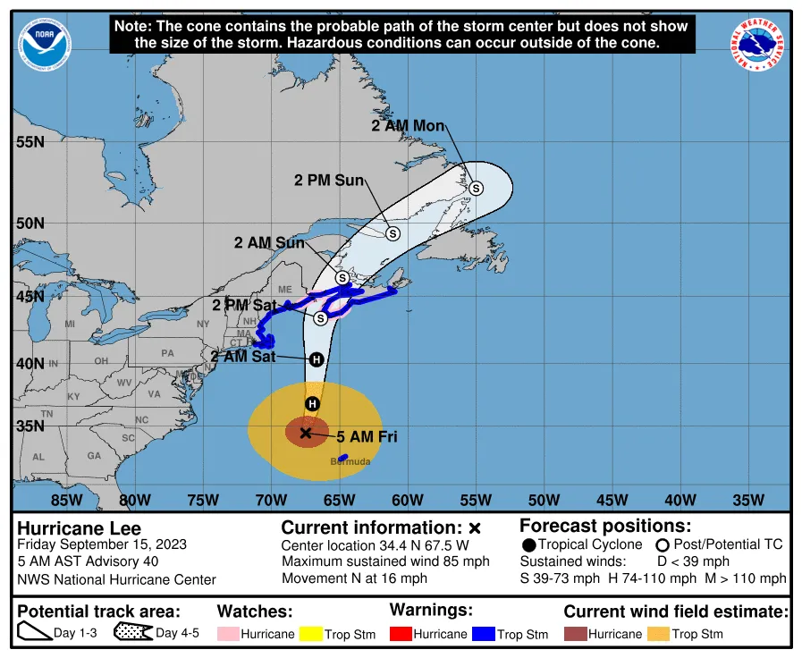
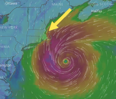
With these labels, we can start to see that some of the strongest mean windspeeds are observed coming from the north-easterly direction, which is characteristic of a type of storm New Englanders call a "nor'easter." We also see one day of strong winds from the west-southwest. A quick Google search helped me find that this was one of the outer arms of Hurricane Lee spinning out clockwise from the storm center on September 15, 2023.
How does September compare to the annual data?
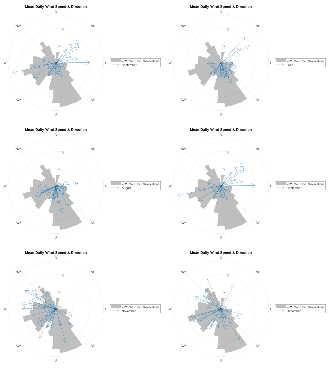
So far, we've only visualized the observations from September, 2023. We can once again combine compassplot with another visualization - polarhistogram in this case - to help us understand how the September observations compare to observations from the entire year. This shows us that the nor'easterly observations from September are actually relatively rare.
clf
pax = polaraxes;
ph = polarhistogram(tbl.WDIR,...
SeriesIndex="none", FaceAlpha=0.25, EdgeColor="none",...
DisplayName="2023 Wind Dir Observations");
% The polarhistogram will show the number of observations at different bins around the polar axes.
% To show these counts on the same plot as the wind speed data, we will normalize the bin counts
% so they are in the same range as the September wind speeds.
ph.BinCounts = normalize(ph.BinCounts, "range" ) * max(sept.mean_WSPD);
hold on
c = compassplot(sept,"mean_WDIR","mean_WSPD","DisplayName","September");
% Once again customize the PolarAxes to show the compass directions.
pax.ThetaDir="clockwise";
pax.ThetaZeroLocation ="top";
pax.ThetaTick = 0:45:360;
pax.ThetaTickLabel = ["N" "NE" "E" "SE" "S" "SW" "W" "NW"];
title("Mean Daily Wind Speed & Direction")
legend
Animate it!
Part of the beauty of MATLAB's modern plotting functions, like polarcompass, is that the data on these objects can be updated in a loop (or in an app callback!) to visualize a different data set or slice of the data. For instance, here we're looping through months 6 through 12 (June through December) and updating the PolarCompassPlot object, stored in the variable c, to visualize the daily wind observations month-by-month.
for i = 6:12
thisMonth = tbl(tbl.MM == i, :);
thisMonth = groupsummary(thisMonth, ["#YY","MM","DD"], "mean", ["WDIR","WSPD"]);
c.SourceTable = thisMonth;
monthName = month(datetime(1,i,1), "name");
c.DisplayName = monthName{:};
pause(1)
end
Conclusion
As I mentioned at the top, compassplot is just the latest in our set of full-featured polar plotting functions. I hope the examples I've shared can inspire you with ideas for your next visualization! And maybe they're leaving you itching for more. Please leave a comment and let me know how you will be using compassplot and what additional polar-plotting features you're interested in having us work on in the future! I'll leave you with this little reminder of the functions already on offer.
figure(Position=[1 1 900 500]);
t = tiledlayout(2, 5, TileIndexing="columnmajor", Padding="tight");
p = polaraxes(t);
title("polaraxes")
nexttile(t)
polarplot(linspace(0,6*pi), linspace(0,6*pi))
title("polarplot")
nexttile(t)
polarscatter(linspace(0,2*pi,20), 1:20)
title("polarscatter")
nexttile(t)
polarhistogram(atan2(rand(1000,1)-0.5,2*(rand(1000,1)-0.5)))
title("polarhistogram")
nexttile(t)
fpolarplot(@(x)sin(2*x))
title("fpolarplot")
nexttile(t);
polarbubblechart(linspace(0,2*pi,15),sin(1:15),logspace(8,10,15));
title("polarbubblechart")
bubblesize(gca,[1 10])
nexttile(t)
compassplot(linspace(0,1.5*pi,10), -15:-6)
title("compassplot")
p1=polaraxes(t);
p1.Layout.Tile = 8;
thetaregion(p1, 2*pi/3, 4*pi/3, FaceColor="red")
title("thetaregion")
p2 = polaraxes(t);
p2.Layout.Tile = 9;
radiusregion(p2, 0.5, 0.8, FaceColor="blue")
rlim([0 1])
title("radiusregion")
p3 = polaraxes(t);
p3.Layout.Tile = 10;
polarregion(p3, [pi 7*pi/4], [0.2 0.4], FaceColor="green")
rlim([0 0.5])
title("polarregion")
- Category:
- Charts,
- Demos,
- Graphics,
- New Features







Comments
To leave a comment, please click here to sign in to your MathWorks Account or create a new one.