A New Colormap for MATLAB – Part 3 – Some Reactions
I hesitated for some time today about where to go next in my discussion about the new default colormap in MATLAB. I finally decided to spend a little time on the reactions so far. Those reactions have ranged from "Great, what took you so long?" to "I hate it; give me back jet!" In the Twitterverse, one scientist proclaimed "End of an era!" Another simply said "yuck." (Jet is still in MATLAB, by the way.)
Today I want to dig into some of those reactions a little bit. Along the way I'll show some experiments with a test pattern to explain some of my comments about jet.
To remind you, last time I summarized 15 years or so of criticisms about rainbow colormaps:
- Rainbow colormaps confuse viewers because there is no natural perceptual ordering of the spectral colors.
- Rainbow colormaps obscure small details in the data.
- Rainbow colormaps mislead viewers by suggesting data features that are not really there. These "phantom features" often take the form of false boundaries. This effect can falsely segment the data.
- Rainbow colormaps lose critical information about high and low data values when displayed or printed on a gray-scale device.
- Rainbow colormaps can be difficult to interpret for some color-impaired viewers.
I have seen a claim that that rainbow incorporates a universally understood order based on associating blue with cold and red with hot. There's no doubt that this order makes sense for some people (although blue flame is hotter than red flame?). I quibble with the "universally understood" part, though. The dominant evidence is that individuals do not universally order the spectral hues the same way unless they refer to spectral order mnemonic, such as "Roy G. Biv." It is well-established, however, that individuals can easily and consistent order colors by relative brightness.
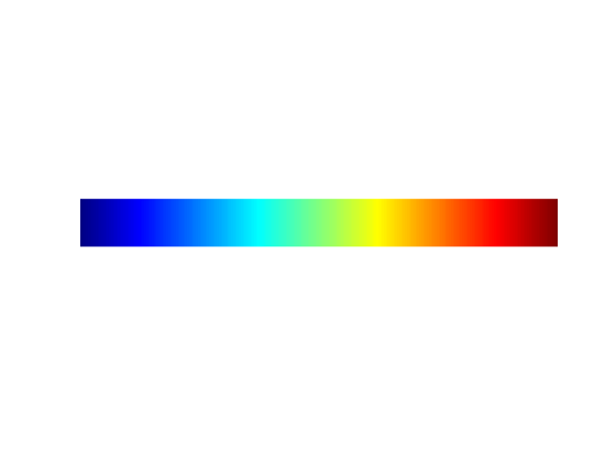
Another commenter said that the rainbow colormap has higher contrast than parula. Yes, this is true. Rainbow goes all the way from dark to bright in the bottom third of the data range, and it goes all the way from bright to dark in the top third of the data range. For some parts of the data range, therefore, there is higher visual contrast than with parula, which uses the entire data range to go from dark to bright. A price paid for this increased contrast, however, is the visual illusions and confusion caused by the reversed roles of dark and bright in different parts of the colormap.
Matteo Niccoli gives the following nice example of a rainbow-based visual illusion. The arrow in the right-hand image below points to something that gives the strong but false impression of being a depression in the bone structure.
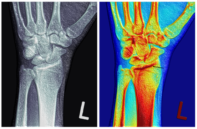
Image credit: Matteo Niccoli, "The Rainbow Is Dead ? Long Live the Rainbow!" Copyright 2014 MYCARTA. Used with permission.
And I showed another visual confusion example last time with these visualizations of two different sinusoidal patterns:
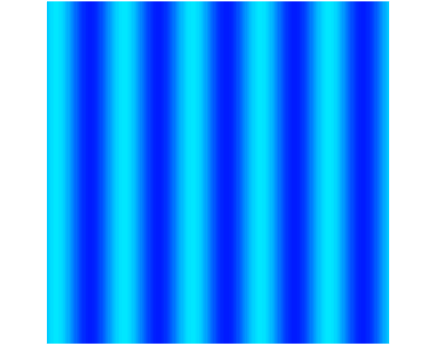
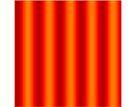
These visualizations give the impression that the two sinusoidal patterns have opposite phase, but in reality they have exactly the same phase.
Another commenter said that, with sufficiently familiarity, the bright "stripes" that are characteristic of the rainbow colormap can be an advantage for certain kinds of data. That might be true in some particular cases, but I don't think it's true in general. Let me show an example, using a test pattern, that illustrates how much difficulty the cyan and yellow stripes can cause in interpreting what should be easily recognizable data.
url = 'https://blogs.mathworks.com/images/steve/2014/eia-2000-cropped.png';
I = imread(url);
imshow(I)
colormap(jet)
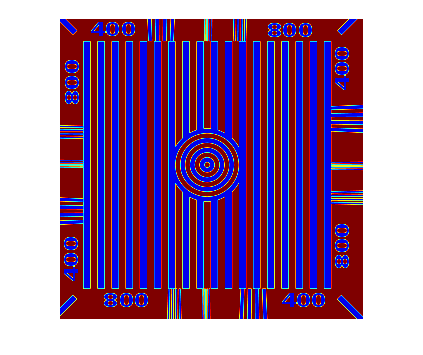
Let me label some portions of the visualization and then ask some quetions about it.
text(35,90,'A','FontSize',25,'HorizontalAlignment','center',...
    'BackgroundColor','white')
text(125,90,'A','FontSize',25,'HorizontalAlignment','center',...
    'BackgroundColor','white')
text(215,90,'A','FontSize',25,'HorizontalAlignment','center',...
    'BackgroundColor','white')
text(190,320,'B','FontSize',25,'HorizontalAlignment','center')
line([77 160],[225 225],'Color','white','LineWidth',5)
text(65,225,'C','FontSize',25,'HorizontalAlignment','right',...
    'BackgroundColor','white')
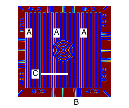
At periodic intervals, the dark blue vertical bars have a bright outline (see the points marked "A"). What is the data significance of these bright outlines? Especially when compared with the dark blue vertical bars that do not have a bright outline?
The vertical bars in between the "A" marks don't have bright outlines. Those bars alternate between dark blue and dark red, a low-contrast combination that is a little difficult to focus clearly on (a red-blue visual illusion called Chromostereopsis).
Above the "B", I see very thin vertical dark bars. When the bars are this thin, it's difficult to distinguish between the dark red and dark blue, which is unfortunate because those colors represent opposite ends of the data range. The bright outlines between the bars is broken up by a diagonal pattern of blue stripes.
The numbers around the border are oddly broken up and hard to decipher.
Let's investigate why some vertical bars are outlined and some not by looking at the data cross-section along the white path marked "C".
c = improfile(I,[77 160],[225 225]);
figure
plot(c,'*-')
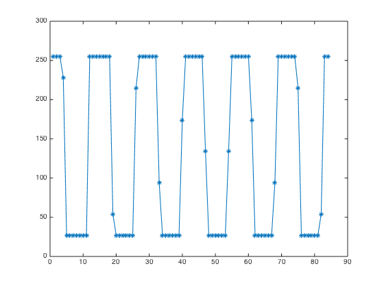
I'll superimpose two lines that show the data values corresponding to the bright cyan and bright yellow in the jet colormap.
hold on
plot([1 84],[1 1]*0.375*255,'c','LineWidth',5)
plot([1 84],[1 1]*0.625*255,'y','LineWidth',5)
hold off
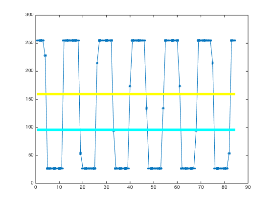
It is now apparent why some vertical bars are outlined but not others. In each transition from low to high and from high to low, there is one data value that is in between. When that one transitional data value happens to be close the data values mapping to cyan or yellow, the vertical bar is shown with a bright outline. Otherwise, there is no outline. Although the effect is visually dramatic and makes some regions of the data look quite different from others, the visual difference has no real data significance.
OK, now let's show this data using the parula colormap.
imshow(I)
colormap(parula)
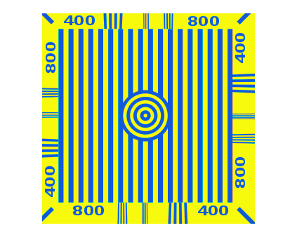
This visualization is trivially easy to interpret. The vertical bars in the middle are all the same. The digits are easy to read. The visual difference between low data values and high data values has high contrast and is easy on the eyes. And the data above the point marked "B" is seen to have a completely different form than the way it appeared with jet. The stripes have a lower spatial frequency and are seen to be slightly fanning out in direction instead of appearing vertical.
A valid complaint about this example is that it is completely artificial, with data rather unlike what people are likely to be looking at with jet or parula. I'd like to suggesting thinking about it this way, though: If jet can take familiar, easily interpretable data and render it almost unrecognizable, what can jet do to your own data?
Finally, I'll mention that a blog reader commented that using jet made it easy to distinguish positive and negative values from each other in a data set whose values are centered around zero. And yes, jet can be better than parula for that. Jet is bright and relatively unsaturated in the middle, and it is dark and saturated at both ends. These are characteristics often shared by colormaps designed specifically for highlighting a central, specific value and distinguishing the values above and below that. These are called divergent colormaps. In a future post I'll show where to find some good divergent colormaps and how to use them in MATLAB.
- 类别:
- Colormap




评论
要发表评论,请点击 此处 登录到您的 MathWorks 帐户或创建一个新帐户。