
raincloudplot: Cloudy With A Chance of Observations
 |
Guest Writer: Baldvin Einarsson
Baldvin is a software engineer in the Statistics and Machine Learning Toolbox. His journey with MATLAB began in the early 2000s during his college years in Iceland, where he first discovered his passion for scientific computing and visualizations. Before joining MathWorks, Baldvin's mathematical research interests included modeling growth and migration patterns of pelagic fish, coupled oscillators and dynamical systems, and biofilm growth. Baldvin then spent nearly 9 years at a natural catastrophe risk modeling firm in Boston before his dream of joining MathWorks became true in 2022. Outside of work, Baldvin enjoys fly tying, knitting, woodworking, and playing the piano.
|
It's raining data visualizations in MATLAB! In this article, we introduce the raincloudplot, a convenient way to show both distributions and individual observations in a single chart. A bit of history first: in R2024b we introduced the violinplot, and in R2025a scatter objects gained new properties to control the direction of jittered points, such as YJitterDirection. Together, these features made it possible to combine violins and scatter points to create rain cloud plots. But, doing so required careful coordination and styling across multiple objects. With the new raincloudplot function, all of that comes together in one place. Creating, modifying, and styling rain cloud plots is now as easy as predicting yesterday’s weather.
The Perfect Storm
The top part of a rain cloud is the "cloud" (the violin plot), followed by the "rain" (the scatter). Let's use the same data we used in the violin plot blog post:
rng(42);
nPts=24;
cloudData = [1.2*randn(1,6*nPts), 0.5*randn(1,4*nPts) + 6, ...
6+8*rand([1,nPts]), 8*rand([1,nPts])];
loc = ones(size(cloudData));
Compare creating the two parts individually and with raincloudplot:
v = violinplot(loc, cloudData, ...
Orientation="horizontal", DensityDirection="positive", ...
DisplayName="The Cloud");
hold on
scatter(cloudData,loc, ...
'filled', MarkerFaceAlpha=v.FaceAlpha, ...
MarkerEdgeColor="flat", MarkerEdgeAlpha=1, ....
YJitter="density", YJitterDirection="negative",...
SeriesIndex=v.SeriesIndex, ...
DisplayName="The Rain");
hold off
legend
raincloudplot(1, cloudData, DisplayName='The Rain in Spain');
legend
Apart from having to use hold on/off, there are a few things to note. First, because the violinplot is oriented horizontally, we must swap the roles of the x and y inputs to scatter. Furthermore, we need to keep up with different property names, for example DensityDirection on the violin, and YJitterDirection on the scatter. We ensured that the color of the scatter matched the violin by setting the SeriesIndex property. And note that there are two legend entries instead of one. The raincloudplot handles all of this for us, demonstrating the benefits of having a dedicated chart for the rain cloud plot.
The Forecast Is Clear
With raincloudplot, you no longer need to juggle separate violin and scatter objects, match their orientations, synchronize colors and styles, or remember which property name belongs to which object. A single function call gives you the full picture: the kernel density estimate overhead reveals the shape of your distribution, while the individual observations below keep you honest about what's actually in the data. This makes it easy to spot gaps and clusters that box plots and histograms can hide. As we discussed in the Coda section of the violinplot blog post, understanding what a kernel density estimate can and cannot tell you is key to interpreting these charts well. Rain cloud plot takes that a step further by grounding the density curve in the actual observations.
When It Rains It Pours
Creating nice looking rain cloud plots is now a breeze. There are many nice features of raincloudplot, including matrix and table support:
figure
tl = tiledlayout(2,1);
T = readtable('tsunamis.xlsx');
nexttile(tl)
raincloudplot(T, ["Longitude","Latitude"])
title("Table input")
nexttile(tl)
raincloudplot(randn(100,3))
title("Matrix input")
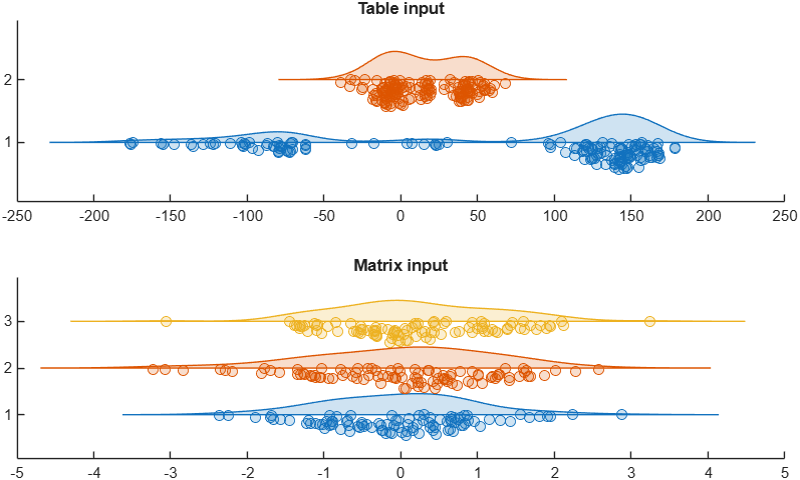
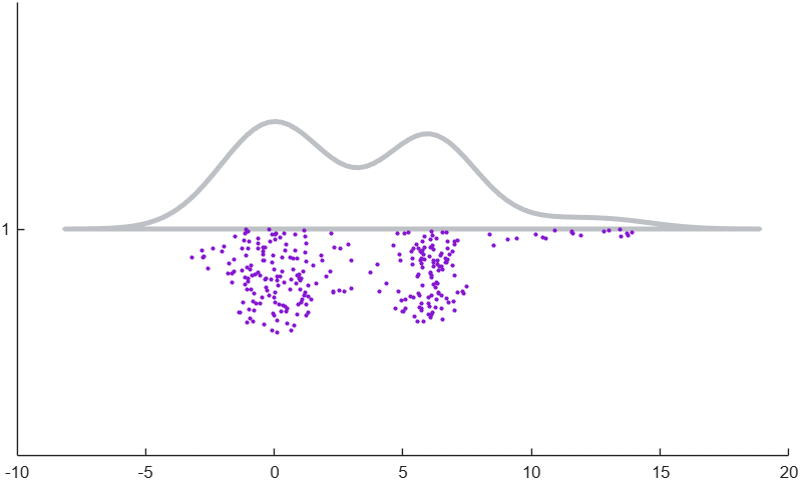
Another benefit of raincloudplot is that all properties are now contained in a single documentation page (link). While raincloudplot handles a lot of details for us, it remains flexible in its ability to style the chart. Let's demonstrate this with the rain cloud that many of you were probably already thinking about creating:
figure
silverLining = [189,193,197]/255;
purpleRain = [133,22,209]/255;
r = raincloudplot(cloudData, ...
EdgeColor=silverLining, FaceColor='none', LineWidth=3, ...
Marker='.', MarkerSize=57, MarkerEdgeColor=purpleRain);
Give raincloudplot a try on your own data - we think you'll be on cloud nine.




评论
要发表评论,请点击 此处 登录到您的 MathWorks 帐户或创建一个新帐户。