
Guilty pleasures: Pie Charts and Donut Charts
 |
Guest Writer: Abby Skofield In today's article, Abby Skofield slices through the debate about pie charts and introduces two new delectable desserts recently added to the MATLAB menu. Abby is a software engineer on the MATLAB Charting Team. Abby started her MathWorks career in the User Experience (UX) group, supporting the graphics team in the lead up to the release of the new graphics system in R2014b. Some of us might remember those changes 😉. In the UX group, Abby had the opportunity to work with hundreds of customers to learn about how they used MATLAB Graphics, their wish lists, and she got to dig in to the technical details with her engineering colleagues. She switched roles in 2020 to join their ranks as a software engineer, where she continues to enjoy learning about customer use cases while also getting hands-on time in the code. |
I've been working with the MATLAB Charting team for 12 years, but you don't need to be surrounded by data viz nerds for that long to have heard the rumors about pie charts. At best, pie charts should be used carefully and sparingly; at worst, they "subtract from the world's knowledge." Pie charts have some haters, including my boss, who wears this shirt around the office sometimes.
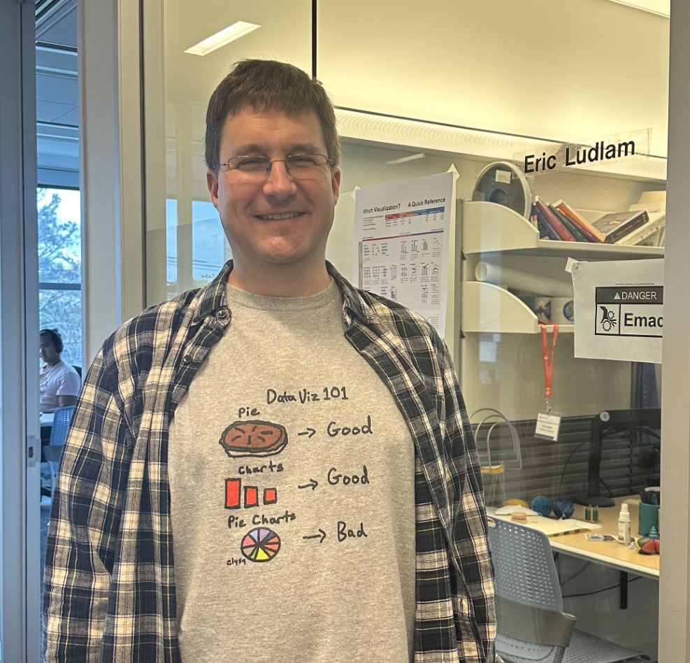
Eric Ludlam, development manager of the MATLAB Charting team.
And that's why I'm surprised to find myself here today telling you about our brand spanking new piechart released in R2023b. I have to admit, I find myself drawn back to pie charts again and again. And I know you are too, given the number of bug reports and enhancement requests we get from you about our existing pie function.
What's wrong with pie charts?
There are lots of different reasons why pie charts are tricky. They turn into a big mess as soon as you have more than a handful of wedges. They can be misleading if they are used to represent data that aren't parts of a whole (e.g., a pie chart showing the ages of people in your household). And at a basic, perceptual level humans are better at differentiating length (heights of different bars) as opposed to differentiating angle (pie wedges). For example, compare the pie and bar charts below.
data = [10 11 9.5 16 18 17];
figure
tiledlayout horizontal
nexttile
pie(data)
nexttile
bar(data, FaceColor = "flat", CData = 1:6);
clim([1 6])
% Axes niceness
axis padded square

What's wrong with MATLAB's current pie chart?
Unfortunately, MATLAB's current pie chart, created with the pie command, is an easy target for the haters not only because it's an empirically bad way to visualize data, but the MATLAB implementation doesn't support many of the programming conventions that MATLAB graphics objects have adopted over the last decade or so. We've heard from customers over and over again, pointing out strange behaviors and asking for simpler workflows and new features. A lot of the pain comes from the fact that pie simply creates a bunch of patch and text objects in a Cartesian axes. Internally, we call this a "bucket of parts" chart because, well, that's what you get - a bucket of the parts used to cobble it together! (It's MATLAB, so of course your bucket is an array.)
figure
bucketOfPieParts = pie([10 11 9.5 16 18 17]);
axis on

bucketOfPieParts
There is no easy way to customize this pie chart as a whole after it's created - instead you need to use indexing or findobj to get the right text or patch handles and set properties on those. For example, here's how you would have to work with the old pie command to customize the chart's appearance and to use the standard ColorOrder colors you see elsewhere in MATLAB. (Requests for a simple way to change pie's colors is something we hear frequently from customers in the Community.)
figure
p = pie([10 11 9.5 16 18 17]);
% Option 1: index to get every other handle which is a text object
txt = p(2:2:end);
set(txt,'Color',[0.5 0.5 0.5])
% Option 2: alternatively, use findobj to get the set of objects with the desired "Type"
pch = findobj(p,'Type','patch');
set(pch,'EdgeColor','w','LineWidth',2)
colors = get(gca,'ColorOrder');
colorsCellArray = mat2cell(colors,ones(7,1),3);
set(pch,{'FaceColor'},colorsCellArray(1:numel(pch)))

Many of you have also reported running into surprising behaviors, most of which are due to the fact that the pie wedges are drawn in the data coordinates of a Cartesian axes. For example, the xlabel and ylabel functions appear to do nothing, while surprisingly the view(3) command, which rotates the axes, actually works.
figure
pie([10 11 9.5 16 18 17])
xlabel('Some important data') % doesn't show up, because pie sets the axes visibility off
view(3) % wow, that works!

New & improved piechart and donutchart functions
Because we hear you, and because we don't judge you for needing an extra serving of pie, we are excited to introduce a new and improved piechart and her fashion-forward BFF donutchart in R2023b.
data = [10 11 9.5 16 18 17];
figure
tiledlayout('horizontal')
nexttile
pc = piechart(data);
nexttile
donutchart(data);

pc % let's check out some of the properties ...
Both charts are real graphics objects with properties, so you'll be able to work with them the way you do the other graphics objects you know and love. This also means we have a way to start addressing all your feature requests. Of course, we weren't able to deliver everything in this first version, but we are excited to have some fresh new ground to work on.
Custom Styles
We've added properties to the new PieChart and DonutChart objects to give you some of the controls you've been looking for. For instance, in this example I'm setting the EdgeColor, LineWidth and InnerRadius properties to achieve a more minimal look with white edges and a thinner donut. And the colororder command can be used to change the color palette with one line of code! Note also that I'm shifting the StartAngle to -45 degrees to change the orientation of the chart, and I could have swapped the Direction of the wedges to clockwise if I had wanted to. The ability to change the orientation of a pie chart was another common request for the old pie chart that we were never able to accommodate.
figure
dc = donutchart([60 17 8 15], ["pass","in progress","filtered","fail"]);
dc.EdgeColor = 'w';
dc.LineWidth = 2;
dc.InnerRadius = 0.7;
colororder meadow
dc.StartAngle = -45;

Support for Tables
The new piechart and donutchart functions support tables and table variable names as inputs. We've been adding support for plotting data directly from tables to many of our existing plotting functions, like plot and scatter, and the new piechart and donutchart functions extend the pattern. You can pass in a table as the first argument and then indicate which table variables to use for the data, and optionally the names.
% Create an example table
Status = ["pass","in progress","filtered","fail"]';
January = [132 4 24 228]';
February = [240 68 32 60]';
March = [344 12 4 48]';
t = table(Status, January, February, March)
t = 4×4 table
figure
dc = donutchart(t,'January','Status');
colororder meadow
colororder meadow

You can even update your chart to display the data from a different variable! For instance, here we start by visualizing the data from the "January" variable, and then switch the DataVariable to "February" to see how things have changed from month to month. The ability to update the data on an existing object will also make the new objects great for app building and animation workflows.
% Swap the data variable to look at another month
dc.DataVariable = 'February';

Interactive Graphics Workflows
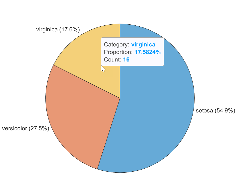
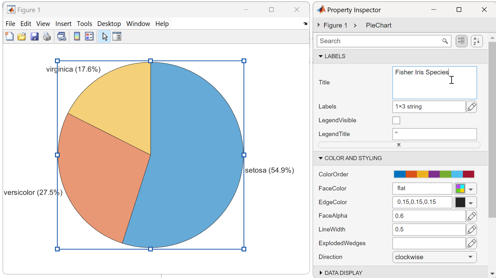
Finally, the new PieChart and DonutChart objects support interactive workflows. You can explore your data with data tips by hovering over the chart. In this example, piechart has binned a bunch of categorical values, allowing us to visualize the relative proportions of species in the array. The data tip shows us the count of how many "virginica" items were binned into the yellow wedge. And you can interactively modify the properties I described earlier, and discover what other properties are available, in the Property Inspector.
load fisheriris.mat
piechart(categorical(species([1:75 135:end])));
What's next?
We can't wait to hear what you think of these new charts! Are you #teamdonut with me, or maybe you like things the old fashioned way? And what features are you excited for us to add next? Based on past requests, I expect I'll hear from many of you about what you want to do with those labels - do tell!


コメント
コメントを残すには、ここ をクリックして MathWorks アカウントにサインインするか新しい MathWorks アカウントを作成します。