As the Wind Blows
As the Wind Blows
NOAA maintains a number of buoys that collect weather data, and they publish the data from them on their website.
There are four of these buoys just outside Boston harbor. They are the red squares on this map.
For example, the data for buoy 44013, which is the bottom one on that map, is available at this URL.
I downloaded the data for 2015, and I can read it into MATLAB like this:
t=readtable('44013c2015.txt','Format','%d%d%d%d%f%f%f%f%f%f','HeaderLines',2);
t.Properties.VariableNames = {'YY','MM','DD','hh','mm','WDIR','WSPD','GDR','GST','GTIME'};
We can see that there are 52,460 rows in this table. That's one measurement every ten minutes for the entire year.
size(t)
t(3805:3810,:)
ans =
       52460          10
ans =
     YY     MM    DD    hh    mm    WDIR    WSPD    GDR    GST     GTIME
    ____    __    __    __    __    ____    ____    ___    ____    _____
    2015    1     27    9      0    19      20.7    999      99    9999
    2015    1     27    9     10    17      22.3    999      99    9999
    2015    1     27    9     20    18      21.6    999      99    9999
    2015    1     27    9     30    17      21.5    999      99    9999
    2015    1     27    9     40    14      20.9    999      99    9999
    2015    1     27    9     50    13      21.1     16    28.8     946
I'm going to convert the date information into datetime to make it easier to work with.
timestamp = datetime(t.YY,t.MM,t.DD,t.hh,t.mm,0);
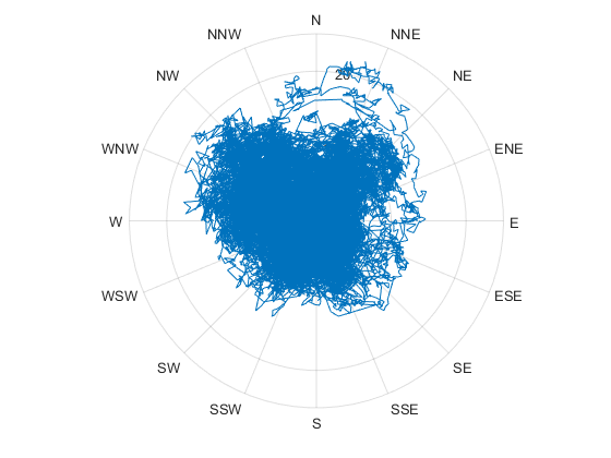
Now I can plot the wind direction and speed using the new polarplot command that was just introduced in R2016a. Note that polarplot wants angles in radians, but we have degrees. That means that we'll want to use the deg2rad function.
h = polarplot(deg2rad(t.WDIR),t.WSPD);

This looks a lot like the old polar function that has been in MATLAB for years, but there are some important differences. It created a line object, but if you look closely you can see that it's not quite like the line object you're used to. Notice that instead of XData and YData properties, it has properties named ThetaData and RData. When you use the older polar function, if you want to get the data from the line object, you need to convert it back to theta and r yourself by calling cart2pol. With polarplot, the line object takes care of that for you.
h
h =
  Line with properties:

              Color: [0 0.4470 0.7410]
          LineStyle: '-'
          LineWidth: 0.5000
             Marker: 'none'
         MarkerSize: 6
    MarkerFaceColor: 'none'
          ThetaData: [1x52460 double]
              RData: [1x52460 double]
              ZData: [1x0 double]

  Use GET to show all properties
And take a look at the axes it created.
ax = gca
ax =
  PolarAxes with properties:

             ThetaLim: [0 360]
                 RLim: [0 25]
       ThetaAxisUnits: 'degrees'
             ThetaDir: 'counterclockwise'
    ThetaZeroLocation: 'right'

  Use GET to show all properties
This is a new PolarAxes, and it has a bunch of properties which are useful here. For example, since the wind direction is in compass points, I want 0 to be north, the values to proceed in a clockwise direction, and the values displayed in degrees. I can do that by just setting these 3 properties.
ax.ThetaAxisUnits = 'degrees';
ax.ThetaZeroLocation = 'top';
ax.ThetaDir = 'clockwise';

We can even switch over to compass points if we'd like:
ax.ThetaTick=0:45:360;
ax.ThetaTickLabels={'N','NE','E','SE','S','SW','W','NW','N'};

ax.ThetaTick=0:22.5:360;
ax.ThetaTickLabels={'N','NNE','NE','ENE','E','ESE','SE','SSE','S','SSW','SW','WSW','W','WNW','NW','NNW','N'};

And I can customize the ThetaAxis or RAxis, just the way I'm used to customizing the XAxis or YAxis on a "regular" Axes object.
ax.RAxisLocation = 90;
ax.RAxis.Color = [1/2 1/2 1/2];
ax.RAxis.Label.String = 'Wind Speed';

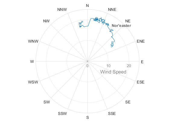
But that plot is really not very useful, is it? What if we looked at just one day? I'm going to pick January 27th, because we had a really big storm that day.
mask = timestamp>=datetime(2015,1,27) & timestamp<datetime(2015,1,28);
h.ThetaData = deg2rad(t.WDIR(mask));
h.RData = t.WSPD(mask);

You can see we had 20 knot winds coming out of the northeast. We call that type of storm a nor'easter in Boston, and they're usually the dangerous ones. This one dropped 22 inches of snow on us.
text(3*pi/16,21,'Nor''easter','FontSize',10,'FontWeight','bold','Color',[3/8 3/8 3/8])

That was the start of a really awful stretch of record breaking snow last winter. Here's what the next couple of weeks looked like.
hold on
for d=datetime(2015,1,28)+days(1:13)
    mask = timestamp>=d & timestamp<(d+days(1));
    polarplot(deg2rad(t.WDIR(mask)),t.WSPD(mask));
end

Now I'd like to animate the plot and see the entire year. I could just set the ThetaData and RData in a loop, but I'd like my animation to look a bit smoother.
To make the animation look smooth, I'm going to draw 6 days at a time, and fade the older days out. I can do the fade by creating 6 line objects.
cla
m = 'o';
th = 0:pi/4:2*pi;
r = ones(size(th));
h = [polarplot(th,r  ,m), polarplot(th,r+1,m), polarplot(th,r+2,m), ...
     polarplot(th,r+3,m), polarplot(th,r+4,m), polarplot(th,r+5,m)];

Now I'll set the colors so they fade between white for my oldest data and blue for my newest.
for i=1:6
    s = (i-1)/5;
    set(h(i),'Color',hsv2rgb(.5661,s,1));
end

And I'll lock the RLim, so the plot doesn't bounce around during the animation.
ax.RLim = [0, max(t.WSPD)];

Now I'm ready to animate.
For each day, I copy to data from each line object to the next older one, and then add the data for the new day.
for d=datetime(2015,1,1):datetime(2015,12,31)
    % Roll the old data down the line
    for i=1:5
        h(i).ThetaData = h(i+1).ThetaData;
        h(i).RData = h(i+1).RData;
    end
    % Add the current day's data
    mask = timestamp>=d & timestamp<(d+days(1));
    h(end).ThetaData = deg2rad(t.WDIR(mask));
    h(end).RData = t.WSPD(mask);
    % Update the title
    title(datestr(d))
    % Tell the graphics system to draw
    drawnow
end

I've been enjoying the new polarplot function, but I should mention that not all of the graphics commands work with PolarAxes yet. You're basically limited to lines and text for the moment. If you need to put other things in your polar plots, the existing polar, pol2cart, and cart2pol functions will be sticking around, so you can continue to do things the old way.
And speaking of cool new features in R2016a, be sure to check out the new Live Editor. I've uploaded some of my favorite blog posts to the File Exchange as Live Scripts. Here's a link so you can download them and try them out.
- 类别:
- Charts


