Mini Hack Contest Analysis
Today we have a guest post from Dave Bulkin. Dave is a developer on the MATLAB Graphics and Charting Team. Dave used to be a neuroscientist, but he loved MATLAB data visualization so much he decided to join MathWorks and work full time on charts.
Mini Hack Contest Analysis
by Dave Bulkin
First of all, thanks to both the organizers and the contributors to MATLAB Mini Hack. In addition to all the fun it was really inspiring to us on the Graphics Team! As Chen wrote in his summary, I made more than a few charts to look at some of the data about the contest. Chen showed a couple of these charts, but Ned was kind enough to let me share a few more on his blog, along with some code.
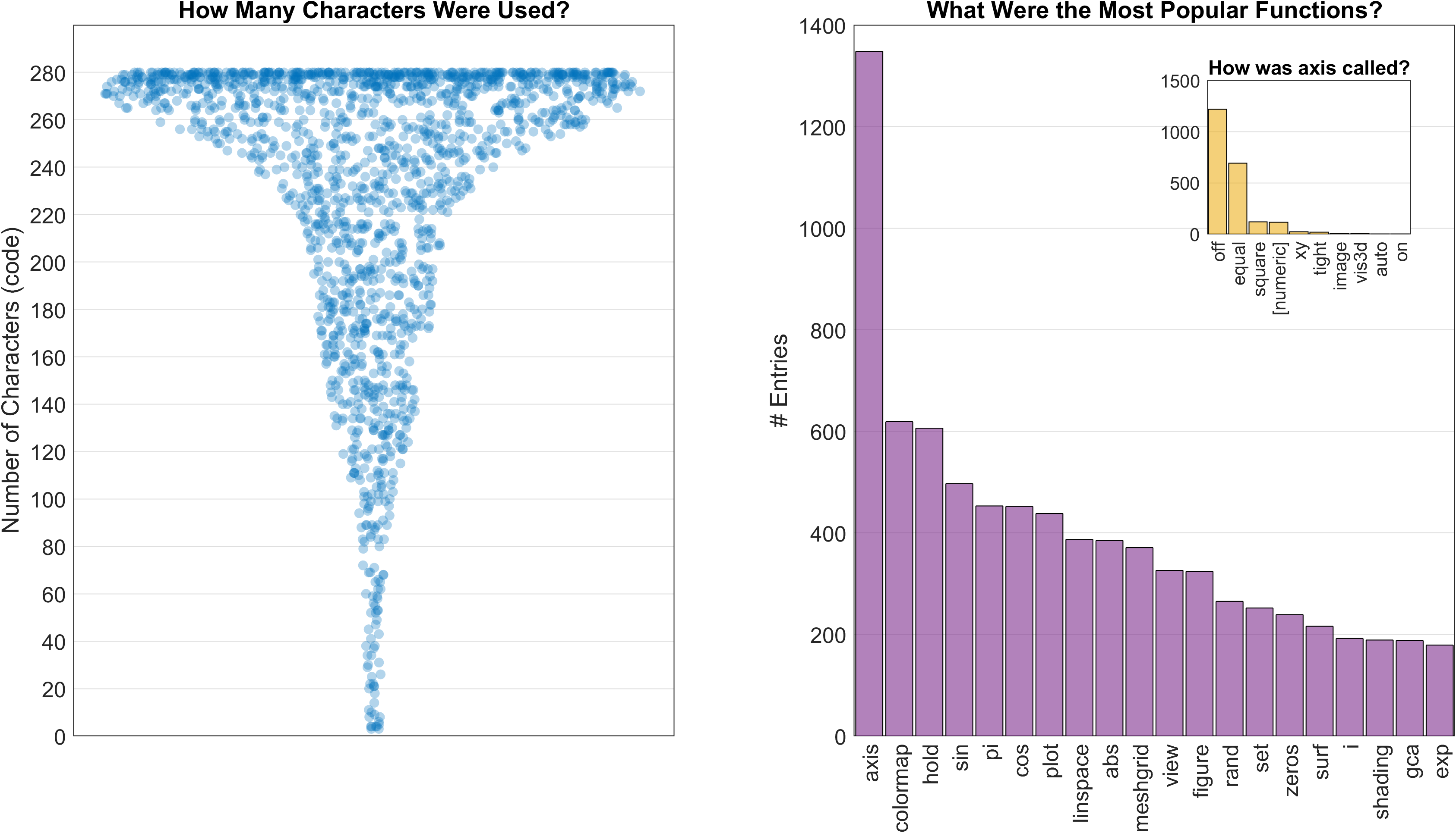
The two that Chen shared in his summary included a swarmchart showing the distribution of the number of characters in each entry, a bar chart showing the most popular functions (and an inset showing the specific ways axis was called). Swarm charts are relatively new – they’re a kind of scatter chart, but with points jittered based on an estimate of the kernel density.
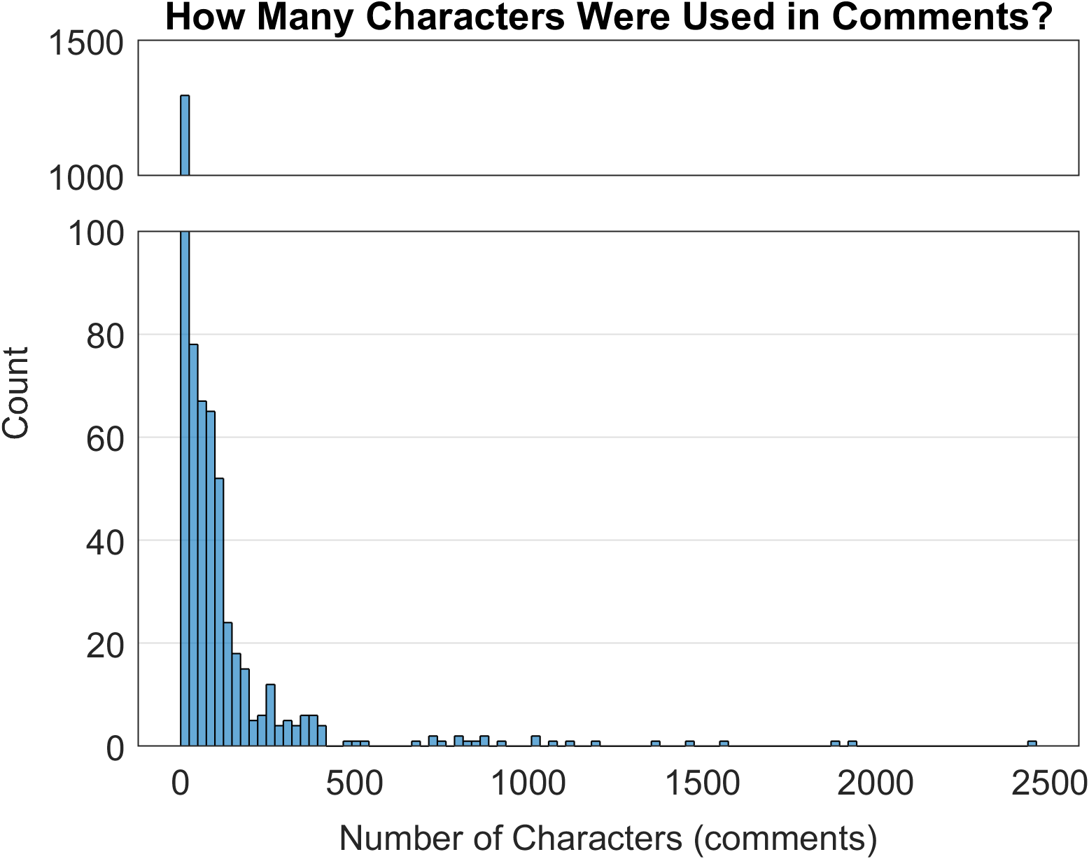
An interesting similar analysis was about how many characters were used in comments. To make a 'broken' y-axis here, I used a trick with tiledlayout and nexttile. This lets you see the distribution while keeping a y-axis that includes the large number of entries with 0 (or very few) characters in comments.
t=tiledlayout(4, 1, 'TileSpacing', 'compact');
nexttile(t);
% histogram code here
ylim([1000 1500]);
xticklabels("")
nexttile(t, [3 1])
% same histogram code here
ylim([0 100])
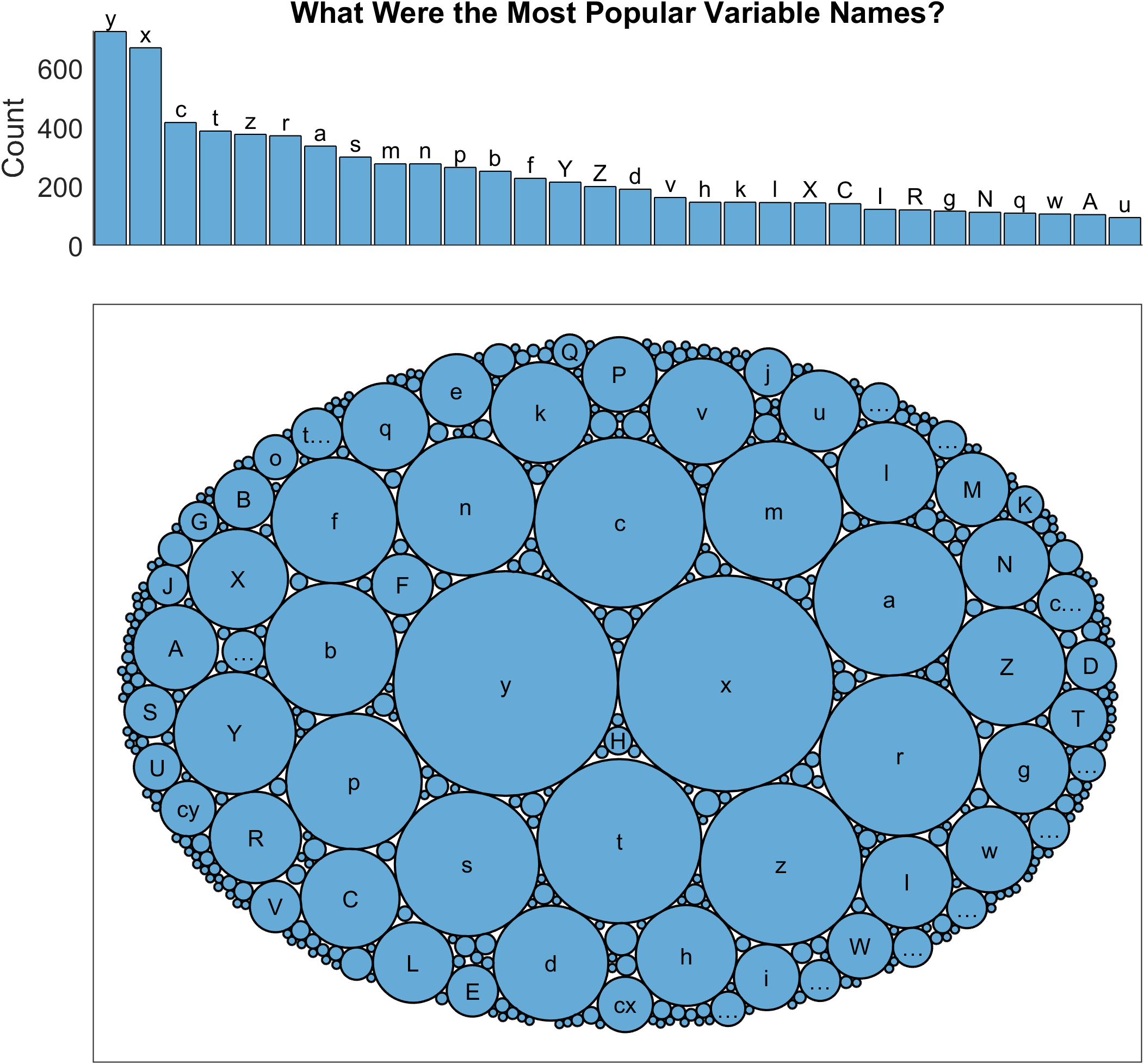
Next, I wondered what variable names were most popular (unsurprisingly single character variable names dominated the entries). Here I used one of our newest charts: bubblecloud, which gives a cool view of so called ‘Parts-to-whole’ data. These charts are fun and can give a sense of the biggest values as well as just how many categories there are in a dataset. The histogram chart at the top shows the most common variables, which is helpful for tying this new-style chart to something more familiar. I labeled the bars at the top with this trick:
h = histogram(varnames); % Be sure to use reordercats to get varnames in the right order
xt = xticks; % Because this is a categorical axis, there's a tick for each label
text(xt(1:30), h.Values(1:30), string(xt(1:30)), ...
'HorizontalAlignment', 'center', 'VerticalAlignment', 'bottom')
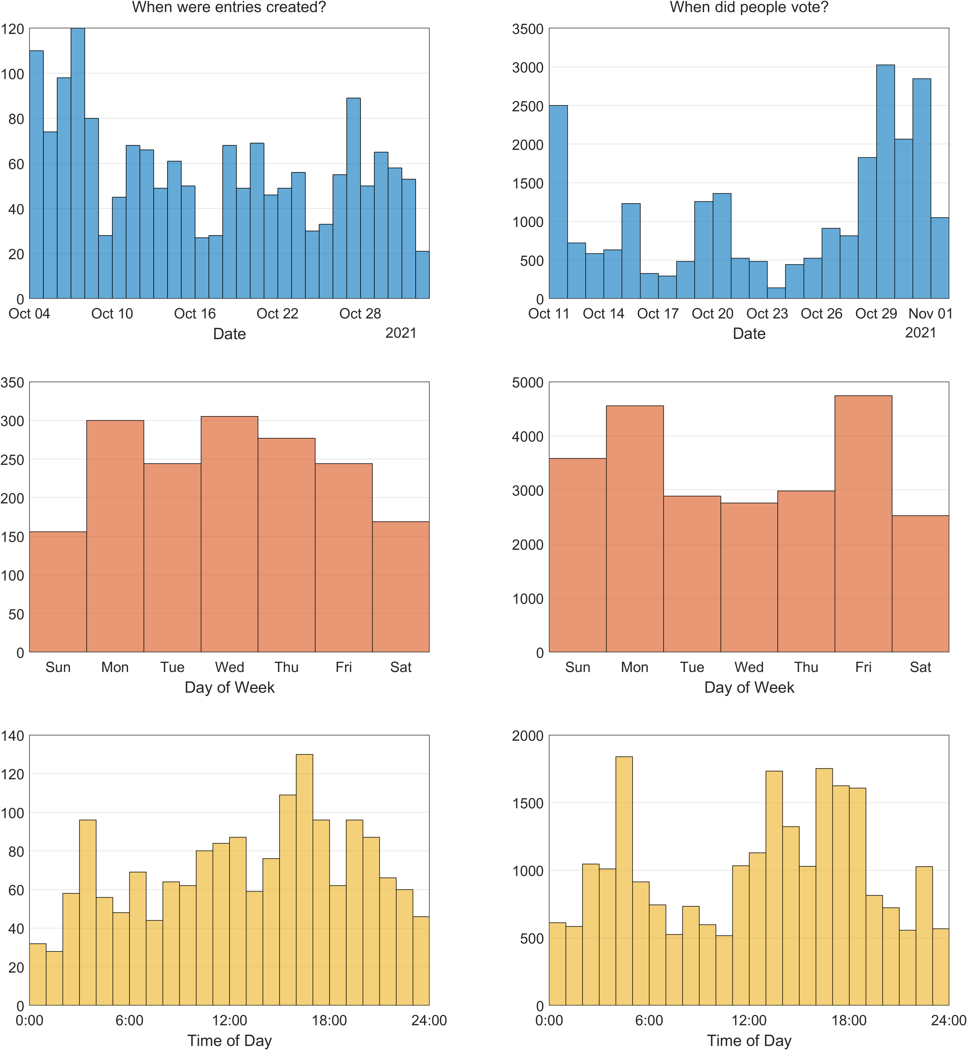
I also wondered when people submitted their entries and when they voted. While MATLAB is most popular in general on weekdays, some of us hypothesized that we’d see more entries on weekends when people weren’t busy at work. But that wasn’t the case, weekdays were more popular for submitting entries and Friday was the most popular day for voting. Did you know that the histogram function lets you directly choose time units for bins when working with datetime data?
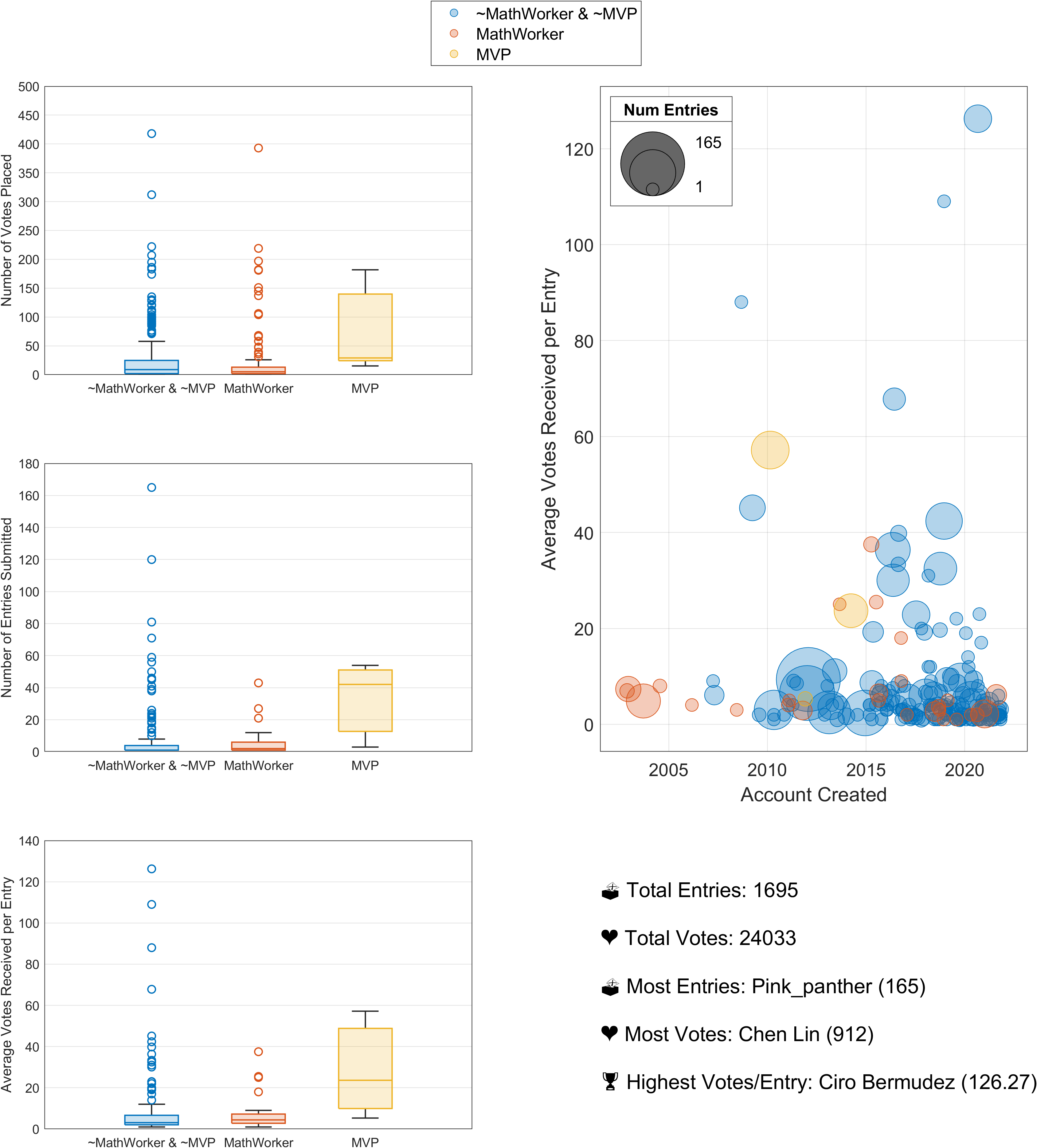
Finally, I made some boxcharts and a bubblechart to look at who was submitting entries and who was voting. I wasn’t surprised to see some of our community MVPs really got involved and were espescially successful, and I was glad to see so much participation among MathWorkers. Shout out to Chen for everything he did to organize the contest, and for voting 912 times…I had to cut down our Y limits because he was such an outlier!
Here's how I placed my legend in the aligned to the layout:
t = tiledlayout(3,2);
nexttile
% boxchart code here
leg = legend;
leg.Layout.Tile = 'North';
% other plots here




댓글
댓글을 남기려면 링크 를 클릭하여 MathWorks 계정에 로그인하거나 계정을 새로 만드십시오.