
Violin Plot: A Tool For Visualizing Distributions
 |
Guest Writer: Baldvin Einarsson
Baldvin is a software engineer in the Statistics and Machine Learning Toolbox. His journey with MATLAB began in the early 2000s during his college years in Iceland, where he first discovered his passion for scientific computing and visualizations. Before joining MathWorks, Baldvin's mathematical research interests included modeling growth and migration patterns of pelagic fish, coupled oscillators and dynamical systems, and biofilm growth. Baldvin then spent nearly 9 years at a natural catastrophe risk modeling firm in Boston before his dream of joining MathWorks became true in 2022. Outside of work, Baldvin enjoys fly tying, knitting, woodworking, and playing the piano.
|
Have you ever wanted to play the violin, but don't have thousands of hours for practicing? Well, with MATLAB R2024b you can instead play the violinplot! To become a data visualization virtuoso, we need to first understand a few things about the nature of the violin plot, which is a tool for visualizing the empirical density distribution of univariate data. In this blog post, we hope to reveal the secrets of how these types of violins are made.
The Orchestra of Data Summary Plots
Let's start with some simple data to fiddle with:
rng(42);
nPts=24;
violinData = [1.2*randn(1,6*nPts), 0.5*randn(1,4*nPts) + 6, ...
6+8*rand([1,nPts]), 8*rand([1,nPts])];
We have several techniques at our fingertips to inspect and visualize the data:
tiledlayout(2,2)
nexttile
boxchart(violinData)
nexttile
histogram(violinData)
nexttile
swarmchart(ones(size(violinData)),violinData)
nexttile
plot(violinData,zeros(size(violinData)),"|"); % pipe markers for each data entry

The bottom right plot resembles a "rug plot".
The Lutherie
Let's now demonstrate how the outline of the violin plot is obtained. First, we obtain the kernel density estimate (KDE) of the data distribution using the kde function. A kernel density estimate of a set of data creates a curve depicting patterns or clusters in the data.
[densVals,evalPts] = kde(violinData);
The function kde outputs the kernel density of the input data evaluated at certain points. Here, we plot a selection of those points in orange, as well as the full density curve in blue:
figure
% Plot a rug plot (i.e. data as vertical pipe markers at the bottom)
plot(violinData, zeros(size(violinData)),"|");
hold on
% Plot the density curve
plot(evalPts,densVals,LineWidth=2,SeriesIndex=1)
% Add some reference lines
selectedPtsIdx = [1 10:10:100]; % Pick a few points to show
stem(evalPts(selectedPtsIdx),densVals(selectedPtsIdx),"filled")
hold off

The KDE curve rises and falls in accordance with the density shown in the rug plot (blue vertical lines), illustrating how to interpret the KDE. Additionally, observe how the default KDE curve gradually approaches y=0 beyond the range of the data. This extension provides a continuous representation of the underlying data distribution, though density estimates in these tails should be interpreted with caution. Lastly, note that the kernel density estimates (y-values) represent a relative measure of data concentration, not probabilities. Therefore, focus on how these y-values change to understand variations in data density.
The blue KDE curve will be used to create the default outline of the violin. In the figures below, we show the steps that take us from raw materials (i.e. the data) to a violin:
figure
lw = 1;
ylims = 1.2*[-max(densVals),max(densVals)];
tiledlayout(2,2)
ax1 = nexttile;
plot(ax1,violinData,zeros(size(violinData)),"|");
title("The Data")
ax1.YLim = ylims;
ax2 = nexttile;
plot(ax2,evalPts,densVals,LineWidth=lw,SeriesIndex=1)
title("1. Outline of Density")
ax2.YLim = ylims;
ax3 = nexttile;
hold on
plot(evalPts, densVals,LineWidth=lw,SeriesIndex=1)
plot(evalPts,-densVals,LineWidth=lw,SeriesIndex=1)
ax3.YLim = ylims;
title("2. Reflect Density")
hold off
ax4 = nexttile;
violinplot(zeros(size(violinData)),violinData, ...
DensityWidth=2*max(densVals), ...
LineWidth=lw,Orientation="horizontal")
ax4.YLim = ylims;
title("3. Fill Interior")

By default, the violin plot orients the violins vertically. Let's plot that default, but "varnish" the violin red (using the FaceColor property):
figure
varnishColor = [0.635 0.078 0.184];
violinplot(violinData,LineWidth=lw, ...
FaceColor=varnishColor,FaceAlpha=0.5)
title("The Stradivarius")

Well, maybe not a Stradivarius, but looks good.
Fine Tuning
The violin plot properties EvaluationPoints and DensityValues by default use the output of kde with all default values. The violinplot function can take in those properties if you wish to craft a violin from your own probability distribution. Some users may for instance have noticed that the outline of the violin extended beyond the range of the input data. Here is a simple demonstration (a trill, if you like) of changing the default outline. In the second plot we manually restrict the outline to the range of the data in violinData, and in the third plot we used a different kernel to obtain the density estimates:
figure
tiledlayout(1,3)
ax1 = nexttile;
violinplot(violinData,LineWidth=2,FaceColor=varnishColor,FaceAlpha=0.4)
title("Default Outline")
ax2 = nexttile;
[densVals2, evalPts2] = kde(violinData, ...
EvaluationPoints=linspace(min(violinData),max(violinData),100));
violinplot(EvaluationPoints=evalPts2,DensityValues=densVals2, ...
LineWidth=2,FaceColor=varnishColor,FaceAlpha=0.4)
title("Restricted To Range")
ax3 = nexttile;
[densVals3, evalPts3] = kde(violinData,Kernel="box");
violinplot(EvaluationPoints=evalPts3,DensityValues=densVals3, ...
LineWidth=2,FaceColor=varnishColor,FaceAlpha=0.4)
title("Using ''box'' Kernel")
linkaxes([ax1, ax2, ax3]);

While violin plot offers flexibility to modify the outline, it requires some knowledge and understanding of density estimates, which users can explore via the kde function.
Chamber Music
Two charts are closely related to violinplot, namely boxchart and swarmchart. The way swarmchart "jitters" densely packed points is by obtaining a kernel density estimate of the data. The boxchart is often overlaid on a violinplot, where the two create a harmony of summary statistics and the probability density estimates of the data.
figure
tiledlayout(1,2)
nexttile
violinplot(violinData);
hold on
swarmchart(ones(size(violinData)),violinData, ...
"filled",MarkerFaceAlpha=0.4,SeriesIndex=1);
hold off
nexttile
v = violinplot(violinData);
hold on
boxchart(violinData,BoxWidth=0.1*v.DensityWidth, ...
SeriesIndex=1);
hold off

Notice that swarmchart does not extend beyond the range of the data (i.e. the y-values in this case). We showed above how the violin plot can be restricted to the range of the input data.
The String Section
Let's create some more data and play some more music! Here, we have used the xgroupdata to separate the instruments:
celloData = [-8+2*rand([1,nPts/4]) 2.5*randn(1,7*nPts), 0.75*randn(1,4*nPts) + 9, ...
14+14*rand([1,nPts]), 8*rand([1,nPts])] + 2;
banjoData = [3*randn(1,7*nPts), 5 + 8*rand([1,nPts])];
y = [violinData, celloData, banjoData];
x = repelem(categorical(["Violin","Cello","Banjo"], ["Violin","Cello","Banjo"]), ...
[numel(violinData),numel(celloData), numel(banjoData)]);
figure
violinplot(x,y,DensityScale="count")
title("The String Section")
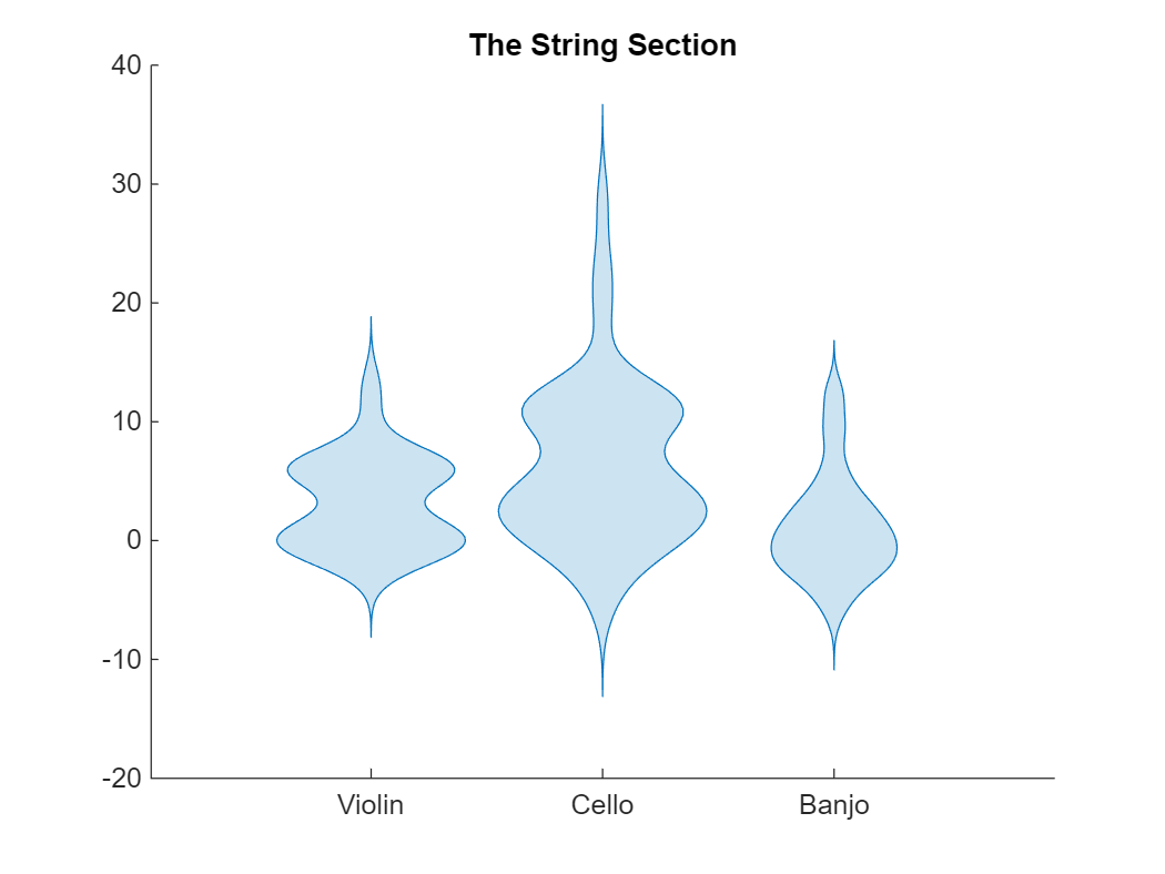
For those unfamiliar with the banjo, look up e.g. the comedian Steve Martin playing some of his favorite pieces.
A Duet - Split Violins
One cool feature of the violin plot is the ability to create half violins, using the property DensityDirection. Let's look at the patients data, and compare blood pressures of smokers vs. non-smokers:
load patients
Smoker = categorical(Smoker,logical([1 0]),["Smoker","Nonsmoker"]);
BPType = categorical([repmat("Systolic",size(Systolic)); ...
repmat("Diastolic",size(Diastolic))],["Systolic","Diastolic"]);
pressureTbl = table(BPType,[Systolic; Diastolic],repmat(Smoker,2,1), ...
VariableNames=["Type","Blood Pressure","Smoker"]);
figure
violinplot(pressureTbl(pressureTbl.Smoker=="Smoker",:),"Type","Blood Pressure", ...
DensityDirection="negative");
hold on
violinplot(pressureTbl(pressureTbl.Smoker=="Nonsmoker",:),"Type","Blood Pressure", ...
DensityDirection="positive");
legend("Smoker","Nonsmoker")
hold off

As we can see, the systolic blood pressure is higher than the diastolic ones, but for both types the smokers tend to have a higher blood pressure.
Coda
You might have noticed that we created the violinData above with a mixture of normal (Gaussian) distributions, which made a violin plot with all default values an appropriate choice for visualizing the empirical distribution. By using the violin plot, we also highlighted the multimodal nature of the data which would go unnoticed in a standard boxplot. However, like any other statistical tool, kde makes assumptions on the distribution of the data. By default, the output is based on a mixture of normals, which might not be appropriate for certain data sets. An example of which is discrete data (i.e. integers), for which a histogram might be better suited.
The interpretability of a violinplot can be challenging. Particularly, the width of the violin doesn't always have a scale associated with it, e.g. when the grouping data is categorical as in The String Section above. Furthermore, when the range of the data is known to be limited in extent, for example, known to be always positive, then it makes sense to limit the violin outline to positive values of the data variable.
Finally, remember that a violin plot is a data visualization tool designed to aid in understanding data distributions, rather than a method for detailed data analysis. However, a well-tuned violin plot can make your data sing.
- Category:
- Charts,
- Demos,
- New Features


Comments
To leave a comment, please click here to sign in to your MathWorks Account or create a new one.