Introducing the Color Picker Component
 |
Guest Writer: Kristen Amaddio Kristen Amaddio is the Senior Team Lead for the MATLAB UI Components team. She first joined MathWorks as part of the Engineering Development Group (EDG) in 2016, which gave her valuable exposure to customer workflows in the MATLAB Graphics and App Building space. Since becoming a developer in 2018, Kristen has made many contributions to the UI components area, including enhancements to the uitable, uicontextmenu, and uigridlayout. She has also made improvements to component interactions and accessibility. When she is not developing software, Kristen enjoys hiking and playing piano.
|
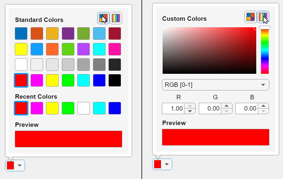
Starting in R2024a, you can now add and configure color picker components in your apps. In App Designer, you can drag a color picker component from the Component Library onto the canvas. You can also use the uicolorpicker function to programmatically place a color picker into a uifigure.
The color picker provides an interactive interface that allows app users to set colors impacting the app. For example, you can configure the color picker to allow your users to change the colors of graphics objects within a chart, or to change the background color and font color of other UI components such as a button or table.

An app author can use the Icon and Value properties and the ValueChangedFcn callback to customize the appearance and interactivity of the color picker.
- Use the Icon property to indicate the purpose for which the app users are picking a color. The icon will appear above a swatch of the currently selected color. If no icon is provided, the swatch will fill the component. We provide three standard predefined icons ("fill", "line", or "text"), but you can also use your own custom icon.
- Use the Value property to get the currently selected color or to programmatically set the color to a new value.
- Use the ValueChangedFcn to react to interactive changes to the color selection.
Demo 1: Interactively changing the table background color
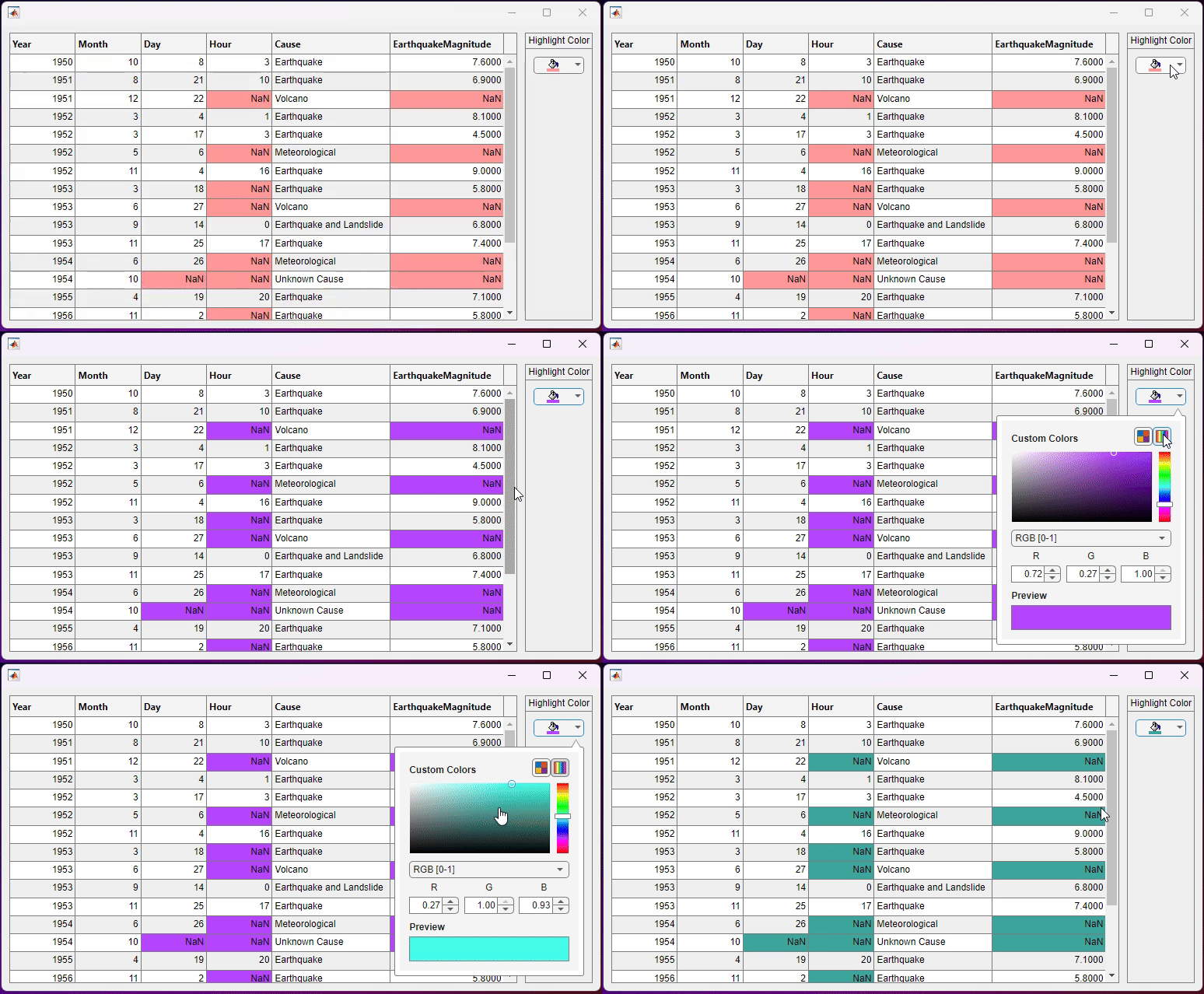
Let's build off of an example from the uitable documentation page. In this example, we show how to use the addStyle function to programmatically add a background color to table cells with missing values. We can bring the color picker component into the mix by letting a user customize what background color they want those cells to have.
We will use a grid layout with two columns to lay out our app. The first column will hold our table, and the second column will hold a panel containing our color picker component. We will make the second column width "fit" so the panel is wide enough to fit the color picker and the table can take up the rest of the space.
fig = uifigure("Position",[500 500 770 390]);
g = uigridlayout(fig,[1,2]);
g.ColumnWidth = {'1x','fit'};
tdata = readtable("tsunamis.xlsx");
vars = ["Year","Month","Day","Hour","Cause","EarthquakeMagnitude"];
tdata = tdata(1:20,vars);
uit = uitable(g,"Data",tdata);
Use the ismissing function to get a logical array of the table elements that contain NaN values. Find the row and column subscripts for the elements that have NaN values. Finally, create a red background color style and add it to the cells in the table with NaN. We will store the original background color value to use for our color picker.
styleIndices = ismissing(tdata);
[nanIndices(:,1),nanIndices(:,2)] = find(styleIndices);
nanBackgroundColor = [1 0.6 0.6];
s = uistyle("BackgroundColor",nanBackgroundColor);
addStyle(uit,s,"cell",nanIndices);
Create a panel with a grid layout holding a color picker component. We use a fit row height so the color picker is as tall as it needs to be. Since we will be using this color picker to fill the background color of the cells, we can use the predefined fill icon, which creates a paint bucket icon. We will set its default Value to the same color we defined before.
p = uipanel(g);
p.Title = "Highlight Color";
g2 = uigridlayout(p,[1 1]);
g2.RowHeight = {'fit'};
backgroundColorPicker = uicolorpicker(g2,"Icon","fill","Value",nanBackgroundColor);
Use the ValueChangedFcn to react to any interactive changes to the value. In our callback function, we will remove the existing styles on the table, and then apply the new background color style based on the value of the color picker.
backgroundColorPicker.ValueChangedFcn = {@updateBackgroundColor,uit,nanIndices};
removeStyle(tbl);
s = uistyle("BackgroundColor",event.Value);
addStyle(tbl,s,"cell",nanIndices);
end
As the user selects different color values from the color picker, the background color of the NaN cells updates accordingly.

Demo 2: A more complex set of styling components
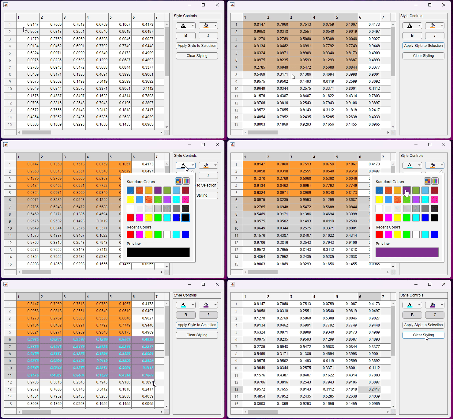
Let's make a more complex app that allows your app users to apply multiple styles, including colors, to selected ranges of a table.
Once again, we can create an app that has a table and a panel of components. This time, we will allow a user to set the font color, background color, font weight, and font angle on a selected range of table cells.
fig = uifigure("Position",[500 500 730 420]);
g = uigridlayout(fig,[1,2]);
g.ColumnWidth = {'1x','fit'};
uit = uitable(g);
rng default;
uit.Data = rand(30);
p = uipanel(g);
p.Title = "Style Controls";
g2 = uigridlayout(p,[4 2]);
g2.RowHeight = {'fit','fit','fit','fit'};
g2.ColumnWidth = {'1x','1x'};
We will use color pickers for the font color and background color styles, and we will use state buttons for the font weight and font angle styles. We will use the 'text' icon for the font color picker and the 'fill' icon for the background color picker.
fontColorPicker = uicolorpicker(g2,"Icon","text","Value","black");
backgroundColorPicker = uicolorpicker(g2,"Icon","fill","Value","#FF9C33");
fontWeightBtn = uibutton(g2,"state","Text","B");
fontWeightBtn.FontWeight = "bold";
fontAngleBtn = uibutton(g2,"state","Text","I");
fontAngleBtn.FontAngle = "italic";
fontAngleBtn.FontName = "Georgia";
Next, we will create two push buttons. Pressing the first button will apply the chosen styles to the selected cells using the addStyle function, and pressing the second button will clear all the styles in the table using the removeStyle function.
applyStyleBtn = uibutton(g2,"Text","Apply Style to Selection","WordWrap","on");
applyStyleBtn.Layout.Column = [1 2];
applyStyleBtn.ButtonPushedFcn = {...
@applyStyles,...
uit,...
fontColorPicker,...
backgroundColorPicker,...
fontWeightBtn,...
fontAngleBtn...
};
clearBtn = uibutton(g2,"Text","Clear Styling");
clearBtn.Layout.Column = [1 2];
clearBtn.ButtonPushedFcn = {@clearStyling,uit};
Based on the values of the color pickers and the state buttons, we will add the specified styles to the selected range of cells in the table. We can get the selected cells by querying the table's DisplaySelection property.
function applyStyles(~,~,tbl,fontColorPicker,backgroundColorPicker,fontWeightBtn,fontAngleBtn)
selectedCells = tbl.DisplaySelection;
if isempty(selectedCells)
return
end
if fontWeightBtn.Value
fontWeightValue = "bold";
else
fontWeightValue = "normal";
end
if fontAngleBtn.Value
fontAngleValue = "italic";
else
fontAngleValue = "normal";
end
s = uistyle(...
"BackgroundColor",backgroundColorPicker.Value,...
"FontColor",fontColorPicker.Value, ...
"FontWeight",fontWeightValue, ...
"FontAngle",fontAngleValue ...
);
addStyle(tbl,s,"cell",selectedCells);
end
function clearStyling(~,~,tbl)
removeStyle(tbl);
end
Now, we can choose different combinations of styles and apply them to the selected cells.

Discussion
We've given you a small taste of how the color picker can be used to update colors in a table; however, there are many other creative ways you can use this component to interact with other components and graphics in your apps. We'd love to hear your thoughts in the comments section below!
- What other color customization would you like to see?
- What do you plan to use the color picker for in your apps?
Read more about the R2024a graphics and app building features.


Comments
To leave a comment, please click here to sign in to your MathWorks Account or create a new one.