
Data Exploration Using Sparklines and Summary Statistics in Live Scripts
Did you know you can explore visualizations and basic statistics of tabular data directly within a live script without writing a single line of code? You can also change data types, sort, and filter tabular data using interactive workflows and MATLAB will generate the corresponding code for reproducibility. This guide will help you get started with a new interactive workflow.

 |
Guest Writer: Ranjani Rajagopalan Ranjani Rajagopalan is a Senior Software Engineer in the MATLAB App Designer team. She first joined Mathworks as a part of the Engineering Development Group (EDG) in 2014, bringing a strong foundation in Big Data and Web Development. Since then, she has made contributions to enhancing data-centric workflows in core MATLAB, designing and developing capabilities to allow users to visualize and interact with rich displays of MATLAB’s datatypes in the GAAB group. She has worked on bringing interactivity to visually explore and transform data in tools like the Variable Editor, Workspace Browser as well as rich displays of variables in Live Scripts. Currently, she is focused on expanding the capabilities of App Designer to support more robust engineering workflows. Outside of work, she enjoys collaborating on community tech projects and exploring through travel. |
Many of you might have used live scripts to explore and analyze data in a document format in MATLAB. While you can see table display in various contexts in MATLAB, the live scripts have interactive capabilities available inline within the table display to make data exploration faster and intuitive by also generating code thereby allowing users to re-create workflows. In version 24a, MATLAB introduced new features to live scripts that aim to refine the data analysis process for users.
When you import table data using functions like readtable, you might not know what the data contains or where to start. Live scripts offer a high-level data exploration workflow to display table data as sparklines which are a visual representation of data trends and variations over time. The live script also displays summary statistics that aim to give a quick metric-based snapshot of the table data. Sparklines appear above each variable, showing trends or frequency distributions, while summary stats like mean, median, and missing values appear just below the header. These features help you quickly spot data types, distributions, and potential issues with no coding required. The new lightweight table design and row striping also improve readability, and these enhancements work across nested tables too.
The following sections will provide a closer look at how sparklines and summary statistics can be enabled and utilized for data analysis within MATLAB's live scripts. Live scripts allow you to import data and view the raw table data as well as perform certain interactions like sorting and filtering that aid iterative data analysis. In this post, we are going to walk through an example that demonstrates how these new visualizations can be leveraged to derive insights and analyze data intuitively on the table without having to write any code or launch an external application.
I have picked the airlines data to uncover insights into flight patterns, delays, and cancellations using these new features. Access the airlinessmall.csv file from the documentation
openExample('matlab/AnalyzeBigDataInMATLABUsingTallArraysExample')
Step 1: Import airlines data in Live Script
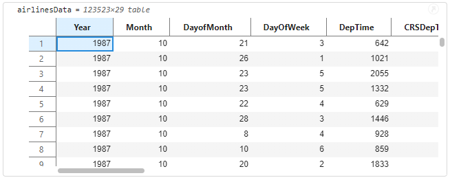
You can bring data into Live Scripts in several ways. Here, we use readtable to load the airlines dataset into the MATLAB workspace. Alternatively, the Import Live Task offers more control over data selection and transformation. Once loaded, the table appears in the Live Script output, where you can scroll through it to view all the variables and get a quick sense of the variables in the table.
% Import airlines dataset and display the imported table variable
airlinesData =readtable('airlinessmall.csv')
Step 2: Explore table by displaying Sparklines and Summary Statistics
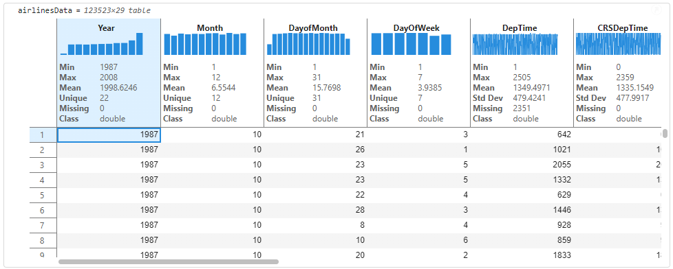
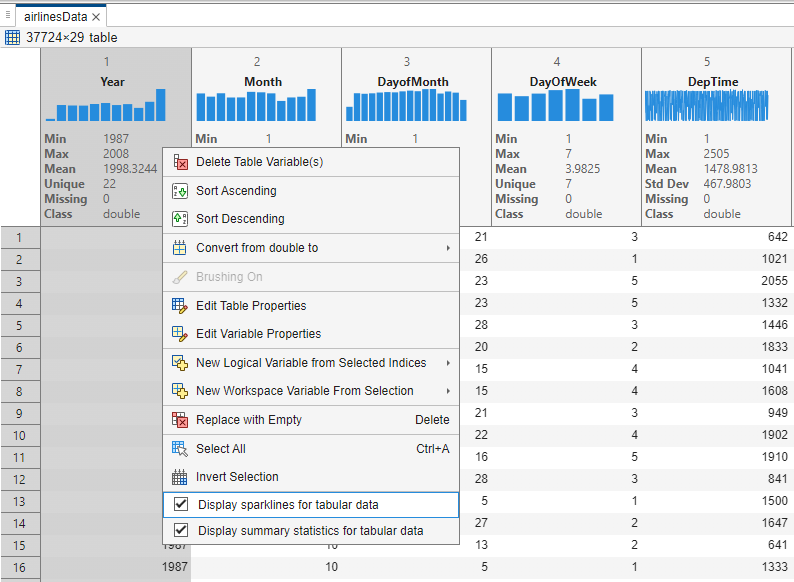
If this is a table that you have not encountered before, you may want to understand certain characteristics of the data to decide if the data needs preparation or cleaning before further in-depth analysis. The output table contains interactive data exploration tools that help in every stage of data analytic workflows. You can right-click on the table and see new context menu options that allow you to turn on ‘Sparklines’ and ‘Summary Statistics’.
The output display will update to show visualizations and summary statistics inline on the headers of the table variables. The visual cues and summaries can help identify the datatypes (e.g., double, categorical, string) without needing to write any additional code. This is a convenient way to decide if the table data needs any datatype conversions. For e.g., flight carriers (UniqueCarrier) might be better suited to be a categorical rather than cell for text analytics workflows.
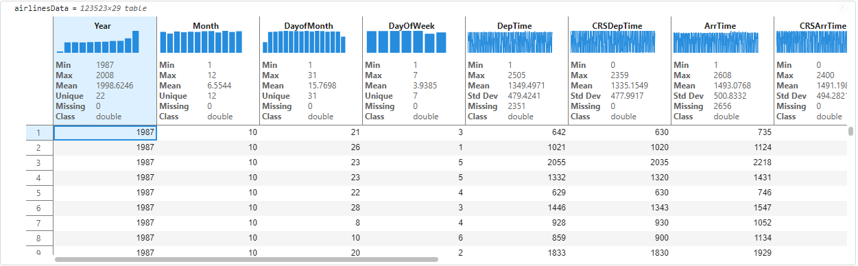
You can scroll horizontally on the output to see sparklines and statistics on every variable of the table.
Interact with sparklines to derive insights
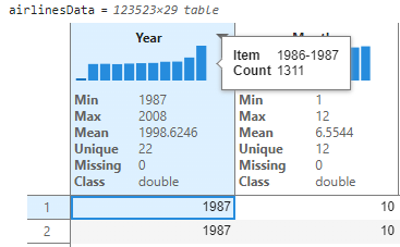
By looking at the sparklines and statistics, we can now gain immediate insights to understand the data distribution and draw preliminary conclusions. For instance, this data has airline information from 1987-2008 (as indicated by the Min and Max values). The thumbnail sparkline visualizations above each variable are also interactive, you can hover on them to get information on bins of data (for unique integer values like Years) and records of data like ArrTime. We understand by hovering on the first bin in year that there were 1311 flight records for the 1986-1987 timeframe.
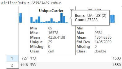
I now see a text-based variable like UniqueCarrier and would like to explore this further. You can hover to see that the airlines are binned together with two airlines represented in each bin.
To see the unique airlines and their flight record count, users can interactively resize the table variable. This expands the bins so we can see the number of flight records for each unique airline carrier. By hovering on the longest bar, we see that delta airline (DL) has the greatest number of flight trips in this table. The hover tooltips and histogram representation aid in quick frequency analysis of text based or unique integer-based data.
See live updates to sparklines and statistics as you clean the data.
With pre-computed statistics on each variable, we can better understand the data just by looking at the values. Looking at the AirTime, we know that the average airtime (Mean value on AirTime) is 233.5 minutes spanning 29 unique airlines (Unique value on UniqueCarrier) with a standard deviation of 549.8 miles for the distance covered (Std Dev on Distance). As a part of prepping data for analysis, users might be interested in looking at variables that have missing values that might make sense to clean. We’ll clean the data in three steps.
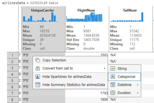
1. Modify datatype of UniqueCarrier: We saw in the previous step that UniqueCarrier was imported as a cell and binned accordingly. To better represent this variable, we would like to convert this to a categorical datatype. Users can right-click by selecting the variable and choose the ‘Convert from cell to' option.
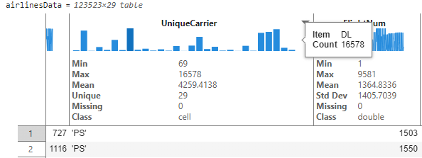
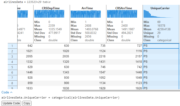
This converts this variable to type ‘categorical’ and the sparkline immediately updates to show bins in descending order. We can hover on the tallest bin and deduce that Delta airline has the maximum number of flights in these data with count 16,578. Also note that interactively changing the datatype resulted in the appearance of a code section below with buttons to “Update Code” and “Copy” the auto-generated code that corresponds to the interactive change. Clicking on “Update Code” will move the generated code onto the code section for execution and reproducibility of the interactions.
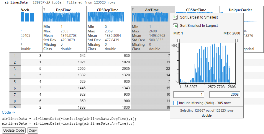
2. Remove missing: An initial scan of the data by looking at the Missing count in DepTime and ArrTime reveals that there are ~2k flights that do not have Arrival or Departure time. We would like to remove these missing values from the data for further analysis. Users can click on the header menu to launch the interactive filtering dialog that also allows removal of missing values from the data. I can now remove any missing records from ArrTime and DepTime by unchecking the ‘Include missing’ checkbox within the filtering dialog. With filters applied on the table, the statistics are now automatically re-computed and reflect that there are no missing values (Missing 0).
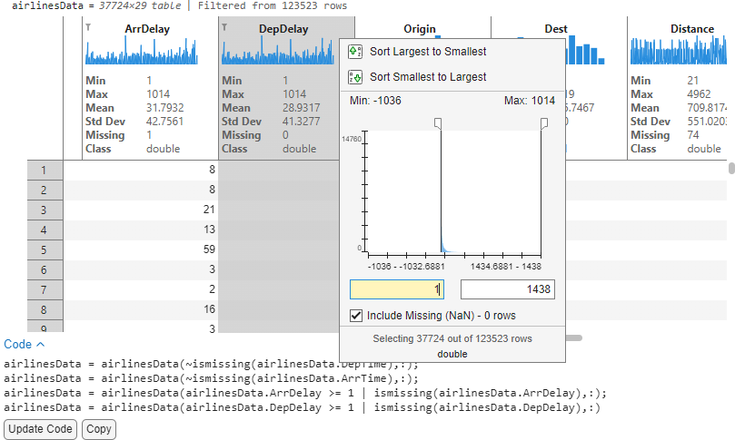
3. Remove data outside bounds: Now that we have a sense of the data, I would like to analyze the delay columns for potential correlations. On closer inspection, I notice that the Departure delay (DepDelay) and Arrival Delay (ArrDelay) have negative values which could distort our analysis focused on delays. Since I am only interested in flights that have positive delays, I can use the same filtering dialog to filter these records and eliminate noise such that we only retain entries that have actual delays. After applying the filter, our data is now down to ~37k records that we can accept by clicking on “Update Code” and proceed to analyze further.
Accepting the code and re-running the section will now re-run airlines data with the filtered times. The sparklines and stats are automatically displayed for subsequent displays of the same variable. We have demonstrated simple cleaning operations from within the table. For more advanced cleaning operations, you can use Cleaning Live Tasks or the Data Cleaner App.
Analyze data using Sorting and Filtering
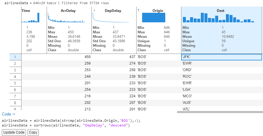
1. Analyze destinations having a delay for flights starting from Boston
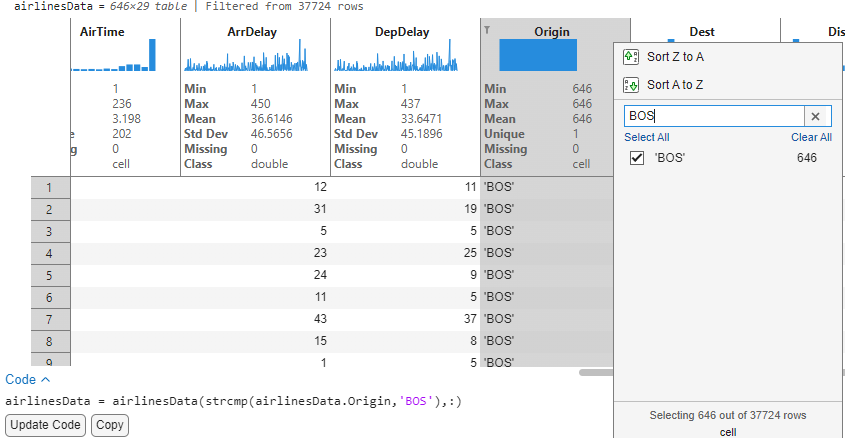
With the cleaned airlines data, I would now like to analyze the destinations originating from Boston that were delayed. To begin with, we filter the Origin variable to reduce the data to flights departing from Boston. The sparklines of the delay columns automatically update to show arrival and departure delay for these flights originating from Boston.
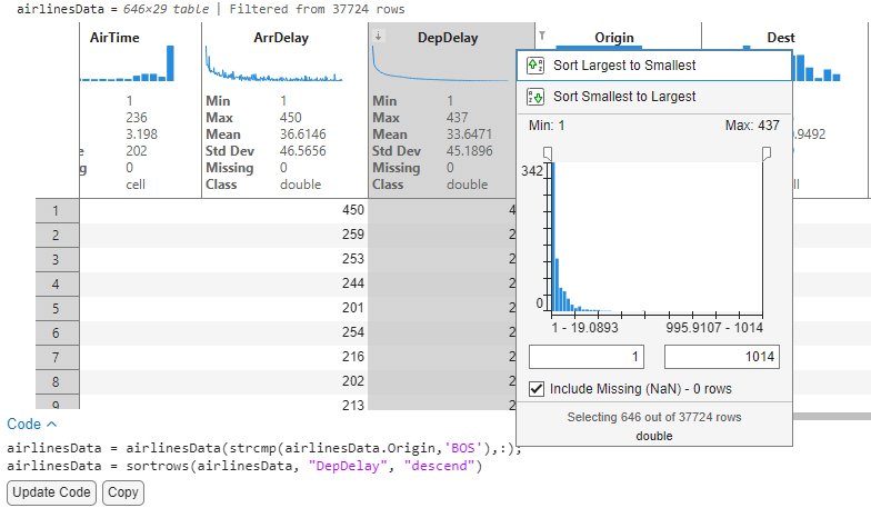
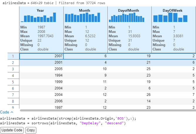
Sorting the DepDelay variable in descending order will now sort the data to list records in order of their decreasing delays (Largest delays first). Since sparklines have live updates with sorting and filtering operations, we can visually evaluate the ArrDelay sparkline data to see that the two delays appear correlated. This concludes that flights that had a departure delay also had delayed arrivals at destination.
We see that of all the 646 flights leaving Boston, the flight to JFK has a maximum departure delay of 437 minutes (~7.2 hours). Mind you, we still have not written any code!
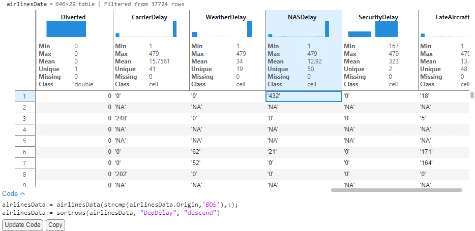
By looking at the Year / Month variables, we can see that this flight departed in June 2007. Knowing Boston, weather-related delays are a year-round tradition, Let’s look at the delay columns to further analyze.
Looking at the delay related variables tell us that this was an NAS Delay (Delay attributed to the National Aviation System). This example illustrates how we can uncover patterns and understand records of data with these interactive features.
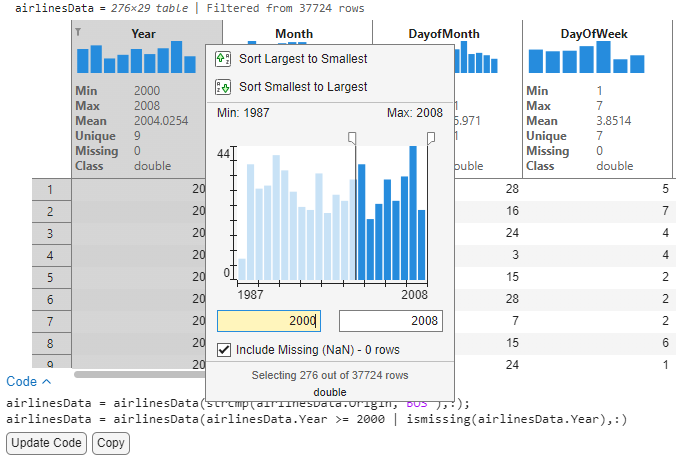
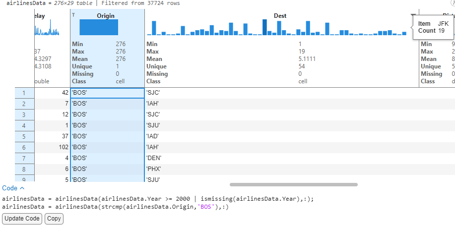
2. Analyze destinations with most flights and airline carriers from Boston for the years 2000-2008.
With the same table filtered from the previous analysis, I would now like to analyze the busiest destinations for flights originating from Boston in recent years. Since the data spans from 1987 to 2008, I will filter years from 2000-2008.
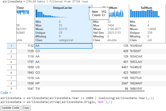
I can now look at the destination variable to show individual bins and see that JFK has the tallest bar, indicating that most flights from Boston flew to New York. Now for a single source (BOS) → Destination (JFK), we can see that there are 29 unique airline carriers with MQ (From American airlines group) having the most flights.
Once done with the analysis, users can save their changes after accepting the code to get a reproducible version of this script and decide to turn off the Sparklines and Summary Statistics using context menu options to hide these visual aids.
Explore visually using the Variable Editor
Some of you might be more familiar with the Variable Editor tool for getting quick insights into your data and plotting to visualize your data. You can also take advantage of this feature by double clicking on a workspace variable to launch the “Variable Editor” and turn Sparklines/ Summary Statistics on using a similar context menu affordance by right clicking on the headers. This gives you the same quick-glance insights—like data trends, value distributions, and missing counts—directly within the Variable Editor, without needing to write code. For a consistent experience across all tables, you can also turn these features on by default via the MATLAB “Settings” window from the Settings -> Variables section.
Discussion
We have seen how we can perform powerful exploratory analysis with the sparklines, and summary statistics feature along with existing tools like sorting and filtering on tables in live scripts. There are many types of explorations that can now be performed with this widget using a combination of all the features. Users can use insights from this display to inform the next steps in advanced analysis workflows using toolboxes or use the 'Visualize Live Task' in live scripts to create advanced visualizations using the plots and charts that are supported in Matlab. We'd love to hear your thoughts in the comments section below!
- Would you like to see any enhancements to the sparklines feature?
- Would you like to see additional summary statistics or customize them for your use cases?
- Would you like to export these graphics and stats to share scripts with a colleague?
- Would you like to see sparklines and summary statistics in app-building workflows?
Let us know in the comments below or by using the “Feedback” button from the MATLAB desktop (available starting in R2025a).


See Also
-
2019 in Review
Blogs
-
-
-


댓글
댓글을 남기려면 링크 를 클릭하여 MathWorks 계정에 로그인하거나 계정을 새로 만드십시오.