
A New Colormap for MATLAB – Part 1 – Introduction
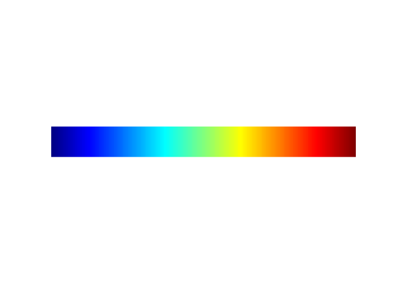
I believe it was almost four years ago that we started kicking around the idea of changing the default colormap in MATLAB. Now, with the major update of the MATLAB graphics system in R2014b, the colormap change has finally happened. Today I'd like to introduce you to parula, the new default MATLAB colormap:
showColormap('parula','bar')

(Note: I will make showColormap and other functions used below available on MATLAB Central File Exchange soon.)
I'm going spend the next several weeks writing about this change. In particular, I plan to discuss why we made this change and how we settled on parula as the new default.
To get started, I want to show you some visualizations using jet, the previous colormap, and ask you some questions about them.
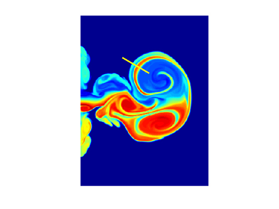
Question 1: In the chart below, as you move from left to right along the line shown in yellow, how does the data change? Does it trend higher? Or lower? Or does it trend higher in some places and lower in others?
fluidJet
hold on
plot([100 160],[100 135],'y','LineWidth',3)
hold off
colormap(gca,'jet')
Question 2: In the filled contour plot below, which regions are high and which regions are low?
filledContour15
colormap(gca,rgb2gray(jet))

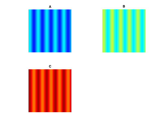
The next questions relate to the three plots below (A, B, and C) showing different horizontal oscillations.
Question 3: Which horizontal oscillation (A, B, or C) has the highest amplitude?
Question 4: Which horizontal oscillation (A, B, or C) is closest to a pure sinusoid?
Question 5: In comparing plots A and C, which one starts high and goes low, and which one starts low and goes high?
subplot(2,2,1)
horizontalOscillation1
title('A')

subplot(2,2,2)
horizontalOscillation2
title('B')

subplot(2,2,3)
horizontalOscillation3
title('C')

colormap(jet)
Next time I'll answer the questions above as a way to launch into consideration of the strengths and weaknesses of jet, the previous default colormap. Then, over the next few weeks, I'll explore issues in using color for data visualization, colormap construction principles, use of the L*a*b* color space, and quantitative and qualitative comparisons of parula and jet. Toward the end, I'll even discuss how the unusual name for the new colormap came about. I've created a new blog category (colormap) to gather the posts together in a series.
If you want a preview of some of the issues I'll be discussing, take a look at the technical paper "Rainbow Color Map Critiques: An Overview and Annotated Bibliography." It was published on mathworks.com just last week.
- 범주:
- Colormap


댓글
댓글을 남기려면 링크 를 클릭하여 MathWorks 계정에 로그인하거나 계정을 새로 만드십시오.