
You’ve Got to be Modeling Me
Joining us today is Wesley Hamilton, who is a STEM Outreach Engineer here at MathWorks. Wesley will talk about tackling the 2019 MathWorks Math Modeling Challenge (M3C) problem. Wesley, over to you…
Introduction
Hello all, I’m Wesley and in this blog post we’ll start tackling the 2019 MathWorks Math Modeling Challenge (M3C) problem. The M3C is a free, annual math modeling competition for high school (HS) juniors and seniors in the U.S. and sixth form students in England and Wales, and is a program of the Society of Industrial and Applied Math. More information about the M3C can be found on their website, including two free workbooks aimed at preparing participants and their coaches to take part in the M3C!
Here we’ll tackle the 2019 M3C problem by building an initial model for the first part of the challenge. To do this we will make use of best modeling practices, including identifying variables and making assumptions, as well as use MATLAB’s data analysis and curve fitting toolboxes to support our modeling process. Note that this approach isn’t the only way teams might approach this problem (though some of the top submissions did something similar!); our goal is to see what a start might look like.
M3C problems consist of three parts. The first part is designed to be doable by most, if not all, teams. The next two parts typically build on work from the first part, but feature more open-ended questions that let teams showcase their creativity and technical prowess when developing models and solutions to the stated questions. As I mentioned, we’ll focus in on part 1 of the 2019 M3C problem and set ourselves up with a solid start for tackling the rest of the challenge.
The general outline we’ll follow is
- read the problem in its entirety,
- formulate a plan to answer the problem,
- carry out our plan.
Throughout this process we’ll make use of MATLAB, a scientific and engineering programming language developed by MathWorks. If you’re new to MATLAB (or programming), MathWorks has a free OnRamp to help you get started. Teams taking part in the M3C can request complimentary MATLAB licenses for the competition. Some of these resources (and much more!) can be found on the M3C’s “Learn Technical Computing” website.
Table of Contents
Initial reading of the problem
Let’s start by reading the part 1 problem statement in its entirety (in the actual competition we’d read the entire problem). In addition to setting the stage for why someone might want to know the answer to these questions, the introduction often contains pieces of information that will be helpful to us as we answer the questions.
We’ll start by reading the introduction for context of the problem:
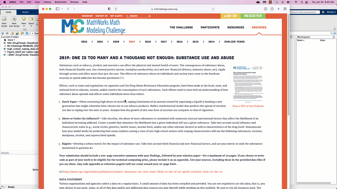
Substances such as tobacco, alcohol, and narcotics can affect the physical and mental health of users. The consequences of substance abuse, both financial (health care, the criminal justice system, workplace productivity, etc) and non-financial (divorce, domestic abuse, etc), ripple through society and affect more than just the user. The effects of substance abuse on individuals and society have come to the forefront recently as opioid addiction has become prominent [1].
We see they provide a reference to an NPR article on Opioid overdoses in the United States. Let’s hold off on looking at the article until we finish reading the problem statement:
Efforts, such as taxes and regulations on cigarettes and the Drug Abuse Resistance Education program, have been made at the local, state, and national level to educate, control, and/or restrict the consumption of such substances. Such efforts need to start with an understanding of how substance abuse spreads and affects some individuals more than others.
Now to part 1, what we are actually being asked to do:
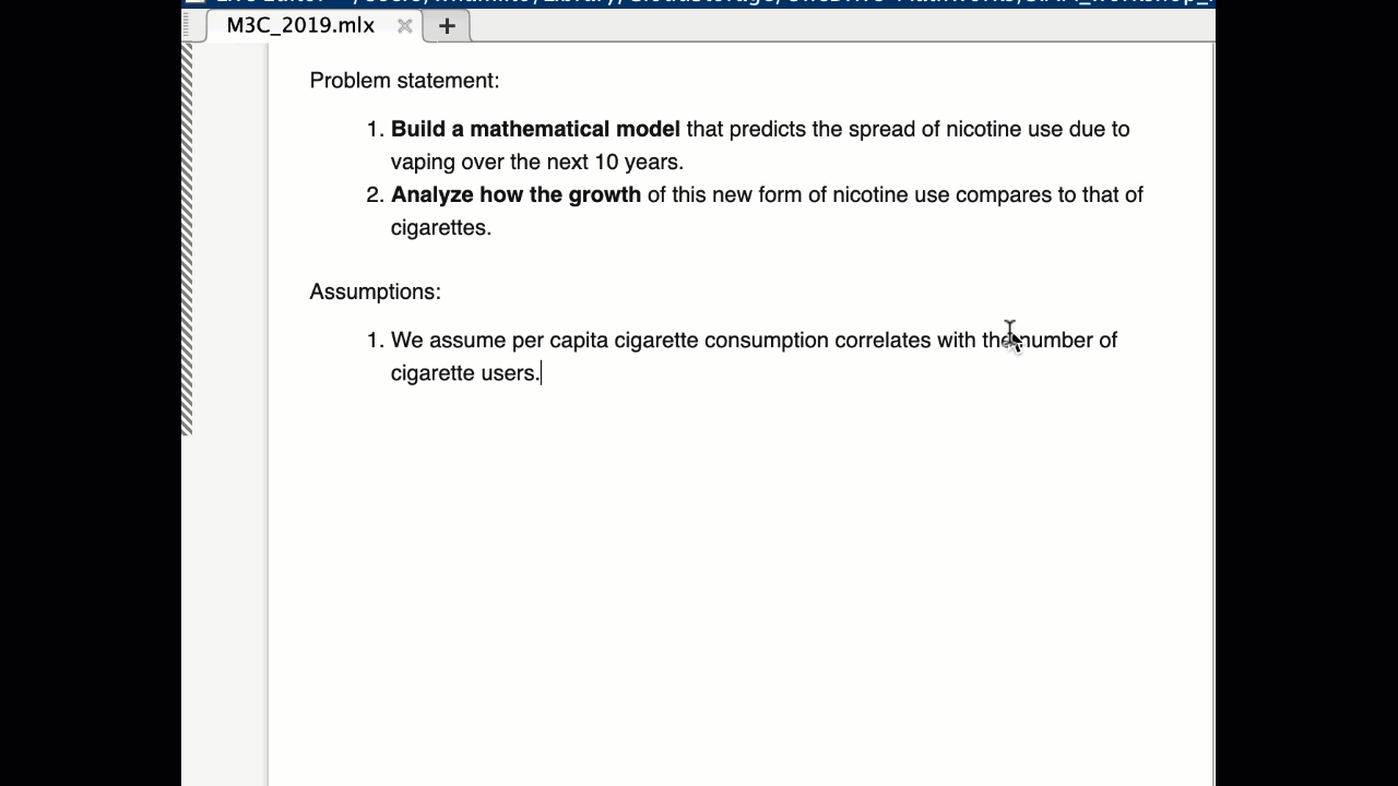
Darth Vapor—Often containing high doses of nicotine, vaping (inhalation of an aerosol created by vaporizing a liquid) is hooking a new generation that might otherwise have chosen not to use tobacco products. Build a mathematical model that predicts the spread of nicotine use due to vaping over the next 10 years. Analyze how the growth of this new form of nicotine use compares to that of cigarettes.
The last two sentences are key, and worth repeating: “Build a mathematical model that predicts the spread of nicotine use due to vaping over the next 10 years. Analyze how the growth of this new form of nicotine use compares to that of cigarettes.”
So, our task is to model the spread of nicotine use due to vaping and compare our model to the usage of cigarettes. Some questions I already have in mind are: how do we measure the spread or use? Do we keep track of vape usage by the number of cartridges used? By number of users?
If you don’t know how vaping works, this would be an opportunity to perform some research to inform some of the questions we’re coming up with. Let’s open a new MATLAB Live Script to start taking notes, starting with the tasks of part 1; let’s convert this to “text”, and then copy over the two key sentences.
Examining the attachments and data
Now let’s look at the provided data. Let’s start with the Figure on historical cigarette usage. “Adult* per capita cigarette consumption and major smoking and health events, United States, 1900–2012.”
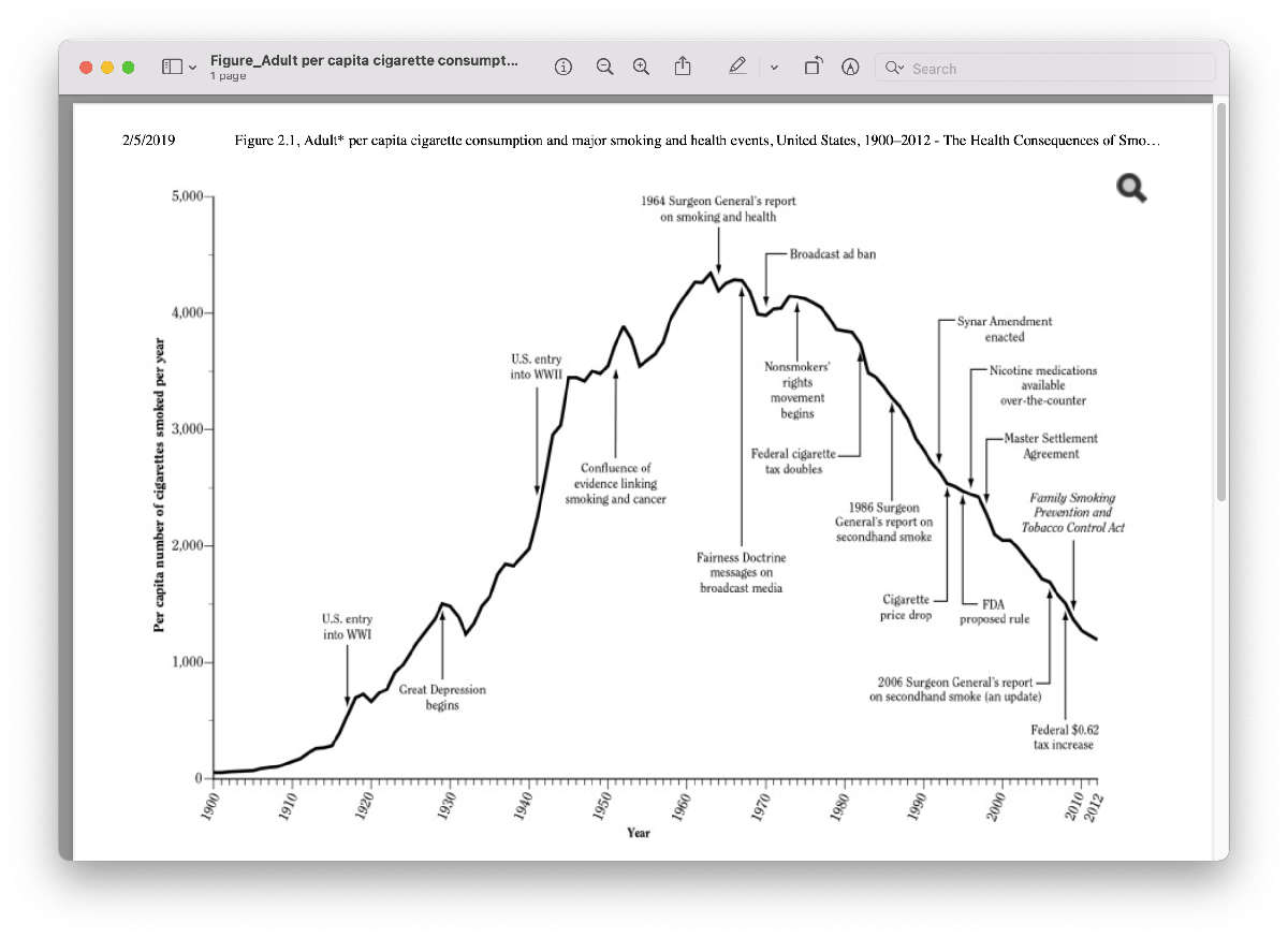
The first thing we should take note of as we look at this graph is the labels on the axes. The x-axis has time in years, and the y-axis is labeled “per capita number of cigarettes smoked per year”. If you’re not sure what per capita means, you should take a moment to do a search for that term so you can fully understand the meaning of the data you have. A quick search turns up that the phrase per capita is often used to replace the words “per person”. So, this data gives us the average number of cigarettes consumed per person each year. This data does not tell us what percentage of the population smokes. However, we can make an assumption that if we did have that data, it might “look” similar to this data in terms of shape. Let’s capture that assumption in our Live Script. If we have time later on, we might search for data to support this assumption.

Speaking of shape, next we might examine the shape of the curve. It starts near zero on the y-axis, hits a peak in the 1960s and 1970s, and then decreases. The shape of this curve reminds me of a Bell curve, or Normal distribution, also called a Gaussian, from probability theory.
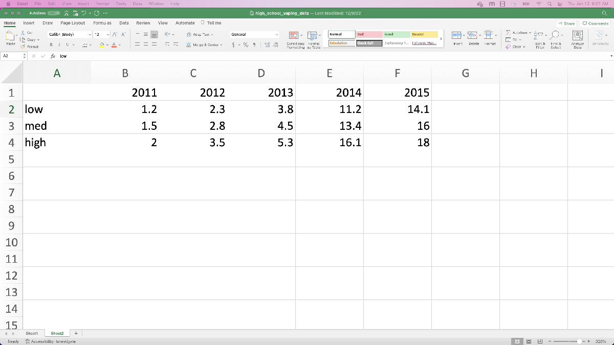
Now let’s take a look at the provided data, starting with the “high_school_vaping_data.xlsx” data. The title of the actual spreadsheet is “Percentage of High School Students who used e-cigarettes in the past 30 days, by gender and race/ethnicity; National Youth Tobacco Survey, 2011-2015”.
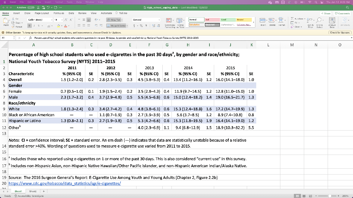
This data looks to be for all HS students (9th through 12th grade), and splits it up based on gender and race/ethnicity. Already it looks like we’ll need to do a little pre-processing if we want to read in the data, because it includes the percentage along with a confidence interval in parentheses in each cell (think of a confidence interval as the error bounds coming from the survey sampling); for MATLAB to happily read it in, there should be a single number in each cell. We also don’t know (without extra research) what percentage of HS students are White or Hispanic/Latino, so we might have to put in extra work if we want to mix and match the data objects that aren’t in the “Overall” row.
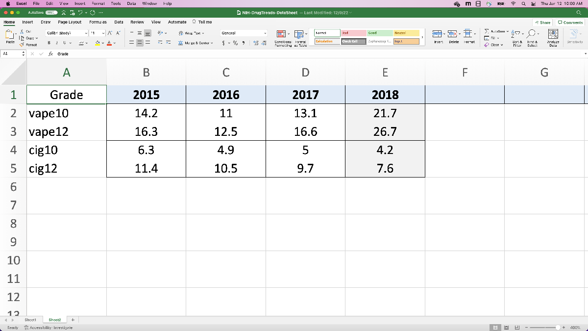
Finally, let’s look at the “NIH-DrugTrends-DataSheet.xlsx”.
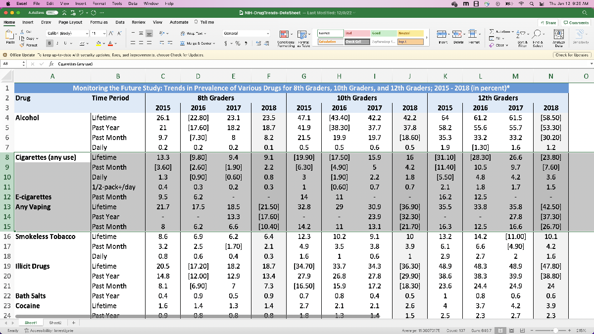
This contains a lot more data on various drugs, but especially relevant for us we see the row corresponding to “any vaping in the past month”. This data is for the years 2015 to 2018, and is split amongst 8th grade, 10th grade, and 12th grade. Also, because of how the data is formatted, we’ll have to perform a little pre-processing before we can read it into MATLAB (like the other spreadsheet). Since the other data is for the years 2011 – 2015, we might want to merge the two datasets so we have data for HS vape usage from 2011 – 2018, which gives our model more to work with. We can justify this by making an assumption that “the National Youth Tobacco Survey and NIH Drug Trends data are comparable”. We’ll have to decide which dataset we use for the 2015 data, but we can do that after we’ve read the data in and are starting to build the model.
Initial plan for model
Now that we’ve taken a look at the provided data, let’s formulate an initial plan of attack to get started with a solution. For assumptions so far we have:
- cigarette per capita usage is comparable to number of people smoking (so that when we go to compare e-cigarette usage with cigarette usage, we can tie in that figure of historical cigarette usage), and
- the National Youth Tobacco Survey and NIH Drug Trends data are comparable (so that we can combine the two datasets so we have more data to work with).
For a course of action, let’s:
- Pre-process the data and read it in.
- Try to fit some curves to the data to predict usage in the future. We might hope that fitting a Gaussian to the data works best, so that we have some basis to say that e-cigarette usage will mimic historical cigarette trends, but let’s see how the models behave first.
- Write a short summary, which we could then copy and paste into our final report.
Reading in and processing the data
Now let’s preprocess the data. Since the spreadsheet has the percentages with confidence intervals in the same cells, it’s easiest if we manually re-enter the data into a different sheet. This will make importing the data significantly easier later on. I’ve also incorporated the confidence intervals by including the low (lower bound of the interval), medium (reported survey result), and high (upper bound of the interval) estimates in the spreadsheet.
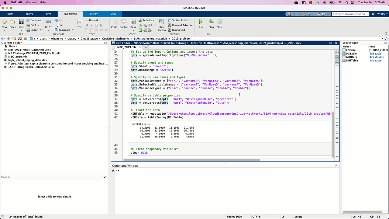
Next, let’s do the same thing with the 10th and 12th grade data from the NIH data. Since we want to compare vaping to cigarette usage, let’s record both the e-cigarette and cigarette data. In this case, let’s actually use the “Any vaping” in the “past month” data, where we’re assuming vaping and e-cigarette usage are comparable data. Otherwise we’re going to do the same thing as before: copy the values into a new spreadsheet page so they’re easy to read in.
With the data ready, let’s use MATLAB to import everything we’ll be using. For this, we’re going to use the “Import Data” app on the home bar, as demonstrated below. For now we’ll just plan to use the “med” values and save the confidence intervals (“low” and “high” values) for later, after we’ve made a solid start and looked at later parts of the challenge.

To summarize the steps, we:
- opened the “Import Data” app from the Home toolbar,
- selected the spreadsheet “high_school_vaping_data.xlsx” which has the data we want to import,
- selected Sheet 2 of the spreadsheet, and selected the row of data we want to start with (since it’s only one row, let’s not bother with importing the column labels, and since we don’t need to worry about row labels, we’ll just import the numeric data),
- clicked the “Import Selection” dropdown menu and selected “Generate Script” (so that we can easily modify the code later and not have to go through the app each time),
- changed the name of the table that is imported into MATLAB, converted it to an array, and then ran the code to verify we imported the data correctly.
Since we didn’t include a semicolon after “HSData = table2array(HSTable)”, MATLAB prints the result of that line of code, which shows us the contents of the array “HSData”, the data we expected to read in.
Now let’s repeat the same process with the NIH data. Here, we’re recording 10th and 12th grader data for vaping and cigarette usage. As before, we select the correct spreadsheet, go to sheet 2, select the data (ignoring the data labels), and click “import selection” and then “generate script”. As before, let’s convert this data to an array, this time called “NIHData”.
Note that we also changed the view style for the Live Script, so that the output of code appears inline and not to the side of the editor. Also, since we’ve copied what we needed from the untitled.m files we can go ahead and close those tabs.
One point worth mentioning here: this is a relatively small dataset, and we could have possibly analyzed the data in excel directly, and/or manually type the data into MATLAB. The Import Data app is incredibly powerful when you start dealing with much larger datasets though, especially if you want to keep track of column or row labels, and is worth knowing about and getting comfortable with.
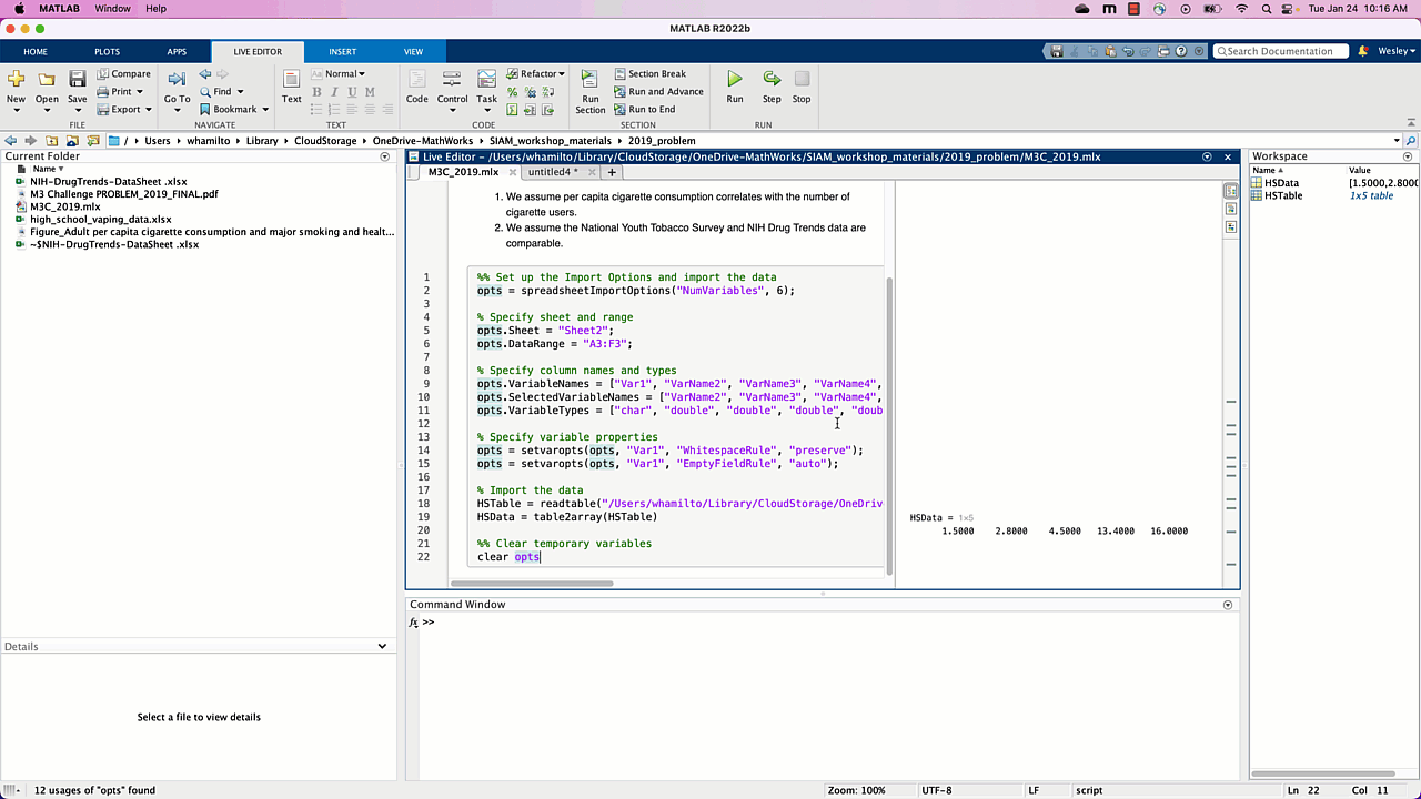
Once all of that is done, we can get started on our model! The code we generated is included here for reference (make sure the excel spreadsheets are located in the same folder as this Live Script):
%% Set up the Import Options and import the data
opts = spreadsheetImportOptions(“NumVariables”, 6);
% Specify sheet and range
opts.Sheet = “Sheet2”;
opts.DataRange = “A3:F3”;
% Specify column names and types
opts.VariableNames = [“Var1”, “VarName2”, “VarName3”, “VarName4”, “VarName5”, “VarName6”];
opts.SelectedVariableNames = [“VarName2”, “VarName3”, “VarName4”, “VarName5”, “VarName6”];
opts.VariableTypes = [“char”, “double”, “double”, “double”, “double”, “double”];
% Specify variable properties
opts = setvaropts(opts, “Var1”, “WhitespaceRule”, “preserve”);
opts = setvaropts(opts, “Var1”, “EmptyFieldRule”, “auto”);
% Import the data
HSTable = readtable(“high_school_vaping_data.xlsx”, opts, “UseExcel”, false);
HSData = table2array(HSTable)
%% Clear temporary variables
clear opts
%% Set up the Import Options and import the data
opts = spreadsheetImportOptions(“NumVariables”, 5);
% Specify sheet and range
opts.Sheet = “Sheet2”;
opts.DataRange = “A2:E5”;
% Specify column names and types
opts.VariableNames = [“Var1”, “VarName2”, “VarName3”, “VarName4”, “VarName5”];
opts.SelectedVariableNames = [“VarName2”, “VarName3”, “VarName4”, “VarName5”];
opts.VariableTypes = [“char”, “double”, “double”, “double”, “double”];
% Specify variable properties
opts = setvaropts(opts, “Var1”, “WhitespaceRule”, “preserve”);
opts = setvaropts(opts, “Var1”, “EmptyFieldRule”, “auto”);
% Import the data
NIHTable = readtable(“NIH-DrugTrends-DataSheet .xlsx”, opts, “UseExcel”, false);
NIHData = table2array(NIHTable)
%% Clear temporary variables
clear opts
Quick Live Script housekeeping
Now that our Live Script is growing, let’s add in a few section breaks and headers so it’s easier for us to revisit and use our code. Based on our strategy for tackling this problem, our sections will be:
- Report (where we write our assumptions and conclusions),
- Reading in data
- Vape model (where we predict future vape usage),
- Comparison to cigarettes.
Building a model by fitting a curve
Our plan here will be to model vape usage by fitting a curve to the data we’ve imported, and use the fitted curve to say something about future vape usage. Two considerations arise:
- The NIH data is split between 10th and 12th grade students. How do we use this data to say something about high school students as a whole?
- We have 2 datasets (the high school vaping data and the NIH data) that cover the years 2011 to 2015, and 2015 to 2018. Can we combine the data in some way to have more data points with which to build the model?
For the first consideration, let’s start by averaging the 10th and 12th grade data from the NIH for each year, and use that as an approximation for all of high school. Implicitly we’re assuming that there are approximately the same number of 10th and 12th grade students in the study (so we can average the percentages) and that 10th and 12th grade students provide a reasonable approximation of how all high school students would behave; let’s actually add this assumption to our running list of assumptions, just in case (we may also want to break it up into two assumptions, but we can decide that later).
We’ll use MATLAB’s mean function to quickly average the percentages by columns, which correspond to years, of the first two rows of NIHdata.
NIHHSData = mean(NIHData(1:2,:))
For the second consideration, we’re going to take the HS data from 2011 to 2014, and use the NIHdata from 2015 to 2018. Here we’re assuming that the methods of surveying are comparable for the two datasets, so it makes sense to merge them. Without looking into the studies themselves, one justification for this we can provide is that the NIH data 2015 value we have (15.25) is within the confidence interval for the HS vaping data (14.1 – 18).
mergedData = [HSData(1:end-1), NIHHSData]
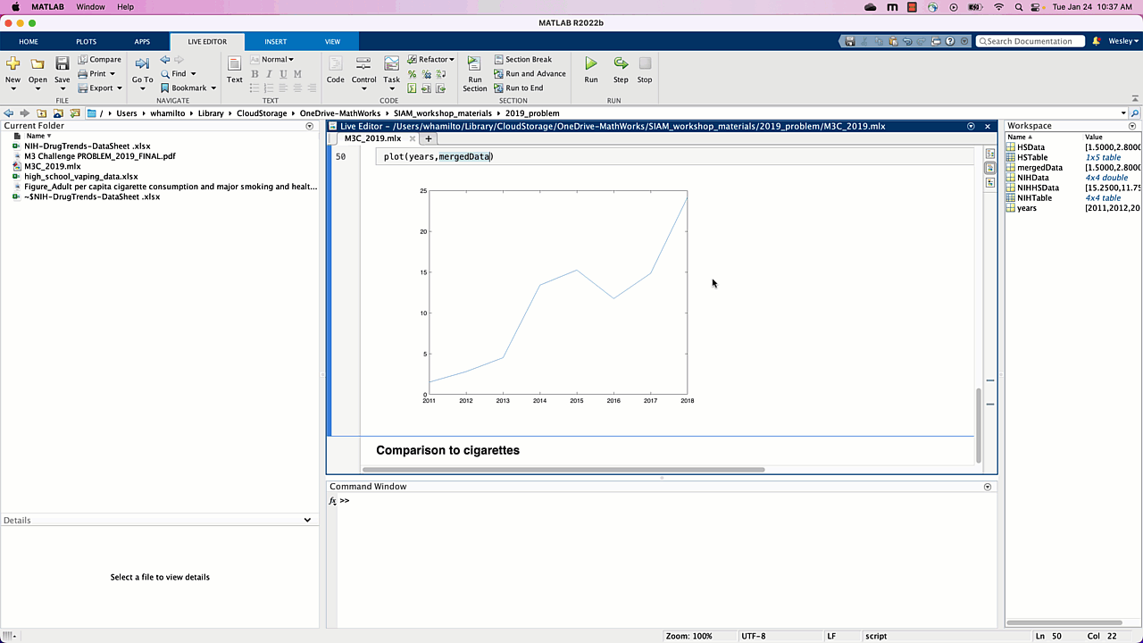
This is a quick and handy trick for combining arrays into new ones, which is something you pick up the more you use MATLAB. More info about working with arrays can be found in MathWorks’ Help Center. As a sanity check, let’s plot the data we’ve imported using the following code:
% visualize the imported data
years = 2011:2018;
plot(years,mergedData)
Our Live Script should show us a plot of vape usage per year, as demonstrated below. In particular, vape usage seems to be on the rise.
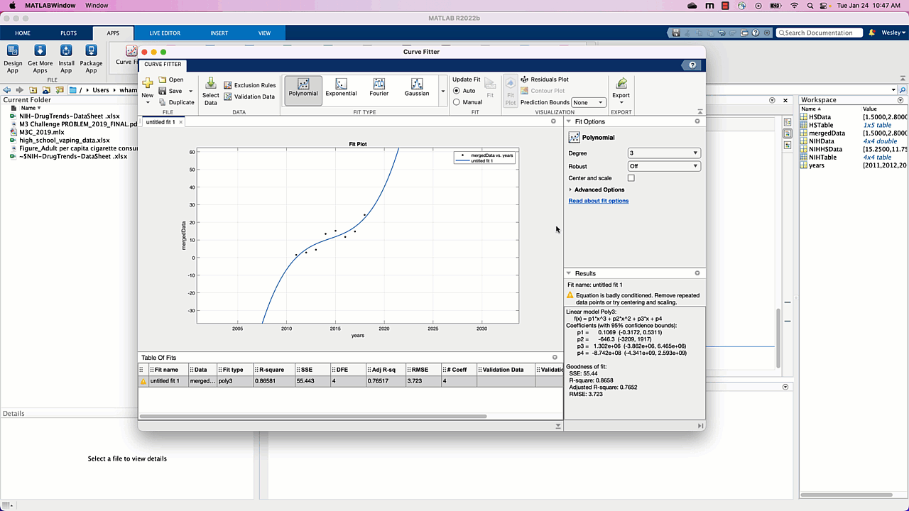
Now that we’ve preprocessed and verified our data, let’s use the built-in “Curve Fitter” app. Once the app opens we need to specify what data we want to fit a curve to by clicking the “Select Data” button. We want “years” as the X data and “mergedData” as Y data. The app automatically tries to fit a 1st degree polynomial (line) to the data, and we can play around with some options to see how 2nd and 3rd degree polynomials approximate the data as well.
As soon as we specify the data to be used, we see the data plotted with a line (1-dimensional polynomial, behind the data selector window) automatically plotted. Is a line a reasonable model for vape usage? Well, it seems to “fit” the data well enough, but what happens as time increases? Since we’re modeling the percentage of HS students vaping, as time increases our model tells us that near 2045, 100% of HS students will be vaping, near 2050 approximately 114% of HS students will be vaping, and so on. This doesn’t make sense for our problem, and using 2nd and 3rd degree polynomials don’t seem to do any better: using a polynomial fit doesn’t seem like the right way to go.
If we think back to our earlier reading of the problem, the historical cigarette usage data looked like a Gaussian. Luckily, Gaussians are a built-in option in the curve fitting app, so let’s try that next.
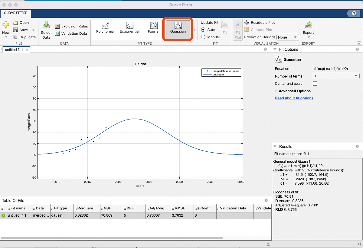
If we click “Gaussian” in the “Fit Type” menu, our model is automatically generated and looks reasonable! From the plot we see that HS vape usage will peak near 2023 at 30%, and then tend towards 0% usage by around 2040. We’re happy with this for now, so let’s export the code to generate the fitted Gaussian and plot and copy it into our notebook. To do this, we want to click the “Export Button” and then “Generate Code”. We can ignore the first few lines and just copy everything underneath “%%Fit: ‘untitled fit 1’.”
Note that this generated code also plots our model. Let’s change some of the settings so the plot is more descriptive:
- Change the title to “Vape usage prediction”,
- Plot the original data for comparison,
- Extend the range of where we want the fitted curve to be plotted, say 2010 to 2040 by specifying those years and then plotting that data,
- Add a legend for the original and fitted data,
- Add a descriptive Y axis label,
- Ensure the extended years are displayed in the plot.
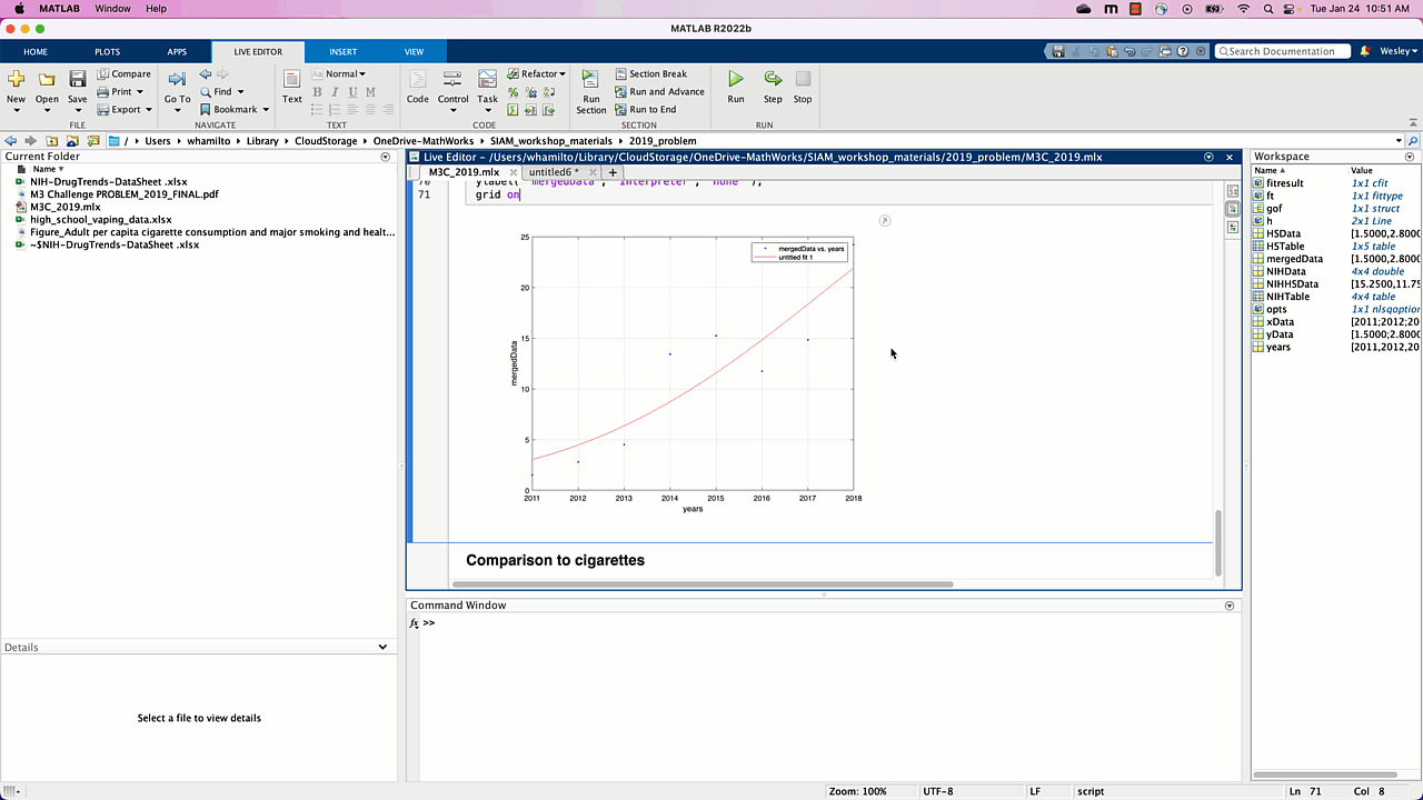
Voila, we have our model for high school vape usage over the next 10+ years, addressing the first of two tasks for part 1 of this challenge. The model in question is a Gaussian, whose equation we see on the right in the “Curve Fitter” app: a1*exp(-((x-b1)/c1)^2), with a1 = 31.9, b1 = 2023, c1 = 7.598. In our report we’ll want to report this model, which we’ll come back to at the end of this post. The code we generated is included here for reference (make sure the excel spreadsheets are located in the same folder as this Live Script):
NIHHSData = mean(NIHData(1:2,:))
mergedData = [HSData(1:end-1),NIHHSData]
years = 2011:2018
plot(years,mergedData)
%% Fit: ‘untitled fit 1’.
[xData, yData] = prepareCurveData( years, mergedData );
% Set up fittype and options.
ft = fittype( ‘gauss1’ );
opts = fitoptions( ‘Method’, ‘NonlinearLeastSquares’ );
opts.Display = ‘Off’;
opts.Lower = [-Inf -Inf 0];
opts.StartPoint = [24.2 2018 1.82425684047535];
% Fit model to data.
[fitresult, gof] = fit( xData, yData, ft, opts );
% Plot fit with data.
figure( ‘Name’, ‘Vape usage prediction’ ); %change the title
plot(years,mergedData) %plot the original data
hold on % don’t generate a new figure when we plot other stuff
extendedYears = 2010:2040; %extend the range of the prediction
plot(extendedYears,fitresult(extendedYears))
%fitresult is a function, so fitresult(extendedYears) are the values of our
%model on the values in the array extendedYears
legend(‘HS vaping data’,‘model prediction’ ); %add a legend for the original and fitted data
% Label axes
xlabel( ‘years’, ‘Interpreter’, ‘none’ );
ylabel( ‘percentage of HS students vaping’, ‘Interpreter’, ‘none’ ); %add a descriptive label
xlim([2010 2040]) % ensure the extended years are displayed in the plot
grid on
Comparing to historical data
The other task for part 1 is to compare the HS cigarette usage to the historical trend, and the strategy we’ll start with is fitting a Gaussian to that data and comparing to the historical trend. This would provide further evidence that
- the NIH data is reliable, and
- the Gaussian is a reasonable model to use for cigarette usage and, hence, vape usage.
To do this we’ll use the same pipeline as above:
- use MATLAB’s mean function to average the third and fourth rows of NIHdata, which have the cigarette usage data for 10th and 12th graders from 2015 to 2018,
- use the curve fitter app to fit a Gaussian to the data.
The first step looks just like it did before: isolate the 10th and 12th grade cigarette usage data and take the column-wise mean to get our HS cigarette usage estimate.
cigYears = 2015:2018;
cigData = NIHData(3:4,:);
cigDataHS = mean(cigData)
The second step looks similar to before: open up the curve fitter app, specify the x and y data to use, and choose “Gaussian” under “Fit Type”. Note that we also specified a new vector with just the years 2015 – 2018, since we’ll need to tell the curve fitter app which X data we want to use and the Y data in this case isn’t the entire period 2011-2018.
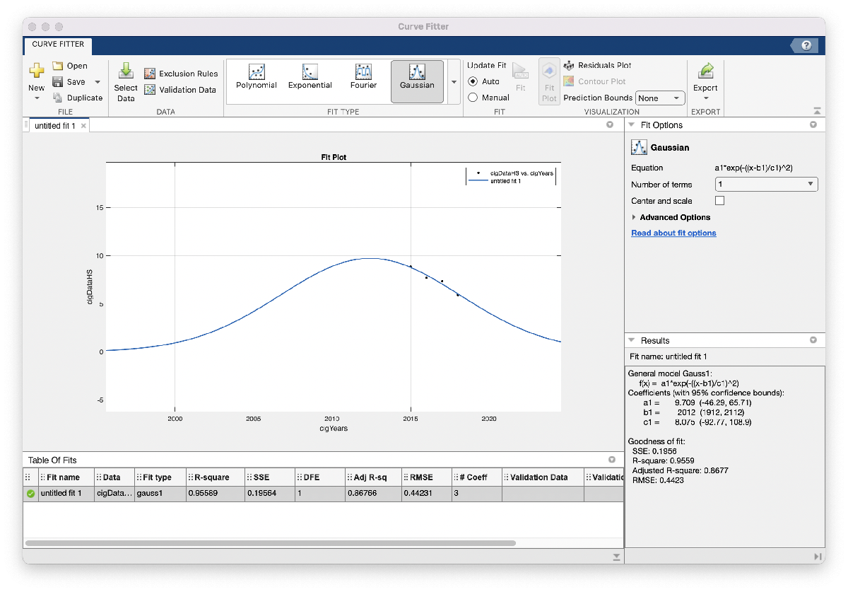
When we zoom out this time, however, the model looks a little less realistic: this Gaussian suggests that HS cigarette usage peaked around 2012, and around 1996 was close to 0 percent usage. We would probably expect to see a higher percentage of HS cigarette usage further back in time, so maybe we won’t include this model in our report just yet. One possible reason for this model not matching our expectations is that the amount of data we used is relatively small: in the vape usage model we had 8 data points to fit our model with, whereas here we only have 4. We’ll go ahead and save the code and figure we generated so they’re easy to return to. As we did above, we’ll change some of the settings so the plot is more descriptive:
- Change the title to “Vape usage prediction”
- Plot the original data for comparison
- Extend the range of where we want the fitted curve to be plotted, say 1990 to 2020 by specifying those years and then plotting that data
- Add a legend for the original and fitted data
- Add a descriptive Y axis label
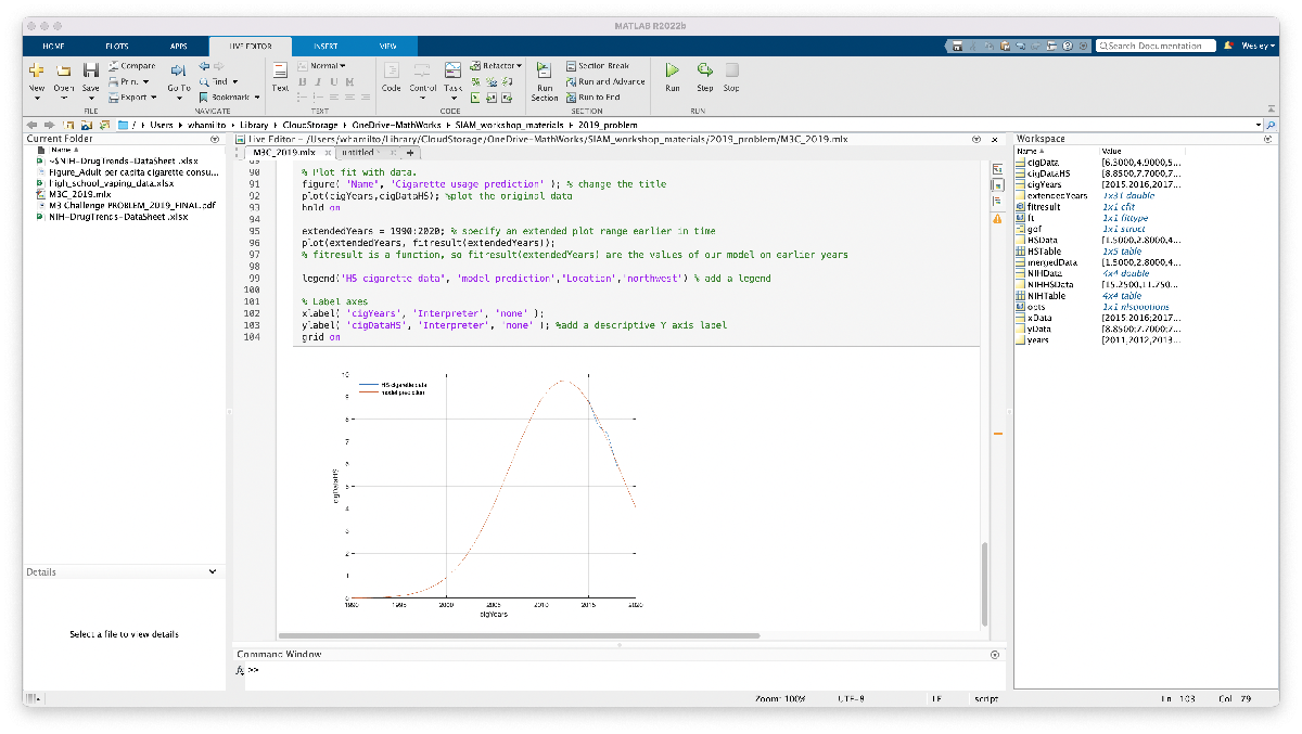
We’re not ready to include this model or plot in our report, but at least we have the code ready to go and modify if/when we find supplementary data to improve our model. The code we generated is included here for reference (make sure the excel spreadsheets are located in the same folder as this Live Script):
cigYears = 2015:2018;
cigData = NIHData(3:4,:);
cigDataHS = mean(cigData)
%% Fit: ‘untitled fit 1’.
[xData, yData] = prepareCurveData( cigYears, cigDataHS );
% Set up fittype and options.
ft = fittype( ‘gauss1’ );
opts = fitoptions( ‘Method’, ‘NonlinearLeastSquares’ );
opts.Display = ‘Off’;
opts.Lower = [-Inf -Inf 0];
opts.StartPoint = [8.85 2015 2.00542812275561];
% Fit model to data.
[fitresult, gof] = fit( xData, yData, ft, opts );
% Plot fit with data.
figure( ‘Name’, ‘Cigarette usage prediction’ ); % change the title
plot(cigYears,cigDataHS); %plot the original data
hold on
extendedYears = 1990:2020; % specify an extended plot range earlier in time
plot(extendedYears, fitresult(extendedYears));
% fitresult is a function, so fitresult(extendedYears) are the values of our model on earlier years
legend(‘HS cigarette data’, ‘model prediction’,‘Location’,‘northwest’) % add a legend
% Label axes
xlabel( ‘cigYears’, ‘Interpreter’, ‘none’ );
ylabel( ‘cigDataHS’, ‘Interpreter’, ‘none’ ); %add a descriptive Y axis label
grid on
Summary of progress and next steps
One aspect of the competition not yet discussed is the fact that it’s a team effort, in that (likely) it will be you and 1-3 of your colleagues tackling this question together. So, as you and your teammates continue on in the day, one task someone could take on is to refine the cigarette usage model. This might mean finding more data points to build a more accurate model, or trying a different curve to fit the model, or exploring a completely different approach! We could also revisit the model we’re happy with to show we tried other reasonable models; polynomials didn’t seem to give us reasonable results, but maybe a logistic curve or Weibull curve (whatever that is) would give other reasonable models.
Another task for a teammate could be to revisit and add justification to the two assumptions we wrote down: does per capita cigarette usage correlate with with number of cigarette users (maybe as a percentage of total population)? can we find data about number or percentage of cigarette users throughout history, maybe even HS cigarette usage data or charts? Why are the National Youth Tobacco Survey and NIH Drug Trends datasets comparable/mergeable? Etc.
At this point we’ve more-or-less answered part 1, at least enough for us to be comfortable that we have something we can write about and so we can get started on part 2 of the question. Before reading and starting on part 2, let’s collect our thoughts and outline our solution (so far) to part 1:
To model the spread of nicotine usage due to vaping over the next 10 years, we use survey data from the National Youth Tobacco Survey and NIH to fit a Gaussian model on percentage of HS students vaping:
percentage of HS students vaping = a1*exp(-((x-b1)/c1)^2),
where a1 = 31.9, b1 = 2023, c1 = 7.598, and x is the year of interest. Our model predicts vaping usage will peak with approximately 32% of HS students vaping by the year 2023, afterwhich usage will decline until nearly 0% usage by 2040. The rest of this section describes in more detail our methods and assumptions that support this model. [Here we would include assumptions, discuss the model development including the rational for choosing a Gaussian, etc.]
We’re not done with part 1, but we have a solid start. Make sure to check out part 2 that examines some student submissions to this challenge, and some of the models their teams built!
- 类别:
- Math Modeling,
- MATLAB


评论
要发表评论,请点击 此处 登录到您的 MathWorks 帐户或创建一个新帐户。