Multipoint data gathering in Trendy
When we launched Trendy, you could only grab one data point per trend. One of our very first plots, which was created as simple example, tracks the daily high and low temperatures in Anchorage, Alaska. Naturally, this plot requires two data points for each day: the daily high in Anchorage, and the daily low in Anchorage. But the thing is, these two numbers both come from the same web page. That means we’re visiting the same page twice to get two numbers. Seems a shame, eh? It would be much nicer if we could just visit the page once and extract both numbers.
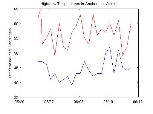
That’s why we recently added the ability to grab and store multiple data points (i.e. vectors) per day in a single trend. In keeping with our weather example, here’s the first vectorized trend I created: Vectorized High/Low for Anchorage. Plotting is very straightforward. The data for vectorized trends is stored as the rows of a matrix. So if you plot time against data, you get a nice time series plot of each piece of data. Here is the resulting high-low temperature plot and the accompanying code.

plot(time1656,data1656(:,1),'red')

hold on

plot(time1656,data1656(:,2),'blue')

hold off

datetick

ylabel('Temperature (deg. F)')

title('High/Low Temperatures in Anchorage, Alaska')
Now let’s move on to something a little more ambitious. Suppose you wanted to track the standings of every American major league baseball team. Before vectorized trends, you would need to create 30 different trends, one for each team. Patrick Kalita has done this. At the time he didn’t have any choice, but it must have taken him a while. Using this data, Patrick is tracking the standings for each division in the major leagues. I want to call your attention to the fact that he has carefully aligned each team’s line color with their real-life team colors. Nice work Patrick!
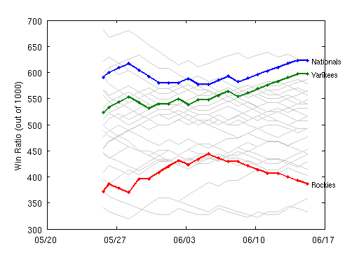
I wanted to try to do something similar: track the winning percentage of all the major league teams. Now I can do that in a single trend. With all the data in one place, I can easily show all the teams in a single plot. But maybe more important, it’s easier for me to analyze the data. For instance, here’s a plot where I calculate the longest current winning and losing streaks. Note the freakish correlation between the Nationals and the Yankees.

Cleverest usage of vectorized trends so far: Aurelien’s Reasons why MathWorks should have an office in my village. It’s a comparison of the weather differences between Meudon (near Paris) and Corbières. It looks like Corbières is winning!


댓글
댓글을 남기려면 링크 를 클릭하여 MathWorks 계정에 로그인하거나 계정을 새로 만드십시오.