
Exploring Secondary Axis Labels in MATLAB
One of our missions for this blog is to boost our readers' familiarity with the latest features and to keep you in the forefront of MATLAB graphics and app building advancements. Last week I mentioned that MATLAB R2023b has more than two dozen new features in the graphics and app building domains. Help us achieve our goal by letting us know which new features you would like to see covered in the blog!
One of my favorite features from R2023b is a trio of convenience functions that control secondary labels on Cartesian axes.
You might be wondering, what are secondary labels?
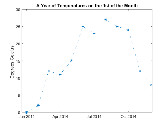
Secondary labels are designed to display additional information about an axis such as tick label units. By default, MATLAB adds a secondary label next to an axis when plotting datetime values, duration values, or numeric values in exponential form. The use of secondary labels often simplifies tick labels by eliminating repetitive information such as including the same year in all datetime tick labels. Here are some automatically generated secondary labels for numeric, duration, and datetime rulers.

To generate a datetime example similar to the purple axes above,
date1 = datetime(2023,09,13,0,3,0) + seconds(-45:5:45);
date2 = datetime(2023,10,28,0,0,0) + days(-45:5:45);
plot(date1, date2, "o");
axis tight
Controlling secondary labels in MATLAB R2023b
Here are some common situations reported by MATLAB users where these functions will come in handy.
Remove a secondary label. Time-of-day is the focus of your data and you don't want to show the date in the purple axes above. Remove the secondary label using,
xsecondarylabel(Visible = "off")
Change a secondary label. In your manuscript, "hr" is used to indicate "heart rate" and you want to change "hr" in the orange axes above to "hours". Change the secondary label using,
ysecondarylabel('hours')
Add your own secondary label. You're working with scaled data such that the values 0.5 and 1.0 should be interpreted as five million and ten million. Add the exponent notation shown in the blue axes above using,
xsecondarylabel('x10^7')
Label axis units. This is my favorite reason to use these new functions. Label the axes' units without relying on the xlabel or ylabel. Let's look at a full demo below.
Demo: using secondary labels to indicate axis units
In 1662 Robert Boyle discovered that the volume of an ideal gas is inversely proportional to the pressure exerted upon the gas assuming constant temperature (Boyle's Law). Graphical visualizations were not yet common in 1662 so Boyle published his results as a table of numbers. Let's plot the results to show the relationship between pressure and volume for ideal gases.
Read in Boyle's data from 1662 using Boyle's original generic variable names. We'll use columns A2 (gas volume) and D (pressure). For a complete explanation of the table variables, see J. B. West (1999, J Appl Physiol).
T = readtable("https://blogs.mathworks.com/graphics-and-apps/files/boylesData.csv")
Boyle trapped gas between the end of a j-shaped tube and a column of mercury. He measured pressure upon the gas in units of inHG or inches of mercury by gradually adding mercury to the tube which increases the pressure on the gas. Volume of the gas was measured by the height of the gas pocket at the end of the tube, in inches. I dug deep searching for the diameter of his tube so we could use actual units of volume but couldn't find it. Inches will suffice assuming the tube had a uniform diameter. A shout-out is waiting for anyone who can find Boyle's tube diameter from a credible source!
Boyle treated volume as the independent variable (table variable A2) so we'll plot volume along the x-axis and pressure (table variable D) on the y-axis.
figure();
plot(T.A2, T.D, "-s")
grid on
title("Boyle's Data")
xlabel("Volume")
ylabel("Pressure")
Add secondary labels to indicate axis units (starting in MATLAB R2023b).
xsecondarylabel("in")
ysecondarylabel("inHg")

Boyle's data shows that the volume of the gas is inversely proportional to the pressure exerted upon it. As pressure falls, volume increases like a balloon expanding in a vacuum. This relationship is beautifully shown by plotting the reciprocal of pressure against volume.
figure()
plot(T.A2, 1./T.D, "-o");
grid on
xlim([0, 15])
ylim([0, 0.04])
title("Boyle's Law")
xlabel("Volume")
ylabel("Inverse of pressure")
xsecondarylabel("in");
ysecondarylabel("inHg^-1")

Join the conversation!
We've learned how to change, create, or remove a secondary label. Let's continue the discussion in the comments section below!
- What other customizations would be helpful with secondary labels?
- What other recent new features in graphics and app building are you interested in learning more about?
- Do you think Robert Boyle's interest in pressure and volume was affected by being the 14th child in his family?
- Category:
- Charts,
- Demos,
- New Features


Comments
To leave a comment, please click here to sign in to your MathWorks Account or create a new one.