
Welcome to the MATLAB Graphics and App Building blog!
Welcome to the launch of the MATLAB Graphics and App Building blog! I am your host, Adam Danz, whom some readers may recognize from the MATLAB Central Community. My experience with MATLAB started as an overwhelmed graduate student staring at an empty MATLAB desktop unsure of where to begin. Working as a Ph.D. student in a neurophysiology laboratory, specializing in vision science, I developed a passion for data analytics and building interactive apps to streamline my analyses. One evening in the lab I stumbled upon the MATLAB Central community and decided to answer some questions. Engaging with 1000s of fellow users since then and delving into their projects, goals, and challenges has been an immensely rewarding experience.
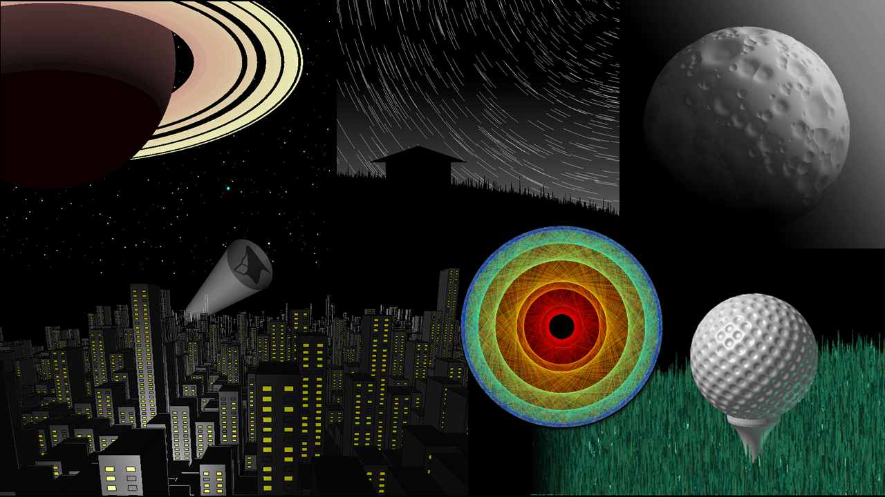
In 2020, I was honored to join the MathWorks Community Advisory Board, and in 2022, I became a developer on the MATLAB Graphics and Charting team at MathWorks. While my expertise is in areas of science, math, and data analytics, I also occasionally express some artistic creativity through MATLAB (secretly, I'm really in it for the math). Here are some graphics I generated as a grad student and MathWorker in the MathWorks Mini Hack contests (2021, 2022 galleries; but wait till you see what my manager can create!).
Today I’m excited to bridge my experiences as a MATLAB user, community contributor, and MathWorker as the host of the new MATLAB Graphics and App Building blog! In addition to my own contributions, expect to meet other esteemed guest contributors from the graphics and app building area at MathWorks, who will each bring diverse perspectives and backgrounds.
Why do we need a graphics and app building blog?
Some readers may fondly recall MathWorks’ Mike on MATLAB Graphics blog from 2014-2017 which served as a valuable resource for navigating the changes to the graphics system in R2014b. Since then, our system has grown in many exciting new ways and directions:
- App Designer was introduced in R2016a and has seen new UI components, app building conveniences, and performance improvements with every single MATLAB release.
- App Designer opened the door to MATLAB web apps, an entirely new workflow made possible by the MATLAB Web App Server.
- The breadth of charts in MATLAB has grown significantly, with many supporting important datatypes including tables, timetables, datetime, duration, and categoricals.
- The graphics interactions system has also evolved to allow for more seamless exploration and analysis of your data.
- New layouts and layout conveniences for figures, axes, and apps have become increasingly flexible and user-friendly.
- Exporting your carefully crafted visualizations and apps for presentations and publications is easier today with new functions and options.
- And much more, from performance improvements, to Simulink integrations, and even a sneak peek at dark mode for your plots and apps via the New Desktop for MATLAB (beta).
With such substantial progress made since our previous blog, there is an abundance of exciting updates and advancements to catch up on. In fact, the recent MATLAB R2023b release alone boasts more than two dozen new features in the graphics and app building domains!
We want to include you in the action, highlight what’s new, demonstrate workflows, inspire readers with neat demos, and share stories, tips, and tricks with readers from various backgrounds and skill levels.
Moreover, we value your thoughts and questions! What specific topics would you like to see covered in this blog? What burning questions or curiosities can we address? I encourage you to respond in the comments below or reach out to me by using the contact button in my profile.
Build the MATropolis!
I affectionately refer to the vibrant MATLAB community as The MATropolis where you and I are residents! The background image for this blog is intended to capture the essence of The MATropolis, created entirely using MATLAB. Let's step through the reproduction code and build it together.
The graphic is basically a 3D bar plot using random bar heights. To generate the same random numbers used in the image, specify the random number generator algorithm and seed (rng).
rng(20210214,'twister')
The figure size is 560x560 pixels. Instead of specifying the full 1x4 figure position, you can specify the width and height of the figure and then use movegui to ensure that the figure is still on the screen.
fig = figure('units','pixels');
fig.Position(3:4) = [560,560];
movegui(fig)
The custom colormap is a rearrangement of the r-g-b columns of the pink colormap. This is a pretty neat and easy way to generate up to 27 different colormaps just by indexing the columns of a single colormap.
cmap = pink();
customColormap = cmap(:,[2,3,1]);
Create the axes and assign the custom colormap. The view angle specifies an oblique line of sight on the axes. The axes color is set to a darker shade chosen from the colormap.
axes('Colormap', customColormap,...
'Color', customColormap(25,:), ...
'View',[164,19],...
'CameraViewAngle', 3.5)
Hold the axes. I often see MATLAB users forget this step and wonder why their axes properties changed. Many of our graphics functions call newplot to set up the figure and axes. Newplot decides whether the axes should be reset or not. To avoid resetting the axes properties when a graphics object is added, specify hold on. Note, another approach would be to set the axes properties after adding the bar plot which does not require holding the axes.
hold on
Generate a 15x15 3D bar plot with random bar heights from a gamma distribution. The gamma distribution was chosen so that tall buildings are less frequent and stand out more than other buildings. randg requires the Statistics and Machine Learning Toolbox. An easy alternative to randg is to pull positive random values from a normal distribution: h=abs(randn(15))*2.
h=randg(1,15);
b=bar3(h);
axis equal
By default, the 3D bar colors vary along the x-axis. We want color to vary along the z-axis so that darker shades are at the bottom and lighter shades are at the top of the bars. The bars are constructed of surface objects with one surface object for each row of bars along the x-axis. For each surface object, set its color data according to the buildings' height and interpolate the face color to create a smooth transition from bottom to top of each building.
for i=1:numel(b)
set(b(i),'CData',b(i).ZData,'FaceColor','interp')
end
hold off
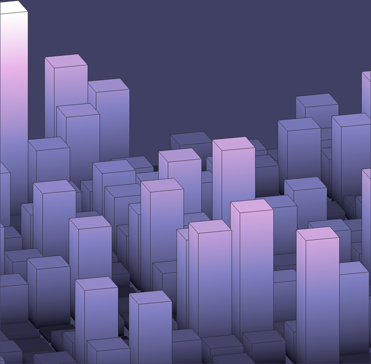
Tweak it, append it, or share your own representation of the MATropolis with us! Change the colormap, camera viewing angle, add a setting sun, or use a different distribution of building heights. Maybe you want to add windows, create a rooftop view, or add a bat signal! Thanks for making it this far and for being a part of the community!
- Category:
- App Building,
- Demos,
- Graphics,
- MathWorks Community


Comments
To leave a comment, please click here to sign in to your MathWorks Account or create a new one.