Weather Prediction – How Far Can You Go?
This summer my mother-in-law is renting a house on a lake in New Hampshire. Looking at the calendar, my wife said: "The ten-day forecast makes it look like it's going to be pretty hot up at the lake next week." This led to a more general discussion of the merits of ten-day forecasts.
It's funny how we can make decisions based on long-term predictions of weather even though we rarely go back and verify that the forecast was any good. Somehow the fact that the forecast exists at all gives it value. I'm left pondering this question: how much should we trust a ten-day prediction? As it happens, I have some data that can be useful here. For some time, I have been collecting some relevant data on Trendy: the ten day forecast for Natick, Massachusetts (hometown for MathWorks). So let's run some numbers.
Here's the trend: Ten Day Forecast Highs for Natick, MA.
Once a day this trend collects ten data points: today's high temperature and the predicted high temperature for the next nine days. In MATLAB, we'll be working with a matrix with one row for each day and ten columns.
Let's get the data into MATLAB so we can play around with it. I can retrieve (and so can you) the data from Trendy as a JSON object using the following call:
https://www.mathworks.com/matlabcentral/trendy/trends/1655/trend_data.json
In order to read this into MATLAB, I'm going to use Joe Hicklin's JSON parser.
url = 'https://www.mathworks.com/matlabcentral/trendy/trends/1655/trend_data.json';
json = urlread(url);
raw = JSON.parse(json);
t = zeros(length(raw),1);
d = zeros(length(raw),10);
for i = 1:length(raw)
    t(i) = raw{i}{1};
    predictions = raw{i}{2};
    for j = 1:10
        d(i,j) = str2num(predictions{j});
    end
end

firstTenRows = d(1:10,:)
firstTenRows =

    44    51    59    66    46    48    53    50    51    54
    50    58    63    49    48    52    48    46    57    54
    59    61    49    47    53    49    48    43    41    48
    62    49    48    54    49    39    39    44    47    46
    49    48    54    50    40    38    39    47    51    54
    47    55    50    39    40    48    52    53    53    53
    54    50    40    39    48    53    54    52    52    50
    49    40    38    50    55    54    56    56    53    49
    40    39    50    56    54    52    56    54    47    43
    39    50    55    55    55    59    58    40    41    46
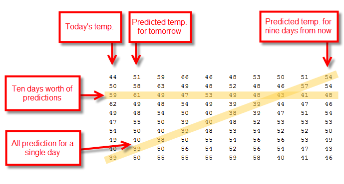
Now I have a temperature prediction matrix that's structured like this.

I want to re-order this matrix so that each line shows the prediction trajectory for a single day in time. That means picking off the diagonals highlighted in the diagram above. So let's write some code that does this shift. I'm going to end up with two new matrices, d1 and d2
rowIndex = 1:10;
colIndex = 10:-1:1;
sz = size(d);

len = (size(d,1)-10);
d1 = zeros(len,10);
d2 = zeros(len,10);
t1 = zeros(len,1);
for i = 1:len
    ind = sub2ind(sz,rowIndex+i-1,colIndex);
    trend = d(ind);
    d1(i,:) = trend;
    d2(i,:) = trend-trend(end);
    t1(i) = t(i+9);
end

firstTenRows = d1(1:10,:)
firstTenRows =

    54    57    43    39    38    40    39    38    39    39
    54    41    44    39    48    48    50    50    50    49
    48    47    47    52    53    55    56    55    54    57
    46    51    53    54    54    54    55    55    57    58
    54    53    52    56    52    55    57    57    60    58
    53    52    56    56    59    59    61    63    63    64
    50    53    54    58    45    42    45    44    44    43
    49    47    40    39    37    42    43    43    43    43
    43    41    41    42    44    48    47    49    48    47
    46    44    48    49    46    52    51    50    49    48
In d1, each row is the evolving temperature prediction for each day. So when we plot the first row of d1, we're getting the predictive arc for November 13th of last year.
i = 1;
plot(-9:0,d1(i,:))
title(sprintf('Predicted Temperature for %s',datestr(t1(i),1)))
xlabel('Time of Prediction (Offset in Days)')
ylabel('Predicted Temperature (Deg. F)')

In d2, we just subtract from each row the last value in each row. Since this last value is the final (and presumably correct) temperature, this difference gives us the predictive error across the ten days. Here's the error for the November 13th prediction.
i = 1;
plot(-9:0,d2(i,:))
title(sprintf('Error in Predicted Temperature for %s',datestr(t1(i),1)))
xlabel('Time of Prediction (Offset in Days)')
ylabel('Prediction Error (Deg. F)')

Notice that it shrinks to zero over time. That's good! Our predictions get more accurate as we approach the actual day in question. But the early predictions were off by as much as 18 degrees. Is that good or bad? You tell me.
Now let's look at all the days.
plot(-9:0,d2','Color',[0.5 0.5 1])
title('Error in Predicted Temperature')
xlabel('Time of Prediction (Offset in Days)')
ylabel('Prediction Error (Deg. F)')

It's hard to get a sense of the error distribution. So let's finish with a histogram of the absolute value of the error. Out of 240 measurements in this data set, the median error for a ten-day prediction is six degrees.
hist(abs(d2(:,1)),1:25)
title('Histogram of Error in the Ten-Day Forecast')
xlabel('Error (deg. F)')
ylabel('Number of Samples')

That seems pretty good. Most of the time that error is going to be less than seven or so degrees Fahrenheit (or four degrees Celsius). I probably don't need to pack a sweater for the weekend at the lake.


댓글
댓글을 남기려면 링크 를 클릭하여 MathWorks 계정에 로그인하거나 계정을 새로 만드십시오.