
Deep Learning Visualizations: CAM Visualization
I’m hoping by now you’ve heard that MATLAB has great visualizations, which can be helpful in deep learning to help uncover what’s going on inside your neural network.
Last post, we discussed visualizations of features learned by a neural network. Today, I’d like to write about another visualization you can do in MATLAB for deep learning, that you won’t find by reading the documentation*.
 This can show what areas of an image accounted for the network's prediction.
To make it more fun, let’s do this “live” using a webcam. Of course, you can always feed an image into these lines instead of a webcam.
First, read in a pretrained network for image classification. SqueezeNet, GoogLeNet, ResNet-18 are good choices, since they’re relatively fast.
This can show what areas of an image accounted for the network's prediction.
To make it more fun, let’s do this “live” using a webcam. Of course, you can always feed an image into these lines instead of a webcam.
First, read in a pretrained network for image classification. SqueezeNet, GoogLeNet, ResNet-18 are good choices, since they’re relatively fast.
 *And to be clear, this is all documented functionality - we're not going off the grid here!
Grab the input size, the class names, and the layer name from which we want to extract the activations. We want the ReLU layer that follows the last convolutional layer.
I considered adding a helper function to get the layer name, but it’ll take you 2 seconds to grab the name from this table:
*And to be clear, this is all documented functionality - we're not going off the grid here!
Grab the input size, the class names, and the layer name from which we want to extract the activations. We want the ReLU layer that follows the last convolutional layer.
I considered adding a helper function to get the layer name, but it’ll take you 2 seconds to grab the name from this table:
Now let’s run this on an image.
Now you can switch from a still image to a webcam, with these lines of code:
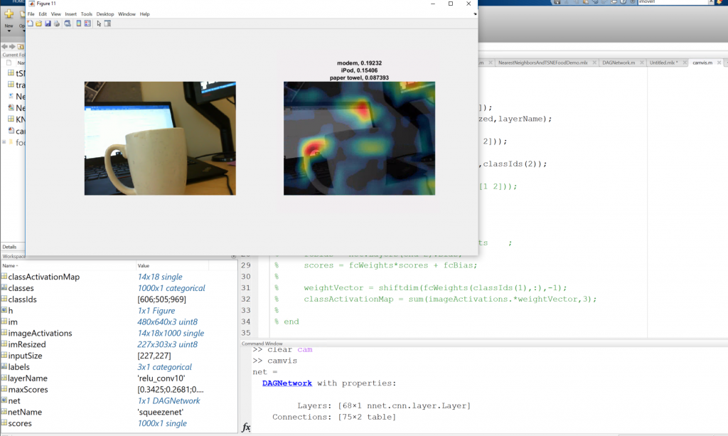
 You can switch the class activations to visualize the second most likely class, and visualize what features are triggering that prediction.
 Finally, you’ll need two helper functions to make this example run:
CAM Visualizations
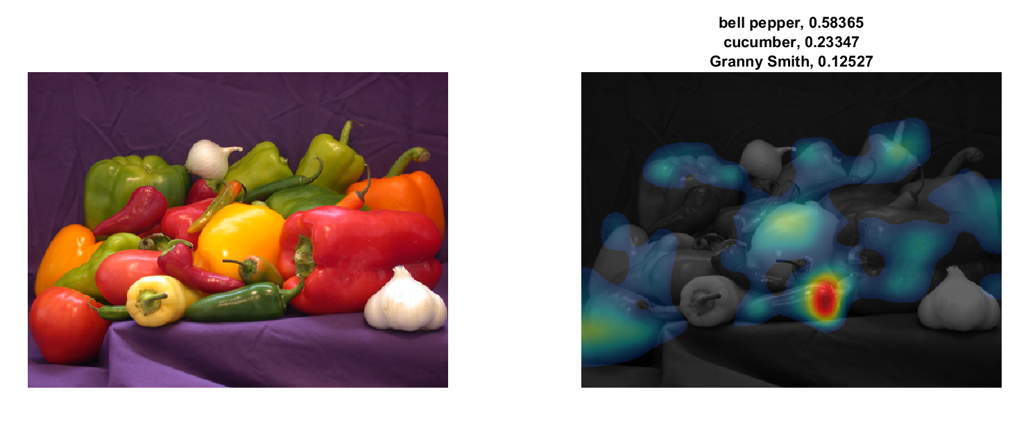
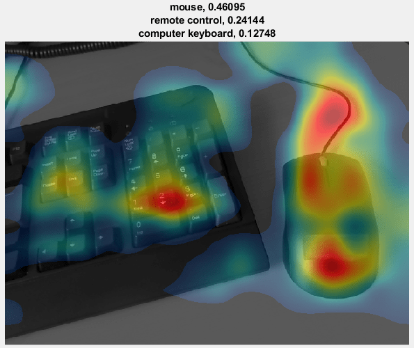
This is to help answer the question: “How did my network decide which category an image falls under?” With class activation mapping, or CAM, you can uncover which region of an image mostly strongly influenced the network prediction. I was surprised at how easy this code was to understand: just a few lines of code that provides insight into a network. The end result will look something like this:
This can show what areas of an image accounted for the network's prediction.
To make it more fun, let’s do this “live” using a webcam. Of course, you can always feed an image into these lines instead of a webcam.
First, read in a pretrained network for image classification. SqueezeNet, GoogLeNet, ResNet-18 are good choices, since they’re relatively fast.
netName = 'squeezenet';
net = eval(netName);
Then we get our webcam running.
cam = webcam;
preview(cam);
Here’s me running this example.
| Network Name | Activation Layer Name |
| googlenet | 'inception_5b-output' |
| squeezenet | 'relu_conv10' |
| resnet18 | 'res5b' |
im = imread('peppers.png');
imResized = imresize(im,[inputSize(1),NaN]);
imageActivations = activations(net,imResized,layerName);
The class activation map for a specific class is the activation map of the ReLU layer, weighted by how much each activation contributes to the final score of the class.
The weights are from the final fully connected layer of the network for that class. SqueezeNet doesn’t have a final fully connected layer, so the output of the ReLU layer is already the class activation map.
scores = squeeze(mean(imageActivations,[1 2]));
[~,classIds] = maxk(scores,3);
classActivationMap = imageActivations(:,:,classIds(1));
If you’re using another network (not squeezenet) it looks like this:
scores = squeeze(mean(imageActivations,[1 2]));
[~,classIds] = maxk(scores,3);

if netName ~= 'squeezenet'

    fcWeights = net.Layers(end-2).Weights    ;
    fcBias = net.Layers(end-2).Bias;
    scores = fcWeights*scores + fcBias;

    weightVector = shiftdim(fcWeights(classIds(1),:),-1);
    classActivationMap = sum(imageActivations.*weightVector,3);
end
Calculate the top class labels and the final normalized class scores.
scores = exp(scores)/sum(exp(scores));
maxScores = scores(classIds);
labels = classes(classIds);
And visualize the results.
subplot(1,2,1);
imshow(im);
subplot(1,2,2);
CAMshow(im,classActivationMap);
title(string(labels) + ", " + string(maxScores));

drawnow;
The activations for the top prediction are visualized. The top three predictions and confidence are displayed in the title of the plot.
Now you can switch from a still image to a webcam, with these lines of code:
h = figure('Units','normalized','Position',[.05 .05 .9 .8]);
while ishandle(h)
% im = imread('peppers.png'); <-- remove this line
im = snapshot(cam);
put an ‘end’ to the loop right after drawnow; you’re good to run this in a loop now. If I lost you with any of these steps, a link to the full file is at the bottom of this page.
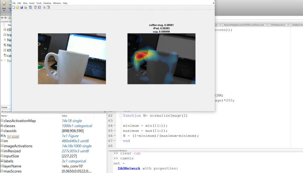
It’s also interesting to note that you can do this for any class of the network. Take a look at this image below. I have a coffee cup that is being accurately predicted as a coffee mug. You can see those class activations. But why is it also being highly classified as an iPod?
You can switch the class activations to visualize the second most likely class, and visualize what features are triggering that prediction.
Finally, you’ll need two helper functions to make this example run:
function CAMshow(im,CAM)
  imSize = size(im);
  CAM = imresize(CAM,imSize(1:2));
  CAM = normalizeImage(CAM);
  CAM(CAM < .2) = 0;
  cmap = jet(255).*linspace(0,1,255)';
  %'
  CAM = ind2rgb(uint8(CAM*255),cmap)*255;

  combinedImage = double(rgb2gray(im))/2 + CAM;
  combinedImage = normalizeImage(combinedImage)*255;
  imshow(uint8(combinedImage));
end

function N= normalizeImage(I)
  minimum = min(I(:));
  maximum = max(I(:));
  N = (I-minimum)/(maximum-minimum);
end
Grab the entire code with the blue "Get the MATLAB Code" link on the right. Happy visualization! Leave a comment below, or follow me on Twitter!
Copyright 2018 The MathWorks, Inc.
Get the MATLAB code
- Category:
- Deep Learning


Comments
To leave a comment, please click here to sign in to your MathWorks Account or create a new one.