
Neural Network Feature Visualization
Visualization of the data and the semantic content learned by a network
This post comes from Maria Duarte Rosa, who is going to talk about different ways to visualize features learned by networks. Today, we'll look at two ways to gain insight into a network using two methods: k-nearest neighbors and t-SNE, which we'll describe in detail below.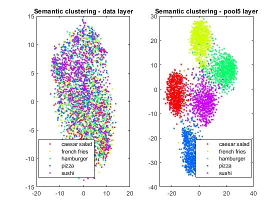
Visualization of a trained network using t-SNE
Dataset and Model
For both of these exercises, we'll be using ResNet-18, and our favorite food dataset, which you can download here. (Please be aware this is a very large download. We're using this for examples purposes only, since food is relevant to everyone! This code should work with any other dataset you wish). The network has been retrained to identify the 5 categories of objects from the data:| Salad | Pizza | Fries | Burger | Sushi |
 |
 |
 |
 |
 |
k-nearest neighbors search
A nearest neighbor search is a type of optimization problem where the goal is to find the closest (or most similar) points in space to a given point. K-nearest neighbors search identifies the top k closest neighbors to a point in feature space. Closeness in metric spaces is generally defined using a distance metric such as the Euclidean distance or Minkowski distance. The more similar the points are, the smaller this distance should be. This technique is often used as a machine learning classification method, but can also be used for visualization of data and high-level features of a neural network, which is what we're going to do. Let's start with 5 test images from the food dataset:idxTest = [394 97 996 460 737];
im = imtile(string({imdsTest.Files{idxTest}}),'ThumbnailSize',[100 100], 'GridSize', [5 1]);

dataTrainFS = activations(netFood, imdsTrainAu, 'data', 'OutputAs', 'rows');
imgFeatSpaceTest = activations(netFood, imdsTestAu,'data', 'OutputAs', 'rows');
dataTestFS = imgFeatSpaceTest(idxTest,:);
Create KNN model and search for nearest neighbours
Mdl = createns(dataTrainFS,'Distance','euclidean');
idxKnn = knnsearch(Mdl,dataTestFS, 'k', 10);
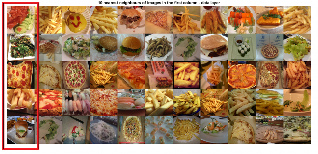 Searching for similarities in pixel space does not generally return any meaningful information about the semantic content of the image but only similarities in pixel intensity and color distribution. The 10 nearest neighbors in the data (pixel) space do not necessarily correspond to the same class as the test image. There is no "learning" taking place.
Take a look at the 4th row:
Searching for similarities in pixel space does not generally return any meaningful information about the semantic content of the image but only similarities in pixel intensity and color distribution. The 10 nearest neighbors in the data (pixel) space do not necessarily correspond to the same class as the test image. There is no "learning" taking place.
Take a look at the 4th row:

dataTrainFS = activations(netFood, imdsTrainAu, 'pool5', 'OutputAs', 'rows');
imgFeatSpaceTest = activations(netFood, imdsTestAu,'pool5', 'OutputAs', 'rows');
dataTestFS = imgFeatSpaceTest(idxTest,:);
Create KNN model and search for nearest neighbours
Mdl = createns(dataTrainFS,'Distance','euclidean');
idxKnn(:,:) = knnsearch(Mdl,dataTestFS, 'k', 10);
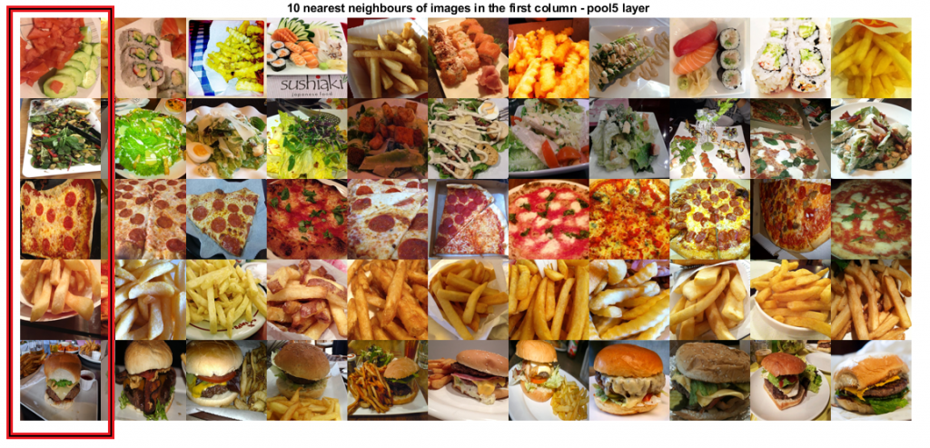
The first column (highlighted) is the test image, the remaining columns are the 10 nearest neighbors
K-NN: What can we learn from this?
This can confirm what we expect to see from the network, or simply another visualization of the network in a new way. If the training accuracy of the network is high but the nearest neighbors in feature space (assuming the features are the output of one of the final layers of the network) are not objects from the same class, this may indicate that the network has not captured any semantic knowledge related to the classes but might have learned to classify based on some artifact of the training data.Semantic clustering with t-SNE
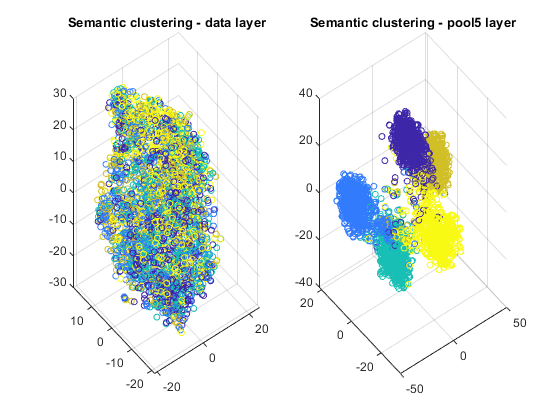
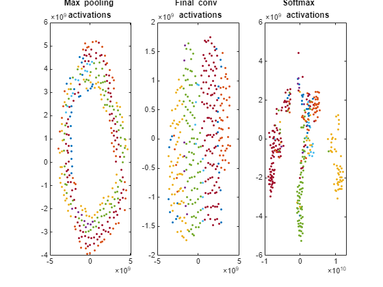
t-Distributed Stochastic Neighbor Embedding (t-SNE) is a non-linear dimensionality reduction technique that allows embedding high-dimensional data in a lower-dimensional space. (Typically we choose the lower dimensional space to be two or three dimensions, since this makes it easy to plot and visualize). This lower dimensional space is estimated in such a way that it preserves similarities from the high dimensional space. In other words, two similar objects have high probability of being nearby in the lower dimensional space, while two dissimilar objects should be represented by distant points. This technique can be used to visualize deep neural network features. Let's apply this technique to the training images of the dataset and get a two dimensional and three dimensional embedding of the data. Similar to k-nn example, we'll start by visualizing the original data (pixel space) and the output of the final averaging pooling layer.layers = {'data', 'pool5'};
for k = 1:length(layers)
dataTrainFS = activations(netFood, imdsTrainAu, layers{k}, 'OutputAs', 'rows');
AlltSNE2dim(:,:,k) = tsne(dataTrainFS);
AlltSNE3dim(:,:,k) = tsne(dataTrainFS), 'NumDimensions', 3);
end
figure;
subplot(1,2,1);gscatter(AlltSNE2dim(:,1,1), AlltSNE2dim(:,2,1), labels);
title(sprintf('Semantic clustering - %s layer', layers{1}));
subplot(1,2,2);gscatter(AlltSNE2dim(:,1,end), AlltSNE2dim(:,2,end), labels);
title(sprintf('Semantic clustering - %s layer', layers{end}));
figure;
subplot(1,2,1);scatter3(AlltSNE3dim(:,1,1),AlltSNE3dim(:,2,1),AlltSNE3dim(:,3,1), 20*ones(3500,1), labels)
title(sprintf('Semantic clustering - %s layer', layers{1}));
subplot(1,2,2);scatter3(AlltSNE3dim(:,1,end),AlltSNE3dim(:,2,end),AlltSNE3dim(:,3,end), 20*ones(3500,1), labels)
title(sprintf('Semantic clustering - %s layer', layers{end}));
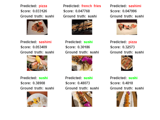
Examples of images in the wrong semantic cluster
Let's take a closer look at the 2D image of the pool5 layer, and zoom in on a few of the misclassified images. |
 |
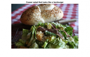
im = imread(imdsTrain.Files{1619});
figure;imshow(im);title('Hamburger that looks like a salad');
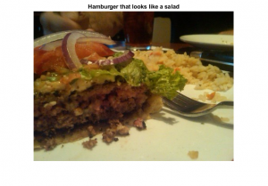 A hamburger in the salad cluster. Unlike other hamburger images, there is a significant amount of salad in the photo and no bread/bun.
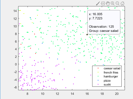
im = imread(imdsTrain.Files{125});
figure;imshow(im);title('Ceaser salad that looks like a hamburger');
. A salad in the hamburger cluster. This may be because the image contains a bun or bread in the background.
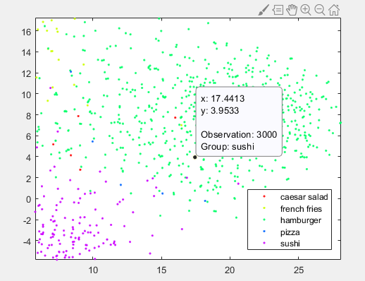
im = imread(imdsTrain.Files{3000});
figure;imshow(im);title('Sushi that looks like a hamburger');


Copyright 2018 The MathWorks, Inc.
Get the MATLAB code
- Category:
- Deep Learning


Comments
To leave a comment, please click here to sign in to your MathWorks Account or create a new one.