
Highlighting Parts of Charts
Highlighting Parts of Charts
Sometimes you would like change how a chart looks in a way which isn’t supported by the implementation of the chart. For example, you might want to change the color of one of the bars in a bar chart to highlight it.
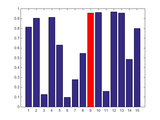
The bar chart currently doesn’t give you a way to do this. One way which immediately comes to mind is to find and modify the object which the bar chart created to represent that single bar. It turns out that doing this by fiddling around with the bar chart’s internals is actually not a great approach. There are a couple of reasons for this. Sometimes the charts are doing something which is trickier than it my seem. For example, if the number of bars gets really large, it might combine some of them for performance reasons. In addition, if the chart redraws, it might overwrite your modifications, and you’ll have to reapply them. Also, the details of a chart’s internals often change when you get a new release of MATLAB.
A better approach to this sort of problem is actually to create two separate charts. We can then give each of the two charts different attributes. Then we can highlight particular data values by partitioning the data between the two charts.
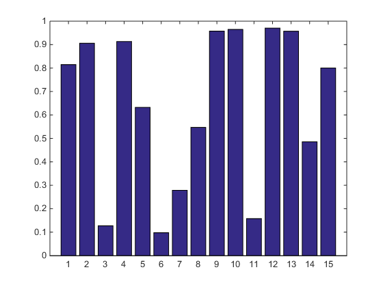
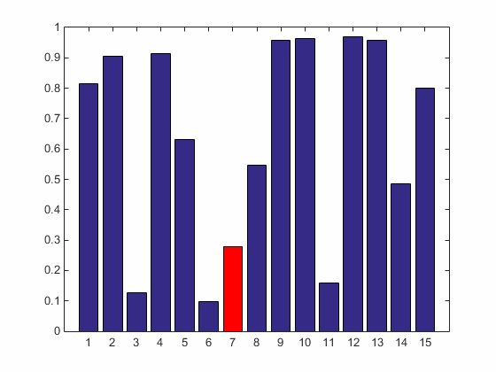
The easiest way to partition the data is to use the fact that the charts ignore any data values which are set to NaN. For example, we can recreate the picture above like this. First we create an array named ydata.
rng(0)
ydata = rand(1,15);
Next we create an array of logicals which is the same size.
sel = false(size(ydata));
We're going to put true into this array anywhere we want a bar to be red.
sel(9) = true;
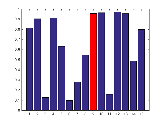
Now we can use that logical array as a "mask" to partition ydata into two copies. One copy has nan where sel is true. The other copy has nan wherever sel if false.
y1 = ydata;
y1(sel) = nan;

y2 = ydata;
y2(~sel) = nan;
Now we can use hold to create two bar charts from these two arrays.
figure
h1 = bar(y1);
hold on
h2 = bar(y2);
At this point, we can change any of the properties on either of the charts to make them look different. For example, to get the picture above, we’d set the FaceColor of the second bar to red.
h2.FaceColor = 'red';
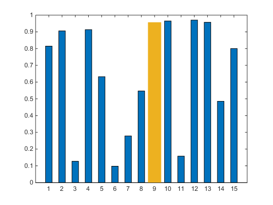
But we could change anything. Maybe you're Auric Goldfinger, and you'd like the highlight to look like a big gold bar.
ax = gca;
h1.FaceColor = ax.ColorOrder(1,:);
h2.FaceColor = ax.ColorOrder(3,:);
h1.BarWidth = .5;
h2.BarWidth = 1;
h2.EdgeColor = 'none';
OK, now that we have that basic trick, let’s go crazy with it. We’ll build a simple interactive app which lets us click on the bars to change which ones are highlighted. To do that, we’ll need to listen for clicks and use that to change the contents of the two arrays.
Here’s a complete implementation.
function highlightable_bar(ydata)
  % An example of how to use two bar charts to highlight
  % selected values.
  %
  % Create 2 bar charts.
  h1 = bar(ydata);
  hold on;
  h2 = bar(nan(size(ydata)));
  hold off;
  % You can set whatever properties you like on each of them to make
  % them look as different as you would like.
  h2.FaceColor = 'red';
  % Add a button down listener to each bar chart
  h1.ButtonDownFcn = @btndwn;
  h2.ButtonDownFcn = @btndwn;
  function btndwn(~,evd)
    % Figure out which bar the user clicked on. The eventdata tells us
    % where the mouse was when the click occurred.
    x = round(evd.IntersectionPoint(1));
    % Create 2 YData arrays from the original one. The first
    % has a nan for the selected bar. The second has nans for
    % all of the other bars.
    sel = false(size(ydata));
    sel(x) = true;
    h1.YData = ydata;
    h1.YData(sel) = nan;
    h2.YData = ydata;
    h2.YData(~sel) = nan;
  end
end
The function btndwn will get called every time one of the bars gets clicked on. When that happens, we create new YData arrays for the two bar charts. We do this by updating the entry in the logical array sel which corresponds to the bar which was clicked on. Let's start clicking!
You can use this same technique with other types of charts. For example, check out this contour plot with major & minor contour lines. You can find out how to create this on the doc page Combining Different Visualizations.

What can you create using this technique?
- 범주:
- Charts,
- Interactivity

