 Cleve’s Corner: Cleve Moler on Mathematics and Computing
 The MATLAB Blog
 Guy on Simulink
 MATLAB Community
 Artificial Intelligence
 Developer Zone
 Stuart’s MATLAB Videos
 Behind the Headlines
 File Exchange Pick of the Week
 Hans on IoT
 Student Lounge
 MATLAB ユーザーコミュニティー
 Startups, Accelerators, & Entrepreneurs
 Autonomous Systems
 Quantitative Finance
 MATLAB Graphics and App Building
Linked Selection
Linked Selection
When we create visualizations of data which have multiple values per data point, we need to use different graphics features to represent the different values. These are called "visual channels". For example, consider the following four charts.
figure('Position',[200 200 760 150]);
co = get(groot,'DefaultAxesColorOrder');
col = co(1,:);
v1 = [9 10 2 8];
v2 = [7 1 3 6];
v3 = [7 2 9 3];
v4 = [1 6 3 8];
v5 = [5 10 8 10];
subplot(1,4,1)
bar(v1,'FaceColor',col)
title('One Value')
subplot(1,4,2)
scatter(v1,v2,'filled')
title('Two Values')
subplot(1,4,3)
scatter(v1,v2,25*v3,'filled')
title('Three Values')
subplot(1,4,4)
scatter(v1,v2,25*v3,v4,'filled')
title('Four Values')
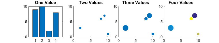
In the first, we're representing a single set of data values using the heights of the bars.
In the second, we're representing two data values using the X & Y coordinates of the points in the scatter chart.
In the third, we're using the size of the bubbles to represent a third data value.
And finally, in the fourth, we're using the colors to represent a fourth data value.
There are a number of different visual channels we can use. Tamara Munzner's wonderful new book "Visualization Analysis & Design" lists these visual channels in decreasing order of effectiveness.
- Position
- Length
- Angle
- Area
- Depth (3D Position)
- Color luminance
- Color saturation
- Curvature
- Volume
Unfortunately we can't mix all of these visual channels in one chart. For example, the human vision system uses size as a depth cue for figuring out how far away objects are. This means that we can't use both the area and the depth channels. In practice, once we get past three or four visual channels, we're probably not really creating an effective visualization.
So what can we do if we have data with more than three of four values? The best answer is usually to combine multiple charts.
clf
subplot(1,5,1)
bar(v1,'FaceColor',col)
title('First Value')
subplot(1,5,2)
bar(v2,'FaceColor',col)
title('Second Value')
subplot(1,5,3)
bar(v3,'FaceColor',col)
title('Third Value')
subplot(1,5,4)
bar(v4,'FaceColor',col)
title('Fourth Value')
subplot(1,5,5)
bar(v5,'FaceColor',col)
title('Fifth Value')
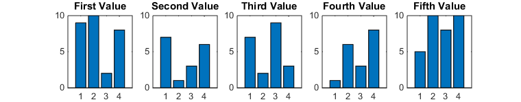
The problem with this approach is that it can be difficult to keep track of the which items in the different charts correspond to the same data point. This can be very challenging when we're looking at a static visualization, but if we create an interactive application we can make it easier to see how multiple charts are related. One of my favorite techniques for this is something called "linked selection". The basic idea is that when you select an item in one chart, the corresponding items get highlighted in the other charts.
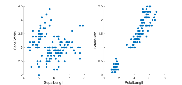
Here's an example. When I drag a rectangle in the scatter chart on the right, I can see that that the data points in the lower left corner of that chart correspond to the ones in the upper left of the other chart.

There's a bit of setup required to link charts like this, but it really isn't hard once you've learned the tricks. Let's walk through how I created that example.
First we'll need some data. This is the famous "Fisher Iris" dataset. If you have the Statistics Toolbox, then you've already got this dataset. Otherwise, you'll have to download it from the net.
if ~exist('fisheriris.mat')
    load fisheriris
else
    txt = urlread('https://archive.ics.uci.edu/ml/machine-learning-databases/iris/iris.data');
    meas = textscan(txt,'%f%f%f%f%s','delimiter',',');
end
Next we'll need 2 axes and 4 scatter charts. Why four? Because we're going to do the highlighting using the technique I described a couple of weeks ago.
close
figure('Position',[500 500 750 350])
a = gobjects(1,2);
s = gobjects(1,2);
h = gobjects(1,2);
for i=1:2
    a(i) = subplot(1,2,i);
    s(i) = scatter(meas{2*i-1},meas{2*i},'filled');
    s(i).PickableParts = 'none';
    s(i).MarkerFaceColor = col;
    hold(a(i),'on');
    h(i) = scatter(nan,nan);
    h(i).PickableParts = 'none';
    h(i).Marker = 'o';
    h(i).SizeData = 50;
    h(i).MarkerFaceColor = 'red';
end

xlabel(a(1),'SepalLength')
ylabel(a(1),'SepalWidth')
xlabel(a(2),'PetalLength')
ylabel(a(2),'PetalWidth')

Now we need to add the interaction part. That starts when we click on an axes, so we'll need to add a Hit event listener to each axes.
addlistener(a(1),'Hit',@(~,evd)mybtndown(a(1),evd,s(1).XData,s(1).YData,s,h));
addlistener(a(2),'Hit',@(~,evd)mybtndown(a(2),evd,s(2).XData,s(2).YData,s,h));
Where mybtndown is the following function.
function mybtndown(ax,~,xdata,ydata,s,h)
  % Start point
  sp = [];
  % Don't let things move while we're selecting
  ax.XLimMode = 'manual';
  ax.YLimMode = 'manual';
  %
  % 1) Create the rectangle
  r = rectangle('Parent',ax);
  %
  % 2) Figure's button motion function updates rectangle and highlight
  fig = ancestor(ax,'figure');
  fig.WindowButtonMotionFcn = @btnmotion;
  function btnmotion(~,~)
    cp = [ax.CurrentPoint(1,1:2)'];
    if isempty(sp)
        sp = cp;
    end
    % Make the rectangle go from sp to cp
    xmin = min([sp(1), cp(1)]);
    xmax = max([sp(1), cp(1)]);
    ymin = min([sp(2), cp(2)]);
    ymax = max([sp(2), cp(2)]);
    r.Position = [xmin, ymin, xmax-xmin, ymax-ymin];
    % Identify all of the data points inside the rectangle
    mask = xdata>=xmin & xdata<=xmax & ydata>=ymin & ydata<=ymax;
    % And highlight them in both charts
    for i=1:length(h)
        h(i).XData = s(i).XData(mask);
        h(i).YData = s(i).YData(mask);
    end
  end
  %
  % 3) Figure's button up function cleans up
  fig.WindowButtonUpFcn = @btnup;
  function btnup(fig,~)
    delete(r);
    ax.XLimMode = 'auto';
    ax.YLimMode = 'auto';
    fig.WindowButtonMotionFcn = '';
    fig.WindowButtonUpFcn = '';
  end
end
This function creates the rectangle which shows what we're selecting, and two callbacks.
The first callback gets called whenever the mouse moves. In this one we update the rectangle, identify all of the data points inside it, and add them to the highlight in both charts.
The second callback gets called when the mouse button is released. This simply puts everything back to the way it started.
Of course you really need to try this out to get a feel for how effective this technique is. You should download this function and try it yourself.
close
figure('Position',[500 500 750 350])
t = table(meas{1},meas{2},meas{3},meas{4});
t.Properties.VariableNames = {'SepalLength','SepalWidth','PetalLength','PetalWidth'};
linked_scatter(t);
- Category:
- Charts,
- Interactivity

