Performance Scaling
Performance Scaling
Graphics performance is a complex and interesting field. It's one my group has been spending a lot of our time working on, especially as we designed MATLAB's new graphics system. Because the new graphics system is multithreaded and splits work between the CPU and the graphics card, you usually need to do quite a bit of exploration to understand why a particular case has the performance characterstics it does. The balance between the different parts of the system is usually more important than any single component.
There are a lot of different ways to explore the performance of a particular case. We’ll visit several of them here in future posts. Today we’re going to look at how the time it takes to create a chart scales with the number of values we’re plotting and the type of chart we’re using. This type of scaling analysis is a great first step in understanding the performance of any software system, and I generally recommend it as the starting point in figuring out a graphics performance issue.
Lets start with a really simple example. We can measure the time it takes to create various size area charts using the following code.
figure
axes
s = round(10.^(1:.25:6));
nt = numel(s);

t = zeros(1,nt);
for i=1:nt
    np = s(i);
    d = rand(1,np);
    cla;
    drawnow;
    tic
    area(d);
    drawnow;
    t(i) = toc;
end
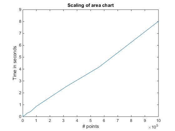
If we plot t, we’ll get something like this:
cla
plot(s,t)
xlabel('# points')
ylabel('Time in seconds')
title('Scaling of area chart')

As you can see, the scaling is roughly linear. That makes sense. As the chart gets larger and more complex, the time it takes to create it gets larger in proportion. When we get all the way to the right side of the chart, we're creating an area chart with a million points, and it takes about 8 seconds.
Now lets look at how different types of charts compare. The following script will do the same sort of measurement for six different types of charts.
figure
axes
s = round(10.^(1:.25:6));
n = numel(s);
funcs = {'area','stem','bar','scatter','stairs','plot'};
results.count = s;
for i=1:numel(funcs)
  t = zeros(1,n);
  for j=1:n
    np = s(j);
    x = 1:np;
    d = rand(1,np);
    cla;
    drawnow;
    f = str2func(funcs{i});
    tic
    f(x,d);
    drawnow;
    t(j) = toc;
  end
  results.(funcs{i}) = t;
end
But I actually used a slightly more complicated version which you can download here.
load r2014b_scaling_results
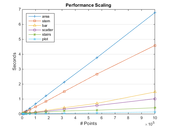
Then we can plot the results like this:
cla
hold on
funcs = {'area','stem','bar','scatter','stairs','plot'};
m = {'+','s','^','o','*','p'};
for ix=1:numel(funcs)
    f = funcs{ix};
    x = results.count;
    y = results.(f);
    plot(x,y,'DisplayName',f,'Marker',m{ix})
end
legend('show','Location','NorthWest');

set(gca,'YGrid','on')
xlabel('# Points')
ylabel('Seconds')
title('Performance Scaling')

As you can see, the area chart we looked at first is actually the slowest of the bunch, while the line plot which is created by the plot command is the fastest.
If you're following closely, you might have noticed that this chart didn't get exactly the same number for the million point area chart. That's because the script I used in this case does multiple runs and then uses the median value of the times. This is usually a good idea. You'll see small variations in run times depending on where things are in memory and what other processes are running on your computer.
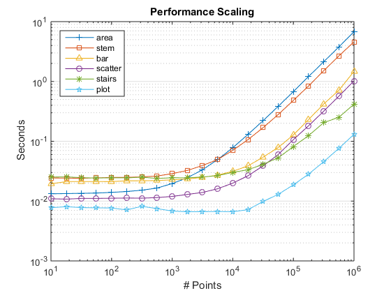
And if you look really, really closely, you might notice that something interesting is happening down there in the lower left corner. A good way to get a better look at it is to switch our XScale and YScale properties to log.
That gives us something like this:
set(gca,'XScale','log','YScale','log')

Now we can see a number of interesting things.
As we saw earlier, area is the slowest when N is very large, but when N is small it is actually faster than bar, stem, and stairs. It scales differently from the others because of the big polygon it creates.
For a small number of points, bar and stem are very similar in performance, but bar pulls ahead when the number of points gets large. The performance scaling of stem actually involves interactions between the threads in the new multithreaded graphics system. This is a very interesting area that we'll be looking at in an upcoming post.
Also notice that all of the curves are flat on the left side. That's because it costs a certain amount to create the chart and initialize the axes regardless of how large or small the chart is. We refer to that as "startup cost".
It's also interesting to compare scaling in different versions of MATLAB. Here is the same chart for R2014a.

As you know, there were a lot of changes to the graphics system in R2014b. Performance scaling was one of the things we worked on improving with the new graphics system. As you can see, we did eliminate the really nasty cases. In R2014a, area and scatter behaved very badly when the amount of data got large. In fact, I locked up my computer trying to get the R2014a number for area at 1,000,000 points! The bad scaling of the old version of area was an artifact of how it handed that large polygon off to the patch object.
We also improved the scaling of bar charts by quite a bit.
On the other hand, the scaling of stem and stairs got a bit worse. You can also see that startup costs have increased a bit in R2014b. We're still working on improving that. In the meantime, there are some workarounds you can use to minimize the impact of startup costs. We'll also talk about those in a future post.
- Category:
- Performance


