Debunking Bad News Analysis with MATLAB
With spring comes the tax filing deadline. This post is also about taxes. I'd like to introduce this week's guest blogger, Toshi Takeuchi. Toshi analyzes web data and runs online ad campaigns here at MathWorks.
Hi, I am Toshi. I am a big fan of Nate Silver who made analyzing data very cool and mainstream. Because I analyze data a lot, it bugs me when I see questionable analyses passed around in the news media.
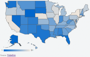
So when I saw this CNBC post on Google+, my “bogus data analysis” radar started sending high alerts.
This map shows you the ranking of states based on average tax amount, adjusted to the cost of living index. Let me pretend some data journalism here.
Contents
What’s wrong with that?
Well, I happen to think that the tax amount is correlated more directly to income, rather than cost of living. The average tax amount should be higher if you live in a state with high median income. Cost of living may be also higher in those states, but that's a secondary effect.
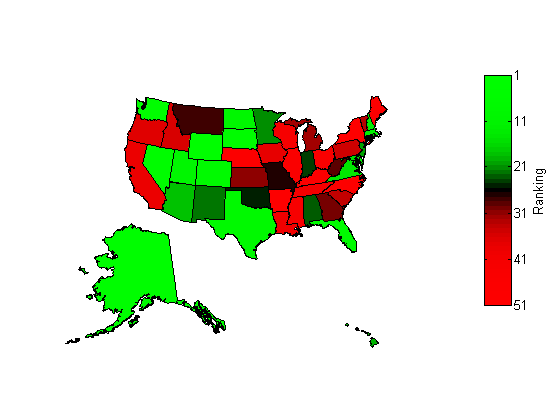
In order to understand the true picture, you actually need to think in terms of tax to income ratio instead. This is what you get when you use this metric.

You can see that the color shifted in a number of states if you compare the first map and the second map. Massachusetts, where I live, actually looks pretty good; so are states in Mid-Atlantic region, while they were red in the first map. On the other hand, the color flips in the other direction in some Gulf Coast states in the South.
If you believed in the original analysis and moved from Massachusetts to one of those states, then your taxes may go down, but your income may also go down even more. Not a good move, IMHO.
% Disclaimer: don't trust my analysis, either - I only did it for
% debunking the original story; it is not meant as a robust analysis.
% Please don't plan your relocation based on this analysis, just in case.
Data analysis is easy with MATLAB
If you are interested in playing a data journalist, this type of analysis is fairly easy with MATLAB.
All I had to do was to download the median income dataset from the Census Bureau website and merge two datasets with the newly introduced table (available in MATLAB since R2013b). I also used Mapping Toolbox to visualize the data.
Import data
First, I went to the data sources to get the data. You can use Excel to import HTML tables into a spreadsheet directly. Census data is also available in Excel format. To match the time period with the original analysis, I used
Historical (1984 to 2012):
Median Household Income by State - Single-Year Estimates [XLS - 98k]
Data sources
% load data from files into tables
Tax = readtable('bestWorstStateTax.csv');
Income = readtable('medianIncome.csv');

% inspect the content
disp Tax
disp(Tax(1:5,:))
disp Income
disp(Income(1:5,:))
Tax
    Rank        State         AvgAnnualStateLocalTaxes
    ____    ______________    ________________________
    1       'Wyoming'         2365
    2       'Alaska'          2791
    3       'Nevada'          3370
    4       'Florida'         3648
    5       'South Dakota'    3766

    PercentDiffFromNationalAvg    AdjRankCostOfLivingIdx
    __________________________    ______________________
    -0.66                         1
    -0.66                         4
    -0.52                         2
    -0.48                         3
    -0.46                         5
Income
       State        MedianIncome    StandardError
    ____________    ____________    _____________
    'Alabama'       43464           2529.4
    'Alaska'        63648           2839.1
    'Arizona'       47044           2921.7
    'Arkansas'      39018           2811.5
    'California'    57020           1237.5
Merge the tables
Now we have two tables in the workspace, and you can also see that each column has a header and can contain a different data type. Both tables contains the same column called "State" containing the text string of state names. We can use that as the key to join those two tables. We don't need all the columns for this analysis, so I will join just the columns I need.
% |table| is smart - it automatically uses that "State" column as the key.
% Just using |State| and |AvgAnnualStteLocalTaxes| and |State| and
% |MedianIncome|.
T1 = join(Tax(:,2:3),Income(:,1:2));
% rename columns
T1.Properties.VariableNames = {'State','Tax','Income'};

% compute tax to income ratio
T1.Ratio = T1.Tax./T1.Income;
% create a new table ranked by tax to income ratio
T2 = sortrows(T1,{'Ratio'});

% inspect the new table
disp T2
disp(T2(1:5,:))
T2
        State         Tax     Income     Ratio
    ______________    ____    ______    ________
    'Wyoming'         2365    57512     0.041122
    'Alaska'          2791    63648     0.043851
    'Washington'      3823    62187     0.061476
    'Nevada'          3370    47333     0.071197
    'South Dakota'    3766    49415     0.076212
Compare two rankings - Top 20
Check whether the new metric produced any meaningful differences.
disp('Top 20')
disp('By Avg. Tax               By Avg. Ratio')
disp([T1.State(1:20) T2.State(1:20)])
Top 20
By Avg. Tax               By Avg. Ratio
    'Wyoming'          'Wyoming'
    'Alaska'           'Alaska'
    'Nevada'           'Washington'
    'Florida'          'Nevada'
    'South Dakota'     'South Dakota'
    'Washington'       'Florida'
    'Texas'            'Colorado'
    'Delaware'         'Texas'
    'North Dakota'     'North Dakota'
    'Colorado'         'Utah'
    'New Mexico'       'Delaware'
    'Alabama'          'Massachusetts'
    'Arizona'          'New Hampshire'
    'Utah'             'Virginia'
    'Mississippi'      'Maryland'
    'Indiana'          'District of Columbia'
    'Louisiana'        'Rhode Island'
    'West Virginia'    'Arizona'
    'Montana'          'Hawaii'
    'Oklahoma'         'New Jersey'
Prepare a new map
Now we will start using the functions from Mapping Toolbox. First we will assemble the required pieces of data to prepare a map.
Note: I also used Bioinformatic Toolbox function redgreencmap to create the colormap to go from green to red to mirror the scheme in the original map. If you don't have this toolbox, you can easily create a custom map in MATLAB. Colormaps are arrays of RGB values (triplets) in the range from 0 to 1.
% get the US geography data as a structure array
states = shaperead('usastatelo', 'UseGeoCoords', true);

% Get the state names as a cell array of strings.
names = {states.Name};

% This is a vector that the stores ranking of each state.
ranking = zeros(length(names),1);
for i=1:length(names)
    ranking(i)=find(strcmpi(names(i),T2.State));
end

% Create a colormap that goes from green to red in 51 steps.
colors = redgreencmap(length(ranking));

% Sort colors by state ranking.
stateColors = colors(ranking,:);

% Separate Hawaii and Alaska from the Continental US.
indexHawaii = strcmp('Hawaii',names);
indexAlaska = strcmp('Alaska',names);
indexConus = 1:numel(states);
indexConus(indexHawaii|indexAlaska) = [];
Plot the new map.
Now we are ready to draw the map.
% This creates a figure with axes of US geography.
% It contains three axes - Continental  US, Alaska and Hawaii.
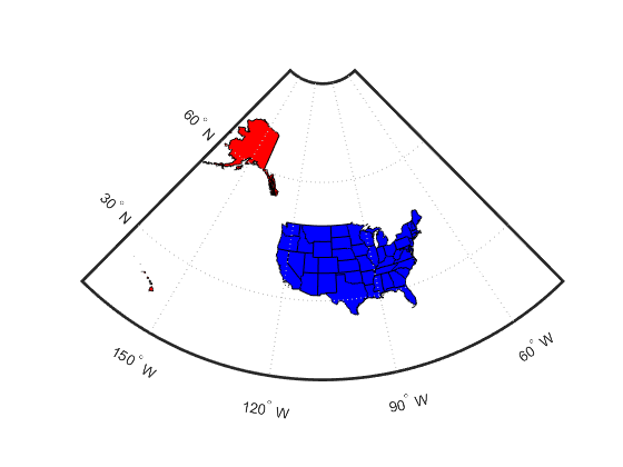
figure; ax = usamap('all');

% We don't need the axes, so turn them off.
set(ax, 'Visible', 'off')

% Draw the states with specified color within the Continental US.
for j = 1:length(indexConus)
    geoshow(ax(1), states(indexConus(j)),'FaceColor',stateColors(indexConus(j),:))
end

% Now do the same for Alaska and Hawaii.
geoshow(ax(2), states(indexAlaska),'FaceColor',stateColors(indexAlaska,:))
geoshow(ax(3), states(indexHawaii),'FaceColor',stateColors(indexHawaii,:))

% We don't need geographical details, so turn them off for each axes.
for k = 1:3
    setm(ax(k), 'Frame', 'off', 'Grid', 'off',...
      'ParallelLabel', 'off', 'MeridianLabel', 'off')
end

% Add a colorbar.
colormap(flipud(colors))
c= colorbar('YTickLabel',...
    {'51','41',...
     '31','21','11','1'});
ylabel(c,'Ranking')

Download the data
You can download the data files from these links:
Use MATLAB to Fight the Noise
Did you enjoy seeing how to use MATLAB for debunking some bad news analysis? Would you like to try? Perhaps you already do this yourself. Tell us know about it here.


コメント
コメントを残すには、ここ をクリックして MathWorks アカウントにサインインするか新しい MathWorks アカウントを作成します。