Automating the extraction of real data from an image of the data – part 1
I'd like to welcome back my fellow MATLAB Central blogger Brett Shoelson for the first in a three-part series on extracting curve values from a plot. You can find Brett over at the File Exchange Pick of the Week blog, or you can check out his many File Exchange contributions. -Steve
In my role as an application engineer, I frequently have the opportunity to help customers with their image processing-related problems. In fact, this is one of the aspects of my job that I enjoy the most; each customer's image poses unique--and sometimes difficult--challenges. I get to help solve them, and move on to other things.
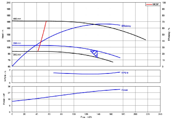
Recently, a customer shared with me an image of a chart showing, among other things, the efficiency of a pump as a function of flow rate. He asked if I could help him automate the extraction of real data from this chart; he has to do this over and over, and is currently following a very manual workflow--clicking along the desired curve and recording the positions of his mouseclicks. If you're ever faced with a similar challenge and you can find a way to get the original data from which the chart was created, that's not only significantly easier, but less noisy than extracting the data from an image. But in this case, the original efficiency-versus-flow data were not available, and the customer had no alternative.
Contents
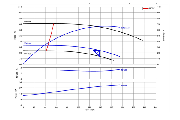
Here's the original image as the customer shared it
url = 'https://blogs.mathworks.com/images/steve/2013/example-pump-perf-curve.jpg';
chart = imread(url);
imshow(chart)
The consistent features
There are three axes in this image. In the top-most of the axes (which is also the largest), there are curves representing both "Head" (in m) and "Efficiency" (in percent) versus flow rate (m^3/h). (The efficiency is labeled on the right side of the top axis.) The customer was interested only in the data reflected by the "efficiency" curve, as labeled in the image.
What information can we rely on from chart to chart? After asking a few questions, I learned that the efficiency curve always starts in the lower left corner of the top axis. Moreover, the axes and curves in this graph are similar--in form, shape, and color--to the corresponding curves in the many other graphs from which he needs to extract these data. (Otherwise, automating this data extraction would be impossible, and we'd have to try for a more "semi-automated" approach to facilitate manual analyses.)
Take a moment to think about the problem
I like to make the point that solutions to image processing problems are typically non-unique. Your own approach may be different--perhaps radically so--from my own. In fact, I often reflect on problems that I've already solved, and realize that I might solve it differently if I were to face it again.
Before you read my solution, take a moment to look at the customer's image and think about how you would approach the problem. When I'm done sharing my workflow, I will encourage you to comment on it, or even to improve upon it. That way, we can learn from each other!
My solution, in three parts
I'm going to step through the steps I took to automate this data-extraction process. This was somewhat tricky, so to keep this blog post from being too long, I'm going to break it up into three parts:
- In the first part, I'll isolate the axes that contains the efficiency curve, and then begin to isolate the two blue curves within that axes.
- In the second post, I'll segment the remaining curves, and process them to isolate only the curve of interest.
- Finally, in post three, I'll extract the x-y- coordinates of the efficiency curve, and create a custom "fit object" that will allow me to automate the determination of efficiency versus flow rate. Along the way, I'll share my thoughts about this process.
Boosting the "SNR"
The information we're after (the "signal") is represented graphically in the "Efficiency" curve in the top axes. The rest of the curves are just "noise" here, and our initial task is to ascertain how to discard all of those noise sources, while keeping the signal intact.
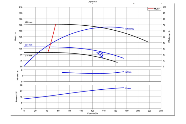
Recognize that each axis in the original image is delineated by a black border (though that's difficult to see here, with the screen capture). With little effort, we can convert those black borders to white; that will allow us to create masks of each axis, and to select (or discard) specific ones.
imshow(chart)
title('Original RGB')
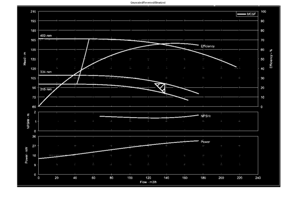
Let's create a reversed, binary version of the original; this will cast the black borders to white:
bw = im2bw(imcomplement(rgb2gray(chart))); % I combined some steps here
imshow(bw)
title('Grayscaled/Reversed/Binarized')
Now that the axes are bordered in white, we can fill the image regions to create solid regions of interest:
filled = imfill(bw,'holes');
imshow(filled)
title('All Regions Filled')
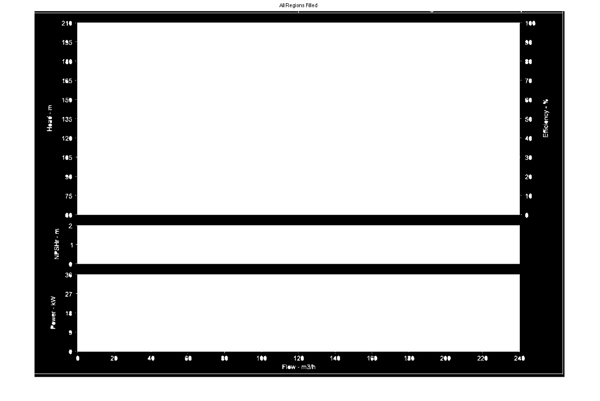
Since I know that the axis I want to keep is the largest one. I can use that information to create a mask that will be useful for discarding a lot of the noise in the original image:
cc = bwconncomp(filled);
stats = regionprops(cc,'Area');
A = [stats.Area];
[~,biggest] = max(A);
filled(labelmatrix(cc)~=biggest) = 0;
imshow(filled);
title('Axis mask')
bb = regionprops(filled,'BoundingBox'); %We'll use this later!
bb = bb.BoundingBox;
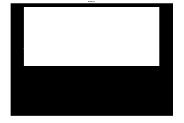
(Note that the selection of the region [axes] of interest [axes 4, bottom right] was achieved simply by applying a logical constraint, and that I could easily have elected to use any combination of logical conditions to select the desired axes. For instance, I could have calculated both areas and centroids of the "blobs" in the "All-Regions-Filled" black and white image. Then I could have picked the region that is larger than a threshold area value, and that has a y-centroid above those of the other axes.)
Masking the original color image
Now we can use this mask to pare the original color image, plane-by-plane:
chart(~repmat(filled,[1 1 3])) = 0;
imshow(chart)
title('Masked RGB Original')
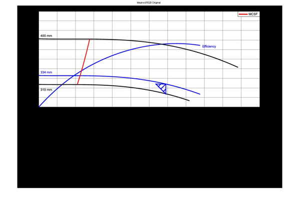
We've now discarded a lot of the noise, but the difficult part remains. Unfortunately, several non-interest curves intersect the curve we need. Even more unfortunately, one of those curves is the same color as the curve of interest! But perhaps we can continue along the path of noise reduction by exploring and using the color information in the image; it's possible that something in a grayscale representation of the image (rgb2gray, or individual red, green, or blue colorplanes) could be useful here. To explore that possibility, I like to use ExploreRGB.
ExploreRGB(chart)

Nothing that's immediately obvious jumps out at me that will make the selection of the efficiency curve any easier. But let's click on the "Advanced-Mode" toolbar button (upper left) to explore different colorspace representations:

Now, by studying the "blue chrominance image" (in the 4th row, 2nd column), we can see that the blue curves can readily differentiated from non-blue curves simply by changing colorspaces.
(Recognize that I could simply click on the blue-chrominance image, and then right-click to export that image to the base workspace, but I'll show the equivalent code here:) Convert to YCbCr, extract blue chrominance image:
curveOfInterest = rgb2ycbcr(chart);
curveOfInterest = curveOfInterest(:,:,2);
imshow(curveOfInterest);
title('Cb/masked');

By the way, I didn't have to create handles to the subplot axes (ax(1)--ax(4), above). But doing so allows me to use expandAxes, which conveniently lets me click on any of those axes to expand it to full screen, and then to right-click to export the image it contains to my MATLAB workspace.
Done...for now.
Let's stop there. Next week, we'll resume the problem and isolate only the efficiency curve. (That, it turns out, is the most difficult part of this problem!)




Comments
To leave a comment, please click here to sign in to your MathWorks Account or create a new one.