That Tooltip Looks Familiar
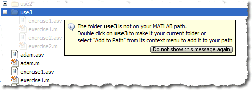
Here’s a bit of desktop trivia for ya…. In R2010a we introduced a Current Folder visualization that dims out files not on the path. If you hover your mouse over one of these files, you’ll see a yellow tooltip with an information icon, some text, and a button:

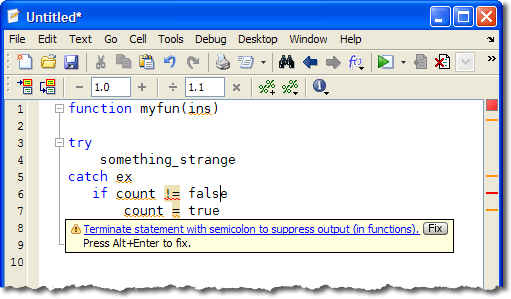
Does this window look familiar to you? It should, it’s quite similar to the one we introduced with extended M-Lint messages back in R2009a. Here we’ve got a yellow box, an icon, a message, a little gray button:

For the current folder browser, we were able to make use of the work already done, in order to provide information about the path, in a way that is more use-friendly than a basic text tooltip. We’re planning on using it in a few more places, but we’re not going to do it for everything, since this kind of tooltip feels bulkier than the regular “what is this button?” type.
Have you found this information useful, or have you already disabled the message by clicking on the “do not show me this again” button?


댓글
댓글을 남기려면 링크 를 클릭하여 MathWorks 계정에 로그인하거나 계정을 새로 만드십시오.