Data Visualization in the Opening Ceremony of the Rio 2016 Olympics

Rio de Janeiro – Opening ceremony of the 2016 Olympic Games in Maracanã Stadium. Image credit: Fernando Frazão/Agency Brazil. Shared under Creative Commons license.
The opening ceremony of the Rio 2016 Olympics was a spectacle designed to showcase the history and culture of Brazil.
The host nation also used it as an opportunity to highlight the dangers the world faces due to climate change. This video section of the ceremony, watched by nearly 3.3 billion, made people worldwide stop and think about the impact our actions are having on our planet.
It began with narration saying, “The heat is melting the icecap. It’s disappearing very quickly.” It included animations from NASA showing projected flooding of coastal cities, including Rio de Jainero. It was a daring move intended to get people talking.
Here’s an expert from Marshall Shepherd’s Forbes article, Why The Rio Olympics And Leonardo DiCaprio Get Your Attention On Climate Change:
If you watched the Opening Ceremony of the Rio Olympics Friday evening, social media was buzzing about the bold inclusion of a segment on climate change. The segment highlighted the perils of sea level rise on vulnerable nations and cities and also showed Ed Hawkins’ compelling visual spiral indicating global warming. I also noticed more activity on my social media platforms from people that normally do not talk about the topic. The overwhelming comments where things like “wow, that was a wake up call” or “that really stimulated a conversation with my kids.”
The Climate Change Spiral
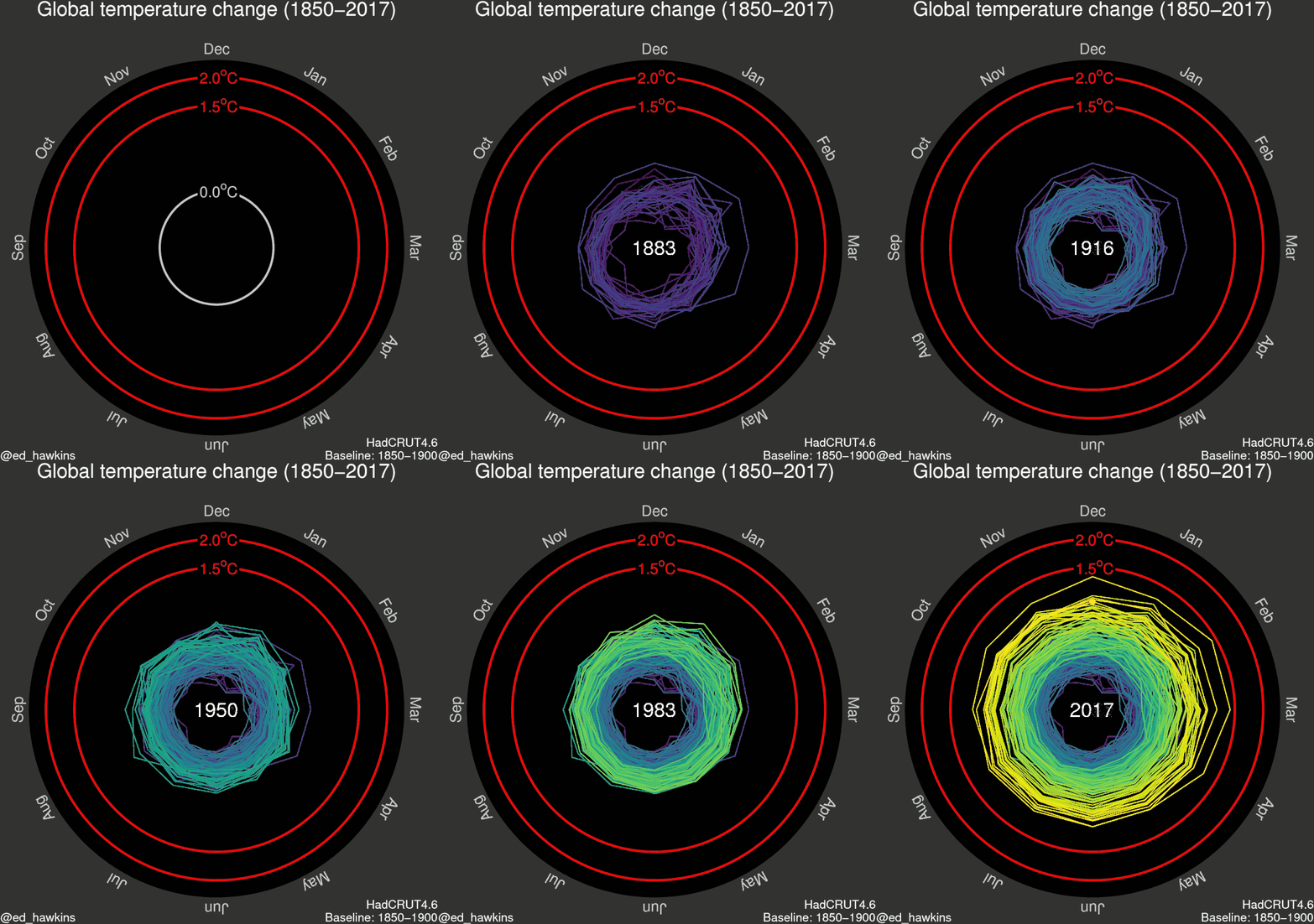
Dr. Ed Hawkins’ global warming spiral shows the extent of global temperature increase from 1850 to the present. It eloquently depicts how dangerously close we are to a 2-degree Celsius increase in global temperature since pre-industrial days.
For the original gif, I wanted to try and visualise changes in global temperatures in different ways to learn about how we might improve our communication. The spiral presents the information in a straightforward way which appears to resonate with people.
The pace of change is immediately obvious, especially over the past few decades. The relationship between current global temperatures and the internationally discussed target limits are also clear without much complex interpretation needed.
The colours represent time. Purple for early years, through blue, green to yellow for most recent years. The colour scale used is called ‘viridis’ and the graphics were made in MATLAB. – Dr. Ed Hawkins.
Dr. Hawkins, a climate scientist at the University of Reading, launched his blog The Climate Lab Book as a tool to foster discussion among climate scientists. He explains why data visualization is critical:
My research focuses on understanding climate variability and change. My blog is a forum for open discussion of many different climate science topics, especially where the communication of the issues is potentially controversial or liable to misinterpretation. I use MATLAB for data analysis because it can handle the very large datasets produced in climate science.
The blog has had helpful discussions about many aspects of climate change science, but also visualisation, such as our #endrainbow campaign to reduce the use of rainbow colour schemes, such as jet. Obviously, MATLAB has made a step forward by switching the default colour scheme to parula.
This particular form of data visualization has proven exceptionally popular, even before it appeared in the Opening ceremony. The animated GIF was first seen in a CNN article, 2016 to be hottest year yet as April smashes records. The original GIF has been retweeted over 15,000 times. Adding the Olympic rings to the upper right hand corner may just be the trick needed to increase that number even further!


评论
要发表评论,请点击 此处 登录到您的 MathWorks 帐户或创建一个新帐户。