 Cleve’s Corner: Cleve Moler on Mathematics and Computing
 The MATLAB Blog
 Guy on Simulink
 MATLAB Community
 Artificial Intelligence
 Developer Zone
 Stuart’s MATLAB Videos
 Behind the Headlines
 File Exchange Pick of the Week
 Hans on IoT
 Student Lounge
 MATLAB ユーザーコミュニティー
 Startups, Accelerators, & Entrepreneurs
 Autonomous Systems
 Quantitative Finance
 MATLAB Graphics and App Building
All-time heat records set around the globe last week: Some great climate visuals
Phew… that was hot!
Last week was more than warm here in the Northeast. Meteorologists called the phenomena an oppressive heat dome. We weren’t alone in our suffering. In fact, much of the globe was in record-setting territory.
- Montreal set an all-time record high of 36.6 C (97.9 degrees ) on July 2nd, breaking the previous record set 147 years earlier.
- In Tbilisi, Georgia, the capital city soared to 40.5 C (104.9 degrees) on July 2, its all-time record.
- On July 6, a city in Algeria soared to 51.3 C (124.3 degrees), the highest temperature ever measured on the African content.
Visualizing Climate Data
Just how warm was it around the globe last week? The map below shows a simulation of the maximum temperatures on July 3. This forecast map is from Climate Reanalyzer, a data visualization website created by Dr. Sean Birkel at the Climate Change Institute, University of Maine. Although this and other graphics on the site are made in NCL, all image colormaps are designed using the MATLAB Colormap Editor.
If you’d like to see the data in an interactive format, click here.

Simulation of maximum temperatures on July 3 from American (GFS) weather model at two meters above the ground. Image credit: Climate Change Institute, University of Maine, USA.
This map shows the temperatures on a single day. But what if you wanted to see the temperature trends over many decades?
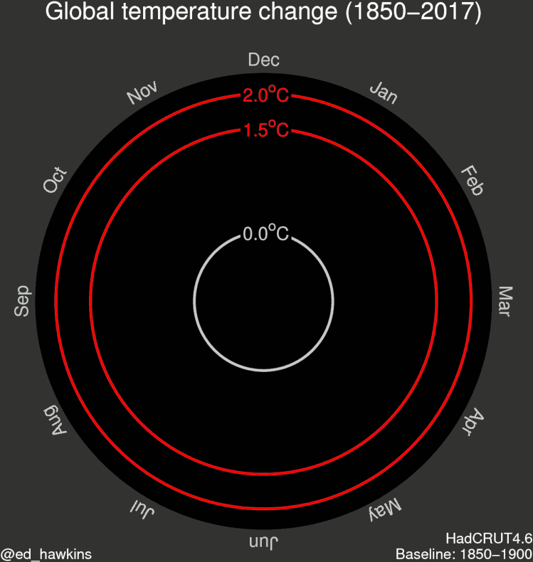
In 2016, Professor Ed Hawkins, a climate scientist at the University of Reading, tweeted the climate spiral, an animation that showed global temperatures from 1850 through 2016. That Tweet has been viewed over 3 million times and was also featured in the opening ceremony of the Rio 2016 Olympics.
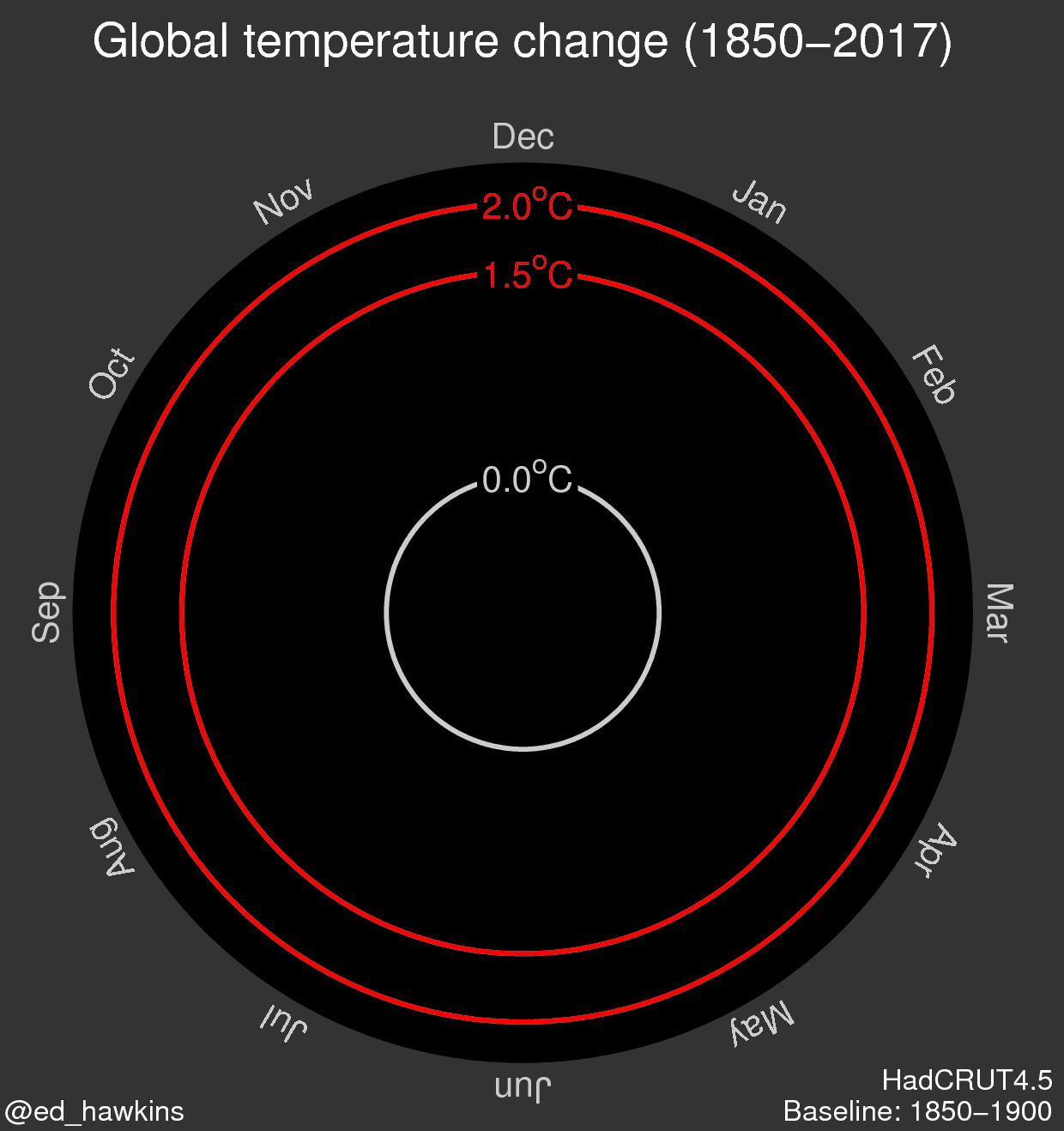
Image credit: Dr. Ed Hawkins, @ed_hawkins, from The Climate Lab Book.
#MetsUnite for the Summer Solstice
This year, Professor Hawkins created a new set of climate visualizations: Warming Stripes. These show the long-term rise in temperatures for both global data and particular locations, with each stripe representing a single year. The visualizations are discussed in his blog, the Climate Lab Book.
In a surprising twist, this pattern was seen around the globe on June 21st, the first day of summer. Over 100 meteorologists used the pattern to highlight climate change. The pattern was on their coffee mugs, ties, or necklaces. According to The Washington Post, “International participants include meteorologists in Canada, Belgium, Italy, United Kingdom, Germany and South Africa.”
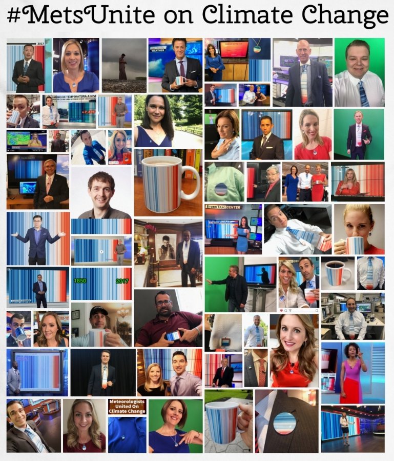
#MetsUnite on the first day of summer. Image credit: @WeatherProf
The pattern has 123 stripes, each showing the global temperature for the last 123 years, from left to right. The pattern highlights the fact that the last four years were the warmest on record, and 17 of the 18 warmest years have occurred since 2001.
Meteorologist Jeff Berardelli of Miami was the driving force behind the #MetsUnite movement. With the help of Climate Central, a nonprofit climate-change communication firm that conducts outreach to meteorologists, Beradelli organized the meteorologists to draw attention to the data. “It struck me as an opportunity to communicate climate change in the simplest way possible,” he told The Washington Post


댓글
댓글을 남기려면 링크 를 클릭하여 MathWorks 계정에 로그인하거나 계정을 새로 만드십시오.