Fighting Crime with Predictive Policing
I recently noticed that there is a Kaggle competition titled San Francisco Crime Classification which asks you to predict the category of crimes that occurred in San Franciso from 1/1/2003 to 5/13/2015 in theSFPD Crime Incident Reporting system. The goal of the competition is to predict the category of crime that occurred based on time and location.
This reminded me of the movie Minority Report in which a special unit of police arrests people before they commit crimes, but that’s SciFi. A more realistic approach is to deter crime by analyzing the past data to predict when and where crimes take place and deploy law enforcement resources to such hot spots. This approach is known as predictive policing.

Let’s take a look at the SFPD data to see what we can learn from it. This has nothing to do with the goal of the competition, but Kaggle is ” also encouraging you to explore the dataset visually “. So why not?
Contents
The SFPD Crime Incident Report Data
You need to first download the zipped data files from Kaggle website, unzip and place them into your current folder. Let’s load the data see what attributes are included.
T = readtable('train.csv','Format','%D%C%q%C%C%q%q%f%f');   % load data from csv
week = {'Sunday','Monday','Tuesday','Wednesday', ...        % define order
    'Thursday','Friday','Saturday'};
T.(4) = reordercats(T.(4), week);                           % reorder categories
T.(6) = categorical(T.(6));                                 % convert to categorical
T.Properties.VariableNames                                  % show variable names
ans =
  Columns 1 through 5
    'Dates'    'Category'    'Descript'    'DayOfWeek'    'PdDistrict'
  Columns 6 through 9
    'Resolution'    'Address'    'X'    'Y'
Let’s also add a new column to assign dates to specific weekly internvals for time series analysis.
t = datetime('2003-1-5') + days(0:7:4515);                  % weekly date intervals
weeks = NaT(size(T.Dates));                                 % empty datetime array
for i = 1:length(t) - 1                                     % loop over weekly intervals
    weeks(T.Dates >= t(i) & T.Dates < t(i+1)) = t(i);       % dates to weekly intervals
end
T.Week = weeks;                                             % add weekly intervals
Now let’s see what is included in ‘Category’. There are 38 categories of crime and non-crime incidents, such as ARSON, ASSAULT, and BAD CHECKS, but which ones should we focus on?
T.Category = mergecats(T.Category,{'TRESPASS','TREA'});     % merge mislabeled categories
tab = tabulate(T.Category);                                 % tabulate categories
[Count, idx] = sort(cell2mat(tab(:,2)),'descend');          % sort by category total
figure                                                      % new figure
bar(Count)                                                  % plot bar chart
ax = gca;                                                   % get current axes handle
ax.XTick = 1:size(tab, 1);                                  % use categories as tick
ax.XTickLabel = tab(idx,1);                                 % rename tick labels
ax.XTickLabelRotation = -90;                                % rotate text vertically

Broken Windows Theory
This theory, embraced by New York City Police Commissioner (then NYPD Chief) William Bratton in the 1990s, says that leaving broken windows unrepaired leads to more vandalism and greater social disorder in the neighborhood, because it signals that no one cares there. Up to that pointhe NYPD focused on solving serious crimes. However, the theory suggested that cracking down on petty crimes might lead to reduction in more serious ones. While New York saw a drop in the crime rate under Bratton, this theory is not without critics because it also led to the controversial stop and frisk practice.
Perhaps this theory provides one starting point for our exploration. Does the SFPD data show a correlation between a petty crime like vandalism and other more serious crimes? Let’s start with bivariate histogram using histogram2 to plot the vandalism incidents by location. Check sfcrime_load_map.m to see how you retrieve a raster map from Web Map Service.
sfcrime_load_map                                            % load map from WMS
vandalism = T(T.Category == 'VANDALISM', [1,3:5,8:10]);     % subset T by category
nbins = 100;                                                % number of bins
xbinedges = linspace(lim.lon(1),lim.lon(2),nbins);          % x bin edges
ybinedges = linspace(lim.lat(1),lim.lat(2),nbins);          % y bin edges
map = flipud(A);                                            % flip image
figure                                                      % new figure
colormap cool                                               % set colormap
histogram2(vandalism.X, vandalism.Y, ...                    % plot 3D bivariate
    xbinedges, ybinedges, ...                               % histogram
    'FaceColor', 'flat', ...
    'FaceAlpha', 0.5, 'EdgeAlpha', 0.5)
hold on                                                     % don't overwrite
image(lim.lon,lim.lat,map)                                  % add the map
hold off                                                    % restore default
ax = gca;                                                   % get current axes handle
ax.CLim = [0 100];                                          % color axis scaling
title({'San Francisco Crime Map'; ...                       % add title
    'Vandalism: Jan 2003 - May 2015'})
zlabel('Count of Police Reports')                           % add axis label
text(-122.52,37.82, 300, 'Golden Gate Bridge')              % annotate landmark
text(-122.4,37.82, 200, 'Bay Bridge')                       % annotate landmark

You can see that those incidents are highly concentrated in several hot spots indicated by the tall magenta bars. There is one particularly tall bar that sticks high above the rest. Where is it? We can plot the top 50 locations of high vandalism incidents with the highest spot marked as “#1”. Check sfcrime_draw_locs.m to see the details.
figure                                                      % new figure
usamap(lim.lat, lim.lon);                                   % set map coordinates
geoshow(A, R)                                               % display map
sfcrime_draw_locs(vandalism,lim.lat,lim.lon,nbins,50,'m')   % draw top 50 locations
title({'Vandalism: Jan 2013 - May 2015';'Top 50 Locations'})% add title

Crime Heat Map
If we process other categories of crime with the same grid, we can create a matrix of crimes by location and we can plot it as a heat map with imagesc to make comparison easier.
Bright horizontal stripes indicate a location where different types of crimes are committed. There is one particularly bright stripe with ASSAULT, DRUG/NARCOTIC, LARCENY/THEFT, NON-CRIMINAL, OTHER OFFENSES, and WARRANTS. ROBBERY, SUSPICIOUS OCC, and VANDALISM also appear in a lighter shade.
If you look at LARCENY/THEFT, it doesn’t necessarily form rows of stripes everywhere it is bright. If you are going to steal, it may be worthwhile to go to places you find high value targets.
cats = categories(T.Category);                              % extract categories
rawCounts = zeros((nbins-1)^2,length(cats));                % set up an accumulator
for i = 1:length(cats)                                      % loop over categories
    data = T(T.Category == cats{i}, 8:9);                   % subset T by category
    [N,~,~] = histcounts2(data.X, data.Y, ...               % get bivariate histogram
        xbinedges, ybinedges);                              % bin counts
    rawCounts(:,i) = N(:);                                  % add to accumulator
end                                                         % as a vector

figure                                                      % new figure
imagesc(rawCounts)                                          % plot matrix as an image
ax = gca;                                                   % get current axes handle
ax.CLim = [0 200];                                          % color axis scaling
ax.XTick = 1:length(cats);                                  % use categories as tick
ax.XTickLabel = cats;                                       % rename tick labels
ax.XTickLabelRotation = -90;                                % rotate text vertically
ylabel('Locations')                                         % add axis label
title('SF Crime Heat Map by Location')                      % add title
colorbar                                                    % add colorbar

Principal Components Analysis
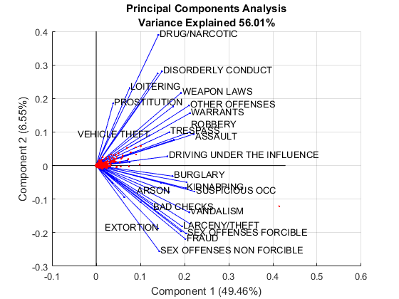
We can use Principal Component Analysis uisng pca to get a better sense of the relationship among different categories and visualize the result with biplot. We need to use weighted PCA to address the big scale differences among categories. We also need to hide some categories as the output will be too cluttered if we try to display all 38 of them.
w = 1 ./ var(rawCounts);                                    % inverse variable variances
[wcoeff, score, latent, tsquared, explained] = ...          % weighted PCA with w
    pca(rawCounts, 'VariableWeights', w);
coefforth = diag(sqrt(w)) * wcoeff;                         % turn wcoeff to orthonormal
labels = cats;                                              % categories as labels
labels([4,9,10,12,13,15,18,20,21,23,25,27,28,31,32]) = {''};% drop some labels to avoid clutter
figure                                                      % new figure
biplot(coefforth(:,1:2), 'Scores', score(:,1:2), ...        % 2D biplot with the first two comps
    'VarLabels', labels)
xlabel(sprintf('Component 1 (%.2f%%)', explained(1)))       % add variance explained to x axis label
ylabel(sprintf('Component 2 (%.2f%%)', explained(2)))       % add variance explained to y axis label
axis([-0.1 0.6 -0.3 0.4]);                                  % define axis limits
title({'Principal Components Analysis'; ...                 % add title
    sprintf('Variance Explained %.2f%%',sum(explained(1:2)))})
htext = findobj(gca,'String','VEHICLE THEFT');              % find text object
htext.HorizontalAlignment = 'right';                        % change text alignment
htext = findobj(gca,'String','ASSAULT');                    % find text object
htext.Position = [0.2235 0.0909 0];                         % move label position
htext = findobj(gca,'String','ROBBERY');                    % find text object
htext.Position = [0.2148 0.1268 0];                         % move label position
htext = findobj(gca,'String','ARSON');                      % find text object
htext.HorizontalAlignment = 'right';                        % change text alignment
htext = findobj(gca,'String','EXTORTION');                  % find text object
htext.HorizontalAlignment = 'right';                        % change text alignment

Assault, Robbery and Vehicle Theft
The upper half of the biplot seems to show less sophisticated crimes than the lower half, and VANDALISM is more closely related to ARSON, and SUSPICIOUS OCC, and it is also related to LARCENY/THEFT but LARCENY/THEFT itself is closer to BAD CHECKS, EXTORTION, FRAUD and SEX OFFENSES FORCIBLE.
You can also see ASSAULT, ROBBERY, and VEHICLE THEFT are also very closely related. Among those, ASSAULT has the largest count of incidents. Maybe that’s the crime we need to focus on. Let’s check the top 50 locations for those crimes. As you would expect, you see good overlap of those locations.
assault = T(T.Category == 'ASSAULT', [1,3:5,8:10]);         % subset T by category
vehicle = T(T.Category == 'VEHICLE THEFT', [1,3:5,8:10]);   % subset T by category
robbery = T(T.Category == 'ROBBERY', [1,3:5,8:10]);         % subset T by category

figure                                                      % new figure
usamap(lim.lat, lim.lon);                                   % set map coordinates
geoshow(A, R)                                               % display map
topN = 50;                                                  % get top 50
hold on                                                     % don't overwrite
sfcrime_draw_locs(assault,lim.lat,lim.lon,nbins,topN,'r')   % draw locations in red
sfcrime_draw_locs(vehicle,lim.lat,lim.lon,nbins,topN,'g')   % draw locations in green
sfcrime_draw_locs(robbery,lim.lat,lim.lon,nbins,topN,'b')   % draw locations in blue
hold off                                                    % restore default
title({'Assault, Robbery, and Vehicle Theft'; ...           % add title
    sprintf('Top %d Locations',topN)})

Grand Theft Auto
To see if we can use the data for prediction, we need to check the time dimension as well. We can use the weekly interval column to plot the weekly trends. This is strange. VEHICLE THEFT suddenly dropped in 2006! It’s time to dig deeper.
figure                                                      % new figure
[G, t] = findgroups(assault.Week);                          % group by weekly intervals
weekly = splitapply(@numel, assault.Week, G);               % get weekly count
plot(t, weekly)                                             % plot weekly count
hold on                                                     % don't overwrite
[G, t] = findgroups(vehicle.Week);                          % group by weekly intervals
weekly = splitapply(@numel, vehicle.Week, G);               % get weekly count
plot(t, weekly)                                             % plot weekly count
[G, t] = findgroups(robbery.Week);                          % group by weekly intervals
weekly = splitapply(@numel,robbery.Week, G);                % get weekly count
plot(t, weekly)                                             % plot weekly count
hold off                                                    % restore default
title('ASSAULT, ROBBERY, VEHICLE THEFT - Weekly')           % add title
ylabel('Count of Incidence Reports')                        % add axis label
legend('ASSAULT','VEHICLE THEFT', 'ROBBERY')                % add legend

Eureka!
Looking at descriptions, you notice that recovered vehicles are also reported as incidents. For some reason, it was the incidents of recovered vehicles that dropped off since 2006. Such a sudden change is usually caused by a change in reporting criteria, but it looks like half of the stolen cars were often recoveverd eventually in the good old days? Are they still recovered but not reported, or are they no longer recovered? This Boston Globe article mentions that “Of the 10 vehicles most frequently stolen, all were made before 2007,” and credit new antitheft devices for the decline, and say those still stolen are shipped overseas (not likely to be recovered).
Anyhow, this time series analysis shows that there is a lot more going on than just time and location in crime. We could deal with the change in car theft reporting by omitting the data prior to 2006, but we would have to redo the heat map and run PCA again. Perhaps the Broken Windows Theory is not that useful as the basis of our analysis.
isRecovered = strfind(vehicle.Descript,'RECOVERED');        % find 'RECOVERED' in descrption
isRecovered = ~cellfun(@(x) isempty(x), isRecovered);       % is recovered if not empty
[G, t] = findgroups(vehicle.Week(~isRecovered));            % group by weekly intervals
weekly = splitapply(@numel, vehicle.Week(~isRecovered), G); % get weekly count
plot(t, weekly)                                             % plot weekly count
hold on                                                     % don't overwrite
[G, t] = findgroups(vehicle.Week(isRecovered));             % group by weekly intervals
weekly = splitapply(@numel, vehicle.Week(isRecovered), G);  % get weekly count
plot(t, weekly)                                             % plot weekly count
hold off                                                    % restore default
title('VEHICLE THEFT - Weekly')                             % add title
ylabel('Count of Incidence Reports')                        % add axis label
legend('UNRECOVRED', 'RECOVERED')                           % add legend

Another Kind of Broken Windows
Loren shared a NY Times article San Francisco Torn as Some See ‘Street Behavior’ Worsen with me. It is about the rise of smash-and-grab thefts from vehicles from the perspective of a local resident at Lombard Street, famous for its zigzags. The article says victims are often tourists and out-of-town visitors. LARCENY/THEFT is clearly on the rise, and it indeed comes mainly from Auto-related thefts.
larceny = T(T.Category == 'LARCENY/THEFT', [1,3:5,8:10]);   % subset T by category
isAuto = strfind(larceny.Descript,'LOCKED');                % find 'LOCKED' in descrption
isAuto = ~cellfun(@(x) isempty(x), isAuto);                 % is auto if not empty
figure                                                      % new figure
subplot(1,2,1)                                              % subplot 1
[G, t] = findgroups(larceny.Week(isAuto));                  % group by weekly intervals
weekly = splitapply(@numel, larceny.Week(isAuto), G);       % get weekly count
plot(t, weekly)                                             % plot weekly count
title('LARCENY/THEFT, Auto')                                % add title
subplot(1,2,2)                                              % subplot 2
[G, t] = findgroups(larceny.Week(~isAuto));                 % group by weekly intervals
weekly = splitapply(@numel, larceny.Week(~isAuto), G);      % get weekly count
plot(t, weekly)                                             % plot weekly count
title('LARCENY/THEFT, Non-Auto')                            % add title
ylim([0 500])                                               % adjust y-axis scale
hold off                                                    % restore default

When you map the top 100 locations of car-related LARCENY/THEFT, Lombard Street doesn’t make the cut, but the distribution indeed looks different from VEHICLE THEFT. You see several locations near famous tourist attractions like Fisherman’s Wharf and SoMa, known for the concentration of tech companies. It appears they do go after tourists and business vistors who are not familiar with the lay of the land. Now we found factors that affect one type of crime!
figure                                                      % new figure
usamap(lim.lat, lim.lon);                                   % set map coordinates
geoshow(A, R)                                               % display map
topN = 100;                                                 % get top 100
hold on                                                     % don't overwrite
sfcrime_draw_locs(larceny(isAuto,:),lim.lat,lim.lon, ...    % draw locations in red
    nbins,topN,'r')
sfcrime_draw_locs(vehicle,lim.lat,lim.lon,nbins,topN,'b')   % draw locations in blue
plotm(37.802139, -122.41874, '+g')                          % add landmark
plotm(37.808119, -122.41790, '+g')                          % add landmark
plotm(37.7808297, -122.4301075, '+g')                       % add landmark
plotm(37.7842048, -122.3969652, '+g')                       % add landmark
plotm(37.7786559, -122.5106296, '+g')                       % add landmark
plotm(37.8038433, -122.4418518, '+g')                       % add landmark
hold off                                                    % restore default
title({'LARCENY/THEFT - Auto vs. VEHICLE THEFT'; ...        % add title
    sprintf('Top %d Locations',topN)})
textm(37.802139, -122.41574, 'Lombard Street', ...          % annotate landmark
    'Color', 'g')
textm(37.8141187, -122.43450, 'Fisherman''s Wharf', ...     % annotate landmark
    'Color', 'g')
textm(37.7808297, -122.4651075, 'Japan Town', ...           % annotate landmark
    'Color', 'g')
textm(37.7842048, -122.3949652, 'SoMa', ...                 % annotate landmark
    'Color', 'g')
textm(37.7786559, -122.5086296, 'Sutro Baths', ...          % annotate landmark
    'Color', 'g')
textm(37.8088629, -122.4628518, 'Marina District', ...      % annotate landmark
    'Color', 'g')
textm(37.715564, -122.475662, ...                           % add note
    {'Red:  LARCENY/THEFT - Auto','Blue: VEHICLE THEFT'}, 'BackgroundColor','w')

Summary
We looked at the Broken Windows Theory as a starting point of this exploration, but the SFPD data doesn’t provide easily detectable correlation among crimes that you would expect based on this theory, and time series analysis shows that there is a lot more going on than just time and location that affects crime. When we focused on specific types of crime that are in decline or on the rise, and cross referenced those with external data sources, we learned a lot more. This points to a potential for enriching this dataset with data from other sources like demographics to improve predictive capability, but it also creates a dilemma of civil rights violation if not done carefully. British Transit Police got creative and did an interesting experiment to place “watching eyes” posters to deter bike thefts. This is a good creative use of insights from doing this type of analysis.
By the way, I couldn’t help playing with the camera object in MATLAB Graphics. Here is a fun flyover animation of the San Francisco crime scene! Check out sfcrime_flyover.m for more details.

Hopefully you now see how you can fight crime with data. Download this post in standard MATLAB script (click “_Get the MATLAB code_” below) and use it as the starting point for your exploration or even join Kaggle competition. If you find anything interesting, please let us know!
Published with MATLAB® R2016a
- 类别:
- Social Computing


评论
要发表评论,请点击 此处 登录到您的 MathWorks 帐户或创建一个新帐户。