 Cleve’s Corner: Cleve Moler on Mathematics and Computing
 The MATLAB Blog
 Guy on Simulink
 MATLAB Community
 Artificial Intelligence
 Developer Zone
 Stuart’s MATLAB Videos
 Behind the Headlines
 File Exchange Pick of the Week
 Hans on IoT
 Student Lounge
 MATLAB ユーザーコミュニティー
 Startups, Accelerators, & Entrepreneurs
 Autonomous Systems
 Quantitative Finance
 MATLAB Graphics and App Building
Visualizing out-of-gamut colors in a Lab curve
I was looking today at an old post, "A Lab-based uniform color scale" (09-May-2006). I wanted to provide an update to illustrate that it is easier to convert from Lab to RGB colors now than it was then. When I reread the original post, though, I realized that I was naive back then about the possibility that constructing a colormap using a path in Lab space could result in out-of-gamut colors when converting to sRGB.
After thinking it over, I think I'd like to do two (or maybe three) follow-up posts. The first follow-up post, today, will focus on some ways to visualize where a curve in Lab space goes out-of-gamut for sRGB. Next, I'll explore ways to modify the technique I demonstrated previously in order to avoid out-of-gamut colors.
Here is the colormap I showed in the 09-May-2006 post:
radius = 50;
theta = linspace(0, pi/2, 256).';
a = radius * cos(theta);
b = radius * sin(theta);
L = linspace(0, 100, 256).';
lab = [L, a, b];
Display the colormap:
rgb = lab2rgb(lab);
ax = newplot;
colorSwatches(ax,rgb,0)
daspect(ax,[30 1 1])
xlim(ax,[0 size(lab,1)])
ylim(ax,[0 1.5])
axis(ax,"off")
(The function colorSwatches is from Digital Image Processing Using MATLAB (DIPUM3E), and it is included in the MATLAB code files for the book.) The next couple of lines shrink the figure vertically so that there isn't so much white space captured above and below the displayed colormap.
fig = ax.Parent;
fig.Position(4) = fig.Position(4)/3;

What I didn't realize when writing that 2006 post is that some of those Lab colors are not in the gamut of the sRGB color space. We can determine that by looking at the color component values in rgb to see if there are any that are outside the range $[0,1]$.
rgb = lab2rgb(lab);
max(rgb(:))
min(rgb(:))
This led me to explore different ways to visualize which colors in a Lab curve are out of gamut. (Note that this discussion assumes that we are talking about sRGB, which is the default color space used by lab2rgb.) The first thing I tried was to add marks to the displayed colormap to indicate which colors are out-of-gamut. This next block of code finds all the contiguous segments of out-of-gamut colors in the colormap.
out_of_gamut_mask = any(rgb > 1,2) | any(rgb < 0,2);
d = diff([0 ; out_of_gamut_mask ; 0]);
first = find(d == 1)
last = find(d == -1) - 1
The values of first and last above mean that the Lab colors lab(1:61,:) and lab(211:256,:) are out of the sRGB gamut. Now use these numbers to add gamut alarm indicators (red bars) to the displayed colormap.
hold on
y = [1.25 1.25];
for k = 1:length(first)
x1 = first(k) - 1;
x2 = last(k);
x = [x1 x2];
plot(ax,x,y,"r",LineWidth = 5)
end
hold off

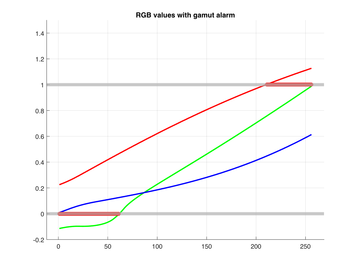
Another visualization approach is to plot the red, green, and blue color component values returned by lab2rgb and show where those values are too high or too low.
figure
hold on
plot(rgb(:,1),'r')
plot(rgb(:,2),'g')
plot(rgb(:,3),'b')
xlim([1 - 0.05*height(rgb), 1.05*height(rgb)]);
y1 = min(-0.2,ax.YLim(1));
y2 = max(1.2,ax.YLim(2));
ylim([y1 y2]);
grid("on")
yline(0, LineWidth = 5, Color = [0.7 0.7 0.7])
yline(1, LineWidth = 5, Color = [0.7 0.7 0.7])
too_high = any(rgb > 1,2);
k = find(too_high);
if ~isempty(k)
plot(k,ones(size(k)),'r*',MarkerSize = 6)
end
too_low = any(rgb < 0,2);
k = find(too_low);
if ~isempty(k)
plot(k,zeros(size(k)),'r*',MarkerSize = 6)
end
hold("off")
title("RGB values with gamut alarm")
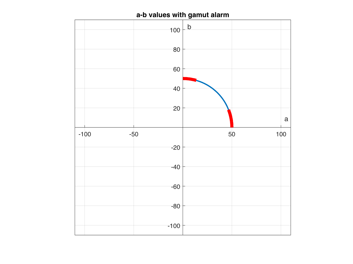
Next I want to show the a and b values for the out-of-gamut Lab curve colors.
plot(lab(:,2),lab(:,3));
axis equal
xlim([-110 110])
ylim([-110 110])
ax = gca;
ax.XAxisLocation = "origin";
ax.YAxisLocation = "origin";
xlabel("a")
ylabel("b")
hold on
for k = 1:length(first)
j1 = first(k);
j2 = last(k);
x = lab(j1:j2,2);
y = lab(j1:j2,3);
plot(x,y,"r",LineWidth = 5)
end
hold off
grid(ax,"on")
title("a-b values with gamut alarm")
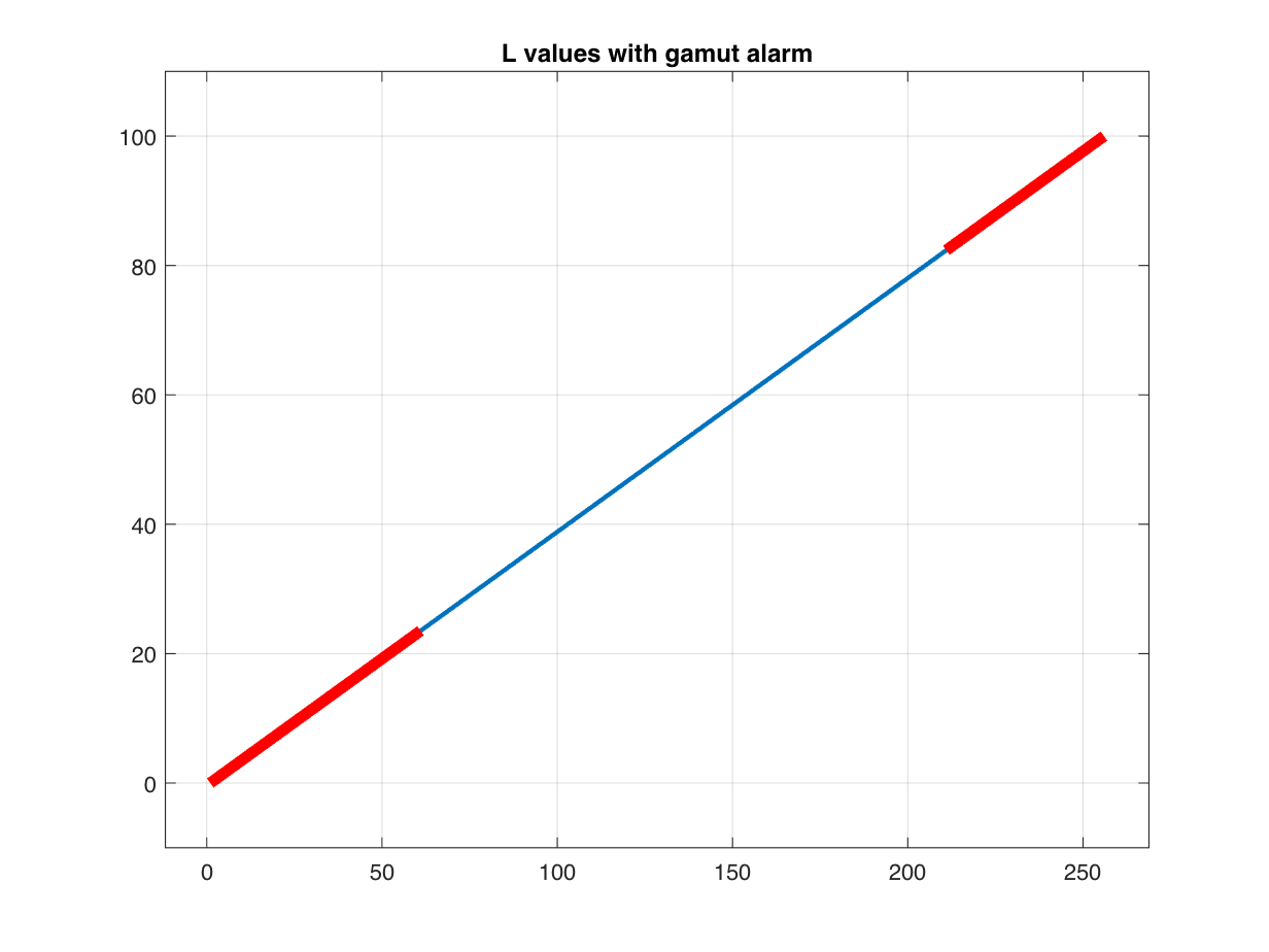
Finally, I want to show the L values for the out-of-gamut Lab curve colors.
plot(lab(:,1));
xlim([1 - 0.05*height(lab), 1.05*height(lab)]);
ylim([-10 110])
hold on
for k = 1:length(first)
j1 = first(k);
j2 = last(k);
x = j1:j2;
y = lab(j1:j2,1);
plot(x,y,"r",LineWidth = 5)
end
hold off
grid on
title("L values with gamut alarm")
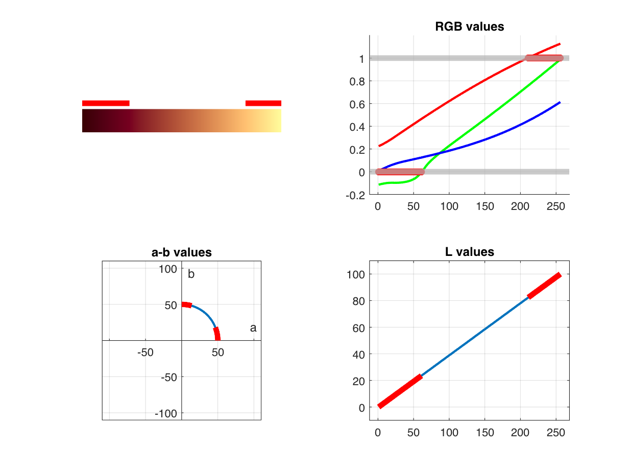
I created some utility functions that generate these different plots. They are at the end of this post. I'll finish up by using tiledlayout to combine all four plots in a single figure.
tiledlayout(2,2)
nexttile
plotLabColormapWithGamutAlarm(lab)
nexttile
plotLabRGBColorsWithGamutAlarm(lab)
title("RGB values")
nexttile
plotABWithGamutAlarm(lab)
title("a-b values")
nexttile
plotLWithGamutAlarm(lab)
title("L values")
Utility Functions
function plotLabColormapWithGamutAlarm(lab)
[first,last] = outOfGamutSegments(lab);
rgb = lab2rgb(lab);
ax = newplot;
colorSwatches(ax,rgb,0)
daspect(ax,[30 1 1])
xlim(ax,[0 size(lab,1)])
ylim(ax,[0 1.5])
axis(ax,"off")
hold(ax,"on")
y = [1.25 1.25];
for k = 1:length(first)
x1 = first(k) - 1;
x2 = last(k);
x = [x1 x2];
plot(ax,x,y,'r',LineWidth = 5)
end
hold(ax,"off")
end
function plotLabRGBColorsWithGamutAlarm(lab)
ax = newplot;
rgb = lab2rgb(lab);
hold(ax,"on")
plot(ax,rgb(:,1),'r')
plot(ax,rgb(:,2),'g')
plot(ax,rgb(:,3),'b')
xlim(ax,[1 - 0.05*height(rgb), 1.05*height(rgb)]);
y1 = min(-0.2,ax.YLim(1));
y2 = max(1.2,ax.YLim(2));
ylim(ax,[y1 y2]);
grid(ax,"on")
yline(ax,0, LineWidth = 5, Color = [0.7 0.7 0.7])
yline(ax,1, LineWidth = 5, Color = [0.7 0.7 0.7])
too_high = any(rgb > 1,2);
k = find(too_high);
if ~isempty(k)
plot(ax,k,ones(size(k)),'r*',MarkerSize = 6)
end
too_low = any(rgb < 0,2);
k = find(too_low);
if ~isempty(k)
plot(ax,k,zeros(size(k)),'r*',MarkerSize = 6)
end
hold(ax,"off")
end
function plotABWithGamutAlarm(lab)
ax = newplot;
plot(ax,lab(:,2),lab(:,3));
axis(ax,"equal")
xlim(ax,[-110 110])
ylim(ax,[-110 110])
ax.XAxisLocation = "origin";
ax.YAxisLocation = "origin";
xlabel("a")
ylabel("b")
[first,last] = outOfGamutSegments(lab);
hold on
for k = 1:length(first)
j1 = first(k);
j2 = last(k);
x = lab(j1:j2,2);
y = lab(j1:j2,3);
plot(ax,x,y,'r',LineWidth = 5)
end
hold off
grid(ax,"on")
end
function plotLWithGamutAlarm(lab)
ax = newplot;
plot(ax,lab(:,1));
xlim(ax,[1 - 0.05*height(lab), 1.05*height(lab)]);
ylim(ax,[-10 110])
[first,last] = outOfGamutSegments(lab);
hold on
for k = 1:length(first)
j1 = first(k);
j2 = last(k);
x = j1:j2;
y = lab(j1:j2,1);
plot(ax,x,y,'r',LineWidth = 5)
end
hold off
grid(ax,"on")
end
function [first,last] = outOfGamutSegments(lab)
rgb = lab2rgb(lab);
out_of_gamut_mask = any(rgb > 1,2) | any(rgb < 0,2);
d = diff([0 ; out_of_gamut_mask ; 0]);
first = find(d == 1);
last = find(d == -1) - 1;
end


댓글
댓글을 남기려면 링크 를 클릭하여 MathWorks 계정에 로그인하거나 계정을 새로 만드십시오.