Expo Conversations – Part 2
This is a continuation of the last post (see Expo Conversations – Part 1), in which we learned how the MathWorks UK office built a system for detecting social interaction at the MATLAB Expo conference. This week, Marta Wilczkowiak continues the story with the help of Toshi Takeuchi.
Marta is a senior application engineer at MathWorks UK, helping MATLAB users to design, develop and deploy production-quality code. Toshi is a Senior Marketing Manager at MathWorks.
Social Conversation through Technology Convergence – Understanding Crowd Dynamics with RFID Data Analysis
by Marta Wilczkowiak and Toshi Takeuchi
In the previous post, you learned how we built an RFID-based people tracking system from scratch in three months, a “technology stack” that spanned multiple hardware and software disciplines. We ended the post with how we managed to survive the moment of the truth: the first integration test, live at a conference with hundreds of delegates.
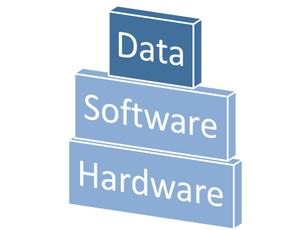
Now we had raw data to analyze to improve our system.
The Twist – Making Sense of RFID Data
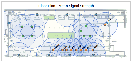
Once we examined the real word data collected during the event more closely, we faced a new dilemma – we had originally assumed we could use signal strength to estimate distances. However, in reality there was so much fluctuation in signal strength that you could not make a confident estimate this way. This, incidentally, is why RFID-based localization is a hot research topic today.
We were determined to work on an engineering solution, but it would take more time and effort. In the meantime, was there a way to get meaningful insights from the messy data at hand?
Web Analytics Meets Engineering
As we discussed the conference data internally at MathWorks, this issue came to the attention of Toshi Takeuchi, a US-based analyst. He immediately saw a similarity with the familiar problems he faced in analyzing massive volume of page views and clicks – always messy. What would happen if you applied web analytics techniques to this engineering problem? We embraced this suggestion and immediately shared our code and data with Toshi. Our collaboration was possible because we all spoke the same language – MATLAB.
Use of Proxy Metric
Non-physical measurements are often used in web analytics. For example, the recommendations you see on online shopping or movie streaming websites are computed using distance measured in terms of similarity or affinity. Was there anything in the dataset, besides the signal strength, that we could turn into a proxy metric? The new approach Toshi came up with was to recast connection frequency as this virtual distance. If two tracking devices are connecting to one another more frequently than others in a given time interval, then we could think of them being “close” in the virtual space defined by connection frequency. This metric seemed far more reliable than signal strength. Our original goal was to understand the social interactions of the delegates, and physical distance metric was just a means to that end. If a virtual metric did the same job, then it seemed a good substitute.
The Result
With the support from Toshi, we were able to reconstruct the estimated movements of the delegates using the connection frequencies with stationary anchors such as demo stations (orange circles) and catering (green circles). Note that no personally identifiable information was collected or used for this analysis.
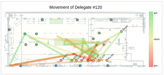
In the plot above, you see such an estimated movement for Delegate #120. This person appeared to have approached a nearby catering station first, then spent quite some time around BLOODHOUND Super Sonic Car in the middle, but in the afternoon stayed “closer” to software related demos than hardware-based demos as measured in this “virtual” space.
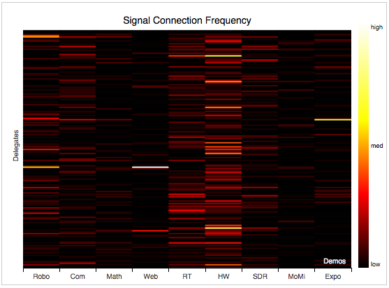
We can use this information to map the frequencies of connections between delegates and demo stations, and visualize it as a heat map. The vertical bands with lighter red stripes indicates which demos had more connections than others, and horizontal stripes show to which demo stations each delegate connected frequently. You can see that people who connected with “RT” (a real-time testing exhibit) and “HW” (a hardware testing exhibit) had very little overlap with the people who connected with “Robo” (a robotics exhibit).
The Insight – the Three Factors of Delegate Behavior
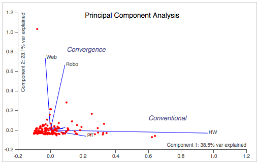
Ultimately, the data is only as good as the insights you get from it. When we computed the estimated movements of the delegates with a technique called Principal Component Analysis, we could summarize the complex data by a mere three factors.
- The “Web”: people who showed strong “connections” with the “Web” demo
- The “Robo”: people who showed strong “connections” with “Robo” demo
- The “Conventional”: people who showed strong “connections” with “HW” demo
Furthermore, “Web” people and “Robo” people tend to share similar connection patterns as compared to “Conventional” people – what is common to both? They are both what we might call “convergence” applications where software and hardware are being integrated in an unconventional way.
While this might not be a novel insight, it was still very useful for us to know that the data backed up what we had been intuitively sensing all along. It was also interesting to see which delegates showed which particular inclinations on an individual basis (each dot in the plot identify a specific delegate).
Back to Reality – the Next Step
It is tempting to speculate if the virtual proximity on this plot correlates to actual shared interest among those delegates. If so, it is also interesting that two of the main factors turned out to be the web and robotics, which are examples of convergence-oriented applications that cross the traditional virtual/physical divide.
If there was an exit survey that asked the participants which demos they found interesting, we could use predictive analytics techniques to validate how well this virtual metric predicts the actual interest. Alternatively, we could use additional stationary anchors to determine which sessions delegates attended. If we placed more anchors on the floors in a more evenly spaced grid, including the areas populated by third party exhibitors, it would give more data points and more accurate measurements.
If we validated this correlation, it could open up opportunities for new ways for our delegates to find like-minded people.
The Journey Continues
Our journey is not over yet – we still have challenges with the system. But our project proved how such an inter-disciplinary system could be built in three months using MATLAB, Simulink, and lots of team work.


Comments
To leave a comment, please click here to sign in to your MathWorks Account or create a new one.