
Cody Problem Visualization, Revisited
Way back in 2013 I did a blog post about visualizing Cody problems. The idea was to take various metrics for each problem and let people plot them in different ways. The resulting visualization is still running, but the data set only includes problems that were created before February 2013. I’ve wanted to revisit this visualization for some time. 2013 was a long time ago! These days, instead of 1200 problems to look at, we have more than 3700.
This summer, with the help of my hard-working intern Anirudh Watturkar, we got the old visualization up and running again using the latest data. Here it is:
Just use the dropdown menus to choose the x-axis and y-axis and off you go. You can also make use of two additional dimensions with dot size and color.
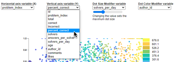
And once you have a plot you like, you can hover over a dot to see what problem it corresponds to, or you can click on it and be transported to exactly that problem.
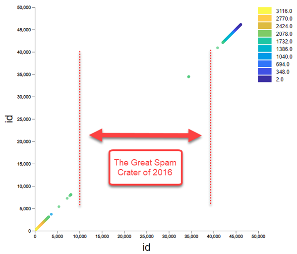
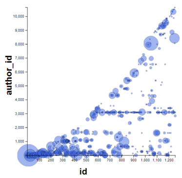
Right away you notice that the default view when you land, id vs. id, looks odd. This is because we had a massive influx of spam problems at one point and we erased something like 30,000 bogus problems. So the id takes a dramatic jump somewhere in the middle of 2016. I’ve added a dimension called problem_index that counts sequentially from 1 to the most recent problem, leaving out all the spam entries.
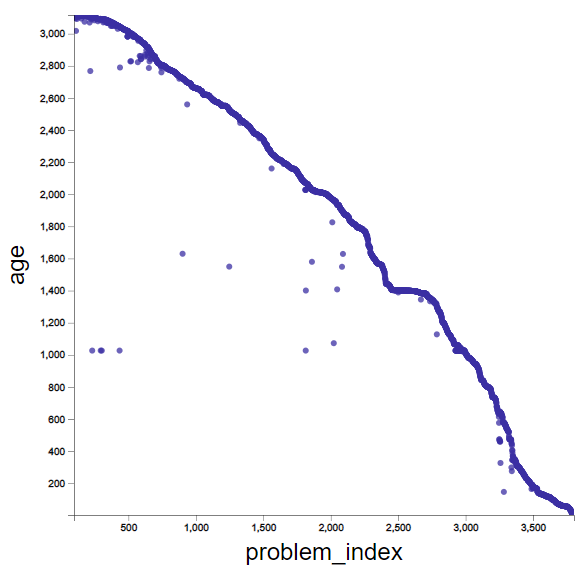
If we look at problem age vs. problem index, we can see periods in which problems came in faster and slower. Horizontal “plateau” shapes mean that many problems came in during a short period. These generally happen during contests and promotions.
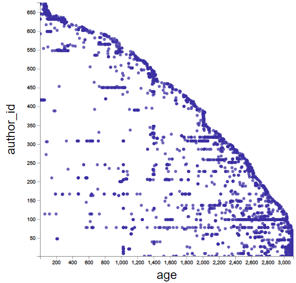
If we look at author_id vs. age, you can see horizontal patterns that show those authors who have created many problems. The longer the horizontal band, the longer that person has been active as an author. It’s impressive to see authors whose contributions span many years. But it’s also impressive when dozens of problems come in very quickly from one person.
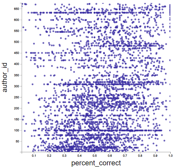
Here we look at author_id vs. percent_correct. You can see that, of those authors with many problems, some skew toward being harder (low percent_correct) while others skew toward the easy (high percent_correct). A small set of problems are pegged against the 100% correct wall.
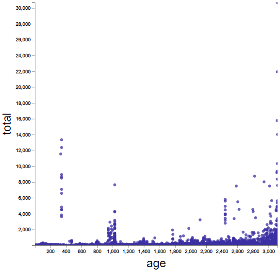
We can plot total number of solutions against age. Not surprisingly, older problems tend to have more solutions. But even so, some more recent problems jump out as having high solution counts. The high solution count peak on the left side of this diagram (around 350 days old) is associated with practice problems for MATLAB Onramp.
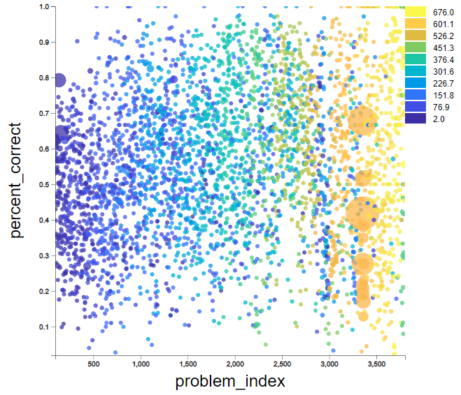
Finally, here’s my favorite, where I throw in color and dot size. We’re looking at percent_correct vs. problem_index. My eye detects a slight trend upward (easier) through the middle of the plot before things spread out again. The dot size indicates solvers_per_day, and the color show the author_id. I can tell a lot of stories looking at this chart.
Play around with the visualization and see what you can learn. Tell me a story in the comments below!


Comments
To leave a comment, please click here to sign in to your MathWorks Account or create a new one.