
MATLAB Drive and British Coal
The other day I received this email from my friend Jos.

Very thoughtful of him! After a recent meeting, we were discussing the UK's notable decline in coal consumption. Jos had found some data from a government website and shared it with me via MATLAB Drive. Please note that all the numbers shown here have to do with the energy used to generate electricity (as opposed to, say, heat or transportation).
Because we both use MATLAB Drive, Jos can leave his code and data in place and just issue the invitation. Once I accept it, I can work in the same exact folder, thereby avoiding a lot of back and forth messaging with attachments.
I accepted the invitation and saw a folder with a spreadsheet, two import routines, and a file called runme.m.

Here's that runme.m file from Jos.

And when I run it, this is the result.

Sure enough, the usage of coal is now close to zero! But since Jos invited me to collaborate with this shared data, I thought I would fill out the analysis a bit more. Let's dig a little deeper.
Step one was to move his code into a Live Script (much later, I would take this Live Script and publish it directly to WordPress, so you're effectively looking at the Live Script I created).
Next, I loaded the data and cleaned up the table a bit more.
filename = "UK-energy-fuels.xls";
data = importdata(filename);
headers = importheaders(filename);
% Clean up some headers
headers(5) = "Hydro";
headers(7) = "Wind_Onshore";
headers(8) = "Wind_Offshore";
headers(end) = "Total";
% Missing values in data (NaN should be zero)
data(isnan(data)) = 0;
t = array2table(data','VariableNames',headers);
% Throw out some unused columns
t(:,[9 12 13 14]) = [];
Let's switch to a timetable. Timetables are awesome.
t.Time = datetime(1998:2019,1,1)';
t = t(:,[end 1:(end-1)]);
t = table2timetable(t)
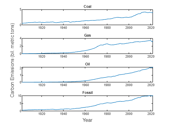
A quick stacked plot is a fun way to get our bearings. The nice thing about stacked plots is that they know all about timetables, so there's not much you have to worry about. Just one line of code, and no messing around with labels and limits.
stackedplot(t(:,[1 2 3 4 5 6 9 10]))

Since the y-scales are all different, the stacked plot is mostly useful for trends. Notice that Wind and Solar are moving steadily upward, while Hydro hasn't varied much. And there's Coal doing its disappearing act.
To understand the relative contributions of these energy sources, let's do an area plot.
Tables make this so pleasant!
h = area(t.Time,[t.Coal t.Oil t.Gas t.Nuclear t.Hydro t.Wind t.Solar t.Bioenergy]);
Fun fact: you can now set colors in MATLAB plots with CSS-style hex color designations. Let's find some appropriate colors for the chart. I picked these colors with this tool: https://www.w3schools.com/colors/colors_picker.asp.
sources = [ ...
"#4d4d4d", "Coal";
"#663300", "Oil";
"#999966", "Gas";
"#aa80ff", "Nuclear";
"#0066ff", "Hydro";
"#66ccff", "Wind";
"#ffff66", "Solar";
"#33cc33", "Bioenergy"];
for i = 1:length(h)
h(i).FaceColor = sources(i,1);
end
legend(sources(:,2), ...
"Location","northeastoutside")
xlabel("Date")
ylabel("Energy (TWh)")
grid on

Here's Jos's Coal plot, but normalized against the total, so we're looking at energy share as a percentage.
plot(t.Time, 100*t.Coal./t.Total, "o-","LineWidth",3)
grid on
xlabel("Date")
ylabel("Percentage")
title("Percentage of energy derived from Coal in the UK")

Who, at the beginning of this century, would have predicted this outcome? There is a certain poetic symmetry to the fact that Britain was the first country to make massive use of coal for industrial power, and it may well be the first to let it go.
There's an interesting side story here about the horse race between onshore and offshore wind. The UK has been a pioneer in offshore wind. You might say they're the Saudi Arabia of blustery sealanes.
plot(t.Time,[t.Wind_Onshore t.Wind_Offshore],"o-","LineWidth",3)
xlim(datetime([2012 2020],1,1))
legend({'Onshore','Offshore'},'Location',"best")
xlabel("Date")
ylabel("Energy (TWh)")
grid on

From a standing start at the beginning of the century, wind now generates 20% of the UK's power. And between the two flavors, onshore and offshore, as of 2019 it's a dead heat! Given the trends, you'd have to put your money on offshore wind. There's a lot more ocean than island. And fewer crinkly bits to get in the way.
As I was doing these plots, I couldn't help but notice that the total amount of energy consumed in Britain is shrinking over time. Which is all to the good. After all, it's much easier to use less coal when you need less overall energy in the first place.
plot(t.Time, t.Total,"LineWidth",3)
grid on
xlabel("Date")
ylabel("Energy (TWh)")
title("Overall power consumption in the UK")

Since I am a speculative person, and since MATLAB is the master of curve fitting, I naturally wondered: suppose this downward trend keeps up? What then?
tm = year(t.Time(8:end));
dt = t.Total(8:end);
% p is the polynomial equation for the linear fit to the data
p = polyfit(tm,dt,1);
% ti is where we intersect the x axis
ti = -p(2)/p(1);
t0 = 2005;
tf = [t0 ti];
df = polyval(p,tf);
hold on
plot(datetime(round(tf),1,1),df,"o-","Color","red")
hold off
xlim(datetime([2000 2100],1,1))
xlabel("Date")
ylabel("Energy (TWh)")

Based on current trends, we can confidently assert that the UK will need no power of any kind by 2096.
So thanks for this data, Jos! Sharing data and code on MATLAB Drive made this investigation easy. And now that I've done my bit, I'll see what Jos has to add. I'm curious to discover, in 80 years time, how he'll manage with no electricity.


Comments
To leave a comment, please click here to sign in to your MathWorks Account or create a new one.