
2022 Mini Hack Content Analysis
Today, once again, I am delighted to introduce guest blogger Dave Bulkin. You may remember that Dave blogged in this space last year about our first Mini Hack (Mini Hack Contest Analysis). Dave is a developer on the MATLAB Graphics and Charting Team. In the post below, Dave not only examines the code behind the leading entries, but he also introduces you to some new visualization techniques.
For reference, follow this link to the Mini Hack Gallery.
2022 Mini Hack Contest Analysis
by Dave Bulkin
Thanks to the Mini Hack organizers and all the contributors for another great set of beautiful and inspiring visualizations! And thanks to Ned for letting me return to his blog to share some analyses about the content.
Last year’s analysis showed that the axis function was unquestionably the most popular function, the only one used in the majority of submissions. This was unsurprising: axis is a four-character “Swiss army knife” of functionality. The axis function remained on top in 2022, and still was used in most entries, but the chart below shows that trig functions made their way up in the ranks this year.
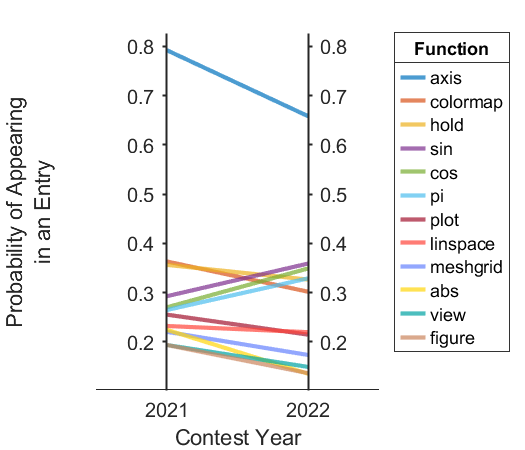
To make this chart I used one of our standalone visualizations: parallelplot. Parallel coordinates plots are often used with more than two variables but can be handy for a quick visualization of how things change in two different conditions. I used a trick to label the values: parallelplotprovides a grouping variable which is intended to visualize how groups of lines change across multiple coordinates, but I used one group for each function to serve as a label. My code to call parallelplotlooked something like this (I also tweaked the Colorproperty a bit to get distinct colors for the last 5 functions:
parallelplot(tbl, ...
CoordinateVariables = ["prob21" "prob22"], ...
GroupVariable = 'Function', ...
CoordinateTickLabels = ["2021" "2022"], ...
LineWidth = 2, ...
DataNormalization = "none");
When I looked at the Mini Hack data last year I tried to drill into all the ways that contest entries used axis, this year I thought it would be interesting to look at how the various colormaps were used. Here, I didn’t rely on static analysis to pick out function calls because colormaps can be used as a function (clr = lines(4);) or as a string (colormap('hot')), so instead I just searched the entries for all occurrences of all of our colormaps. The contains function makes short work of this kind of task. I started with a bar plot of the data but it was a little bland, so I decided to try to make a chart where each bar’s face showed the colormap:
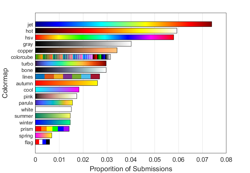
One approach to making these bars would be to use patch, setting linearly spaced vertices along the edges of the bars and using the FaceVertexCData property to specify the color for each vertex. However, bars are rectangles, and it’s quite easy to make colorful rectangles with the image command, so I took that approach. My code looked something like this:
spacemult = 1.3; % used for adding space between the bars
for i = 1:numel(cmaps)
x = [0 mu(i)];
y = [i i] * spacemult;
n = ...; % n was normally 255, but a lower value for prism, flag, and lines
c = reshape(feval(cmaps(i), n), 1, n, 3);
offset = diff(x)/n; % An offset because image takes center coordinates
image(x + [offset -offset]/2, y, c);
rectangle('Position',[0 y(1)-.5 x(2) 1])
end
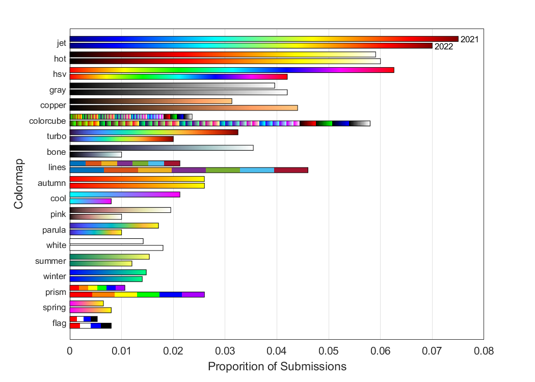
And here’s a version of the plot that looks at the change in colormap popularity across years. hsv, turbo, bone and cool were less popular, while copper, colorcube, lines and prism were more popular:
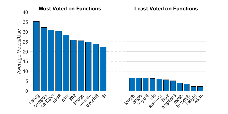
It’s all well and good to talk about which functions (and colormaps) were used the most, but if you want to have a successful Mini Hack entry, you probably want to know which functions led to the most votes. To investigate I computed the average number of votes for entries that contained each function. Because some functions were used sparsely, I limited this analysis to functions that were used in at least 20 entries, and to simplify the presentation I included both years in my analysis and didn’t try to compare. This was by no means a perfect analysis, I found that popular submissions (and their remixes) tended to dominate the scores. But if you’re looking to win in Mini Hack, you might consider making an image with some gamma random numbers, a two-dimensional inverse Fourier transform, and a pink colormap…
One of the coolest features of this year’s Mini Hack, was the ability to depend on File Exchange submissions. For my final analysis I wanted to use a File Exchange chart that uses the MATLAB ChartContainer base class. ChartContainer provides a framework for developing standalone visualizations like parallelplot above – these visualizations aren’t like traditional MATLAB graphics that can be combined in an axes, but instead are charts designed for a special purpose that works independently from other charts. You can read more about standalone visualizations in the “More About” section at the bottom of the parallelplot documentation page.
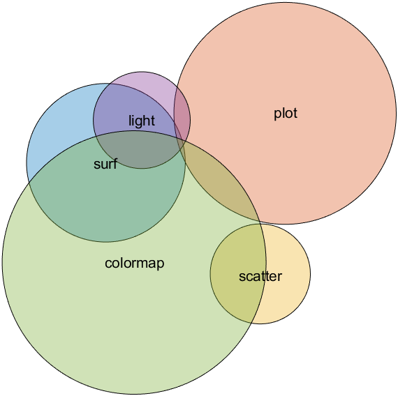
The MATLAB Charting Team has published a few example charts on File Exchange (you can find these by searching for the chartcontainer tag). One of our examples produces Euler diagrams. These charts have been controversial internally – in part because many folks call them Venn diagrams which are slightly different. However, the deeper challenge with this visualization is that proportional circular Euler diagrams with more than two categories don’t necessarily have a solution, so error (potentially qualitative error) tends to be present in these charts. Thus, we’ve puzzled about whether we should include this kind of visualization in a product where the math…works. Nonetheless we had an ambitious intern last year who implemented an algorithm published in IEEE Transactions on Visualization and Computer Graphics, and it makes for a neat chart that highlights the co-occurrence of function use in Mini Hack entries. The diagram below shows how light is often used in entries with surf, but not with scatter, and colormap is used with surf and scatter, but not so much with plot.


See Also
-
2019 in Review
Blogs
-


Comments
To leave a comment, please click here to sign in to your MathWorks Account or create a new one.