
Plotting with Style: Synchronizing Color and LineStyle with SeriesIndex

Guest Writer: Eric Ludlam
Joining us again is Eric Ludlam, development manager of MATLAB’s charting team. Discover more about Eric on our contributors bio page.

MATLAB Graphics supports a lot of color and style customization that can be applied to your charts. While this flexibility is great for making highly customized graphics, it can make for some added work when you want to tweak the aesthetic when you share color relationships across multiple plots. For example, consider this code snippet where you'd like a line and a scatter to have the same color: you either have to pull the color from one object and set it on the next, or you need to specify your own colors on both.
theta = 0:.1:2*pi;
h = plot(theta,sin(theta));
hold on
sh2 = scatter(theta,cos(0:.1:2*pi));
set(sh2,'MarkerEdgeColor', h.Color); % copy color from the line handle
hold off

If you want to change the color from blue to some other color after creating this chart and you hadn't saved any handle outputs, you would now need to use findobj to find the handles to your charts, and set the Color on the line and MarkerEdgeColor on the scatter to your new color.
If you follow other blogs at the MathWorks, you likely have also heard about a new feature we're working on to support Dark Mode in figures. It's important that features like Dark Mode don't override manually set colors because in data vizualizations, colors can often have specific meaning. When you use automatically selected colors however, those colors will be updated to look good with dark backgrounds.
That brings us to our topic today. You can use the "SeriesIndex" property to synchronize colors and keep your charts ready for Dark Mode. SeriesIndex can be found on most charts and graphics objects. The SeriesIndex property can be used to control properties such as Color, and for line plots, LineStyle as well. Let's dig in!
Punkin Chunk Data Set
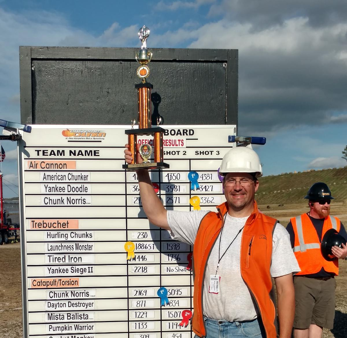
The data set I'm going to use today is from the World Championship Punkin Chunk, a contest where my catapult team and I compete with other teams to see who can chunk (launch) a pumpkin the farthest, as measured by a survey team. I gathered these data off the official site which goes back to 2000, and I filled in missing entries for satellite contests based on photographs like this one after I managed to score a trophy for chunkin' a pumpkin over 1000 ft.
I've captured the data in a mat file, and the fields I'll be using include the Year, Machine name, and the Distance.
You can download the mat file like this:
matfile="PunkinChunk2000-2018.mat";
if ~exist(matfile,'file')
url="https://github.com/MATLAB-Graphics-and-App-Building/matlab-gaab-blog-2024/raw/main/PunkinChunkSeriesIndex/";
websave(matfile, url+matfile);
end
Load the data file:
load('PunkinChunk2000-2018.mat', 'ChunkTab')
% Display some results from the torsion division
tail(ChunkTab(ChunkTab.Division=='torsion',:))
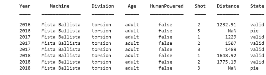
My catapult's name is "Mista Ballista", and my team and I often refer to it as "Mr. B". It's a re-imagining of an ancient Greek ballista, one of the first large stone throwing devices ever built.

Plotting Data with MATLAB's Default Color assignments
Here's how to plot out my competition shots as recorded in the table along with a fit line so you can see how we've been trending year-over-year.
Notice that I'm creating the scatter chart directly from the table. When you specify a table as the first input with names of variables in the table for X (Year) and Y (Distance), you also get some handy X and Y axis labels. This feature was added in R2021b.
mrb_h = scatter(ChunkTab(ChunkTab.Machine=="Mista Ballista",:), ...
'Year', 'Distance', 'filled', 'DisplayName', "Mista Ballista");
hold on
[fX, fY] = computeFit(mrb_h); % See helper fcn at end of script
mrb_fit_h = plot(fX, fY, 'LineWidth', 1);
% Decorate
title("Punkin Chunk: Mista Ballista")
subtitle("Competition Measurements") % Introduced 2020b
set(gca,'TitleHorizontalAlignment','left'); % Introduced R2020b
grid on
box on
xlim padded % Introduced R2021a

You can see we've been making progress every year up to 2018, after which we haven't been able to compete since there hasn't been a Punkin Chunk within traveling range that I could get to.
As for this chart, it looks good so far and it is easy to see what's going on. That changes once I add one of my competitors in the torsion division to this chart. As you can see below, there are now 4 colors in the chart, where ideally there should only be 2, one for each machine.
onager_h = scatter(ChunkTab(ChunkTab.Machine=="Onager",:), ...
'Year', 'Distance', 'filled', 'DisplayName', "Onager");
[fX, fY] = computeFit(onager_h);
onager_fit_h = plot(fX, fY, 'LineWidth', 1);
% Redecorate
title("Punkin Chunk","Competition Measurements")
legend([mrb_h onager_h], 'Location', 'northwest','AutoUpdate','off');
hold off

How to Set SeriesIndex
Now that we're looking at the results from multiple competitors, we should make the colors for the scatter and fit line match. We can do that by using SeriesIndex!
I saved the handles for Mista Ballista's scatter and fit line, and the handles to Onager as well. We can now synch up their Series Indices and everything will now match in color. You might wonder why we'd use SeriesIndex instead of just setting the Color property. For starters, the scatter chart uses MarkerEdgeColor or MarkerFaceColor which is different from the line's Color property, so you need to specify each one separately. The second reason is that SeriesIndex now tells MATLAB that these graphics objects are related to each other, which will make it easier to change colors and styles together (see below.)
Here's the code to set the SeriesIndex:
set([mrb_h, mrb_fit_h],'SeriesIndex', 1);
set([onager_h, onager_fit_h], 'SeriesIndex', 2);

The SeriesIndex property was introduced in R2019b and can be any positive integer. It is used to index into both the Axes ColorOrder and LineStyleOrder properties. As of R2023b, more objects now support SeriesIndex, including the xline and yline objects. In addition, SeriesIndex now supports a value of 'none' which indicates it should use a neutral color (dark gray by default).
mrb_best = max(ChunkTab.Distance(ChunkTab.Machine=="Mista Ballista"));
mrb_best_h = yline(mrb_best,'-',"Ballista's Best","LineWidth", 1, "Alpha", 1);

mrb_best_h.SeriesIndex
Creating Charts in a loop with SeriesIndex
You can also control the SeriesIndex of all these graphics objects during creation, and it's easy to do that even if you have an unknown number of data series to stick into one plot. This next block of code will pluck out data for several competitors in the Torsion division and plot them together.
machines = [ "Shenanigans" "Mista Ballista" "Onager" "Roman Revenge" "Chucky III" ];
handles = gobjects(1,numel(machines));
% Place this chart in tiled layout so we can add more axes later
tiledlayout(1,1,'Padding','compact','TileSpacing','compact');
ax1=nexttile;
hold on
% Loop over each machine
for idx=1:numel(machines)
Machine_dat = ChunkTab(ChunkTab.Machine==machines(idx),:);
h = scatter(Machine_dat, 'Year', 'Distance', 'filled', ...
'SeriesIndex', idx); % Specify during creation
[fX, fY] = computeFit(h);
handles(idx) = plot(fX, fY, 'LineWidth', 2, ...
'DisplayName', machines(idx), ...
'SeriesIndex', idx); % Set series index to match.
end
% Decorate!
title("Punkin Chunk: Torsion Division","Competition Measurements")
set(gca,'TitleHorizontalAlignment','left')
ylim([0 4000])
box on
grid on
xlim padded
legend(handles, 'Location', 'northwest', 'Direction','reverse'); % Direction added in R2023b

Let's add a little axes on the side to show the longest shots for each machine in the chart. I'll use a fun trick by placing this new axes in the west tile to keep it narrow automatically. Using yline makes it easy to create a mini graph with nice labels, and we can set the SeriesIndex on them too!
ax2=nexttile('west'); % Add a mini-chart on the side
for idx=1:numel(machines)
best = max(ChunkTab.Distance(ChunkTab.Machine==machines(idx)));
yl = yline(best,'',best,'Alpha',1,'LineWidth',2,...
'SeriesIndex',idx); % Set Series Index during creation
% Re-align some labels to avoid overlap
if ismember(machines(idx), ["Onager" "Shenanigans"])
yl.LabelVerticalAlignment = 'bottom';
end
end
% Decorate!
box on
grid on
linkaxes([ax1 ax2], 'y') % Keep Y linked between both axes
xticks([]);
% Remove ticklabels and ylabel from ax1, add to ax2
yticklabels(ax1,[]);
ylabel(ax1, '');
ylabel(ax2,'Distance');

So yea, Mista Ballista isn't as competitive as some of the other machines, but I'm still proud of my 1700ft shot.
But that's not what we are here for.
Manipulating Chart Colors and Styles
Once all the elements of your chart are matched up using SeriesIndex, you can now modify the color of your chart easily. To quickly change the color, you can use the colororder command. Starting in R2023b, there are several new named color orders to choose from to make restyling your chart easy. Notice that when you don't specify an axes handle, this command works on all charts in all axes in the figure. If you frequently create charts with multiple axes, this can be a big time-saver!
colororder earth

You can also manipulate the LineStyleOrder of the Axes to change the style of all the lines in one go. By default, the LineStyleCyclingMethod is 'aftercolor', and since we want colors and line styles to cycle together, we also need to change that property to 'withcolor'.
Edit: As of R2024a you can also use the linestyleorder function to set the LineStyleOrder and LineStyleCyclingMethod.
set([ax1 ax2],'LineStyleOrder', [ "-" ":" "--" "-."], ...
'LineStyleCyclingMethod', 'withcolor')

So now you see that using SeriesIndex can make restyling your chart quick and easy. An additional benefit is that using SeriesIndex will also make your charts compatible with upcoming Dark Mode support which will help keep your charts looking good with either dark or light backgrounds.
function [fX, fY] = computeFit(h)
% Compute fit for data contained in line or scatter object H
X = h.XData;
Y = h.YData;
mask = ~(isnan(Y) | isnan(X));
F = polyfit(X(mask), Y(mask), 2);
fX = linspace(min(X), max(X));
fY = polyval(F, fX);
end
- Category:
- Charts,
- Demos,
- Graphics,
- New Features


Comments
To leave a comment, please click here to sign in to your MathWorks Account or create a new one.