Put on your slow eyes with Trendy
Once, long ago, I wanted to know how many files there were on the File Exchange. This number, as it happens, is easily had. Just look at the top right of the file listing and you’ll see it (look where it says “1 – 50 of 14973”, or some similarly large number). Right away I realized this number wasn’t very interesting by itself. What I really wanted to know was this: How big is the File Exchange compared to how big it was yesterday? This information isn’t hard to get either, but it does require some discipline. First you write down today’s number somewhere, and then you have to remember to do the same thing tomorrow. Unfortunately, I’m not very disciplined. And since ultimately what I really wanted was long-running time series, why not automate this process?
Since I’m a MATLAB programmer, I wrote some MATLAB code to pull the number off the web page and store it in a MAT-file. I kicked off MATLAB every night with a scheduled task on my PC, and it would gather and plot the necessary data. This worked well enough, and soon other people were asking me to track things: sales numbers, file sizes, bug counts, headcount numbers. These data sources are all similar in two important respects: they’re slow-moving trends (gathering data once a day is fast enough), and the information is available on a web page somewhere. At that point I realized we had an opportunity to make a simpler and more general service: Trendy.
Trendy is a web service that makes it easy for you to track and plot slow-moving trends. You only need to give us two little chunks of MATLAB code: one to collect the latest data point for a trend you care about, and one to plot the resulting trend. We take care of the rest. We’ll store your data in a safe place and we’ll remember to run your code every night.
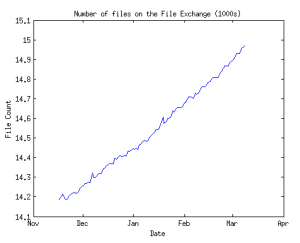
Here, for example, is the data I’ve been collecting on the number of files on the File Exchange. It’s hard to make sense of a list of numbers without plotting it. So here is a plot of the same data.
Notice that separating the trend’s data from its plot has some benefits. For one thing, I can do multiple plots of the same data. I might want to plot the rate at which files are coming in (with data smoothing). Or I might want to use linear extrapolation to predict how long until we hit a certain threshold.
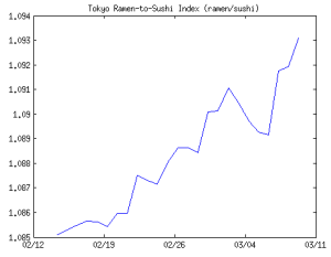
Because everything on Trendy is public, you’re welcome to plot someone else’s data. Teja Muppirala made a cool plot of the number of sushi and ramen restaurants in Tokyo. When I saw Teja’s plot, it occurred to me to plot the ramen-to-sushi index. Noodles are cheaper than fish, so who knows? Maybe this can be used as a leading indicator for the Japanese economy.
Trendy is designed to remove the tedium of data collection, but as a side effect it also give you something else: data transparency. If you see an interesting plot, you can say “Show me the data.” And if you’re still curious, you can say “How did you get that data?” The data source is just a click away.
When you first create a trend, it seems maddeningly slow to fill up with data. But then you forget about it for a few days, and the next then you know, it’s revealing some fascinating patterns. Like the time-lapse movie of a sprouting bean, when you put on your slow eyes, you see things you never noticed before. We’re used to living in a data-rich world. Numbers are good. But for every number you hold in your hand, Edward Tufte is asking “compared to what?” From Premier League football to the solar system and beyond, Trendy helps you make sense of the numbers you care about.
- Category:
- Community,
- MATLAB Central


Comments
To leave a comment, please click here to sign in to your MathWorks Account or create a new one.