
A dangerous rainbow: Why colormaps matter.
Rainbows typically signify a turn for the better. The storm has ended. The skies are clearing. But when the rainbow scale is used for weather and climate maps, the results can be misleading, and possibly downright dangerous.
A recent article in The Wall Street Journal, Weather Forecasts Should Get Over the Rainbow, detailed how the rainbow color scale, while adding visual interest, often leads to misunderstanding the data. Data scientists caution against using the rainbow colormap.
“Our vision is really good at drawing boundaries and clustering similar colors,” Rob Simmon, senior data visualization engineer at Planet, told The Wall Street Journal. “When it comes to the rainbow, this means that the transition from yellow to green jumps out at us, while shifts within, for example, the green part of the spectrum are much less apparent. This can create artificial boundaries in data that is actually smooth—a seemingly technical issue with serious consequences.”
Serious Consequences?
To explain the potential for serious consequences, The Wall Street Journal provided the recent example of the maps used during Hurricane Florence:
“For instance, the map consulted by Mr. Trump and his advisers during Hurricane Florence included a sharp boundary between yellow and green bands that appeared to represent a huge drop in the probability of tropical-force storm winds. This border stretched through Delaware, West Virginia, Virginia, North Carolina and South Carolina, affecting millions of people trying to determine the level of risk the storm posed. In fact, the difference was just 10%. Such visual confusion also can mislead policy makers tasked with issuing evacuation warnings.”

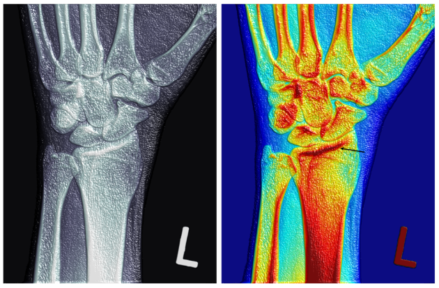
Image Credit: Just In Weather.
Perception is everything
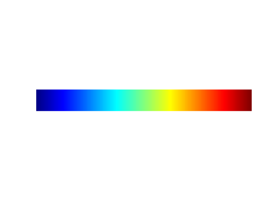
For many years, scientists have considered the rainbow color map, also known as Jet, a poor choice for data visualizations. In the 2007 IEEE article, Rainbow Color Map (Still) Considered Harmful, authors David Borland and Russell M. Taylor II from the University of North Carolina at Chapel Hill stated, “The rainbow color map confuses viewers through its lack of perceptual ordering, obscures data through its uncontrolled luminance variation, and actively misleads interpretation through the introduction of non-data-dependent gradients.”
People perceive contrast in brightness and can easily order options in grayscale.
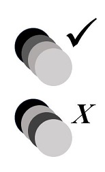
The authors then described how the rainbow colormap, based on the ordering of the wavelength of light, is not a perceptual ordering. Switching to the rainbow scale, people often have difficulty ordering the colors.
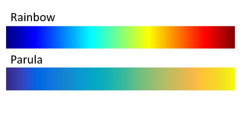
Default Colormap
Changing to a perceptually ordered colormap helps data understanding.
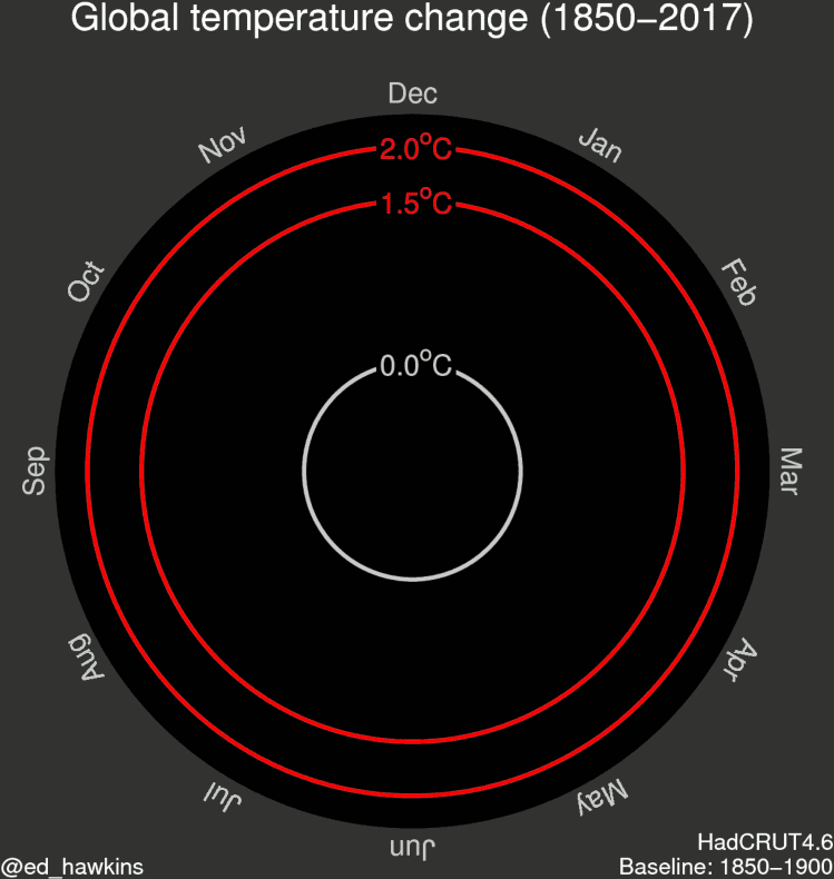
Data scientists agree. Climate scientist Ed Hawkins launched his blog The Climate Lab Book as a tool to foster discussion among climate scientists. He explains why data visualization is critical:
“The blog has had helpful discussions about many aspects of climate change science, but also visualisation, such as our #endrainbow campaign to reduce the use of rainbow colour schemes, such as jet. Obviously, MATLAB has made a step forward by switching the default colour scheme to parula.”


Comments
To leave a comment, please click here to sign in to your MathWorks Account or create a new one.