Making Pretty Graphs
| Update (2025): Looking for the latest techniques for making pretty graphics? Check out our 2025 revisit of this article in the Graphics and App Building blog, featuring modern approaches and updated MATLAB features for creating publication-quality graphics. |
Today I’d like to introduce a guest blogger, Jiro Doke (email: Jiro.Doke@mathworks.com), who is an applications engineer here at The MathWorks. He used MATLAB in his life prior to The MathWorks, and one of his interests is data visualization.
Contents
In my graduate work, I used MATLAB extensively for doing analysis and visualization. Often times, the plots that I created
were used for my publications. It was then when I started to explore the flexibility of Handle Graphics to customize MATLAB
plots in order to create publication-quality graphics. Ultimately, I was able to use MATLAB almost exclusively for my plots.
Let me walk you through the step-by-step process of how I did it. I'm using some fabricated data, but the plot is very similar
to the ones I generated for my research.
Load Data
First you might download the data.
load data
Create Basic Plot
First, I plot my data to create the crude visualization
figure('Units', 'pixels', ...
    'Position', [100 100 500 375]);
hold on;

hFit   = line(xfit  , yfit   );
hE     = errorbar(xdata_m, ydata_m, ydata_s);
hData  = line(xVdata, yVdata );
hModel = line(xmodel, ymodel );
hCI(1) = line(xmodel, ymodelL);
hCI(2) = line(xmodel, ymodelU);
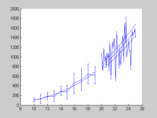
Adjust Line Properties (Functional)
Next, I do my first-round modification of my plots. At this point, I'm not worried about the esthetics yet.
set(hFit                          , ...
  'Color'           , [0 0 .5]    );
set(hE                            , ...
  'LineStyle'       , 'none'      , ...
  'Marker'          , '.'         , ...
  'Color'           , [.3 .3 .3]  );
set(hData                         , ...
  'LineStyle'       , 'none'      , ...
  'Marker'          , '.'         );
set(hModel                        , ...
  'LineStyle'       , '--'        , ...
  'Color'           , 'r'         );
set(hCI(1)                        , ...
  'LineStyle'       , '-.'        , ...
  'Color'           , [0 .5 0]    );
set(hCI(2)                        , ...
  'LineStyle'       , '-.'        , ...
  'Color'           , [0 .5 0]    );
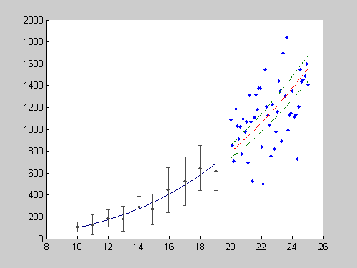
Adjust Line Properties (Esthetics)
To make it more publication-quality, I make the following changes to the line properties, including the errorbar widths. In
my opinion, using thicker lines and larger markers greatly improves the "look" of my graphics. It's quite subjective, but
I select them based on how much data is on the graph. I select the appropriate "crowdedness" (balance of dark and white space):
set(hFit                          , ...
  'LineWidth'       , 2           );
set(hE                            , ...
  'LineWidth'       , 1           , ...
  'Marker'          , 'o'         , ...
  'MarkerSize'      , 6           , ...
  'MarkerEdgeColor' , [.2 .2 .2]  , ...
  'MarkerFaceColor' , [.7 .7 .7]  );
set(hData                         , ...
  'Marker'          , 'o'         , ...
  'MarkerSize'      , 5           , ...
  'MarkerEdgeColor' , 'none'      , ...
  'MarkerFaceColor' , [.75 .75 1] );
set(hModel                        , ...
  'LineWidth'       , 1.5         );
set(hCI(1)                        , ...
  'LineWidth'       , 1.5         );
set(hCI(2)                        , ...
  'LineWidth'       , 1.5         );

% adjust error bar width
hE_c                   = ...
    get(hE     , 'Children'    );
errorbarXData          = ...
    get(hE_c(2), 'XData'       );
errorbarXData(4:9:end) = ...
    errorbarXData(1:9:end) - 0.2;
errorbarXData(7:9:end) = ....
    errorbarXData(1:9:end) - 0.2;
errorbarXData(5:9:end) = ...
    errorbarXData(1:9:end) + 0.2;
errorbarXData(8:9:end) = ...
    errorbarXData(1:9:end) + 0.2;
set(hE_c(2), 'XData', errorbarXData);

Add Legend and Labels
No plot is complete unless it is well annotated.
hTitle  = title ('My Publication-Quality Graphics');
hXLabel = xlabel('Length (m)'                     );
hYLabel = ylabel('Mass (kg)'                      );

hText   = text(10, 800, ...
  sprintf('\\it{C = %0.1g \\pm %0.1g (CI)}', ...
  c, cint(2)-c));

hLegend = legend( ...
  [hE, hFit, hData, hModel, hCI(1)], ...
  'Data (\mu \pm \sigma)' , ...
  'Fit (\it{C x^3})'      , ...
  'Validation Data'       , ...
  'Model (\it{C x^3})'    , ...
  '95% CI'                , ...
  'location', 'NorthWest' );
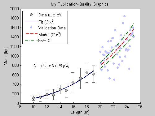
Adjust Font and Axes Properties
Since many publications accept EPS formats, I select fonts that are supported by PostScript and Ghostscript. Anything that's
not supported will be replaced by Courier. I also define tick locations, especially when the default is too crowded.
set( gca                       , ...
    'FontName'   , 'Helvetica' );
set([hTitle, hXLabel, hYLabel, hText], ...
    'FontName'   , 'AvantGarde');
set([hLegend, gca]             , ...
    'FontSize'   , 8           );
set([hXLabel, hYLabel, hText]  , ...
    'FontSize'   , 10          );
set( hTitle                    , ...
    'FontSize'   , 12          , ...
    'FontWeight' , 'bold'      );

set(gca, ...
  'Box'         , 'off'     , ...
  'TickDir'     , 'out'     , ...
  'TickLength'  , [.02 .02] , ...
  'XMinorTick'  , 'on'      , ...
  'YMinorTick'  , 'on'      , ...
  'YGrid'       , 'on'      , ...
  'XColor'      , [.3 .3 .3], ...
  'YColor'      , [.3 .3 .3], ...
  'YTick'       , 0:500:2500, ...
  'LineWidth'   , 1         );

Export to EPS
I set PaperPositionMode to auto so that the exported figure looks like it does on the screen.
set(gcf, 'PaperPositionMode', 'auto');
print -depsc2 finalPlot1.eps
close;
Postprocess
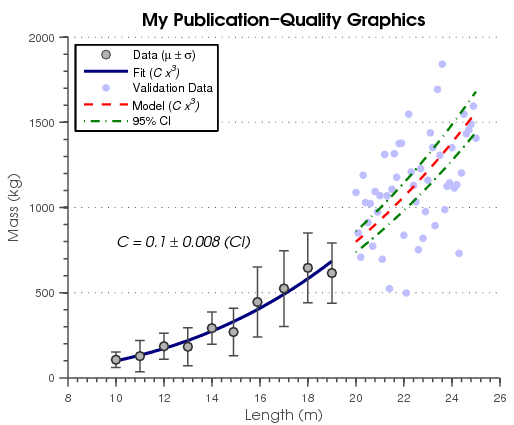
This looks great! One thing that I may want to change is the way the dotted and dashed lines look. Notice that the dots are
too small. So, I wrote a simple function that goes into the EPS file and modifies the line definitions. I have posted the
function, fixPSlinestyle, on the File Exchange.
fixPSlinestyle('finalPlot1.eps', 'finalPlot2.eps');

And there you go. I have automated the process of creating publication-quality graphics. Handle Graphics give you advanced control of how graphics look. In case you didn't know, MATLAB allows you to quickly take a MATLAB script
and publish a formated report (HTML, Word, LaTeX, XML, PPT), where the figures are automatically converted to various graphics format,
including EPS. This document was created using publish.
Your Examples
Tell us here about some of the cool things you do with Handle Graphics to make your figures look prettier.
Published with MATLAB® 7.5





댓글
댓글을 남기려면 링크 를 클릭하여 MathWorks 계정에 로그인하거나 계정을 새로 만드십시오.