SIR Math Model of Virus Spread (Coronavirus or other)
Will's pick this week is SIR Math Model of Virus Spread (Coronavirus or other) by Tom Beekhuysen.
One of the most popular Simulink submissions at the moment is a model that predicts the daily cases of a disease as it spreads through a population of fixed size. Though the model only consists of 10 blocks, it is able to produce those projection curves we have all become familiar with in recent months. It's a testament to how easily you can craft a model in Simulink.
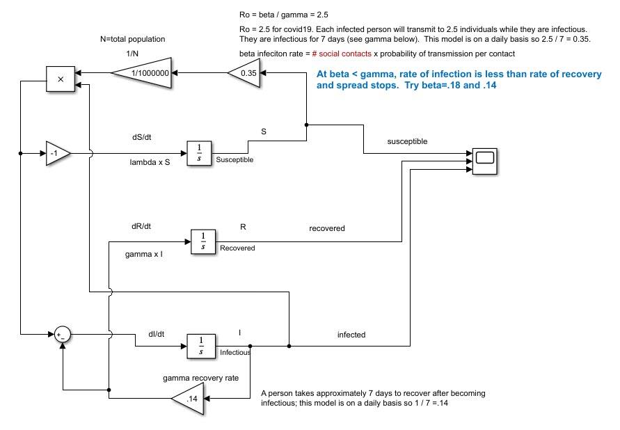 Another things I love about Simulink that's highlighted by this submission is the ease of understanding a model. The graphics make the model's three interrelated differential equations so approachable that I immediately began thinking of ways to tinker with it. I reorganized it in a way that made even more sense to me:
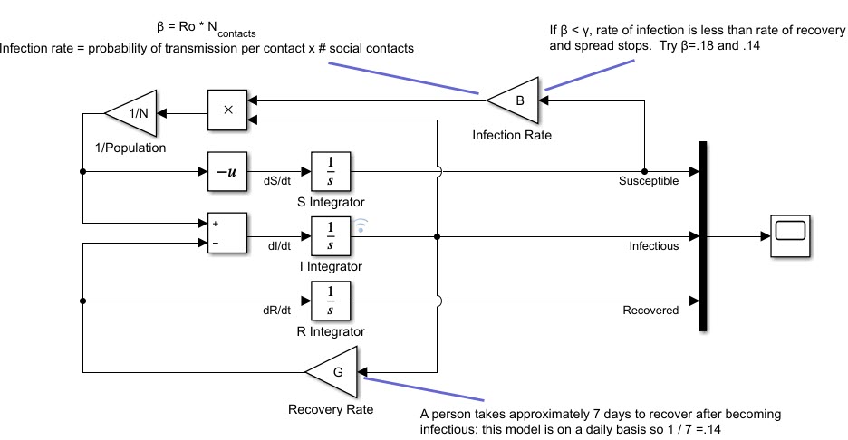
That faint blue wireless icon beside the I Integrator indicates that I'm logging that signal. That enabled me to record the results for multiple different infection rates. I then used the Simulation Data Inspector to visualize daily cases for infection rates ranging from .12 to .40. It makes a big difference in the results for a population of 1 million: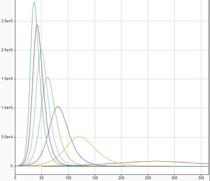
Tom's model inspired me to think about how to develop a more elaborate model. Why do the infection and recovery rates need to be a constant? Converting them to time-varying functions to model quarantine measures would be a variation you could quickly try out. You could also break the populations into demographic categories such as age brackets and/or job type. The infection rate could be customized for each group to account for the different risks of essential workers, retirees, and so forth. What ideas do you have to build an even more sophisticated simulation?
Let us know what you think here or leave a comment for Tom.
 Another things I love about Simulink that's highlighted by this submission is the ease of understanding a model. The graphics make the model's three interrelated differential equations so approachable that I immediately began thinking of ways to tinker with it. I reorganized it in a way that made even more sense to me:

That faint blue wireless icon beside the I Integrator indicates that I'm logging that signal. That enabled me to record the results for multiple different infection rates. I then used the Simulation Data Inspector to visualize daily cases for infection rates ranging from .12 to .40. It makes a big difference in the results for a population of 1 million:

Tom's model inspired me to think about how to develop a more elaborate model. Why do the infection and recovery rates need to be a constant? Converting them to time-varying functions to model quarantine measures would be a variation you could quickly try out. You could also break the populations into demographic categories such as age brackets and/or job type. The infection rate could be customized for each group to account for the different risks of essential workers, retirees, and so forth. What ideas do you have to build an even more sophisticated simulation?
Let us know what you think here or leave a comment for Tom.


コメント
コメントを残すには、ここ をクリックして MathWorks アカウントにサインインするか新しい MathWorks アカウントを作成します。