Often times, people want to plot two vectors of data with the same x-axis, but the vectors are at wildly different values on the y-axis. The vector with the smaller y values will often be just a flat line if you use the same scale for both. For that reason, things like plotyy were invented.
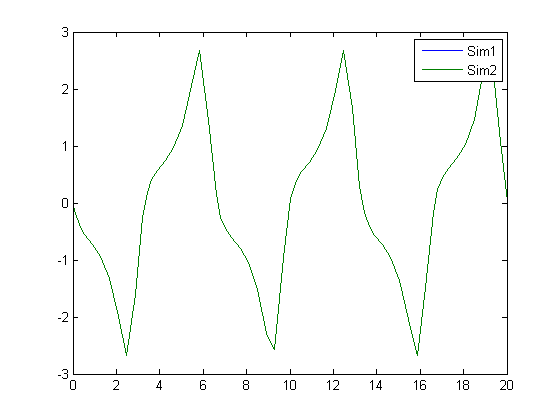
Zhipeng was not satisfied with our implementation, so he made his own with LayerPlot. Compare the difference!
Is there a way to plot with plotyy with several series associated with the first axis, and one with the second? I can get plotyy working with two series, one with each y-axis, but not when I start having more data series…
Both plotyy and plotyyy (that you link to above) only allow for one data series on each axis. They do not allow for say multiple series on one axis and another series on another axis. Is there any way to plot that?
I guess most of the people here run into the following problem :
[ax,h1,h2]=plotyy(im_x,im_y,x,y1);
hold on
plot(ax(2),x,y2)
This usually returns error:
??? Error using ==> plot
Parent destroyed during line creation
When debugging into plot() you find a newplot.m — in there the right parent figure is selected, because even graphical objects need a father! In the same file there is the function
ObserveAxesNextPlot() which deletes the axes we try to plot into *if* the “nextplot” property is not set to “add”.
Hence:
[ax,h1,h2]=plotyy(x, y1, x, y2);
hold on
%%%%%%%%%%%%%%%
set(ax(2),’nextplot’,'add’);
%%%%%%%%%%%%%%%
plot(ax(2),x,y3)
hold off
I’ll second Jiro’s tip. Some years ago I rewired my brain to start using PLOT, LINE, LINE whenever possible instead of PLOT, HOLD ON, PLOT, PLOT. Initially it was just laziness (less typing). Fewer missed HOLD OFF cases to debug was a plus. Code readability improved without HOLD state. Good tip.
I have a question to the above mentioned methods:
I already managed to plot up to 3 datasets in one plot window with the PLOTYY function. But there are still unsolved problems:
1.
Is it possible to add a second dataset to the first y-axis? (I only managed to add a second dataset to the second y-axis)
2. (Most important to me!)
Is it possible to (easily) manipulate the zoom-function in PLOTYY-plots so that the y-axes gets updated when I zoom in? At the moment the axis-settings are very crude and they dont update, when I zoom in the window, so that I wont have any axis-ticks, when I zoom in deeply.
I would be very grateful for helpful answers without using aditional software packages, because the written programm shall be used by other people, too.
first off thanks a lot for the quick response!
Second I have a question concerning the code:
I didn’t implement it yet, but from my understanding I can’t see a part, that enables the zooming with adjusting axes-ticks.
Is there a way to do that?
I now had the chance to test the algorithm and I had a problem:
The first addition with hold(ax(1), ‘on’) worked out fine, but on the other hand, I managed to realize this function another way before.
But where I am stuck is the second addition with (hold(ax(2),’on’) or more precisely the “closing tag” (hold(ax(2), ‘off). Because, when I try to implement this, I get the error message:
“??? Error using ==> hold at 69
Unknown Command option”
For me, it looks like Matlab won’t supply the function of adding more than 1 dataset to the second axis.
Additionally, there is still the problem mentioned above with the non-changing axis-ticks. Is that meant to be solved be the ‘plot’ keyword in the function call of “plotyy”? At least it didn’t work, if it should :(
When you have the 2 y axis’s, how do you change the scale for the on on the right side? I’ve been mainly using the gui to edit any changes to my graphs.
I’m trying to plot several (7) data sets that all have a common y axis (depth). Each data set has different units and scales. What I’d like to do is plot one y axis on the left side and seven different x axes along the bottom, side by side. Do you have any tips for accomplishing this?
This sounds akin to the PLOTYY function, or the MATLAB Central File Exchange file PLOTYYY.
I have not heard of people doing this for X. I am sure it can be done, but 7 is a bit excessive for this format. Have some sample data you can post images of to egt an idea what you are dealing with?
I’m working with geophysical data, so I’d like to produce a depth profile. The y-axis would be depth, from 0 (surface) down to about 100 km let’s say, in increments of 10 km. At each depth I have calculated various properties, such as density, viscosity, temperature, etc, which would be plotted along the x-axis. I’d like to create, on one graph, one line for each of these properties, each with their own scale on the x-axis. Here’s a hypothetical example of some data:
I would say to use plotYYY, because that is close to what you want, but using depth as Y makes sense. Most user made files that do this focus on making Y the multi-axis.
I think you are best off looking at some of the existing ones for ideas on this, but you will have to write it yourself.
The added complication of 7 series, makes this much tougher.
How about this? Kinda kludgy…
Normalize all the values from zero to one. Plot them on the same axis. This gets you the qualitative comparison.
Take this a step further: When you click on a given series, the axis labels will change to be appropriate for that series. You would not be able to see all of them at once, but any one you wanted easy. Pretty clean interface, and not bad to implement.
Thanks for your suggestions Doug. I’ll give that a shot and see what happens. I’ve seen many of these kinds of plots with depth on the x-axis - perhaps for the same reason that you mentioned. I may end up plotting each individually and then using Illustrator to compile them all together on one figure (although I don’t like the idea of doing that - there should be an easy way!). In any case, I’ll let you know the outcome.
I didn’t have a lot of time to mess with this, but I did find a work-around. I plotted all the figures as subplots side-by-side with the same scale on the y-axis. I consolidated them in the figure editor gui. It worked pretty well, but unfortunately isn’t repeatable like a script would be. A friend of a friend put together a pretty complicated script that seems to do everything without the subplot and figure editing. I’ll see if I can get permission to post it here for you to see.
Incidentally, the .eps outputs are pretty nice to work with in Illustrator. The plot can be ungrouped into all it’s component parts and manipulated. I ended up polishing up the figure with this in the end.
Thanks for your comments - I really appreciate the help!
-Zach
Leave a Reply
About
Bob, Brett & Jiro share their favorite user-contributed submissions from the File Exchange.
Hi Doug,
I would like my data to be plotted as points, not lines. Can I make a multiple y axes plot using points?
The commands you are looking for are PLOTYY (to get multiple Y axis) and you want to specify the marker when doing a plot.
>>plot(x,y,’.')
will plot x vs y with dots but no lines connecting.
Doug
Is there a way to plot with plotyy with several series associated with the first axis, and one with the second? I can get plotyy working with two series, one with each y-axis, but not when I start having more data series…
thanks
Erik
Erik,
Try this:
http://www.mathworks.com/matlabcentral/fileexchange/loadFile.do?objectId=1017&objectType=file
Doug
Doug,
Both plotyy and plotyyy (that you link to above) only allow for one data series on each axis. They do not allow for say multiple series on one axis and another series on another axis. Is there any way to plot that?
Thanks,
Sulabh
I guess most of the people here run into the following problem :
[ax,h1,h2]=plotyy(im_x,im_y,x,y1);
hold on
plot(ax(2),x,y2)
This usually returns error:
??? Error using ==> plot
Parent destroyed during line creation
When debugging into plot() you find a newplot.m — in there the right parent figure is selected, because even graphical objects need a father! In the same file there is the function
ObserveAxesNextPlot() which deletes the axes we try to plot into *if* the “nextplot” property is not set to “add”.
Hence:
[ax,h1,h2]=plotyy(x, y1, x, y2);
hold on
%%%%%%%%%%%%%%%
set(ax(2),’nextplot’,'add’);
%%%%%%%%%%%%%%%
plot(ax(2),x,y3)
hold off
Now sit back and behold that beauty.
Another solution is to use the “line” command. LINE is a low-level function that does not call “newplot”.
[ax, h1, h2] = plotyy(x, y1, x, y2);
line(x, y3, ‘Parent’, ax(2));
I’ll second Jiro’s tip. Some years ago I rewired my brain to start using PLOT, LINE, LINE whenever possible instead of PLOT, HOLD ON, PLOT, PLOT. Initially it was just laziness (less typing). Fewer missed HOLD OFF cases to debug was a plus. Code readability improved without HOLD state. Good tip.
Wasn’t aware of the line function for such uses. Certainly better than setting weird axis properties.
Cheers, jiro.
Hallo there,
I have a question to the above mentioned methods:
I already managed to plot up to 3 datasets in one plot window with the PLOTYY function. But there are still unsolved problems:
1.
Is it possible to add a second dataset to the first y-axis? (I only managed to add a second dataset to the second y-axis)
2. (Most important to me!)
Is it possible to (easily) manipulate the zoom-function in PLOTYY-plots so that the y-axes gets updated when I zoom in? At the moment the axis-settings are very crude and they dont update, when I zoom in the window, so that I wont have any axis-ticks, when I zoom in deeply.
I would be very grateful for helpful answers without using aditional software packages, because the written programm shall be used by other people, too.
Best regards
Tobias
Tobias,
This code will do what you want. Basically, calling to the individual axes to get things done.
clf
x = 0:0.01:20;
y1 = 200*exp(-0.05*x).*sin(x);
y2 = 0.8*exp(-0.5*x).*sin(10*x);
[AX,H1,H2] = plotyy(x,y1,x,y2,’plot’);
hold(AX(1), ‘on’)
axes(AX(1))
plot (1:20, rand(1,20)*200)
hold(AX(2), ‘on’)
axes(AX(2))
plot (1:20, rand(1,20)-0.5)
hold(AX(2), ‘off’)
Hi Doug,
first off thanks a lot for the quick response!
Second I have a question concerning the code:
I didn’t implement it yet, but from my understanding I can’t see a part, that enables the zooming with adjusting axes-ticks.
Is there a way to do that?
Tobias
Hi again,
I now had the chance to test the algorithm and I had a problem:
The first addition with hold(ax(1), ‘on’) worked out fine, but on the other hand, I managed to realize this function another way before.
But where I am stuck is the second addition with (hold(ax(2),’on’) or more precisely the “closing tag” (hold(ax(2), ‘off). Because, when I try to implement this, I get the error message:
“??? Error using ==> hold at 69
Unknown Command option”
For me, it looks like Matlab won’t supply the function of adding more than 1 dataset to the second axis.
Additionally, there is still the problem mentioned above with the non-changing axis-ticks. Is that meant to be solved be the ‘plot’ keyword in the function call of “plotyy”? At least it didn’t work, if it should :(
Any clues?
It looks like you are missing the close quote on ‘off.
I can not modify the zoom behavior of plotyy. It is not clear how zooming should work there. You can change the ylim of each axis though.
-Doug
When you have the 2 y axis’s, how do you change the scale for the on on the right side? I’ve been mainly using the gui to edit any changes to my graphs.
Andrew,
x = 0:0.01:20;
y1 = 200*exp(-0.05*x).*sin(x);
y2 = 0.8*exp(-0.5*x).*sin(10*x);
[AX,H1,H2] = plotyy(x,y1,x,y2,’plot’);
%% Take a look at limits then
set(AX(2), ‘ylim’, [-1 1])
Doug
Hi
I have read through these comments and noted that they all require plotyy.
Is there a way to add a second axis after a call to plot?
I’m using a third-party graphing tool and wish to overlay some of my own stuff??
thanks, Lyle
@Lyle,
Take a look at this page from the documentation:
http://www.mathworks.com/access/helpdesk/help/techdoc/creating_plots/f1-11215.html
Hi,
I’m trying to plot several (7) data sets that all have a common y axis (depth). Each data set has different units and scales. What I’d like to do is plot one y axis on the left side and seven different x axes along the bottom, side by side. Do you have any tips for accomplishing this?
Thanks!
This sounds akin to the PLOTYY function, or the MATLAB Central File Exchange file PLOTYYY.
I have not heard of people doing this for X. I am sure it can be done, but 7 is a bit excessive for this format. Have some sample data you can post images of to egt an idea what you are dealing with?
Doug
I’m working with geophysical data, so I’d like to produce a depth profile. The y-axis would be depth, from 0 (surface) down to about 100 km let’s say, in increments of 10 km. At each depth I have calculated various properties, such as density, viscosity, temperature, etc, which would be plotted along the x-axis. I’d like to create, on one graph, one line for each of these properties, each with their own scale on the x-axis. Here’s a hypothetical example of some data:
depth = [0 10 20 30 40 50 60 70 80 90 100] in kilometers
temp = [25 26 28 29 30 31 31 32 35 37 37] in degrees C
density = [2700 2700 2700 2750 2770 2770 2775 2780 2780 3000 3050] in kg/m3
viscosity = [100 110 120 130 140 150 160 170 180 190 200] Pascal*seconds
As you can see, the scales for each property along the x-axis are very different. Is this the kind of sample data you’re asking about? Here are some figures that are close to what I’m thinking:
http://www.ats-intl.com/expertise/images/geophysics-BG2.jpg
http://geophysics.eas.gatech.edu/people/anewman/classes/Geodynamics/misc/prem_earth.pdf
Your help is much appreciated, thanks!
@Zach,
I would say to use plotYYY, because that is close to what you want, but using depth as Y makes sense. Most user made files that do this focus on making Y the multi-axis.
I think you are best off looking at some of the existing ones for ideas on this, but you will have to write it yourself.
The added complication of 7 series, makes this much tougher.
How about this? Kinda kludgy…
Normalize all the values from zero to one. Plot them on the same axis. This gets you the qualitative comparison.
Take this a step further: When you click on a given series, the axis labels will change to be appropriate for that series. You would not be able to see all of them at once, but any one you wanted easy. Pretty clean interface, and not bad to implement.
What do you think?
Doug
Thanks for your suggestions Doug. I’ll give that a shot and see what happens. I’ve seen many of these kinds of plots with depth on the x-axis - perhaps for the same reason that you mentioned. I may end up plotting each individually and then using Illustrator to compile them all together on one figure (although I don’t like the idea of doing that - there should be an easy way!). In any case, I’ll let you know the outcome.
Thanks again.
@Zach
This isn’t exactly what you are looking for but at least it puts all three parameters on the same page with aligned y (depth) axes.
Hi Doug and Les,
I didn’t have a lot of time to mess with this, but I did find a work-around. I plotted all the figures as subplots side-by-side with the same scale on the y-axis. I consolidated them in the figure editor gui. It worked pretty well, but unfortunately isn’t repeatable like a script would be. A friend of a friend put together a pretty complicated script that seems to do everything without the subplot and figure editing. I’ll see if I can get permission to post it here for you to see.
Incidentally, the .eps outputs are pretty nice to work with in Illustrator. The plot can be ungrouped into all it’s component parts and manipulated. I ended up polishing up the figure with this in the end.
Thanks for your comments - I really appreciate the help!
-Zach