Analyzing Uber Ride Sharing GPS Data
Many of us carry around smartphones that can track our GPS positions and that's an interesting source of data. How can we analyze GPS data in MATLAB?
Today's guest blogger, Toshi Takeuchi, would like to share an analysis of a public GPS dataset from a popular ride sharing service Uber.
Contents
Introduction
Uber is a ride sharing service that connects passengers with private drivers through a mobile app and takes care of payment. They are in fact so popular that you hear about them in the news due to their conflicts with local traffic regulations and taxi business interests.
Uber’s ride sharing GPS data was available publicly on infochimps.com, so I used it for this analysis (Unfortunately it is not available anymore). What can we learn from this dataset?

Uber anonymized GPS logs
Let's start by downloading the dataset from the link above (a zipped TSV file), which contains the GPS logs taken from the mobile apps in Uber cars that were actively transporting passengers in San Francisco. The data have been anonymized by removing names, trip start and end points. The dates were also substituted. Weekdays and time of day are still intact.
For the purpose of this analysis, let's focus on the data captured in the city proper and visualize it with Mapping Toolbox.
Run the script to load data. Check loadData.m to see the details.
loadData
Overlay the GPS points on the map.
states = geoshape(shaperead('usastatehi', 'UseGeoCoords', true));
latlim = [min(T.Lat) max(T.Lat)];
lonlim = [min(T.Lon) max(T.Lon)];
ocean = [0.7 0.8 1]; land = [0.9 0.9 0.8];

figure
ax = usamap(latlim, lonlim);
setm(ax, 'FFaceColor', ocean)
geoshow(states,'FaceColor',land)
geoshow(T.Lat,T.Lon,'DisplayType','Point','Marker','.',...
    'MarkerSize',4,'MarkerEdgeColor',[0 0 1])
title('Uber GPS Log Data')
xlabel('San Francisco')
textm(37.802069,-122.446618,'Marina')
textm(37.808376,-122.426105,'Fishermans Wharf')
textm(37.797322,-122.482409,'Presidio')
textm(37.774546,-122.412329,'SOMA')
textm(37.770731,-122.440481,'Haight')
textm(37.818276,-122.498546,'Golden Gate Bridge')
textm(37.819632,-122.376065,'Bay Bridge')

Does the usage change over time?
Let's start with a basic question - how does the use of Uber service change over time. We can use grpstats to summarize data grouped by specific categorical values, such as DayName and TimeOfDay, which were added in the data loading process.
Get grouped summaries.
byDay = grpstats(T(:,{'Lat','Lon','DayName'}),'DayName');
byDayTime = grpstats(T(:,{'Lat','Lon','TimeOfDay','DayName'}),...
    {'DayName','TimeOfDay'});
Reshape the count of entries into a 24x7 matrix.
byDayTimeCount = reshape(byDayTime.GroupCount,24,7)';
Plot the data by day of week and by hours per day of week.
figure
subplot(2,1,1)
bar(byDay.GroupCount); set(gca,'XTick',1:7,'XTickLabel',cellstr(byDay.DayName));
subplot(2,1,2)
plot(byDayTimeCount'); set(gca,'XTick',1:24); xlabel('Hours by Day of Week');
legend('Mon','Tue','Wed','Thu','Fri','Sat','Sun',...
    'Orientation','Horizontal','Location','SouthOutside')

It looks like the usage goes up during the weekend (Friday through Sunday) and usage peaks in early hours of the day. San Francisco has a very active night life!
Where do they go during the weekend?
Is there a way to figure out where people go during the weekend? Even though the dataset doesn't contain the actual starting and ending points of individual trips, we may still get a sense of how the traffic flows by looking at the first and last points of each record.
We can extract the starting and ending location data for weekend rides. Click getStartEndPoints.m to see how it is done. If you would like to run this script, please download districts.xlsx as well.
% Here we load the preprocessed data |startEnd.mat| to save time and plot
% their starting points.

% getStartEndPoints % commented out to save time
load startEnd.mat % load the preprocessed data instead

figure
ax = usamap(latlim, lonlim);
setm(ax, 'FFaceColor', ocean)
geoshow(states,'FaceColor',land)
geoshow(startEnd.StartLat,startEnd.StartLon,'DisplayType','Point',...
    'Marker','.','MarkerSize',5,'MarkerEdgeColor',[0 0 1])
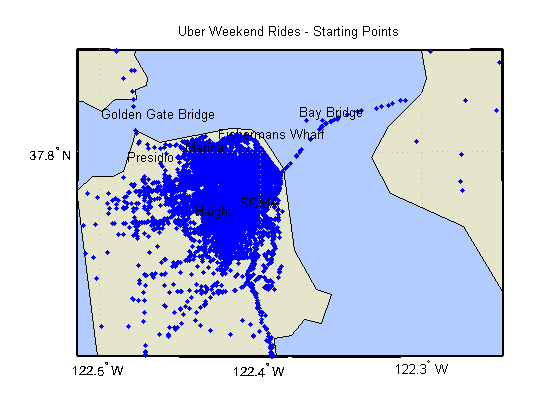
title('Uber Weekend Rides - Starting Points')
xlabel('San Francisco')
textm(37.802069,-122.446618,'Marina')
textm(37.808376,-122.426105,'Fishermans Wharf')
textm(37.797322,-122.482409,'Presidio')
textm(37.774546,-122.412329,'SOMA')
textm(37.770731,-122.440481,'Haight')
textm(37.818276,-122.498546,'Golden Gate Bridge')
textm(37.819632,-122.376065,'Bay Bridge')

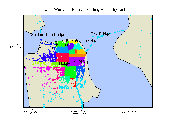
When you plot the longitude and latitude data, you just get messy point clouds and it is hard to see what's going on. Instead, I broke the map of San Francisco into rectangular blocks to approximate its districts. Here is the new plot of starting points by district.
dist = categories(startEnd.StartDist);
cc = hsv(length(dist));

figure
ax = usamap(latlim, lonlim);
setm(ax, 'FFaceColor', ocean)
geoshow(states,'FaceColor',land)
for i = 1:length(dist)
    inDist = startEnd.StartDist == dist(i);
    geoshow(startEnd.StartLat(inDist),startEnd.StartLon(inDist),...
        'DisplayType','Point','Marker','.','MarkerSize',5,'MarkerEdgeColor',cc(i,:))
end
title('Uber Weekend Rides - Starting Points by District')
xlabel('San Francisco')
textm(37.802069,-122.446618,'Marina')
textm(37.808376,-122.426105,'Fishermans Wharf')
textm(37.797322,-122.482409,'Presidio')
textm(37.774546,-122.412329,'SOMA')
textm(37.770731,-122.440481,'Haight')
textm(37.818276,-122.498546,'Golden Gate Bridge')
textm(37.819632,-122.376065,'Bay Bridge')

Visualizing the traffic patterns with Gephi
This is a step in the right direction. Now that we have the starting and ending points grouped by districts, we can represent the rides as connections among different districts - this is essentially a graph with districts as nodes and rides as edges. To visualize this graph, we can use a popular social networking analysis tool Gephi, which was also used in another post, Analyzing Twitter with MATLAB.
You can export StartDist and EndDist as the edge list to Gephi in CSV format.
writetable(startEnd(:,{'StartDist','EndDist'}),'edgelist.csv',...
    'WriteVariableNames',false)
Once you export the edge list, you can plot the connections (edges) between districts (nodes) in Gephi. Now it is much easier to see where people went during the weekend! To see a bigger image, check out the PDF version.

- The size of the district nodes represents their in-degrees, the number of incoming connections, and you can think of it as measure of popularity as destinations. SOMA, Haight, Mission District, Downtown, and The Castro are the popular locations based on this measure.
- The districts are colored based on their modularity, which basically means which cluster of nodes they belong to. It looks like people hang around set of districts that are nearby - SOMA, Downtown, Mission District are all located towards the south (green). The Castro, Haight, Western Addition in the center (purple) and it is strongly connected to Richmond and Sunset District in the west. Since those are residential areas, it seems people from those areas hang out in the other districts in the same cluster.
- The locals don't seem to go to Fisherman's Wharf or Chinatown in the north (red) very much - they are probably considered not cool because of tourists?
Summary
Now you know where to go in San Francisco during the weekend if you want to experience an active night life there. We just looked at the overall weekend data, but you can explore more by time slicing the data to see how the traffic pattern changes based on the time of day or day of the week. You may be able to find traffic congestions by calculating the speed using the timestamps. Try it yourself and share what you find here!.
- Category:
- Community,
- Large data set,
- Social Computing


Comments
To leave a comment, please click here to sign in to your MathWorks Account or create a new one.