
Interactively changing color axis
Jiro's pick this week is Colormouse by Patrick.
In addition to examining the actual values or creating line plots, you can get a lot of insight by visualizing data with color. MATLAB has a number of functions that let you represent your data with color, including image, surf, mesh, and contourf. Many of these functions make use of a colormap that represents a range of colors for the values.
contourf(peaks)
colorbar
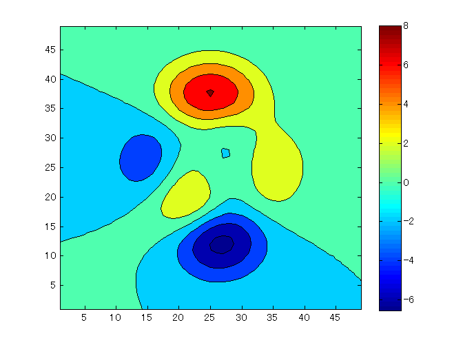
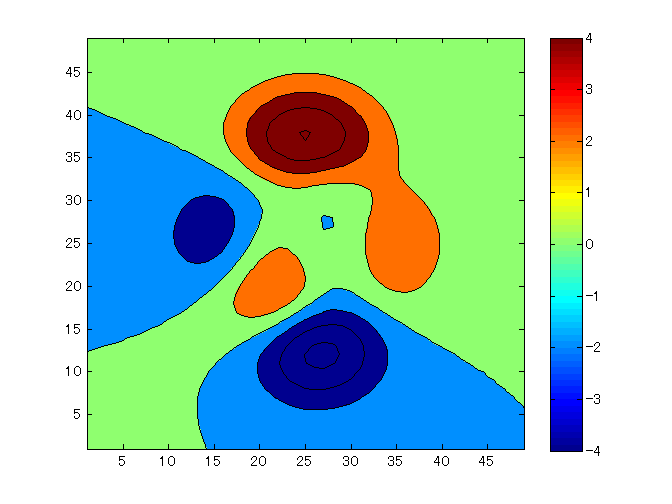
colorbar above shows the range of colors represented in the figure. You can programmatically change this color range by using the caxis function.
caxis([-4 4])
Patrick's colormouse allows you to change the colormap range interactively using the mouse. Calling colormouse adds a toolbar button to the current figure.
Once you're in colormouse mode, you can click-n-drag to move (by moving the mouse up and down) or widen/narrow (left and right) the color range.
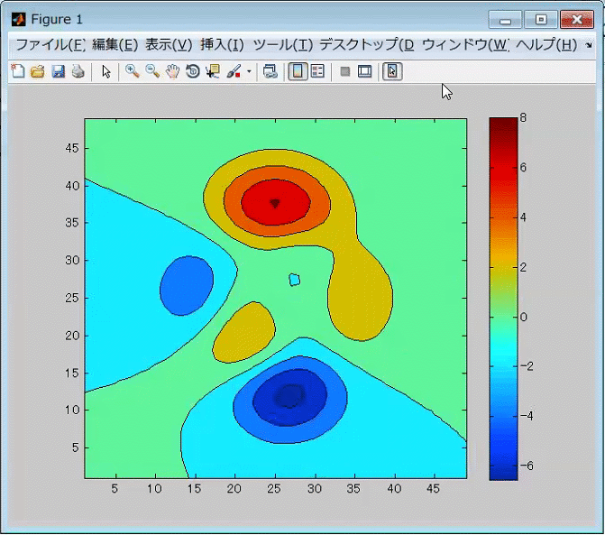
You can also select a specific colormap from a context menu.
Comments
Let us know what you think here or leave a comment for Patrick.
Note that the actual sourcecode resides on GitHub, so please check the GitHub page for the license information.
- カテゴリ:
- Picks


コメント
コメントを残すには、ここ をクリックして MathWorks アカウントにサインインするか新しい MathWorks アカウントを作成します。