A New Colormap for MATLAB – Part 2 – Troubles with Rainbows
Last week I showed you the new MATLAB colormap, parula. Parula has replaced jet as the default colormap in R2014b, which was released earlier this month.
This week I want to explain some of the motivations for replacing jet. Jet is an example of a rainbow colormap. A rainbow colormap is based on the order of colors in the spectrum of visible light. Some of you might know the mnemonic "Roy G. Biv" for remembering the order of colors: red, orange, yellow, green, blue, indigo, and violet.
Multiple methods exists for constructing rainbow colormaps, so they don't all look alike. Here is jet, the MATLAB version:
showColormap('jet','bar')
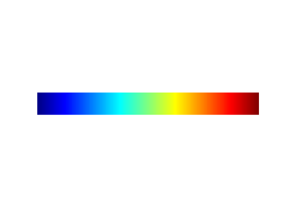
In my introductory post last week, I showed you a few visualization examples using jet, and I asked you some questions about them. Let's look at the questions again and figure out the answers.
Question 1: In the chart below, as you move from left to right along the line shown in yellow, how does the data change? Does it trend higher? Or lower? Or does it trend higher in some places and lower in others?
fluidJet
hold on
plot([100 160],[100 135],'y','LineWidth',3)
hold off
colormap(gca,'jet')
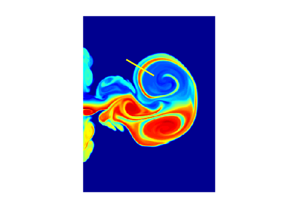
By my count there are six very distinct color changes as you move along the line from left to right. So what does that mean about the data?
I posed this question to someone who is very familiar with the jet colormap, and I was surprised by the response: "The data starts low, goes high, and then goes back low again."
"But what about all those other color stripes," I asked? "What do they mean?"
"That's just what jet does. I've learned to ignore all those stripes."
Oh! Well, it turns out that some of the color stripes are indeed mostly meaningless. But not all of them!
Here's what the data actually does along that path.
improfile(s.X,[100 160],[100 135])
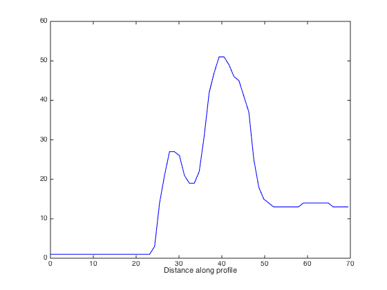
Yes, the data starts low, goes high, and then goes back low. But if you ignore all the color stripes in between the blue and the red, then you miss the presence of the smaller-magnitude peak on the left. Alternatively, if you believe that all the color stripes are meaningful, then the yellow stripes seem to falsely suggest distinct data regions to the left and the right of the main peak.
Now let's compare with parula.
fluidJet
colormap(gca,parula)
hold on
plot([100 160],[100 135],'y','LineWidth',3)
hold off
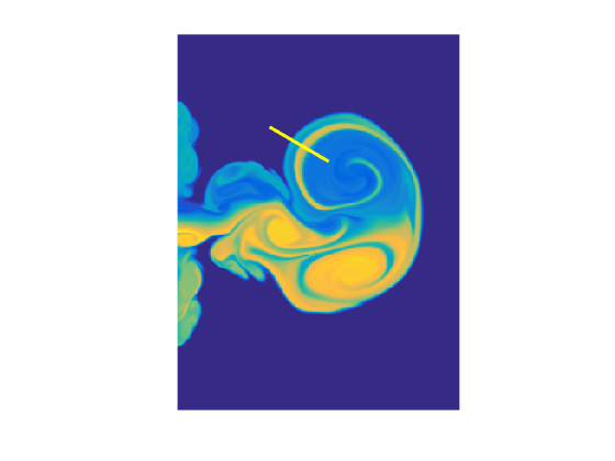
You can see that now there are only four distinct color changes as you follow the yellow line. These changes correspond directly to real features in the data. There are no extraneous color stripes that do not correspond to real data features.
Question 2: In the filled contour plot below, which regions are high and which regions are low?
filledContour15
colormap(gca,rgb2gray(jet))
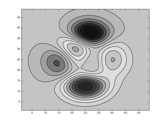
In the plot above, I have done a crude simulation of what a jet-based visualization looks like if printed on a grayscale printer. Here's the full color version:
colormap(gca,jet)
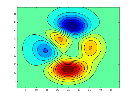
If you are familiar with jet and know therefore that blue is low and red is high, then you can probably look at the full-color version and give a reasonable interpretation of it. When rendered as grayscale, however, all hope is lost. The red and blue colors of jet are just about equally dark.
Here are the full-color and grayscale results with parula.
filledContour15
colormap(gca,parula)
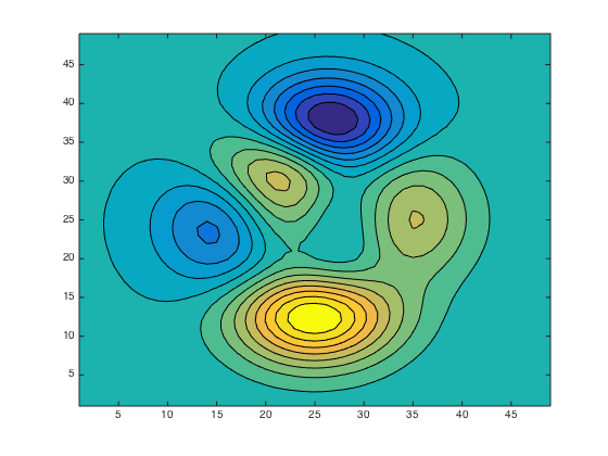
filledContour15
colormap(gca,rgb2gray(parula))
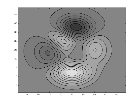
With parula, dark consistently means low, and bright consistently means high.
The last questions relate to the three plots below (A, B, and C) showing different horizontal oscillations.
Question 3: Which horizontal oscillation (A, B, or C) has the highest amplitude?
Question 4: Which horizontal oscillation (A, B, or C) is closest to a pure sinusoid?
Question 5: In comparing plots A and C, which one starts high and goes low, and which one starts low and goes high?
subplot(2,2,1)
horizontalOscillation1
title('A')

subplot(2,2,2)
horizontalOscillation2
title('B')

subplot(2,2,3)
horizontalOscillation3
title('C')

colormap(jet)
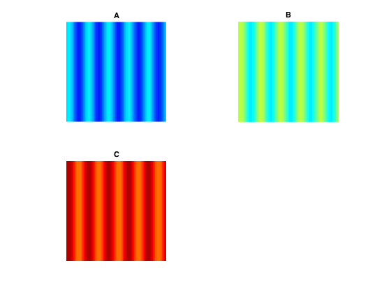
The answers are subjective and might depend on your monitor and ambient lighting. But here's what I see.
The data pattern in image A has significantly higher visual contrast than either image B or image C. That suggests that the data oscillation in A has the highest amplitude.
The data patterns in images B and C both exhibit vertical stripes within each period of the oscillation. That strongly suggests that horizontal oscillations shown in B and C have some constant or almost-constant regions and that they go up and down in something like a stair-step pattern. To my eye, image A looks the most like a pure sinusoid.
And finally, the pattern in image A starts with a bright stripe on the left, whereas the image B pattern starts with a dark stripe. That suggests that oscillation A starts high, while oscillation B starts low (or maybe vice versa).
You probably won't be surprised to find out that these are all trick questions. Actually, oscillations A, B, and C are all sinusoids with exactly the same amplitude and shape. They differ only in their constant offsets, which place them in different regions of the jet colormap. Note especially that oscillations A and C are actually in phase with each other; they both start high and go low. The differences we see are all visual artifacts caused by the jet colormap.
Compare the result using parula:
colormap(parula)
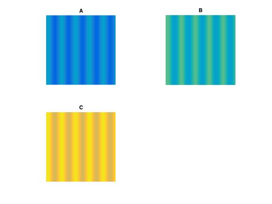
With these examples, I wanted to show several ways in which the jet colormap, and rainbow colormaps in general, can mislead the viewer about properties of the data.
It turns out that some people have been writing about these problems with rainbow colormaps for years. Here's a summary of the main criticisms:
- Rainbow colormaps confuse viewers because there is no natural perceptual ordering of the spectral colors. In addition to causing visual confusion (such as whether oscillations A and C above are in-phase or out-of-phase), the lack of perceptual ordering can slow down tasks because viewers have to refer to the color key more often in order to interpret the data.
- Rainbow colormaps obscure small details in the data. The primary reason is that the green and especially the cyan sections of the rainbow colormap are perceptually indistinct, which makes the data in the corresponding ranges appear to be uniform or flat. (I haven't shown examples of this in the blog, yet, but there are examples in the technical paper mentioned below.)
- Rainbow colormaps mislead viewers by suggesting data features that are not really there. These "phantom features" often take the form of false boundaries. This effect, in combination with perceptually indistinct green or cyan regions, can falsely segment the data.
- Rainbow colormaps lose critical information about high and low data values when displayed or printed on a gray-scale device.
- Rainbow colormaps can be difficult to interpret for some color-impaired viewers.
For a much more detailed summary of the literature and online sources regarding rainbow colormaps, see the paper "Rainbow Color Map Critiques: An Overview and Annotated Bibliography" on mathworks.com.
Next time I'll starting getting into colormap construction principles.
- Category:
- Colormap




Comments
To leave a comment, please click here to sign in to your MathWorks Account or create a new one.