Can We Predict a Breakup? Social Network Analysis with MATLAB
The R2015b release is here and one of the exciting new features lets us create, explore, and analyze graphs and networks. Today's guest blogger, Toshi Takeuchi, shows you how to get started with social network analysis using this new feature.

 You see that two people (Nodes 1 and 34) have well above the average number of degrees. Node 33 has many friends but not as many as those two. Let’s color the edges (connections) of those two individuals.
 This doesn’t look right, because it completely ignores the structure of connections in the network. This is a good example where the traditional machine learning approach alone cannot solve the problem.

Contents
Social network analysis and machine learning
When it comes to data science, you think of machine learning and data mining, but you should consider adding social network analysis as part of your data science toolkit. Social network analysis offers new ways to capture features from your dataset by mapping and measuring relationships using graphs and networks, and it is complementary to traditional machine learning techniques like cluster analsysis. Let's use an example to show you how it works. This article explains how Facebook knows when you'll get divorced (even before you do). Unfortunately we don't have access to the dataset Facebook has, but we can use a publicly available dataset to do a similar analysis.Zachary's Karate Club Dataset
Zachary's Karate Club dataset contains a social network of friendships between 34 members of a karate club at a US university in the 1970s. We don't know the details, but a dispute that erupted in this club eventually caused it to break up into two groups. Could we have predicted exactly how the club would split by looking at the structure of its social relationships, similar to Facebook?Let's load the dataset
You can download the dataset here but it is in a unfamiliar non-tabular text format. I created a script loaddata.m to parse this text file but you can just load the MAT-file instead.websave karate2.mat https://blogs.mathworks.com/images/loren/2015/karate.mat;
load karate2.mat
Creating Graph Object
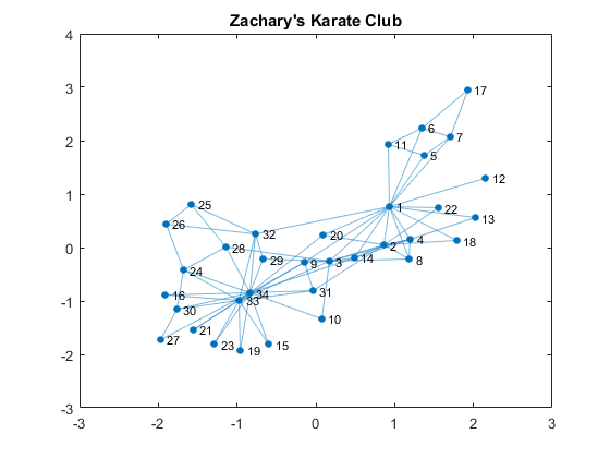
Individual members are represented as nodes, and the edges that connect two nodes represent their friendships. Edges are therefore just a pair of nodes. edges represents the pairs as rows in a 78 x 2 matrix. nodes are just an array of numbers that represents the nodes. Friendships are mutual and therefore they don't have direction. We can use an undirected graph to represent this social network. You can create a graph by supplying the lists of nodes that form edges.G = graph(edges(:,1), edges(:,2)); % create a graph from edges G.Nodes = table(name); % name the nodes figure % visualize the graph plot(G); title('Zachary''s Karate Club')

Who is the Most Connected?
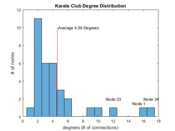
The plot shows a typical "hubs and spokes" structure with a couple of hubs, which are nodes that have a lot of connections. You are popular if you have a lot of friends, so this represents popularity. One way to quantify popularity is a metric called degree, the number of edges connected to each node. Let's find the degree distribution of this social network.D = degree(G); % get degrees per node mu = mean(D); % average degrees figure histogram(D); % plot histogram hold on line([mu, mu],[0, 10], 'Color', 'r') % average degrees line title('Karate Club Degree Distribution') xlabel('degrees (# of connections)'); ylabel('# of nodes'); text(mu + 0.1, 10, sprintf('Average %.2f Degrees', mu)) text(14.5, 1.5, 'Node 1') text(11, 2, 'Node 33') text(16, 2, 'Node 34')
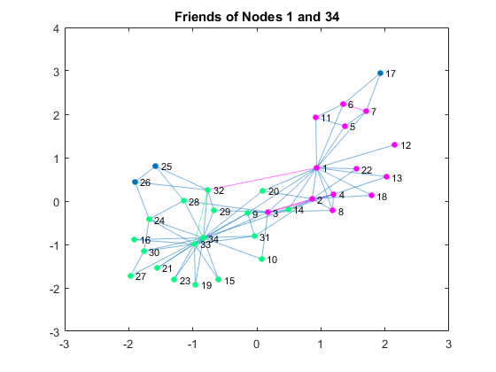
 You see that two people (Nodes 1 and 34) have well above the average number of degrees. Node 33 has many friends but not as many as those two. Let’s color the edges (connections) of those two individuals.
N1 = neighbors(G, 1);                               % get 1's friends
N1 = [N1; 1];                                       % add 1
N34 = neighbors(G, 34);                             % get 34's friends
N34 = [N34; 34];                                    % add 34

c1 = [1,0,1];                                       % 1's group color
c2 = [0,1,0.5];                                     % 34's group color

figure
P = plot(G);                                        % plot the graph
highlight(P, N1, 'NodeColor', c1, 'EdgeColor', c1); % highlight 1's friends
highlight(P, N34, 'NodeColor', c2, 'EdgeColor', c2);% highlight 34's friends
title('Friends of Nodes 1 and 34')

The Breakup
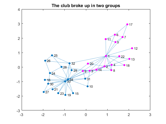
By coloring the connections of those two, you can see that the club already had two subgroups based on social relationships. Let's compare the previous visualization with the visualization of the actual breakup based on the information from the linked textbook above.G1nodes = [1, 2, 3, 4, 5, 6, 7, 8, 9,... % Node 1's group 11, 12, 13, 14, 17, 18, 20, 22]; figure P = plot(G); % plot the graph highlight(P, G1nodes, 'NodeColor', c1,'EdgeColor', c1); % highlight group title('The club broke up in two groups')

Predicting the Breakup
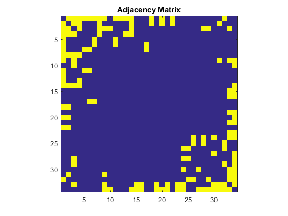
Now that we are familiar with this dataset, let's see if there is a way to detect two groups in this dataset. Here is an adjacency matrix of this network. Each row and column are node ids and if two nodes have a relationship, then the intersection becomes 1, otherwise 0. The diagonal elements represents self-referential connections and therefore they are 0 in this social network.A = adjacency(G); % create adjacency matrix A = full(A); % convert the sparse matrix to full matrix figure imagesc(A) % plot the matrix axis square title('Adjacency Matrix')

Hierarchical Clustering Approach
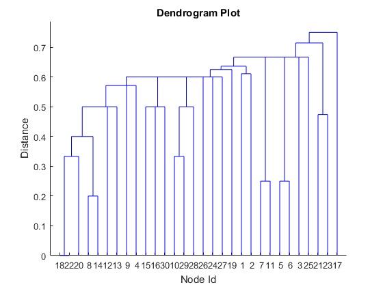
In machine learning, this can be handled as a clustering problem. Let's try Hierarchical Clustering with the number of shared connections as distance metric – the more connections you share, the closer. Since we have binary data, we will use the Jaccard distance.dist = pdist(A, 'jaccard'); % use Jaccard distance to score connections Z = linkage(dist); % create tree figure dendrogram(Z) % plot dendrogram title('Dendrogram Plot') xlabel('Node Id'); ylabel('Distance')
 This doesn’t look right, because it completely ignores the structure of connections in the network. This is a good example where the traditional machine learning approach alone cannot solve the problem.
Graph Partitioning Approach
What can we use from graph theory to partition the graph? One approach, suggested by Pat Quillen, uses Algebraic connectivity to weight the nodes based on the minimum number of cuts you need to make to create two subsets, and the Fielder Vector is used for this purpose. In a typical use, we want to partition nodes into two groups of equal size. Let's partition the nodes with the median value. The nodes with lower-than-median values are less well connected than those with higher values. Now let's use the Fielder Vector to identify the graph partition and compare the result to the actual split.L = laplacian(G); % get Laplacian Matrix of G [V, ~] = eig(full(L),'vector'); % get eigenvectors from L w = V(:,2); % the Fiedler Vector P1nodes = find(w < median(w)); % select nodes below median value errors = setdiff(G1nodes, P1nodes) % any diff from the actual split?
errors =
   Empty matrix: 1-by-0
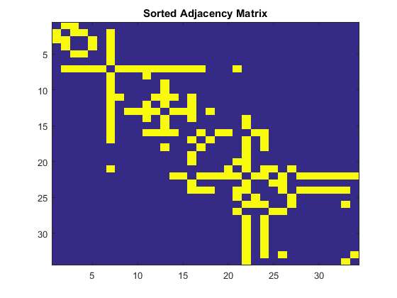
You can see that Fielder Vector did a perfect good job identifying the partition of this graph. If you sort the Adjacency Matrix by Fielder Vector, you can also see this split.
[~, order] = sort(w);                   % sort the weights by value
sortedA = A(order, order);              % apply the sort order to A

figure
imagesc(sortedA)
title('Sorted Adjacency Matrix')

Summary - how does this compare to the Facebook example?
In this case, the Fielder Vector was all we needed to partition the graph. But in more complicated cases you may be able to use it as a distance metric for cluster analysis, replacing the Jaccard distance in the above example. Social network analysis and machine learning should be complementary tools in your data science toolkit. How does this apply to the situation of how Facebook predicts breakups between couples? Think of Nodes 1 and 34 as a couple, and the graph as their Facebook friends. It looks surprisingly similar to the graph in the article cited above, except that it has more than two clusters. If you think about it, you have old classmates, coworkers, family members, and other social activities and they usually form distinct clusters. Interestingly, the article says that total number of mutual friends a couple share is not a good indicator of romantic relationships. It is better if their mutual friends are less well connected. Apparently, romantic relationships and karate clubs don't share the same social dynamics. Try Release R2015b, and check out this new graph feature and let us know what you think here.Published with MATLAB® R2015b


Comments
To leave a comment, please click here to sign in to your MathWorks Account or create a new one.