Visualizing the frequency distribution of 2-Dimensional Data
Brett's Pick this week is "cloudPlot", by Daniel Armyr.
As data acquisition and storage capacities continue to expand, we are constantly being bombarded with increasingly large datasets. Analyzing--or even just visualizing--these data represents one of the most pressing challenges of our time.
Whenever I present "Speeding Up MATLAB Applications," I always make a point of saying that there are "better" (i.e., efficient) ways to use MATLAB, and "worse" (inefficient) ways to use it. (This is true of all languages, of course, but the "cost" of doing things inefficiently in an interpreted language like MATLAB can be more pronounced than when compared with poorly implemented compiled code. I find that people who tell me that MATLAB is slow, often don't use it to its full potential.) I like to make the point, too, that writing better code entails keeping tabs on memory management in addition to performance. (This becomes ever more important with the aforementioned "Big Data challenges.") In fact, one of the topics of that "Speeding Up" presentation deals with efficient visualization of data--and with recognition that visualizations may contain full copies of your data.
Daniel's cloudPlot provides a very clever, and very well implemented, way of visualizing large 2-dimensional data. You can see this clearly in the following code section. First, we create some data. We'll create x and y as 1 million-by-one vectors of normally distributed random doubles; as created, each variable occupies 8 megabytes of memory:
x = randn(1000000,1);
y = randn(1000000,1);
Now how would we best visualize x versus y? We could plot them, of course:
h = plot( x, y, 'b.' );
axis equal
title ( 'Plotting all data' ,'fontsize',12,'fontweight','bold');

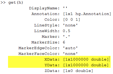
As I see it, there are two significant problems with this visualization. First, we have lost all the subtleties of the data. We have a big mass of points, from which we can tell very little about the distribution of our data. And secondly, that graphic contains full copies of x and y! We can see that readily when we get the properties of the plot:

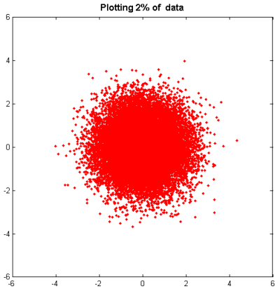
Plotting a small subset--say, 2 percent-- of the data is a good start; we lose very little information, but the plot contains only 300 kilobytes of data instead of 16 megabytes:
pct = 2;
stepsize = 100/pct;
h = plot(x(1:stepsize:end),y(1:stepsize:end),'r.')
title ( 'Plotting 2% of  data' ,'fontsize',12,'fontweight','bold');

However, we still have the significant problem that we can't really tell what's going on with our data.
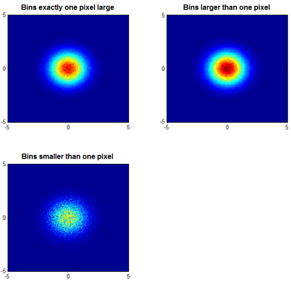
Enter Daniel's cloudPlot. After cleverly binning the 2-dimensional data, Daniel's function creates a great visualization that yields a lot more information than does the plots we created above:
subplot ( 2, 2, 1 );
colormap(jet);
cloudPlot( X, Y ,[-5 5 -5 5]);
title ( 'Bins exactly one pixel large' );
subplot ( 2, 2, 2 );
cloudPlot( X, Y, [-5 5 -5 5], [], [100 100] );
title ( 'Bins larger than one pixel' );
subplot ( 2, 2, 3 );
cloudPlot( X, Y, [-5 5 -5 5], [], [1000 1000] );
title ( 'Bins smaller than one pixel' );

Now we have a great deal more insight into the distribution of those data. And, the image of the data in the upper left--arguably the most illustrative of the visualizations-- occupies only about a half of a megabyte. (The upper right image is smaller, the lower left, larger.)
Very useful indeed!
As always, I welcome your thoughts and comments. Or leave feedback for Daniel here.
- 범주:
- Picks


댓글
댓글을 남기려면 링크 를 클릭하여 MathWorks 계정에 로그인하거나 계정을 새로 만드십시오.