
Mapping Uber Pickups in New York City
I travel a lot and I use ridesharing services like Uber often when I am away. One of my guest bloggers, Toshi, just got his first experience with such a service when he visited New York, and that inspired a new post.
Contents
- FiveThirtyEight
- Raw data
- Load data with datastore
- Get New York area map
- Visualize Uber pickup locations
- Visualize pickup frequency with a heat map
- Pickups by month
- Create GIF Animation
- Pickups by day of week
- Pickups by hour
- Fast forward to 2015
- Growth from 2014 to 2015 by month
- Growth by day of week
- Growth by hour
- Mapping Hourly Pickups in 2015
- Summary
FiveThirtyEight
I visited New York for Thanksgiving and I used Uber for the first time (Yes, I am a technology laggard when it comes to transportation). Now I undersand why ridesharing got so popular.
I noticed FiveThirtyEight has several articles about Uber and they make their data available on GitHub for the public. In my earlier post we looked at Uber data from San Francisco. It would be curious to compare New York and San Francisco Uber usage. I will quickly summarize San Franciso Uber usage pattern in that dataset (which is no longer available, unfortunately):
- More rides in the weekends than during the weekdays
- More rides in early morning hours than during the daytime
Raw data
I placed the downloaded CSV files into "uber-trip-data" folder in the current folder. CSV files contain Uber pickup data from April through September 2014. Here is a snippet from a CSV file. You can see that it is a tabular data with four columns - Date/Time, Latitude, Longitude, and Base, which is a company code, all affiliated with Uber in this case.
dbtype('uber-trip-data/uber-raw-data-apr14.csv','1:8')
1     "Date/Time","Lat","Lon","Base"
2     "4/1/2014 0:11:00",40.769,-73.9549,"B02512"
3     "4/1/2014 0:17:00",40.7267,-74.0345,"B02512"
4     "4/1/2014 0:21:00",40.7316,-73.9873,"B02512"
5     "4/1/2014 0:28:00",40.7588,-73.9776,"B02512"
6     "4/1/2014 0:33:00",40.7594,-73.9722,"B02512"
7     "4/1/2014 0:33:00",40.7383,-74.0403,"B02512"
8     "4/1/2014 0:39:00",40.7223,-73.9887,"B02512"
Load data with datastore
When you have multiple tabular data files with the same format, you can use datastore to load everything in one shot using a wild card character to match multiple file names, instead of reading them one by one.
ds = datastore(...
    'uber-trip-data/uber-raw-data-*14.csv', ...         % wild card char *
    'ReadVariableNames',false, ...                      % ignore header
    'VariableNames',{'DateTime','Lat','Lon','Base'});
ds.NumHeaderLines = 1;                                  % has header line
ds.TextscanFormats = ...                                % set data formats
    {'%{M/d/yyyy HH:mm:ss}D','%f','%f','%q'};
preview(ds)                                             % preview the data
ans =
        DateTime          Lat        Lon        Base
    _________________    ______    _______    ________
    4/1/2014 00:11:00    40.769    -73.955    'B02512'
    4/1/2014 00:17:00    40.727    -74.034    'B02512'
    4/1/2014 00:21:00    40.732    -73.987    'B02512'
    4/1/2014 00:28:00    40.759    -73.978    'B02512'
    4/1/2014 00:33:00    40.759    -73.972    'B02512'
    4/1/2014 00:33:00    40.738     -74.04    'B02512'
    4/1/2014 00:39:00    40.722    -73.989    'B02512'
    4/1/2014 00:45:00    40.762    -73.979    'B02512'
When you use datastore, you don't actually load data. You are simply creating a reference to a data repository. You need to specify variables of interest and explicitly load the actual data in memory. This allows you to selectively read data too large to fit into memory. In our case, you can load everything and save the resulting table to disk. I commented out the following code because I have done this step.
% ds.SelectedVariableNames = {'DateTime', 'Lat', 'Lon'};  % select variables
% T = readall(ds);                                        % read all
% save('uber.mat', 'T');                                  % save to disk
I am going to reload the existing mat file instead. Let's also load additional settings like latitude/longitude ranges, image size and landmark coordinates with load_settings.m.
load uber                                               % reload data
load_settings                                           % get settings
Get New York area map
If you have Mapping Toolbox, you can download raster maps from a Web Map Service server. I used a raster map service but you can also use an OpenStreetMap service. Get the raster map data if you don't have Mapping Toolbox.
% wms = wmsinfo(url1);                                    % url1 is for raster
%                                                         % url2 is for OSM
% layer = wms.Layer;                                      % get layer object
% [A,R] = wmsread(layer, 'ImageFormat', 'image/png', ...  % read raster image
%     'Lonlim', lim.lon, 'Latlim', lim.lat, ...
%     'ImageHeight', img.h, 'ImageWidth', img.w);

load wms
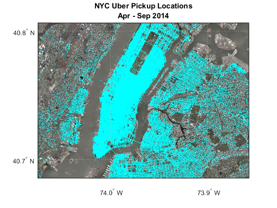
Visualize Uber pickup locations
Now we are ready to show the Uber data over the map.
figure                                                  % create a new figure
usamap(lim.lat, lim.lon);                               % limit to New York area
geoshow(A, R)                                           % display raster map
geoshow(T.Lat, T.Lon, ...                               % overlay data points
    'DisplayType', 'point', ...                         % display as a point
    'Marker', '.', ...                                  % use dot
    'MarkerSize', 1, ...                                % keep the size small
    'MarkerEdgeColor', 'c')                             % set color to cyan
title({'NYC Uber Pickup Locations'; 'Apr - Sep 2014'})  % add title
Visualize pickup frequency with a heat map
Manhattan is almost completely blanketed by dense dots and it's hard to see any details. Mike Garrity showed me how to use histogram2 instead. This function is in base MATLAB and not in Mapping Toolbox. Therefore geospatial coordinates like latitudes and longitudes are treated like ordinary points on a 2D surface. Since longitudes get closer as we move away from the equator, we need to adjust for that with data aspect ratio, which was loaded as dar earlier.
We also have to load the raster map as an image, and x-y coordinates are different between the plot and image. We need to flip the image and fix the orientation of the plot.
nbins = 150;                                            % number of bins
xbinedges = linspace(lim.lon(1),lim.lon(2),nbins);      % x-axis bin edges
ybinedges = linspace(lim.lat(1),lim.lat(2),nbins);      % y-axis bin edges
map = flipud(A);                                        % flip image

figure
imagesc(lim.lon, lim.lat, map)                          % show raster map
hold on                                                 % don't overwrite
colormap cool                                           % set colormap
histogram2(T.Lon, T.Lat, xbinedges, ybinedges, ...      % overlay histogram
    'DisplayStyle', 'tile', ...                         % in 2D style
    'FaceAlpha', 0.5)
hold off                                                % restore default
daspect(dar)                                            % adjust ratio
set(gca,'ydir','normal');                               % fix y orientation
caxis([0 5000])                                         % color axis scaling
title({'NYC Uber Pickup Frequency'; 'Apr - Sep 2014'})  % add title
text(lmk1.lon, lmk1.lat, lmk1.str, 'Color', 'w');       % add landmarks
text(lmk2.lon, lmk2.lat, lmk2.str, 'Color', 'w', ...    % add landmarks
    'HorizontalAlignment', 'right');
colorbar                                                % add colorbar
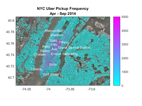
The plot shows that Uber is particularly popular along Fifth Avenue, around Grand Central Station, Penn Station, Chelsea, around the Empire State Building, and Soho. It seems New York Uber users are primarily interested in getting around from transportation hubs and shopping areas?
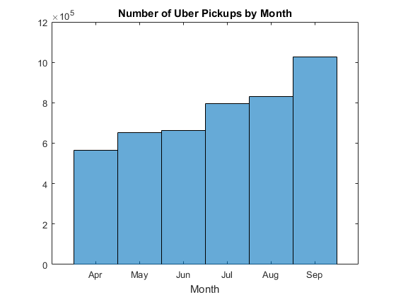
Pickups by month
Did the number of pickups change over time? You can reload the whole dataset and plot a histogram. We see that the volume is increasing month by month.
months = {'Apr','May','Jun','Jul','Aug','Sep'};         % month names

figure
histogram(T.DateTime.Month)                             % plot histogram
ax = gca;                                               % get current axes
ax.XTick = 4:9;                                         % change ticks
ax.XTickLabel = months;                                 % change tick labels
title('Number of Uber Pickups by Month')                % add title
xlabel('Month')                                         % x axis label
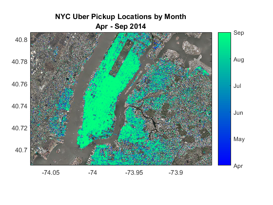
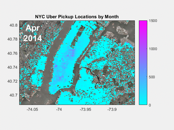
Let's plot this over the map and see if we see any variation by location. To speed it up, we will reduce the data size by drawing samples in equal proportion from each month.
c = cvpartition(T.DateTime.Month, 'Holdout', 1/10);     % partition data
Ts = T(test(c),:);                                      % get 1/10

figure
imagesc(lim.lon, lim.lat, map)                          % show raster map
hold on                                                 % don't overwrite
colormap winter                                         % set colormap
cols = Ts.DateTime.Month;                               % color by month
scatter(Ts.Lon, Ts.Lat, 1, cols, 'MarkerEdgeAlpha', .3) % plot data points
hold off                                                % restore default
xlim(lim.lon)                                           % limit x range
ylim(lim.lat)                                           % limit y range
daspect(dar)                                            % adjust ratio
set(gca,'ydir','normal');                               % fix y orientation
title({'NYC Uber Pickup Locations by Month'; ...        % add title
    'Apr - Sep 2014'})
colorbar('Ticks', unique(cols), 'TickLabels', months)   % add colorbar
Create GIF Animation
Unfortunately, it is not easy to detect patterns in this plot. Mike Garrity also showed me how to use animation with imwrite to see the pattern more clearly.
first = true;                                           % flag

figure('Visible', 'off')                                % make plot invisible
for i = 4:9                                             % loop over Apr to Sep
    imagesc(lim.lon, lim.lat, map)                      % show raster map
    hold on                                             % don't overwrite
    colormap cool                                       % set colormap
    idx = T.DateTime.Month == i;                        % pick data by month
    histogram2(T.Lon(idx), T.Lat(idx), xbinedges, ...   % overlay histogram
        ybinedges, 'DisplayStyle', 'tile')              % in 2D style
    hold off                                            % restore default
    xlim(lim.lon)                                       % limit x range
    ylim(lim.lat)                                       % limit y range
    daspect(dar)                                        % adjust ratio
    set(gca,'ydir','normal');                           % fix y orientation
    title('NYC Uber Pickup Locations by Month')         % add title
    text(cir.ctr(2), cir.ctr(1), ...                    % add month
        {months{i-3};'2014'}, ...                       % at an upper left
        'Color', 'w', 'FontSize', 20, ...               % corner of the map
        'FontWeight', 'bold', ...
        'HorizontalAlignment', 'center')
    caxis([0 1500])                                     % color axis scaling
    colorbar                                            % add colorbar
    fname = getframe(gcf);                                  % get the frame
    [x,cmap] = rgb2ind(fname.cdata, 128);                   % get indexed image
    if first                                            % if first frame
        first = false;                                  % update flag
        imwrite(x,cmap, 'html/monthly.gif', ...         % save as GIF
            'Loopcount', Inf, ...                       % loop animation
            'DelayTime', 1);                            % 1 frame per second
    else                                                % if image exists
        imwrite(x,cmap, 'html/monthly.gif', ...         % append frame
            'WriteMode', 'append', 'DelayTime', 1);     % to the image
    end
end
Now it is easier to see how Uber usage was spreading within Manhattan as well as in the surrounding areas.
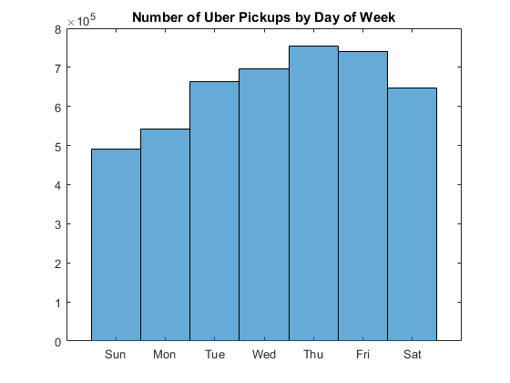
Pickups by day of week
Let's now check the changes by day of week. San Franciscans used Uber more in the weekend but New Yorkers used it more during the weekdays.
week = {'Sun','Mon','Tue','Wed','Thu','Fri','Sat'};     % days of week

figure
histogram(weekday(T.DateTime))                          % plot histogram
ax = gca;                                               % get current axes
ax.XTick = 1:7;                                         % change ticks
ax.XTickLabel = week;                                   % change tick labels
title('Number of Uber Pickups by Day of Week')          % add title
Let's animate this over the map again.
first = true;                                           % flag

figure('Visible', 'off')                                % make plot invisible
for i = 1:7                                             % loop over Sun to Sat
    imagesc(lim.lon, lim.lat, map)                      % show raster map
    hold on                                             % don't overwrite
    colormap cool                                       % set colormap
    idx = weekday(T.DateTime) == i;                     % pick data by day
    histogram2(T.Lon(idx), T.Lat(idx), xbinedges, ...   % overlay histogram
        ybinedges, 'DisplayStyle', 'tile')              % in 2D style
    hold off                                            % restore default
    xlim(lim.lon)                                       % limit x range
    ylim(lim.lat)                                       % limit y range
    daspect(dar)                                        % adjust ratio
    set(gca,'ydir','normal');                           % fix y orientation
    title({'NYC Uber Pickup Locations by Day of Week';  % add title
        'Apr - Sep 2014'})
    text(cir.ctr(2), cir.ctr(1), week{i},...            % add day of week
        'Color', 'w', 'FontSize', 20, ...               % at an upper left
        'FontWeight', 'bold', ...                       % corner of the map
        'HorizontalAlignment', 'center')
    caxis([0 1500])                                     % color axis scaling
    colorbar                                            % add colorbar
    fname = getframe(gcf);                                  % get the frame
    [x,cmap] = rgb2ind(fname.cdata, 128);                   % get indexed image
    if first                                            % if first frame
        first = false;                                  % update flag
        imwrite(x,cmap, 'html/daily.gif', ...           % save as GIF
            'Loopcount', Inf, ...                       % loop animation
            'DelayTime', 1);                            % 1 frame per second
    else                                                % if image exists
        imwrite(x,cmap, 'html/daily.gif', ...           % append frame
            'WriteMode', 'append', 'DelayTime', 1);     % to the image
    end
end
The frequency clearly drops off during the weekend across Manhattan.

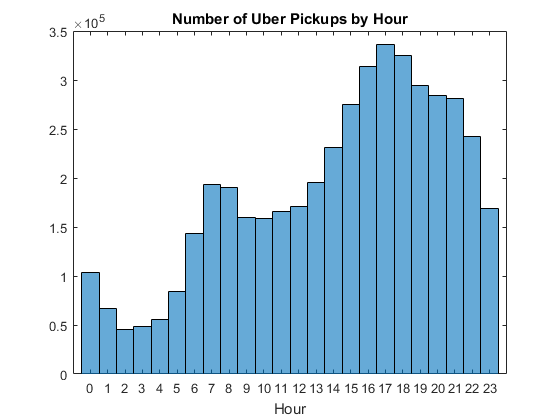
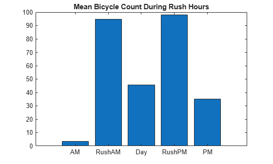
Pickups by hour
Uber users in San Francisco were more active during earlier morning hours. The histogram shows that New Yorkers actually don't stay out as late, and volume peaks during the evening rush hour.
figure
histogram(T.DateTime.Hour)                              % plot histogram
xlim([-1 24])                                           % set x-axis limits
ax = gca;                                               % get current axes
ax.XTick = 0:23;                                        % change ticks
title('Number of Uber Pickups by Hour')                 % add title
xlabel('Hour')                                          % x axis label
Let's animate this as well.
first = true;                                           % flag
ampm = 'AM';                                            % flag

figure('Visible', 'off')                                % make plot invisible
for i = 1:24                                            % loop over 24 hours
    j = i - 1;                                          % hour starts with zero
    imagesc(lim.lon, lim.lat, map)                      % show raster map
    hold on                                             % don't overwrite
    colormap cool                                       % set colormap
    idx = T.DateTime.Hour == j;                         % pick data by hour
    histogram2(T.Lon(idx), T.Lat(idx), xbinedges, ...   % overlay histogram
        ybinedges, 'DisplayStyle', 'tile')              % in 2D style
    line(cir.lon, cir.lat, ...                          % draw clock face
        'Color', 'w', 'LineWidth', 3)
    line(hour.x(i,:), hour.y(i,:), ...                  % draw hour handle
        'Color', 'w', 'LineWidth', 3)
    line(min.x, min.y, ...                              % draw min handle
        'Color', 'w', 'LineWidth', 3)
    if j >= 12                                          % afternoon
        ampm = 'PM';
    end
    text(cir.ctr(2), cir.ctr(1) - .02, ampm, ...        % add AM/PM
        'Color', 'w', 'FontSize', 14, ...
        'FontWeight', 'bold', ...
        'HorizontalAlignment', 'center')
    hold off                                            % restore default
    xlim(lim.lon)                                       % limit x range
    ylim(lim.lat)                                       % limit y range
    daspect(dar)                                        % adjust ratio
    set(gca,'ydir','normal');                           % fix y orientation
    title({'NYC Uber Pickup Locations by Hour'; ...     % add title
       'Apr - Sep 2014'})
    caxis([0 700])                                      % color axis scaling
    colorbar                                            % add colorbar
    fname = getframe(gcf);                              % get the frame
    [x,cmap] = rgb2ind(fname.cdata, 128);               % get indexed image
    if first                                            % if first frame
        first = false;                                  % update flag
        imwrite(x,cmap, 'html/hourly.gif', ...          % save as GIF
            'Loopcount', Inf, ...                       % loop animation
            'DelayTime', 1);                            % 1 frame per second
    else                                                % if image exists
        imwrite(x,cmap, 'html/hourly.gif', ...          % append frame
            'WriteMode', 'append', 'DelayTime', 1);     % to the image
    end
end
You can see Midtown gets really busy during the evening rush hour and Soho and Chelsea get more active during the evening.

Fast forward to 2015
We also have data from Jan through June 2015, but it is in a different format, and the file size is also much bigger. We can use datastore again.
csv2015 = 'uber-trip-data/uber-raw-data-janjune-15.csv';% filename
dbtype(csv2015,'1:8')                                   % show content

ds = datastore(csv2015, 'ReadVariableNames',false, ...  % setup  datastore
    'VariableNames', ...                                % set variable names
    {'Dispatching','Date','Affiliated','LocID'});
ds.NumHeaderLines = 1;                                  % has header line
ds.TextscanFormats = ...                                % set data formats
    {'%C','%{yyyy-M-d HH:mm:ss}D','%C','%f'};
1     Dispatching_base_num,Pickup_date,Affiliated_base_num,locationID
2     B02617,2015-05-17 09:47:00,B02617,141
3     B02617,2015-05-17 09:47:00,B02617,65
4     B02617,2015-05-17 09:47:00,B02617,100
5     B02617,2015-05-17 09:47:00,B02774,80
6     B02617,2015-05-17 09:47:00,B02617,90
7     B02617,2015-05-17 09:47:00,B02617,228
8     B02617,2015-05-17 09:47:00,B02617,7
This time, we will load data sequentially, take what we need, and discard the rest in order to avoid filling up our computer memory. This process takes time and I instead reload data I saved earlier.
% ds.SelectedVariableNames = {'Date','LocID'};            % select variables
% months = [];                                            % accumulator
% days = [];                                              % accumulator
% hours = [];                                             % accumulator
% locations = [];                                         % accumulator
% reset(ds)                                               % reset read point
% while hasdata(ds)                                       % loop until end
%     T = read(ds);                                       % read partial
%     months = vertcat(months, T.Date.Month);             % append months
%     days = vertcat(days, weekday(T.Date));              % append days
%     hours = vertcat(hours, T.Date.Hour);                % append hours
%     locations = vertcat(locations, T.LocID);            % append locations
% end

load nyc2015.mat
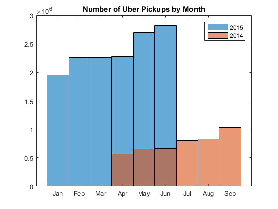
Growth from 2014 to 2015 by month
We can compare data from 2014 and 2015 to see how Uber is growing in New York. You can see a dramatic increase in the volume of pickups.
monthStr = {'Jan','Feb','Mar','Apr', ...                % month names
    'May','Jun','Jul','Aug','Sep'};

figure
histogram(months)                                       % plot histogram
hold on
histogram(T.DateTime.Month)                             % plot histogram
hold off
ax = gca;                                               % get current axes
ax.XTick = 1:9;                                         % change ticks
ax.XTickLabel = monthStr;                               % change tick labels
title('Number of Uber Pickups by Month')                % add title
legend('2015', '2014')                                  % add legend
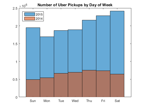
Growth by day of week
When you look at the data by day of week, you see a usage shift - New Yorkers started to use Uber over weekends as well as week days.
figure
histogram(days)                                         % plot histogram
hold on
histogram(weekday(T.DateTime))                          % plot histogram
hold off
ax = gca;                                               % get current axes
ax.XTick = 1:7;                                         % change ticks
ax.XTickLabel = week;                                   % change tick labels
title('Number of Uber Pickups by Day of Week')          % add title
legend('2015', '2014', 'Location', 'NorthWest')         % add legend
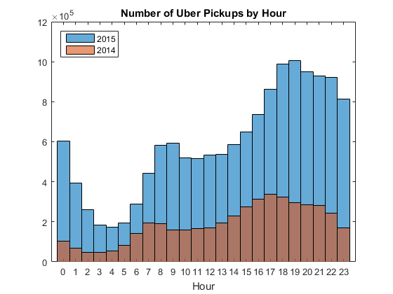
Growth by hour
However, New Yorkers still don't use Uber a lot in early morning hours, and still use it heavily during the evening rush hour.
figure
histogram(hours)                                        % plot histogram
hold on
histogram(T.DateTime.Hour)                              % plot histogram
xlim([-1 24])                                           % set x-axis limits
ax = gca;                                               % get current axes
ax.XTick = 0:23;                                        % change ticks
title('Number of Uber Pickups by Hour')                 % add title
xlabel('Hour')                                          % x axis label
legend('2015', '2014', 'Location', 'NorthWest')         % add legend
Mapping Hourly Pickups in 2015
Do we see any change in geographic pattern along with the volume increase? Instead of latitudes and longitudes, we just have location Ids for pickups in "taxi-zone-lookup.csv". For mapping I added latitudes and longitudes in a separate file.
latlon = readtable('uber-trip-data/latlon.xlsx');       % load lat lon data
onMap = ismember(locations, latlon.LocationID);         % find points on map
locations = locations(onMap);                           % points on map only
hours = hours(onMap);                                   % hours on map only

first = true;                                           % flag
ampm = 'AM';                                            % flag

figure('Visible', 'off')                                % make plot invisible
for i = 1:24                                            % loop over 24 hours
    j = i - 1;                                          % hour starts with zero
    curHour = hours == j;                               % current hour
    [locId, ~, idx] = unique(locations(curHour));       % get unique loc ids
    count = accumarray(idx,1);                          % pickups by locatoin
    rows = ismember(latlon.LocationID,locId);           % get matching rows
    imagesc(lim.lon, lim.lat, map)                      % show raster map
    hold on                                             % don't overwrite
    colormap cool                                       % set colormap
    scatter(latlon.Lon(rows), latlon.Lat(rows), 100, ...% plot data points
        count, 'filled', 'MarkerFaceAlpha', 0.7)        % color by count
    line(cir.lon, cir.lat, ...                          % draw clock face
        'Color', 'w', 'LineWidth', 3)
    line(hour.x(i,:), hour.y(i,:), ...                  % draw hour handle
        'Color', 'w', 'LineWidth', 3)
    line(min.x, min.y, ...                              % draw min handle
        'Color', 'w', 'LineWidth', 3)
    if j >= 12                                          % afternoon
        ampm = 'PM';
    end
    text(cir.ctr(2), cir.ctr(1) - .02, ampm, ...        % add AM/PM
        'Color', 'w', 'FontSize', 14, ...
        'FontWeight', 'bold', ...
        'HorizontalAlignment', 'center')
    hold off                                            % restore default
    xlim(lim.lon)                                       % limit x range
    ylim(lim.lat)                                       % limit y range
    daspect(dar)                                        % adjust ratio
    set(gca,'ydir','normal');                           % fix y orientation
    caxis([0 20000])                                    % color axis scaling
    title({'NYC Uber Pickups by Zone'; 'Jan-Jun 2015'}) % add title
    colorbar                                            % add colorbar
    fname = getframe(gcf);                              % get the frame
    [x,cmap] = rgb2ind(fname.cdata, 128);               % get indexed image
    if first                                            % if first frame
        first = false;                                  % update flag
        imwrite(x,cmap, 'html/nyc2015.gif', ...         % save as GIF
            'Loopcount', Inf, ...                       % loop animation
            'DelayTime', 1);                            % 1 frame per second
    else                                                % if image exists
        imwrite(x,cmap, 'html/nyc2015.gif', ...         % append frame
            'WriteMode', 'append', 'DelayTime', 1);     % to the image
    end
end
The traffic pattern hasn't changed very much from 2014, but you can now see some hot spots in Brooklyin and Queens in the evening rush hour.

Summary
It is very interesting to see such difference in Uber usage between New York and San Francisco. New Yorkers seem to use Uber for commuting and shopping, but it doesn't seem it is a big part of night life, while we saw earlier that San Franciso users got more active in the early morning hours. What accounts for this difference? Share your thought here!
- カテゴリ:
- Data Science,
- How To,
- Mapping


コメント
コメントを残すには、ここ をクリックして MathWorks アカウントにサインインするか新しい MathWorks アカウントを作成します。