 Cleve’s Corner: Cleve Moler on Mathematics and Computing
 The MATLAB Blog
 Guy on Simulink
 MATLAB Community
 Artificial Intelligence
 Developer Zone
 Stuart’s MATLAB Videos
 Behind the Headlines
 File Exchange Pick of the Week
 Hans on IoT
 Student Lounge
 MATLAB ユーザーコミュニティー
 Startups, Accelerators, & Entrepreneurs
 Autonomous Systems
 Quantitative Finance
 MATLAB Graphics and App Building
Climate Data Toolbox: Understanding Our Changing Climate
Today our guest blogger is Lisa Kempler, who works at MathWorks in Natick, Massachusetts.
Lisa supports researchers and educators, frequently geoscientists, helping them build and host the tools that they need on their community portals, from toolboxes to data access APIs to curriculum materials.
Table of Contents
Introduction to the Climate Data Toolbox
Documentation Quick Links
Example: Pacific Ocean Temperature Change Since 1950
Loading the Data
Quick-Look Statistics and Mapping
Temperature Trend Analysis
The Answer: Where is the Temperature Change Statistically Significant?
Additional Reading and References
Introduction to the Climate Data Toolbox
Happy Earth Day!
In the spirit of learning about our climate dynamics, in this 2021 Earth Day blog post I introduce readers to the Climate Data Toolbox, a community-contributed toolbox freely downloadable from MATLAB File Exchange.
Climate Data Toolbox was developed by Chad Greene, a postdoctoral research fellow at NASA Jet Propulsion Laboratory, and Kelly Kearney, a research scientist at University of Washington.
The toolbox was inspired by one big idea: There are a common set of tasks related to data processing, analysis and visualization that Geoscience researchers and students working with climate data typically perform. Greene and coauthors make the case in their paper published in Geochemistry, Geophysics, Geosystems that having everyone who is tackling climate analysis separately recoding these same tasks is not a good use of time, for the individual or the collective, as it takes away from other more innovative climate work. Better to have a set of reusable, publicly shared functions for those repetitive tasks.
Apparently, MATLAB users agree and are busy analyzing climate data. Climate Data Toolbox has been downloaded almost 5000 times since it was published in 2019!
Documentation Quick Links
The toolbox covers a lot of ground, including resources to get new users up to speed. The documentation for the toolbox covers
- Descriptive Statistics
- Matrix Manipulation
- Georeferenced Grids
- Spatial Patterns
- Time Series
- Uncertainty Quantification
- Climate Indices
- Oceans & Atmospheres
- Geophysical Attributes
- Graphics
- Line Plots
- Maps
- Globes
- NetCDF and HDF5
and includes code examples, tutorials, and detailed descriptions for its more than 100 functions.
To give a taste of how the toolbox works, I'll do a brief analysis that ends with an information-packed map.
Example: Pacific Ocean Temperature Change Since 1950
Say we wanted to look at the change in temperature of the Pacific Ocean over time. To start, weÿll need the historical temperature data and functions to calculate the change.
This is the sort of task that Climate Data Toolbox was designed for. The functions are built with map data in mind for accomplishing exactly this sort of analysis - calculating the temperature change and applying assessment tools to determine its importance.
The script will walk us through the steps.
Loading the Data
Load the Pacific Ocean sea surface temperature data. The pacific_sst dataset has temperature data from 1950-2017.
load pacific_sst
Inspect the variables in the workspace to see what the dataset contains. (sst = sea surface temperature)
whos
Quick-Look Statistics and Mapping
To get a handle on the temperature distribution, calculate a map of mean sea surface temperatures.
sst_mean = mean(sst,3);
Now plot the mean sea surface temperature to quickly view how the temperatures are distributed across the ocean and the temperature range over that area. Not surprisingly, the temperatures at latitude = 0, the Equator, are warmer, as we can tell from the colorbar legend.
imagescn(lon,lat,sst_mean)
xlabel longitude
ylabel latitude
colorbar
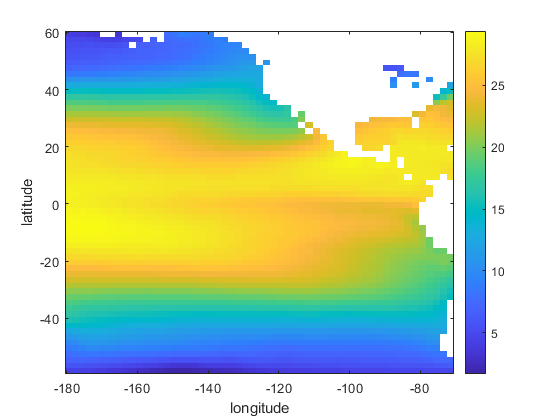
The thermal colormap does a good job of assigning colors that are intuitive for temperature, with redder colors indicating warmer temperatures and bluer ones signifying colder temperatures. Adding borders to the map shows the location of the ocean relative to the land masses, helping us align the temperatures with familar land geographies, with the Americas to the right of the Pacific.
cmocean thermal;
hold on
borders

Temperature Trend Analysis
Calculate a map of trends in the Pacific Ocean sea surface temperature using the yearly trend.
mo_to_yr = 12;
sst_tr = trend(sst,mo_to_yr);
clf
Create a map visualization of the yearly trend data.
imagescn(lon,lat,sst_tr)
cb = colorbar;
ylabel(cb,'sst trend \circC/yr')
cmocean('balance','pivot')

The map is blue in those areas where temperature has decreased, on average, during the measured period (1950-2017).
The red areas show increases in temperature during the same sixty-eight year period.
Now that we have the linear trends mapped, the mann_kendall function calculates whether or not those changes are statistically significant using the original sst dataset.
mk = mann_kendall(sst);
The Answer: Where is the Temperature Change Statistically Significant?
As the last step in the analysis, we'll superimpose the significance data onto the temperature map. stipple overlays the (lat,lon) locations that mann_kendall identified with circle markers.
hold on
stipple(lon,lat,mk)

The map shows the statistically significant sea surface temperature changes from 1950 to 2017. Areas without circles indicate locations where the temperature change wasn't statistically significant.
We achieved our initial objective of determining the temperature change in the Pacific Ocean over time and understanding where that change indicated an important, directional delta. In 20 lines of code, Climate Data Toolbox provided us some interesting information about climate change's impact on the Pacific Ocean.
Perhaps the serious students among you will build on this example to learn more, about the Pacific or other geographies.
Additional Reading and References
To view a tutorial of Chad Greene performing this sea surface temperature analysis with more detailed explanations and some additional analysis steps, watch this YouTube video.
- Climate Data Toolbox (code)
- CDT Documentation (documentation)
- The Climate Data Toolbox for MATLAB - Analyzing Trends & Global Warming (video)
- Climate Data Toolbox for MATLAB (paper in Geochemistry, Geophysics, Geosystems)
- ocean_data_tools (code)
- Visualization of Northern Hemisphere Sea Ice Concentration (tutorial on using MATLAB with ECMWF Climate Data Store)
- Landsat 8 Data Explorer (app)
To share your reactions to the Pacific Ocean trend analysis and the Climate Data Toolbox, generally, send us a comment here, and we will share it with the toolbox authors.
- 범주:
- climate,
- Geosciences,
- News


댓글
댓글을 남기려면 링크 를 클릭하여 MathWorks 계정에 로그인하거나 계정을 새로 만드십시오.