Plot (real) Big
Jiro's pick this week is Plot (Big) by my co-worker Tucker McClure.
"Big data"
That seems to be the buzz lately. But when people say "big data", it could mean a lot of things.
- Storing big data
- Loading big data
- Saving big data
- Visualizing big data
- Analyzing big data
- Manipulating big data
- etc.
This entry by Tucker is all about "visualizing" big data. This was a recommendation from another one of my co-workers, Adam.
Visualizing Big Datasets
One of the issues with visualizing big datasets is that you have so many points displayed on the screen, and exploring (zooming and panning) may become sluggish. It's nice that you have all of those points available, but your screen has only so many pixels, and you don't get additional information by putting more points than what the screen is able to display.
So what can you do? Well, you can choose to display fewer points, just enough to give you a sense of what the dataset looks like. But then, you'd like to be able to see the details if you zoom in. It's sort of like Google Maps, for instance; when you're zoomed out, you see a rough outline of the city and some major highways. When you zoom in, you start to see some of the local roads.
Can we do something like this with MATLAB plots? I created something like that for line plots. Doug even wrote a Pick on it. However, that was more of a proof-of-concept that worked for only 2D line plots. Tucker went all the way. He implemented this using MATLAB Classes, and it could be applied to other plot types. You could also call it with additional arguments that you might pass into these plotting commands. Here are some additional things I like about Tucker's entry:
- Nice documentation for the class
- An extensive set of examples
- A convenience function reduce_plot which allows you to use this class like a function, returning handles to the plot
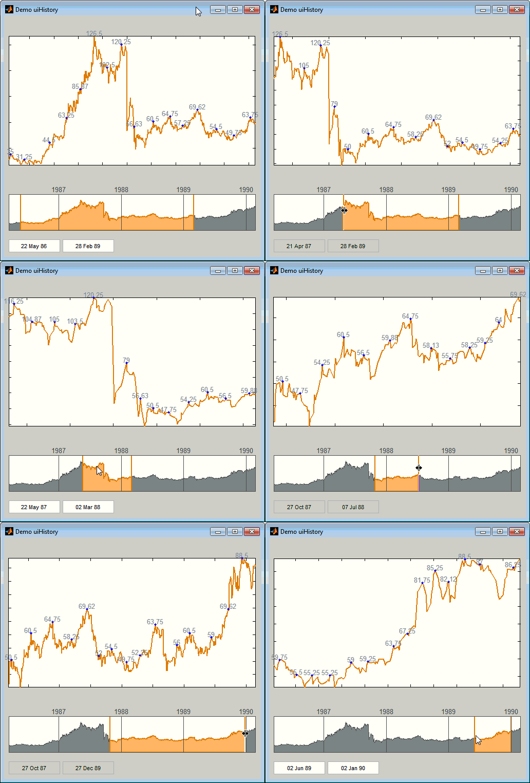
- A companion class for converting your figure to an interactive explorer, which allows you to zoom and pan by using your scroll wheel and left-click dragging, respectively
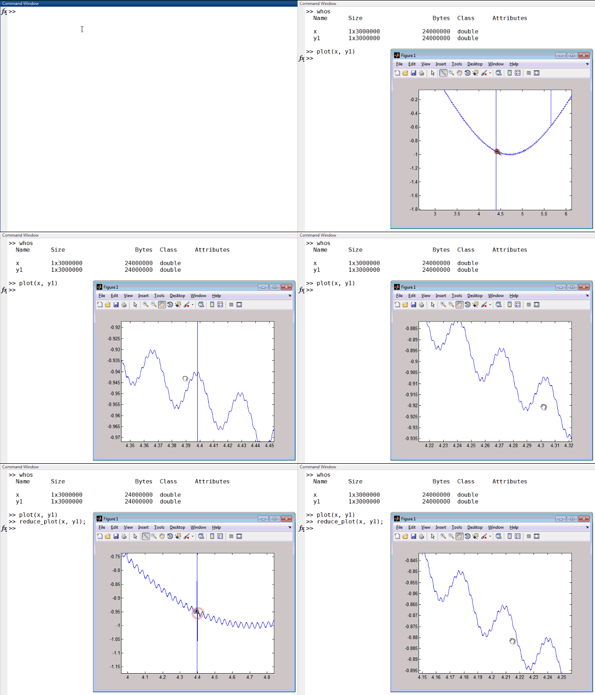
Here's a quick animation of reduce_plot in action, compared to a regular plot. You can see the difference in responsiveness of the plot when I am trying to pan the plot.

Thanks for an awesome entry, Tucker. And thanks for the recommendation, Adam. Some swag going to both of you!
Comments
We'd like to hear from you if you do, or are interested in, big data visualization. What kind of visualization do you use? Do you use any special techniques to deal with your big data? Give this a try and let us know what you think here or leave a comment for Tucker.
- 类别:
- Picks


评论
要发表评论,请点击 此处 登录到您的 MathWorks 帐户或创建一个新帐户。