Colormaps for perceptually challenged individuals
Brett's Pick this week is "Colormaps compatible with red-green color perception deficiencies", by Matthias Geissbuehler.
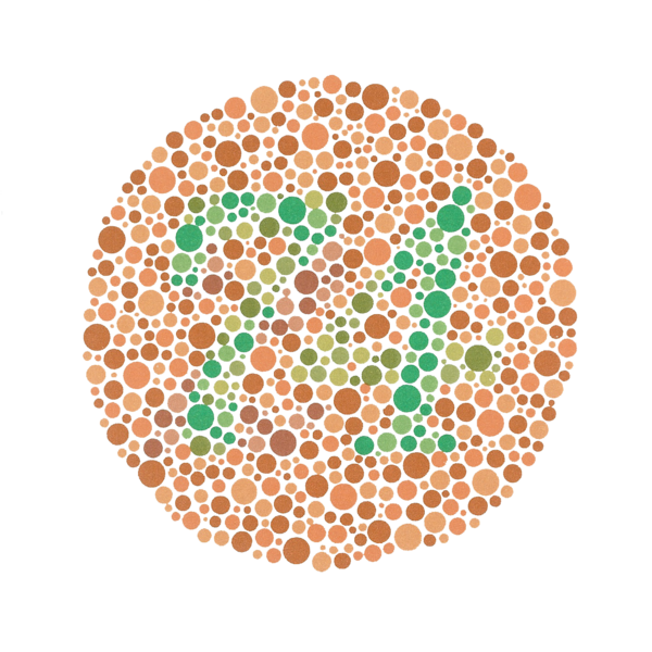
If you can see a two-digit number in this image, count yourself fortunate:

Most of you will see the "74" in this Ishihara color blindness test image. Others will see a "21." And the significant portion of the population with achromatopsia, a form of color blindness, will see no numbers at all.
Especially if you can see the numbers embedded in the test image, it's easy to forget that many people can't differentiate red from green, and thus can't see them. But we need to keep that in mind when we are creating data visualizations. (I admit that I sometimes forget.)
Matthias's submission addresses this issue nicely, and provides several alternatives for visualizing data with colors designed to facilitate color differentiation by color-deficient individuals.
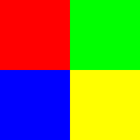
testim = label2rgb([ones(100) 2*ones(100);3*ones(100) 4*ones(100)],[1 0 0;0 1 0;0 0 1; 1 1 0]);
imshow(testim)

(In case you can't see it, the top left block is red, and the top right is green.)
Now let's redisplay the image using colormaps provided by Matthias's file:
testim2 = rgb2ind(testim,4);
cmap1 = morgenstemning(4);
cmap2 = isolum(4);
cmap3 = ametrine(4);
ax(1) = subplot(1,3,1);
subimage(im,cmap1);title('Morgenstemning')
ax(2) = subplot(1,3,2);
subimage(im,cmap2);title('Isolum')
ax(3) = subplot(1,3,3);
subimage(im,cmap3);title('Ametrine')
set(ax,'xtick',[],'ytick',[])
So, returning to the "74" image, we might, for instance, revisualize it using an "isolum" colormap:

I reduced the image to four colors before creating this colormap. There are options that I haven't tried yet that may well improve this visualization, but I'll leave that to your exploration.
(Note: I recognize that some say that color deficiency is a boon under some circumstances. Colorblind individuals may, for instance, be better able to see objects that are camouflaged to the rest of us.)
At Matthias's request, I'm including a citation to his publication on the topic:
M. Geissbuehler and T. Lasser "How to display data by color schemes compatible with red-green color perception deficiencies" Opt. Express 21, 9862-9874 (2013)
http://www.opticsinfobase.org/oe/abstract.cfm?URI=oe-21-8-9862
As always, I welcome your thoughts and comments. Or leave feedback for Matthias here.
- 类别:
- Picks


评论
要发表评论,请点击 此处 登录到您的 MathWorks 帐户或创建一个新帐户。